12 Best Cream Paint Colors For Walls And Cabinets
Would you like to save this?
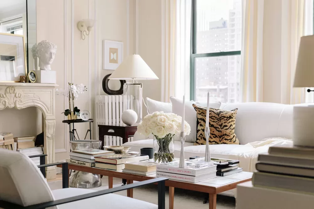
Cream paint colors have been my jam for years now. I’ve always loved a slightly warmer white, which tends to complement my decorating style better than cooler-toned ones. Warm, creamy whites feel clean, but inviting, and they make a perfect whole house paint color, or hue for a bedroom, bathroom or kitchen (I’ve used cream paint colors in all of these spaces in my own homes).
While cream-tones have always been an easy go-to neutral, they’re becoming even more popular now that home decor trends, overall. are getting warmer. We’re saying goodbye to cool grays and bright whites, and opting for browns, and beiges and creams instead.
This also means that I’ve eschewed some of my go-to cream paint colors of the past in favor of richer tones that feel more like alabaster than bright white.
Whether you’re looking for a cream paint color for the walls of your living room or for your entire home, you can’t go wrong with any of the picks I’ve included on my list, below. Many of these shades I’ve used in my own homes, and the rest are hues I’ve sampled and loved, or learned about from interviews with interior designers, or paint company press releases. I’ve seen each of these in person, and can attest that all are beautiful.
Tips For Choosing a Cream Paint Color
Before I dive into my list of the best cream paint colors, I wanted to share a few tips for choosing on for your home.
1. Don’t only go by online color swatches!
For most paint colors, online color swatches are a decent gauge of what a color looks like, but that’s not the case with whites. White paints always look significantly deeper in an online than in person. If you want a true cream color (not an off white) don’t be turned off by the color swatches online, which may look tan or beige.
If you’re researching color online, Google the different shades you’re interested and look at the images that pop up. I find those are more accurate than the little digital paint swatches.
I’ve included both color swatches and images in the post below so you can see how the two compare.
But more importantly ….
2. Always sample!
Try cream paint colors on your walls before committing! Sampling is so important, especially when choosing a white or cream paint. All white paint colors have undertones, and the light in a room greatly impacts the way in which, and the degree to which, these undertones show up. Some cream tones can look more light true, bright whites in rooms that get a lot of natural light, like south or west- facing spaces, or rooms with skylights and lots of windows.
I have an entire post on paint color undertones and how the light in a room affects them if you want to know more about this topic!
3. Pay attention to LRV.
LRV, or light reflective value, is on of my favorite tools for deciding on a paint color. LRV is measured on a scale of 0-100, with 0 being pitch black and 100 being bright white. Most cream colors fall in the 70-82 LRV range. Anything brighter reads more like a true white, and deeper colors start to veer into beige, butter yellow, or greige territory. If you try a color that looks too bright, look for something with a deeper LRV, and vice-versa.
4. Pay attention to undertones.
One of the big concerns with cream paint colors is that they can start to look too yellow. Cream, by nature, has some warmth in it, which is often created with a yellow or yellow-green undertone. But, there are also colors that read like a cream that have more beige or greige undertones. So, if you want to avoid yellows, go for something with a neutral undertone. I’ve noted undertones in my picks, below.
Got it? OK. Here are my choices.
Best Cream Paint Colors For Walls
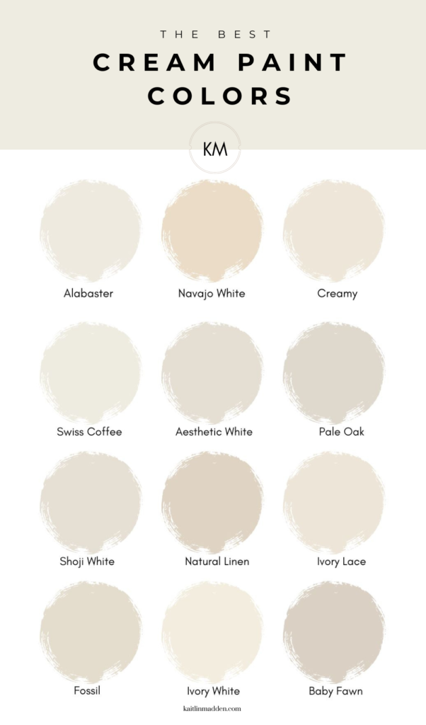
1. Sherwin Williams Alabaster

LRV: 82
Undertones: Neutral, subtle yellow

Sherwin Williams Alabaster is one of my favorite creamy white paint colors. I recently painted my bedroom Alabaster, because I was looking for something bright, but also soft and calming.
Out of all the colors on this list, Sherwin Williams Alabaster is one the brightest, so it reads more like a soft off white depending on the light in your space. You’ll notice in the photo above, though, that the cream tones are very apparent next to the true white trim.
2. Benjamin Moore Navajo White
I first discovered this paint color because it’s the hue that artist Josh Young used in his Chicago apartment, which I think is one of the most gorgeous spaces of all time (see above). If you’re looking for a true, rich cream (not a creamy white like Alabaster), Navajo White is my favorite pick. With an LRV of 78.2, it’s deep enough to read like a cream color even in bright rooms.
3. Sherwin Williams Creamy
If you’re looking for a warm white paint with subtle creamy undertones, try Sherwin Williams Creamy. This was my runner up for my bedroom, but after testing it against Alabaster, I went with Alabaster instead because I wanted more neutral undertones, and the light in my space made Creamy look a bit more yellow. Note that with an LRV of 81, Creamy can look more like a true white in rooms that get plenty of natural light.
4. Benjamin Moore Swiss Coffee
This is Shea McGee’s go-to hue, and one of Benjamin Moore’s all-time best-sellers, which means its got to be good. Swiss Coffee is a smooth, creamy white, reminiscent of fresh coffee with cream. It has a subtle gray undertone, and is very similar to SW Alabaster in that it can appear like a brighter white depending on the space it’s used in.
5. Sherwin Williams Aesthetic White
Aesthetic White is another shade that gets its cream tones from more neutral undertones. While Aesthetic White looks like a beige-toned cream in south or west-facing areas, in a north or east-facing room it can look almost gray-toned.
6. Benjamin Moore Pale Oak
This color is another of Benjamin Moore’s most popular hues, especially over the last few years as customers are searching for warmer neutrals instead of gray tones. In fact, according to one of my Google keyword tools, more than 22,000 people search for this color each month. Wild. It’s easy to see why this creamy neutral is so beloved – Pale Oak is a beautiful soft taupe, offering a light, bright blend of beige and gray for a versatile backdrop
7. Sherwin Williams Shoji White
Shoji White is a popular Sherwin Williams cream. With an LRV of 74, it’s deeper that a true white, but not quit a true beige, either. This shade has warmer tones of peach and orange, so if you’re painting a south-facing room, note that the warm light will underscore these tones.
8. Sherwin Williams Natural Linen
Surprisingly, Sherwin Williams actually classifies Natural Linen as a yellow paint color, which may be a testament to its creamy undertones. However, the color doesn’t read yellow on walls, and instead like a pale beige with warm yellow undertones.
9. Sherwin Williams Ivory Lace
Sherwin Williams Ivory Lace is a delicate, soft ivory that exudes a subtle elegance. It’s sort of like a warm white, but deeper. If you love colors like Swiss Coffee or Benjamin Moore White Dove, but they read too bright white in your space, Ivory Lace is a great shade to try.
10. Benjamin Moore Fossil
A neutral, medium-toned bone color, evoking the earthy hues of ancient fossils. This hue borders on beige, and is perfect for creating a creamy look with some depth.
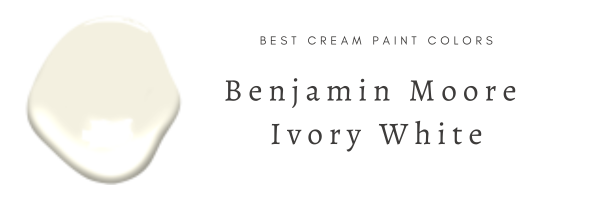
11. Benjamin Moore Ivory White
A lot of the colors I included on this list get their creamy tones from beige undertones, which is a slightly more modern approach to cream hues. However, there’s also a place for classic, buttery yellow creams in today’s interiors, especially in traditional spaces, like the kitchen above. That classic cream tone is exactly what Benjamin Moore Ivory White brings.
12. Benjamin Moore Baby Fawn

LRV: 63.09
Undertones: Beige, brown

If you’re looking for a cream color because you want an alternative to white that has the same versatility, but offers a richer, warmer look, I love Baby Fawn. Baby Fawn is another cream color that can look almost greige or beige in certain lights, especially when combined with bright white shades. But, in instances where you’re looking for a color that won’t be mistaken for plain ol’ white, I think this color is perfect.
Save these shades for later on Pinterest:
FAQs
What color is cream?
Cream is an off white paint color that’s deeper and richer than bright white, but not as deep as beige or greige. It’s like the midpoint between white and beige. Cream is usually a shade of white with either yellow, beige, or greige undertones.
Is cream paint out of style?
If you’re thinking about your parents’ home in the early 2000s, with its cream-colored walls, beige carpet and Tuscan-themed kitchen, then you might have a fear of cream paint being an outdated color trend. But! Like all things in home decor, color is cyclical, and cream-colored paint has been back in style for a few years now. Home color trends have tuned warmer, which means warm whites and cream colors, as well as shades of beige, have replaced bright whites, cool grays, and charcoal hues.
What colors go with cream paint?
One of the beauties of cream-colored paint is its versatility. Cream paint shades complement all sorts of color schemes, but are especially suite to traditional, organic modern, farmhouse and transitional styles.
Colors that go well with cream include:
- White
- Moss green
- Sage green
- Forest green
- Greige
- Tan
- Gray blue (light and dark shades)
- Navy blue
- Cranberry
- Mushroom
- Black
- Wood tones
The only colors you should avoid are clear colors — i.e. bright shades without any brown or gray undertones like Royal Blue, Kelly Green, Bright Yellow, etc. These hues tend to pair better with bright whites. Ditto for neons.


![Retail 101—Shelton Location, Photos & Tips For Shopping the Sale [2025]](https://kaitlinmadden.com/wp-content/uploads/2025/07/Retail-101-shelton12-rotated.webp)
