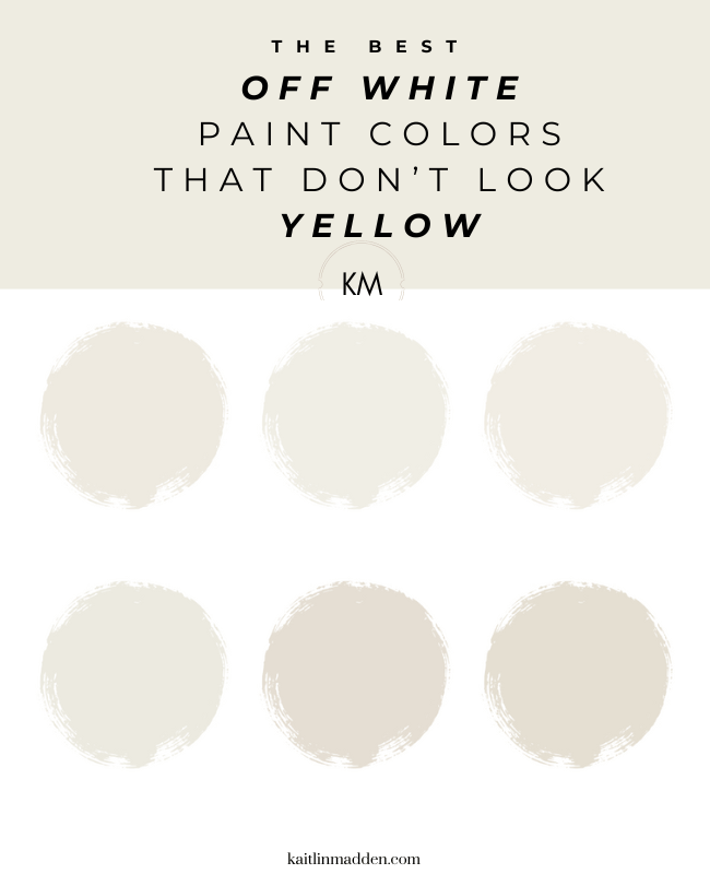
6 Off-White Paint Colors That Don’t Look Yellow
Would you like to save this?
Off white paint colors are notoriously tricky, because they tend to look different in different settings (all paint colors can be are chameleons, but especially shades of white). You might think you found a gorgeous off white paint when you’re standing under the fluorescent lights of the hardware store, but then when you get home you realize you’ve picked a butter yellow (this may or may not have happened to me during my first DIY painting experience, when my husband and I rented an apartment in Chicago, and convinced the landlord to let us paint the bathroom).
If you’re looking for a shade of white that doesn’t look yellow, a good place to start is by choosing a shade without yellow undertones (or with just a hint of a yellow undertone). But! You’ll also need to test the color in your home, because white behaves differently depending on what’s around it and lighting conditions.
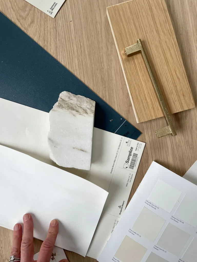
(Side note: I love using Samplize’s peel-and-stick paint samples to test color in my home!)
Below, I’ll shade 6 white paint colors I love that either have no yellow, or just the subtlest amount of yellow (because lighting and surroundings can cancel out these tones).

My Favorite Way to Sample Paint
I LOVE Samplize peel-and-stick paint samples for trying paint colors at home. They’re easy to use, and they offer overnight delivery.
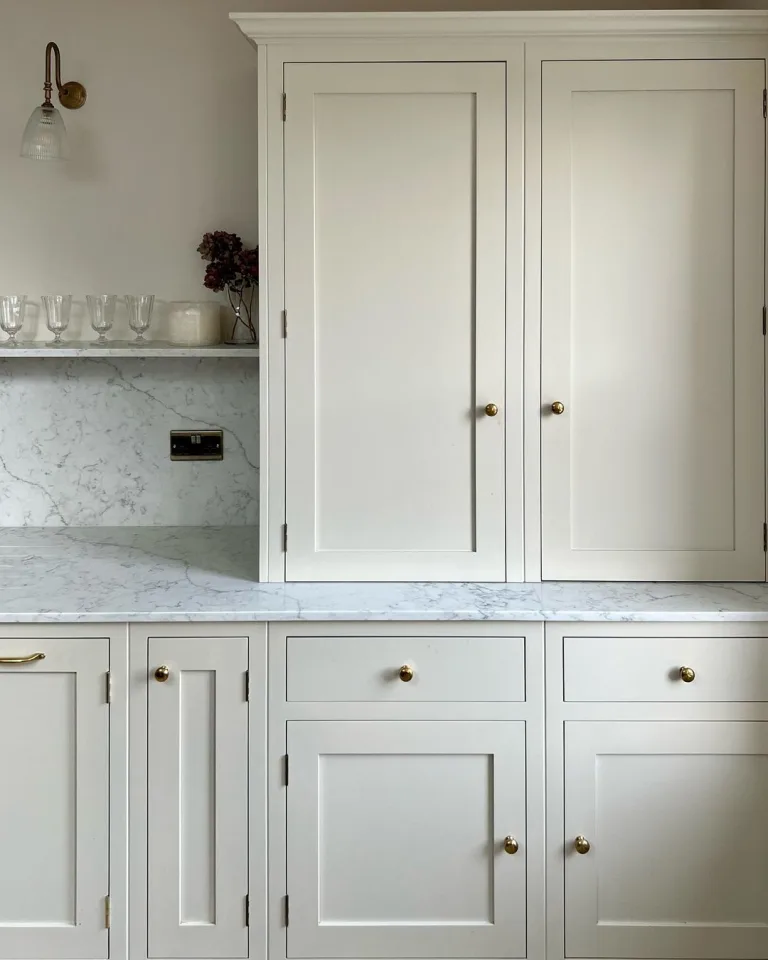
1. Benjamin Moore White Dove
LRV: 85.38

If you’ve considered Benjamin Moore Simply White or Swiss Coffee and found either color too yellow, give Benjamin Moore White Dove a try. It’s another off-white with neutral undertones, so it feels warm without being yellow. With an LRV (or light reflectance value, a measure of paint brightness) of 85.38, it’s also the brightest paint color on this list, so the most likely to look like a true white.
2. Benjamin Moore Glacier White
LRV: 80.18

Glacier White is a similar shade to White Dove, but it’s a bit deeper and leans more green and gray. If you’ve found White Dove to be *almost* right but not quite the one, give Glacier White a try.
3. Sherwin Williams Alabaster
LRV: 82

Sherwin Williams Alabaster is a lovely off white that gets warmth primarily from beige undertones. It does have some yellow undertones, but in most instances they are subtle enough that the color won’t read yellow.
4. Sherwin Williams White Duck
LRV: 74

White Duck is the darkest paint color on this list, but sometimes, you need a white with a little more chutzpah (like if you’re painting a room with tons of natural light and want walls that look off white). Like Alabaster, the color has a little yellow mixed in, but it’s balanced out by gray tones, too, giving it a lovely neutral look.
5. Sherwin Williams Aesthetic White
LRV: 72.5

If you looking for a shade of white with a bit more pigment and depth (but no yellow) Sherwin Williams Aesthetic White is a fab choice. Instead of yellow undertones, it has greige ones, which make it feel less stark than a bright white, but still crisp. Personally, I like Aesthetic White in a room that gets at least a decent amount of warm light (like a South or West-facing room), because it can start to feel a little drab or gray in a northern-facing room or a space that doens’t get lots of light. As always, it’s a good idea to try it out before you commit.
6. Benjamin Moore Steam
LRV: 84.2

I think Benjamin Moore Steam is one of the most underrated shades of white around. It’s not quite as popular as White Dove, Simply White, or Swiss Coffee, but it’s got similar appeal: It’s a versatile off white with some depth, that doens’t look yellow.
Save this post for later:

How to make sure white paint doesn’t look yellow
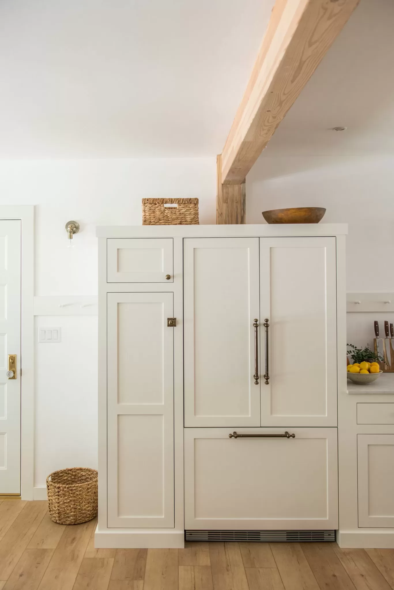
Choosing the right paint color is only the first step in making sure your white paint doesn’t look yellow. Like all colors, white paints look different depending on their surroundings.
There are a few things that will make a white paint feel more yellow than it is. They are:
Putting off white near true white
The first is placing a creamy white paint next to a cool or true white paint. Below is a photo of my kids’ playroom, which has BM Simply White walls and a true, bright white trim color. You can see that wall color looks noticeably warmer than the trim color.
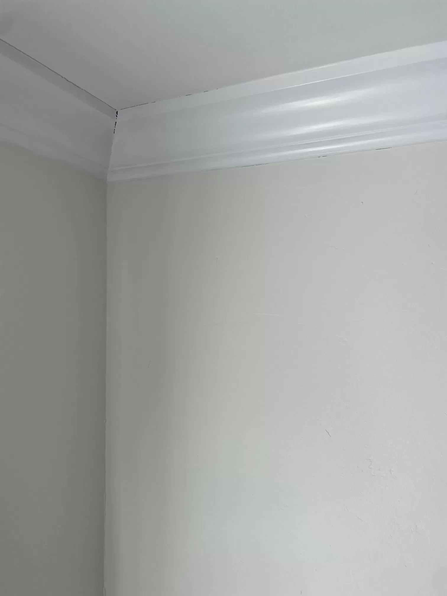
This doesn’t bother me (I love Simply White, but it’s not a paint color to choose if you don’t like yellow undertones). To ensure you don’t get this effect, choose a trim color that also has some warm undertones, or simply paint your trim the same color as your walls.
The same goes for bright white furnishings, window treatments, etc.
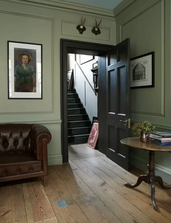
Placing an Off White Next to Cool-Toned Hard Finishes
If you place an off white with even the slightest touch of yellow next to, say, gray granite countertops or a cool-white tile floor, it’ll instantly make any creamy tones in your paint color stand out. If you have cool-toned hard finishes, go for a true white, like Benjamin Moore Chantilly Lace, or a cool white, like Benjamin Moore Decorator’s White.
Certain Lighting
White reflects what’s around it, and certain lighting conditions can make the color look more yellow. Choosing warm-toned lightbulbs can create a yellow cast on the paint, for example. On the other hand, in a room that gets flooded with natural light, yellow tones tend to become more muted and washed out, and even creamy whites can look bright white.