7 Gorgeous Medium Blue Paint Colors

Would you like to save this?
Gorgeous Medium Blue Paint Colors
My favorite shades of blue right now are all medium blues. Not too dark, not too light, all with a smidge of gray or taupe to add just the right dose of sophistication. If that sounds like the juuuust the type of color you’re looking for, keep reading, because I’m going to share 7 of my favorite shades, including the one I used in my sons’ room earlier this year.


01
Sherwin Williams Bracing Blue
Bracing Blue is a lovely shade of blue-gray with a hint of purple in it. I consider Bracing Blue to be a Goldilocks color: not too light, not too dark, not too blue, not too gray. It’s just right on all fronts.


02
Benjamin Moore Van Cortland Blue
Van Cortlandt Blue is an iconic blue-gray Benjamin Moore hue. At first glance, it looks similar to Bracing Blue, but it doesn’t lean quite as purple. I love how it looks in a color drenched room, on walls, ceilings and trim, like in the bedroom above.


03
Benjamin Moore Blue Spruce
Blue Spruce is a slightly darker medium blue paint color, though it’s not quite navy. It’s a gorgeous shade for cabinetry. built ins, or on lower millwork (.e. board and batten or beadboard) paired with wallpaper on top.


04
Benjamin Moore Providence Blue
For a medium blue with green undertones, I love Providence blue. It feels rich and sophisticated without being too moody or overpowering.


05
Sherwin Williams Delft
Delft is such a classic color (sort of like its name, which I imagine comes from Delft pottery, though the shade is a bit more muted). This pretty color would be perfect in a nursery or kids room, in a study, or on trim against white walls


06
Sherwin Williams Slate Tile
Slate Tile is the deepest shade of blue on this list. It’s a great pick for any area that needs a statement: mudrooms, laundry areas, built-ins or accent walls. I also love this color for an exterior or front door.


07
Farrow & Ball De Nimes
I first spotted this color when we were choosing paint shades for our laundry room. We went with something lighter, but I still love this gorgeous hue. It’s a mid-tone blue with a touch of green.
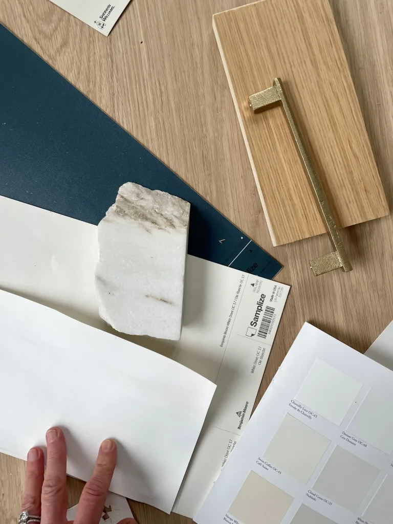
Want to see these colors close up? Paint colors always look different on a screen than they do IRL, so I always suggest ordering a sample (or 12) before deciding on the hue for you. I love Samplize peel-and-stick paint samples because they’re mess free and you can move ’em all around your house.


