5 Common White Paint Color Mistakes To Avoid Before You Commit

Would you like to save this?
Choosing a white paint color can be tough if you aren’t sure what you’re looking for. There are thousands of shades of white paint, and because white reflects light, it’s the ultimate chameleon color, and can look dramatically different from home-to-home and room-to-room.
BUT! There are ways to simplify the process of choosing a white paint color, and it all starts with knowing what mistakes to avoid.
Here, I’ve listed out some of the most common mistakes you can make when picking white paint … lessons I’ve learned as both an interior design editor, as well as a homeowner and house-flipper.
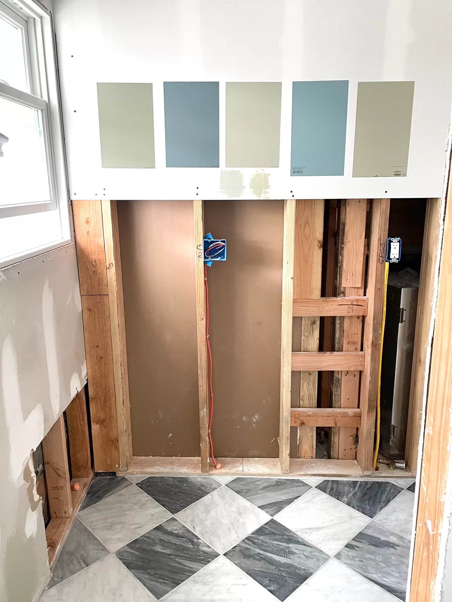
Mistake #1: Not testing the color in your space

This is the single biggest mistake you can make when choosing a white paint. If you take nothing else away from this post, let it be: test your white paint colors in the space where you’ll be using them.
I’ve told this story before, but when my husband and I set out to paint a room white for the first time, I went to the Sherwin Williams store, looked at a bunch of paint swatches under the fluorescent lighting, and picked one.
Imagine my surprise when I got the can of paint home, opened it up in the windowless bathroom I was painting, and it was a creamy butter yellow. I ended up going with it because I was 25 and didn’t have the budget to buy more paint, but the experience taught me a valuable lesson about testing paint colors. They always look different in a store, on a screen, and in someone else’s home than they will in your space. That’s especially true for whites.
I like to test samples in every room I’m using a color in, and even on every wall in the room. I use Samplize peel-and-stick paint samples to make it easy to move them from wall-to-wall and room-to-room without painting your whole house in swatches.
Mistake #2: Ignoring your hard finishes.

One of the best ways to narrow down paint colors is to evaluate the hard finishes in your home. Hard finishes are things like flooring, countertops, backsplash tile, ceiling beams … elements that are affixed to the walls and can’t be moved or replaced.
If your hard finishes are warm (think medium-brown wood floors, earth-toned tile, granite countertops or marble with warm veining, wooden cabinetry) then you’ll want a warm-toned white paint color. My favorite options include Benjamin Moore Simply White, Benjamin Moore White Dove, and Sherwin Williams Alabaster.
If your hard finishes are cool (like gray-toned floors, bright white or slate-colored countertops, Carrara marble mosaic tile with lots of gray veining), you’ll want to go for a neutral or true white paint color. These white paints have minimal undertones, or neutral undertones, that are better suited to cool-toned hard finishes. A few options I love: Sherwin Williams Snowbound, Benjamin Moore Chantilly Lace and Benjamin Moore Oxford White.
Personally, I don’t love cool-toned white paint colors and tend to avoid them because they end up looking too stark.
For questions about paint color undertones and what makes something warm, cool or neutral, check out: All About Paint Color Undertones
Mistake #3: Using white to brighten up a dark room

The beauty of white paint is in its ability to reflect light. That’s literally what white does: it reflects light. When it can’t do that because there isn’t enough natural light in a room, bright white paint looks dull and dingy.
A better option? Use a very pale neutral, like a greige or cream, which will feel rich and luxurious in dimmer light, instead of drab. Benjamin Moore Classic Gray, Benjamin Moore Navajo White, and Shewin Williams Creamy are all gorgeous choices in this category.
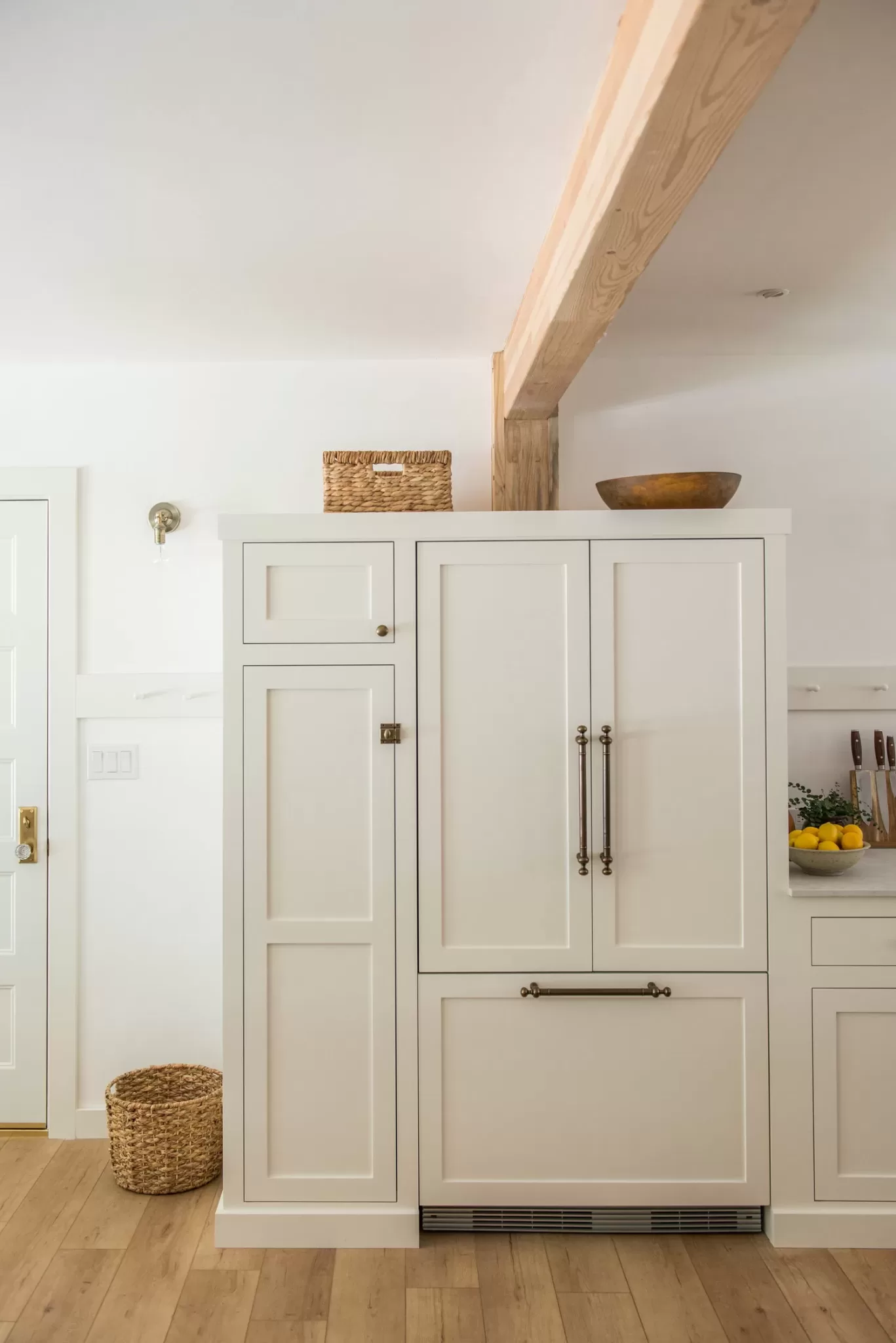
Mistake #4: Painting white walls next to cream or off-white cabinets
I would say, out of all the reader emails I get, the one I’ve gotten most consistently is from someone who has off white or cream kitchen cabinets, paints their walls a true white, cool white, or brighter shade of white, and accidentally caused their cabinets to look yellow by comparison.
Adding a bright white to the walls will instantly make anything cream-toned or off-white look more yellow (or tan, or whatever other undertone is creating the cream effect). Even if the cabinets looked like a subtle warm white before painting, they can end up looking beige or dingy as soon as you put a coat of white paint on the walls.
This is especially true if you have the cream cabinets left over from the Tuscan kitchens of the late 90s/early 2000s. If you’re trying to make the space look more modern, don’t paint the walls a bright white. Choose a color that’s similar in warmth and depth to the cabinets.
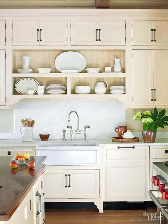
Now! This mistake isn’t inherently bad. It’s only bad if you don’t want your cabinets to look cream or yellow-toned. If this is an intentional choice, it can be beautiful, like in the example here:
Mistake #5: Overthinking the white paint
One of the big reasons white paint can feel so overwhelming is because there are so many shades to choose from. You might think you found a good shade, but then you see seventeen other pretty shades when you go to the paint store to order your paint, or you spot another shade of white posted by your favorite influencer and maybe that’s a better one!
If you feel overwhelmed by all of the options, my advice is stick to the most popular white paint colors. They’re popular for a reason.
Colors like Benjamin Moore White Dove, Benjamin Moore Simply White, Benjamin Moore Chantilly Lace, Sherwin Williams Alabaster, and Sherwin Williams Greek Villa are tried-and-true white paint colors that look good in almost any space. I would decide what general shade of white paint you want—true white, warm white, or cool white—and then start with the most popular shades in that category.
If you want more designer- and homeowner-approved white paint options,, check out:
- Samplize’s Warm White Bundle. It literally has samples of 8 of the all-time most popular white colors from SW & BM.
- Benjamin Moore’s Best-Selling Paint Colors
- Sherwin Williams’ Top 50 Paint Colors
- Behr’s 8 Most Popular Whites