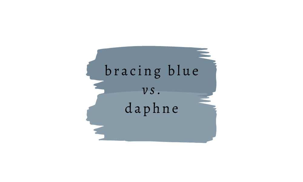
Sherwin Williams Bracing Blue Review & Why I Chose it for My Boys’ Room
After pouring over about a dozen blue paint samples, I recently chose Sherwin Williams Bracing Blue for my sons’ room makeover … and I love it. It’s a gorgeous, mid-tone shade of blue, and honestly, one of the prettiest colors I’ve seen in a long time.
Would you like to save this?
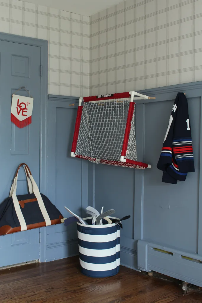
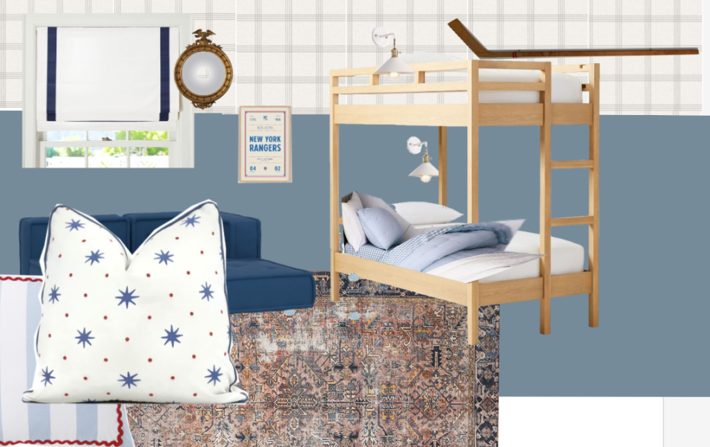
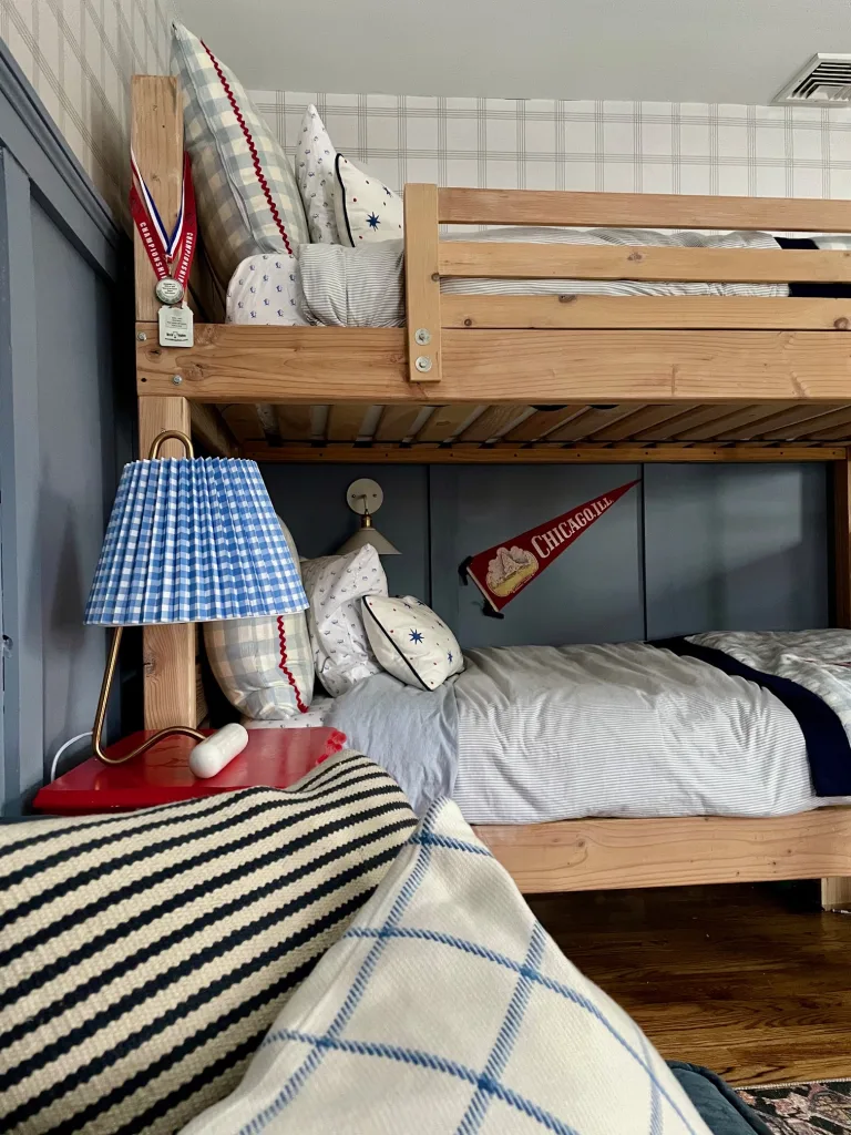
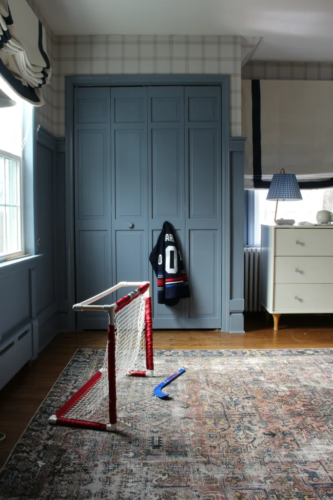
I went with Bracing Blue because I wanted a shade of blue that made an impact, but one that wouldn’t be quite so dark as the Benjamin Moore Hale Navy color that room had been painted in before. (See a tour of the room before here – I loved how it was, but my kids wanted something that was better suited to their current interests, i.e. hockey). My sons’ bedroom doesn’t get a ton of natural light, and the addition of a super-dark paint color gave the room cave-like vibes.
My other contenders for the space were the Sherwin Williams colors Sporty Blue, Daphne, Denim, Scanda, and Notable Hue. All were lovely in their own way, but Bracing Blue stood out to me as the clear winner for the space. I’ll get more into why that is, below.
If you’re considering Bracing Blue for your home, here’s everything you need to know about this blue gray paint color, including its undertones, how dark it is, what colors are similar, and more.
What Color is Sherwin Williams Bracing Blue?
Sherwin Williams Bracing Blue is a beautiful mid-tone shade of blue, with purple and gray undertones. It looks like a blue tone to the naked eye, but Sherwin Williams actually classifies it as a shade of purple. On the spectrum of blue tones, there are green-toned blues, more neutral “true” blues, and then red/purple-toned blues, and Bracing Blue sits on the purple end of the spectrum.
Now, that doesn’t mean it looks purple, at all. My boys would not be thrilled with a purple room. It’s just a shade of blue with red/purple undertones.
The color also has a good amount of gray in it, making it a “dirty” blue. I personally prefer paint colors with some gray or brown in them, since these shades tend to read as more sophisticated than “clean” shades without any neutral tones mixed in.

Its “dirtiness” is actually why I chose it over the other Sherwin Williams colors I was considering, like Sporty Blue, Scanda, Notable Hue and Denim, which are cleaner mid-tone blues (i.e. without as much gray mixed in). When I was choosing paint samples in the store, I actually thought I would like the Sporty Blue the best, but once I got it on the wall, it was way too bright for the look I was going for.
Notable Hue looked more gray on the color swatch in store, but felt just right once I got it on the wall.
In general, this is always a good rule of thumb to think about when choosing a paint color. Colors almost always look brighter and more colorful on the wall than they do in a swatch. I always bring home paint swatches that look a little more dulled out than I think I want … and usually end up going with these ones 🙂
Want to see how Bracing Blue will look in your space? I love ordering peel-and-stick paint samples from Samplize.
Sherwin Williams Bracing Blue LRV
As I mentioned, one of the reasons I chose Bracing Blue is because it’s a mid-tone paint color, which means it’s saturated, but not dark.
Sherwin Williams Bracing Blue has an LRV, or light reflectance value, of 25.0. LRV is measured on a scale of 0-100, with 0 being pitch black, and 100 being pure white. Most paint colors fall somewhere on the scale from 5-93, and mid-tone paint colors generally fall in the 20-45 range.
Sherwin Williams Bracing Blue Undertones
Bracing Blue has purple and gray undertones. Despite the fact that it’s a purple-toned blue, Bracing Blue is considered a cool color.
Colors like Sherwin Williams Bracing Blue
Like I mentioned, I considered a number of other colors when I was choosing a paint color for my sons’ room.
Sherwin Williams Daphne
Daphne is one shade lighter than Bracing Blue. It shares a similar color profile and undertones, but I personally wanted something with a bit more impact, so went with the darker hue. If you are considering Bracing Blue, I’d grab a swatch of Daphne, also, in case the lighter shade is better suited to your space.
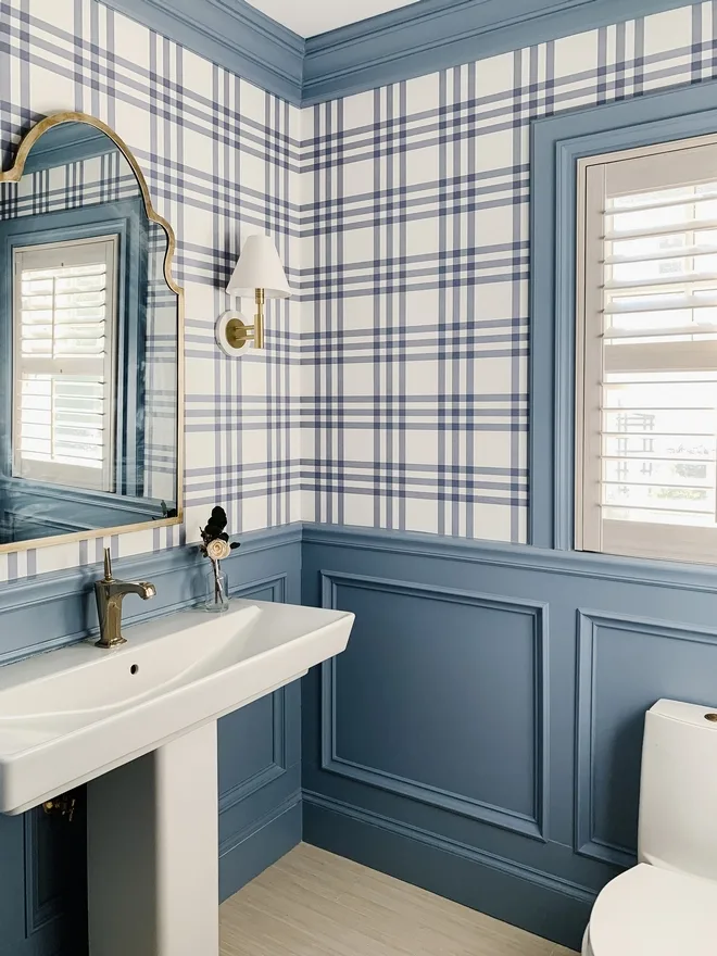
Here’s a look at Daphne that I found online (how gorgeous is this bathroom?!), and you can see how it’s a touch lighter and more blue than Bracing Blue.
Sherwin Williams Sporty Blue

When I was in the store looking at paint swatched, Sporty Blue was the color I thought I was going to use based on the way the swatch looked. But, when I got it home and put the color on my walls, it was too much of a true blue (i.e. it’s cleaner than Bracing Blue), and just felt too bright for the room. If you find that Bracing Blue is too gray for your space and you want something with more blue, Sporty Blue might be your color.
Sherwin Williams Denim

Denim is on the same color card as Sporty Blue, just the shade darker. It was a gorgeous color, but just a bit too dark for the room. It’s almost like a halfway point between Benjamin Moore Hale Navy, and Bracing Blue.
Sherwin Williams Scanda

Scanda had a similar LRV to Bracing Blue, but again, the color was cleaner, so it read a little too bright in my space. Think of it like Bracing Blue, but with less gray.
Sherwin Williams Notable Hue

Notable Hue is a beautiful mid-tone blue shade that’s a bit lighter than Bracing Blue. Like some of the other colors I tested, it was also cleaner than Bracing Blue, and had less noticeable gray undertones. It would be gorgeous as a trim color with white walls in a nursery!

I am just trying to subscribe to your blog …
Hello, the room and color looks so good. I just wondered where did you find the wallpaper?
Thank you! The wallpaper is by Chesapeake: https://rstyle.me/+mmd1WdDRsvowShRiz1eQyg
I love this blue! I have an accent wall in my dining room that I plan to paint with Bracing Blue. Can you tell me where you found the rug in your mood board? It has all the tones I’m going for. Thanks!
It’s such a good color! And yes, it’s a Chris Loves Julia x Loloi rug! Here’s a link https://rstyle.me/+lBFRAcqEazQIINID-A7ZRQ