12 Gorgeous Blue Gray Paint Colors I Love Right Now
Would you like to save this?
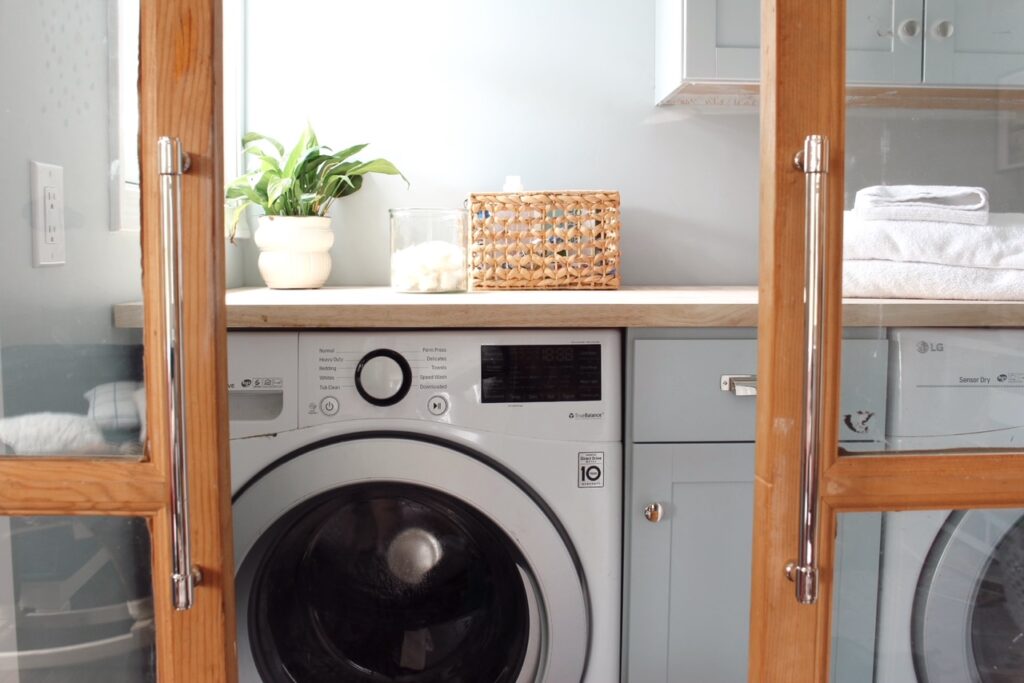
Over the last year, I’ve hunted down the best blue gray paint colors twice. First, when choosing a color for our laundry room. For this space I wanted something cheerful and light, but also something that felt chic and understated. Not an in-your-face baby blue, but a subtle grown-up blue.
For the laundry room, I ended up going with Benjamin Moore Smoke, which is hands down one of my favorite bluish gray paint colors.
A few months later, I decided I wanted to revamp my white-walled dining room. I painted it Benjamin Moore Simply White when we moved into our house a few years ago, and while I still love Simply White, most of the downstairs of our home is painted in it, so I felt like I wanted to switch things up.
For the dining room, I wanted a color that was a bit deeper than Smoke. I actually had almost a whole gallon of the color leftover from the laundry room, so I tried it in the dining room and it felt too colorful, for lack of a better word. (The rooms are on opposite sides of the house, which proves that color looks totally different depending on where it is and what surrounds it).
After trying about eight colors, I settled on Benjamin Moore Wales Gray, which I absolutely love.
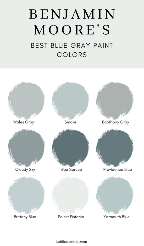
However, I also found a bunch of other beautiful blue gray paint colors that I was thisclose to choosing, including both light and dark shades. Since one of them might be perfect for your space, I’m sharing all of the blue gray paints I tried, plus a number of other popular picks according to designers and paint companies.
The best blue gray paint colors
Pale Blue Gray Paint Colors
1. Benjamin Moore Smoke
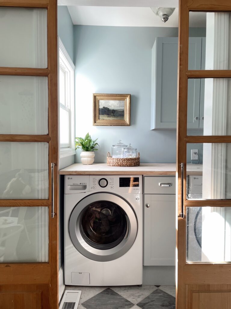
As I mentioned Smoke is the color we chose for our laundry room, and I love it. Benjamin Moore calls the color ‘A versatile medium gray softened with attractive blue-green undertones,’ but in my space it definitely reads more like a light blue first, with gray undertones. It has an LRV of 56, which makes it a tiny, tiny bit lighter than the color we painted our dining room (Wales Gray).
2. Benjamin Moore Wales Gray

Benjamin Moore Wales Gray is the color we ended up painting our dining room. It’s the perfect mid-tone blue-gray paint color – it’s not too dark or too light, and it totally transformed the look of our all-white dining room. In fact, the LRV (or light reflective value) of the paint is 53 on a scale of 0-100 (where 100 is pure white and 0 is pitch black), so it’s literally smack in the middle of the spectrum.
I love that the color reads like a blue, but is still subtle and chic (i.e. you wouldn’t confuse it with powder blue or baby blue). It’s sophisticated for sure.
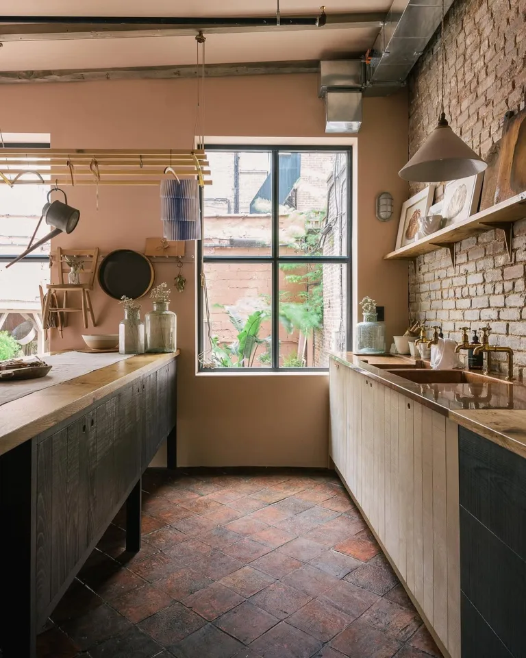
3. Benjamin Moore Boothbay Gray
Boothbay Gray is the color I thought I wanted to paint our dining room, but when I tested it on the walls, it felt more gray than I was looking for. However, I think that has a lot to do with the lighting in our space.
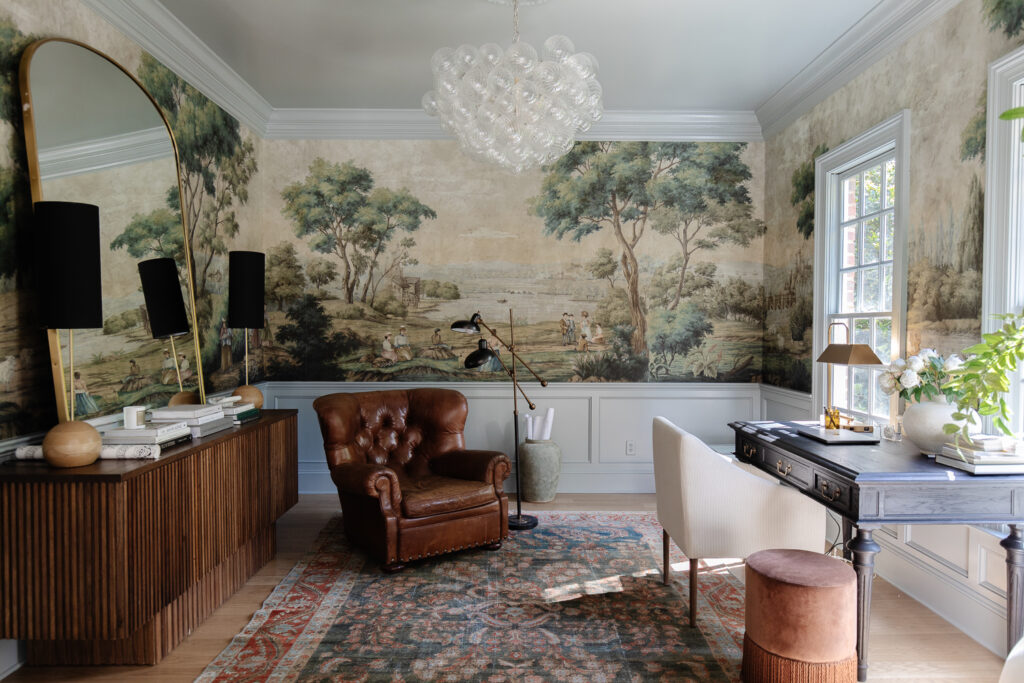
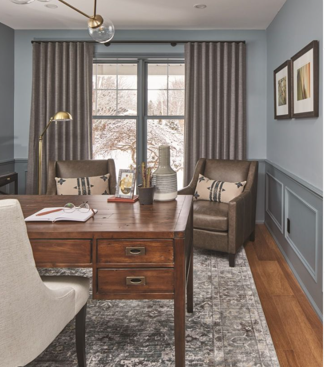
The room faces north, so it automatically makes everything feel a bit more cool-toned and gray. I’ve loved Boothbay Gray when I’ve seen it in other people’s spaces, particular in Julia Marcom’s office, above, which is what inspired my to try out the color. It’s a beautiful, mid-tone blue-gray paint color that leans a touch more gray than Wales Gray.
4. Benjamin Moore Gentle Gray
Benjamin Moore Gentle Gray is a gorgeous mid-tone shade that’s similar to both Smoke and Wales Gray, but with a touch more gray.
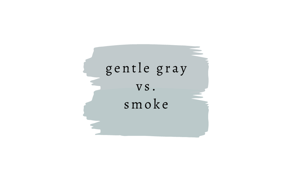
You can also see that, unlike Smoke and Wales Gray, Gentle Gray doesn’t have a noticeable green undertone. So if you’re looking for a shade that’s a slightly more neutral blue-gray, try Gentle Gray.
Darker Blue Gray Paint Colors
5. Benjamin Moore Cloudy Sky
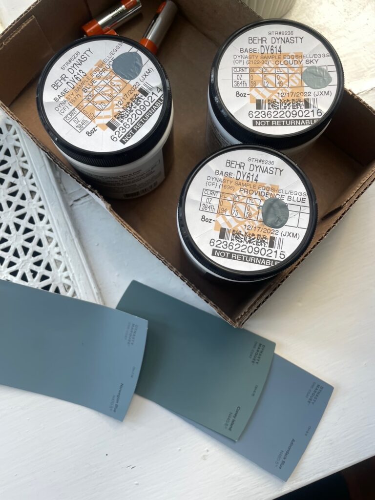
The first color I tried in our dining room was Benjamin Moore Cloudy Sky (yes, I often get Benjamin Moore paint samples color matched at Home Depot, using Behr paint, just for convenience sake).
It’s a steely blue-gray that ended up reading a little too dark in our room, but it’s such a beautiful color and I think in a room that gets a lot of natural light, it would read as more of a mid-toned color.
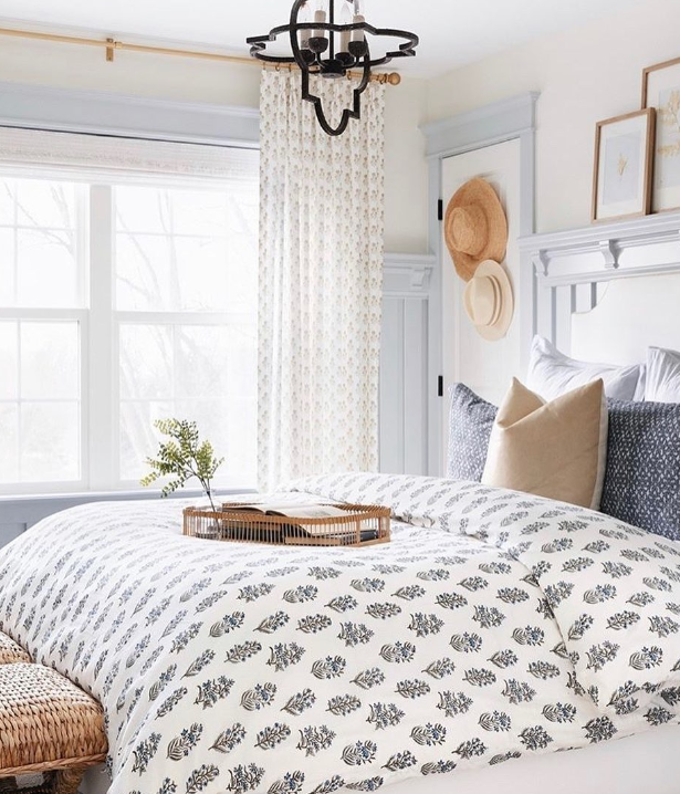
In the room above, the top half of the walls are painted Benjamin Moore Cloudy Sky.
6. Benjamin Moore Blue Spruce

The other two colors I tried for the dining room were Benjamin Moore Blue Spruce and Benjamin Moore Providence Blue.
Of the three, Blue Spruce landed in the middle in terms of darkness, so it wasn’t quite as dark as Providence Blue, but still a lot darker than Cloudy Skies. It has an LRV of 16, so it’s pretty dark, but not quite as dark as popular shades like Benjamin Moore Hale Navy. Again, I loved this shade but it was a bit too dark for what I was going for. I think it would actually be a fab alternative to Hale Navy if you’re looking for something a few shades lighter.
7. Benjamin Moore Providence Blue
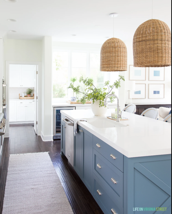
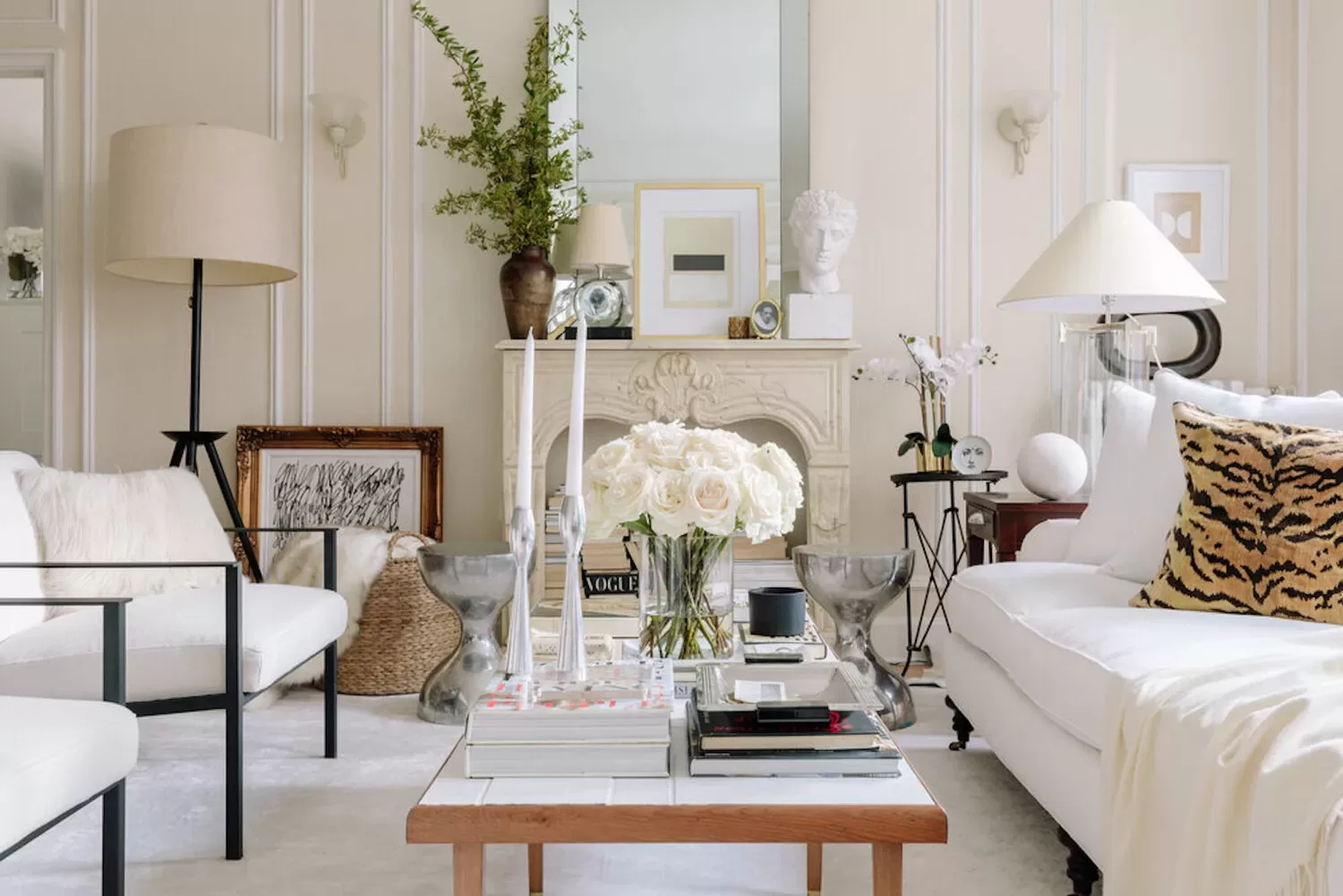
Providence Blue is, again, a darker shade of gray-blue that borders on charcoal tones. It’s another lovely choice if you’re looking for something on the darker end on the spectrum, or if you have a light-filled space and want a rich blue with gray undertones. It makes a perfect pick for a coastal-style home, like the one above. (I love how the island color picks up on the navy color in the coastal barstools).
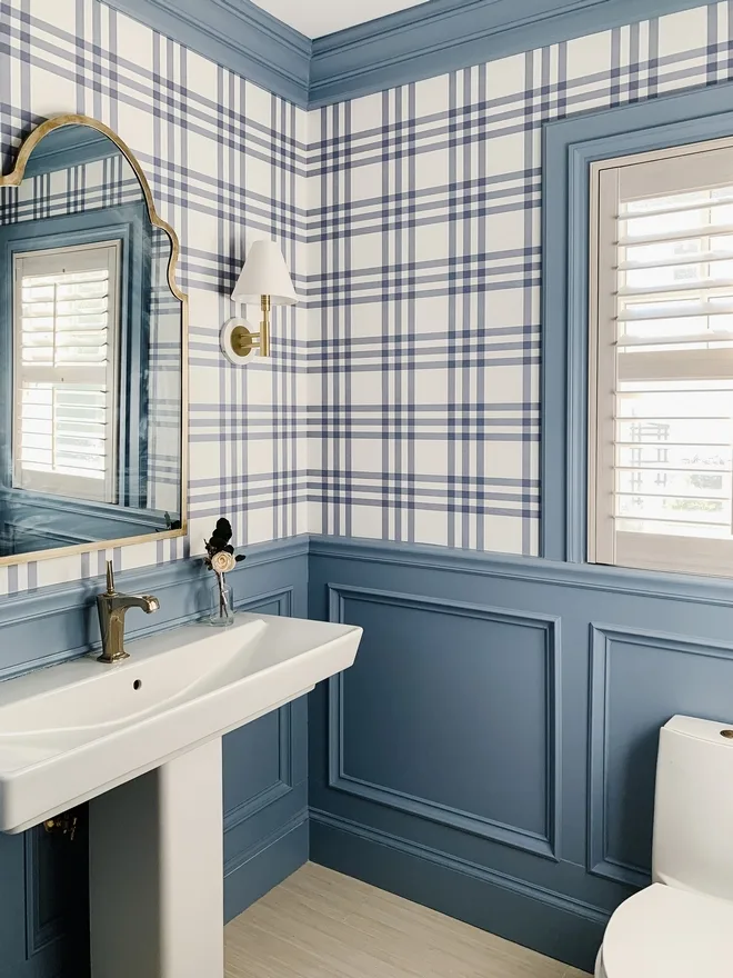
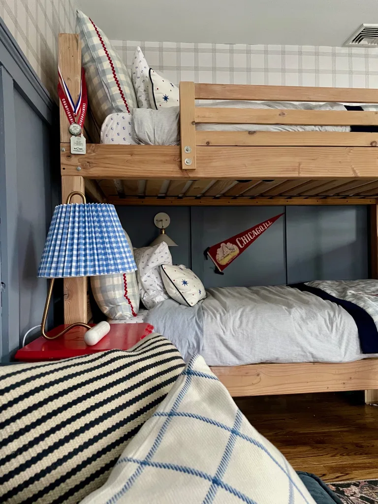
8. Sherwin Williams Bracing Blue
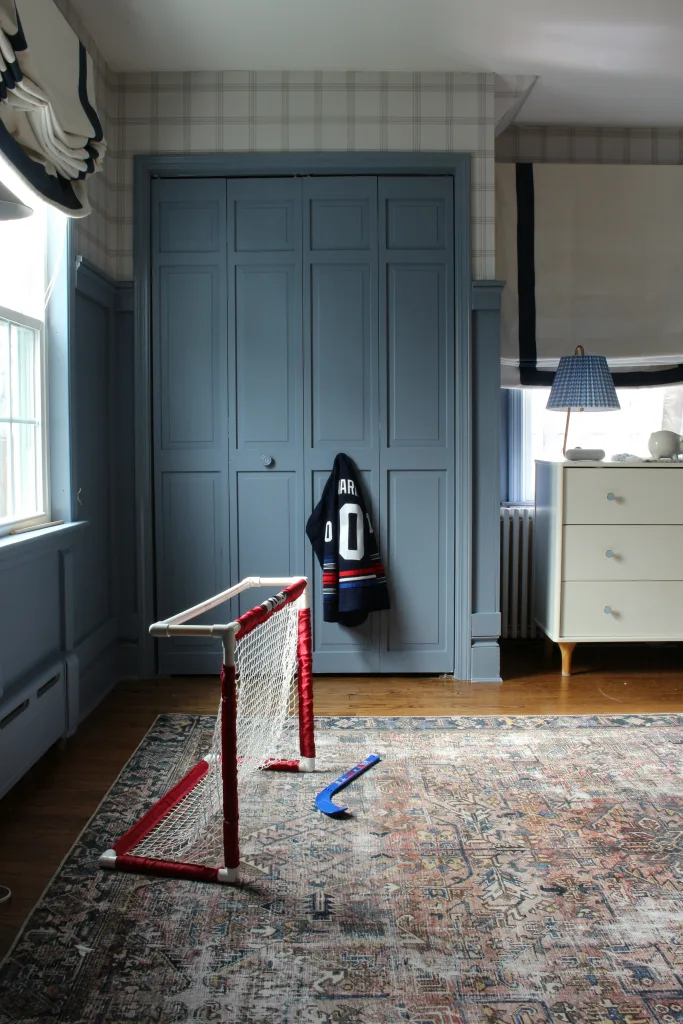
Sherwin Williams Bracing Blue is a beautiful mid-tone blue paint color with purple and gray undertones. I used it on the walls of my sons’ room after trying a number of other similar shades, like Sherwin Williams Sporty Blue and Sherwin Williams Notable Hue, but I preferred the extra touch of gray that Bracing Blue has, which give it a more sophisticated feel. This color is truly gorgeous.
9. Sherwin Williams Daphne
Sherwin Williams Daphne was one of the other blue gray paint colors I tried in my sons’ room, and though I didn’t choose it, I still love it overall. It’s actually on the same color card as Bracing Blue, just one spot lighter, so it has similar undertones.
For more blue gray paint colors, try:
There are some other notoriously popular blue gray paint colors that I haven’t tried myself, but you may want to give them a Google if you’re looking for something different than that I’ve listed above!
I’ve compared these paint colors to Benjamin Moore Smoke, so you can see the difference in shade.
They are:
Benjamin Moore Brittany Blue
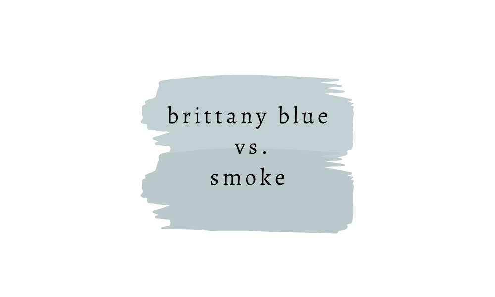
For a slightly paler version of Smoke, try Brittany Blue.
Benjamin Moore Palest Pistachio
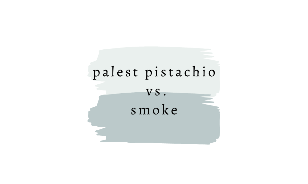
Palest Pistachio is a beautiful color if you’re looking for a very light whisper of color.
Benjamin Moore Yarmouth Blue
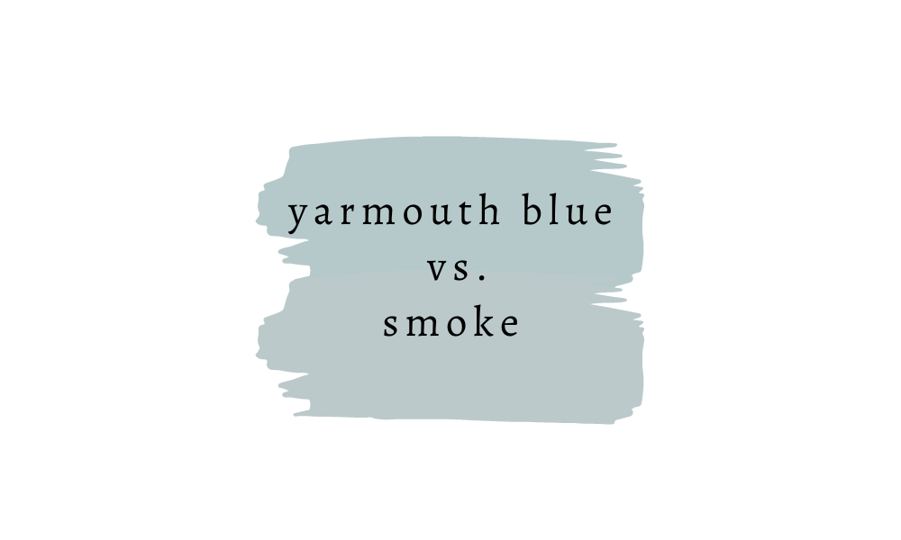
And finally, Yarmouth Blue is a good choice for a blue gray paint color with a hint of green.
3 Comments