Sherwin Williams Repose Gray- Is It Still in Style, How to Use It and More
Would you like to save this?
Back in the 2010s, it was hard to hear about a home makeover without hearing the name Sherwin Williams Repose Gray. This warm gray tone was one of the brand’s “it” colors during the farmhouse and all-gray-everything craze.
While it’s not quite as popular now as it was 10 years ago, it remains a common pick for anyone looking for a warm gray paint color. When I first wrote this post in 2020, there were about 24,000 people searching for Sherwin Williams Repose Gray on Google each month. Now that number has dropped to about 18,000. As of 2026, the colors is also still listed as one of SW’s top-50 best selling shades. It might not be the trendiest paint color of the moment, but it’s proved its staying power.
Wondering if Repose Gray is the one for your room? Here, we’ll dig into its undertones, what colors it pairs well with, how to make it look more modern, how it compares to similar tones and more!
What color is Sherwin Williams Repose Gray?
Repose Gray is a warm gray that can be a bit of a chameleon color thanks to a mix of undertones. It primarily has a taupe cast that comes from violet undertones (usually most prominent in north-facings and lower-light rooms). But! It can also lean more green in some lights. Since it’s such an enigma, it’s definitely a color you want to test out in your space.
Repose Gray LRV

Repose Gray has an LRV of 58, which means it’s a mid-tone gray.
If you’ve never heard of LRV, it’s worth knowing because it makes paint colors so much easier to evaluate, especially if you’re choosing between two similar shades.
LRV measures the light reflectiveness of a color. It’s measured on a scale of 0-100, with 0 being the blackest of black paints, and 100 being a true white. Stonington Gray’s LRV of 59.36 makes it a medium tones gray. For comparison purposes, Benjamin Moore Simply White, one of the brands brightest white paint colors, has an LRV of 89.52, while Benjamin Moore Hale Navy has an LRV of about 8. Generally, paint colors range between a two or three LRV, and a 93 LRV, since there isn’t a true white or true black paint color.
Where to use Sherwin Williams Repose Gray
There are lots of beautiful ways to use Repose Gray. Personally, I love it on kitchen cabinets and bathroom vanities, in bedrooms and bathrooms, and as an exterior trim color on a white house, or a contrast trim color inside. Here’s a look at Repose Gray in various rooms in real homes.
Exterior Trim Color
Repose Gray makes a beautiful exterior trim color on a white house. Use it on doors and shutters.
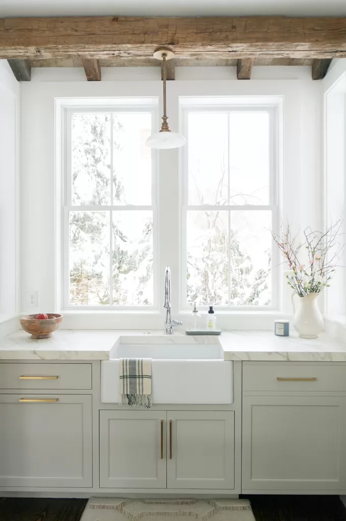
Kitchen cabinets
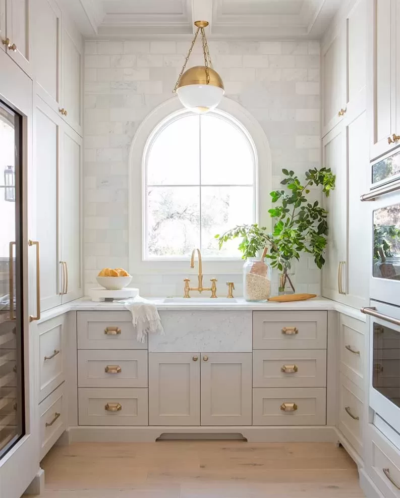
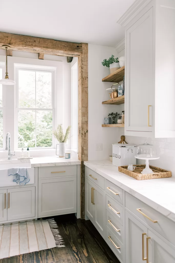
I love Repose Gray on kitchen cabinets, especially paired with marble counters (or marble-look quartz) and brass hardware like in the rooms above, which bring out the warmth in the color. I would avoid it with cool-toned granite, gray floors and/or silver-toned or black hardware, though, which can look very 2010s.
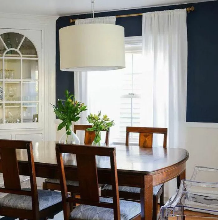
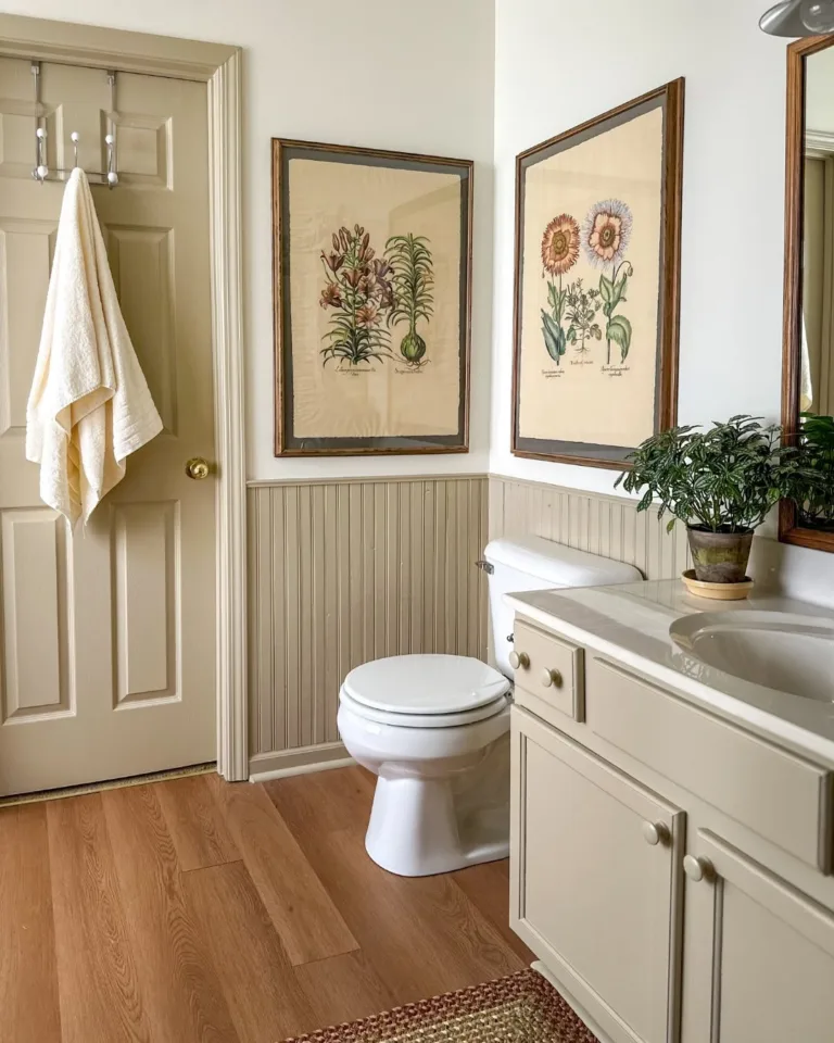
Bathroom
If you’re going to use Repose Gray in a bathroom, I personally prefer it paired with trimwork, like in the space above. This look would also look great reversed, i.e. with the trim painted Repose Gray and the walls painted white. It would also be pretty color drenched in a small powder room.
Bedroom
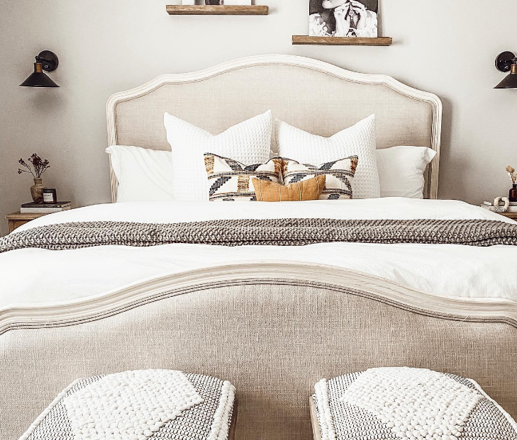
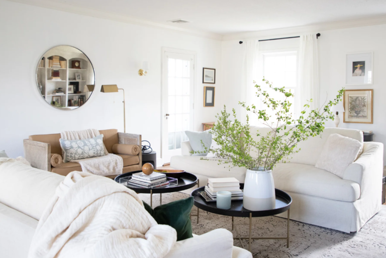
Repose Gray is such a calming, airy choice in a bedroom, especially paired with creamy neutrals and white oak wood tones.
Repose Gray Exterior
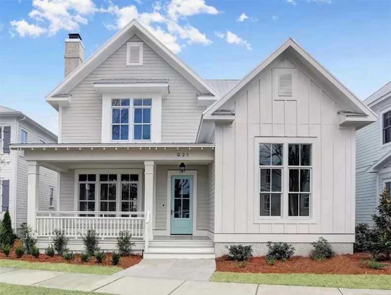
As an exterior color, Repose Gray feels modern and sophisticated, yet subtle. It works well for coastal homes, cottage-style exteriors, or as a shutter color with a white home exterior like I shared earlier.
Contrast trim

I’m not totally sure if the paint color in this photo is Repose Gray, but it’s close, and gives a good visual of how Repose Gray looks as a contrast trim color.
Colors Like Repose Gray
Not sure if Repose Gray is the one? Try one of these other similar shades.
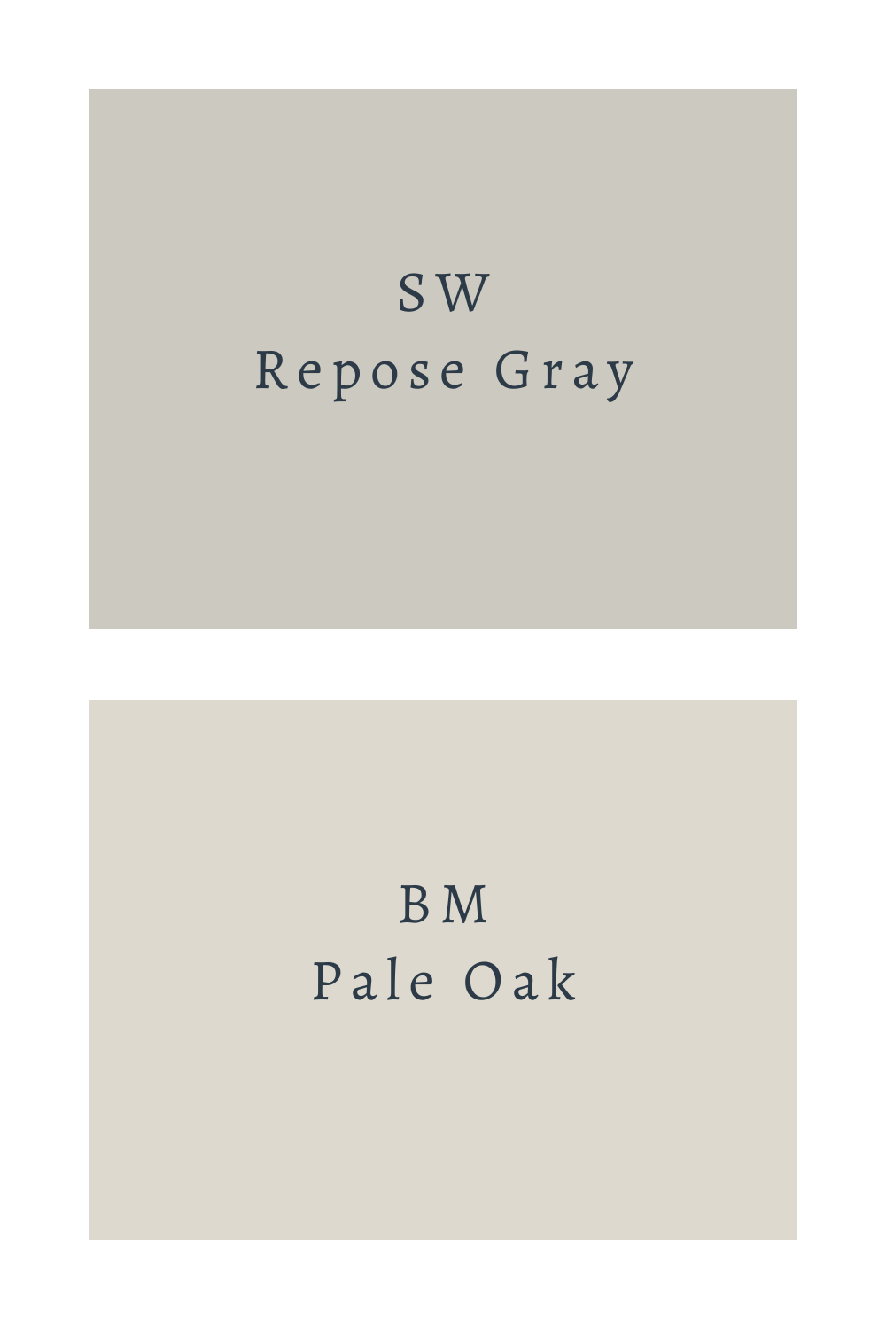
Pale Oak is a popular Benjamin Moore greige that’s a touch lighter and warmer than Repose Gray. It also has more neutral undertones, making it a good choice if Repose Gray looks too purple.
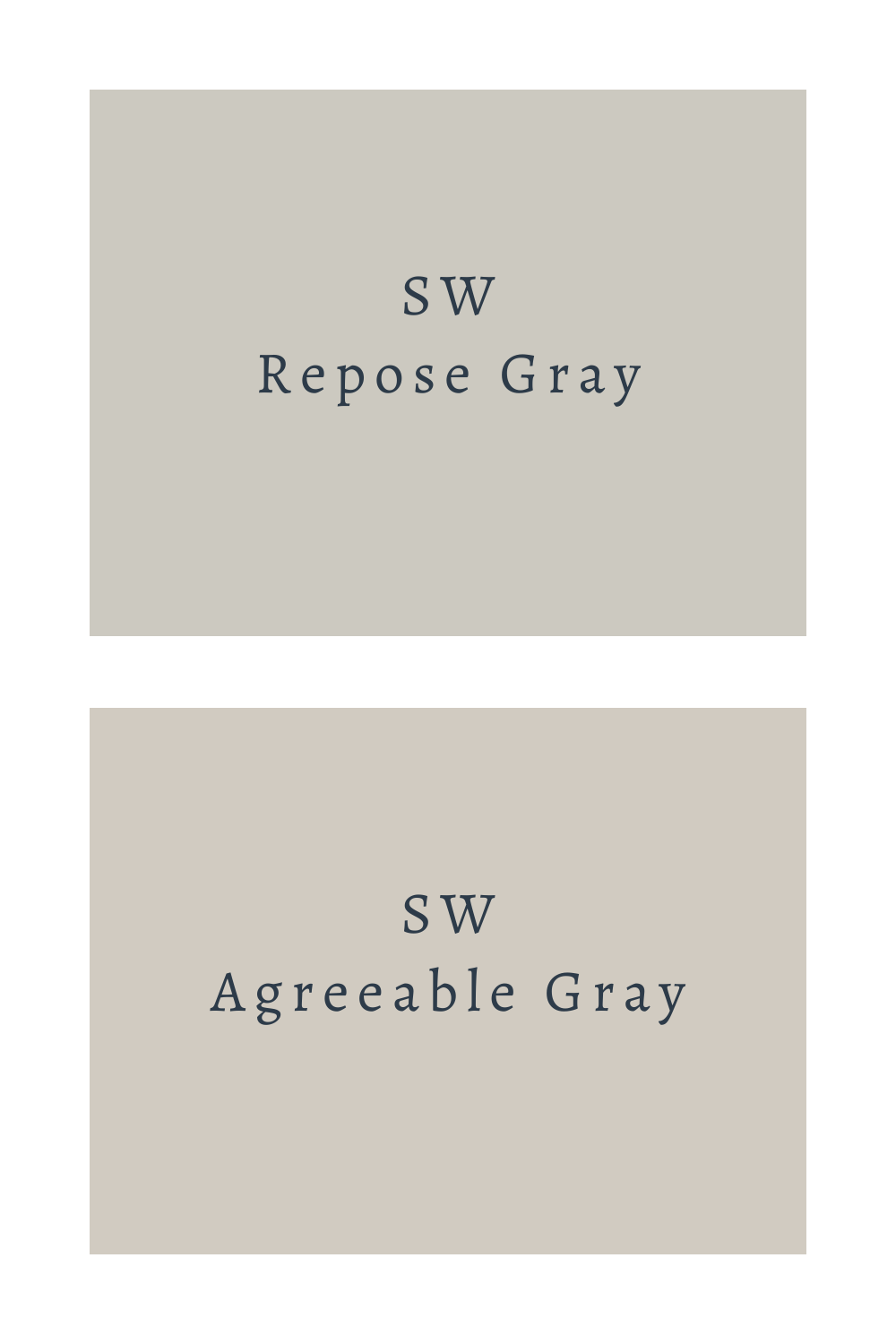
Agreeable Gray is true greige, with more beige undertones than Revere Pewter. Perfect if Revere Pewter is looking a little too gray in your space.
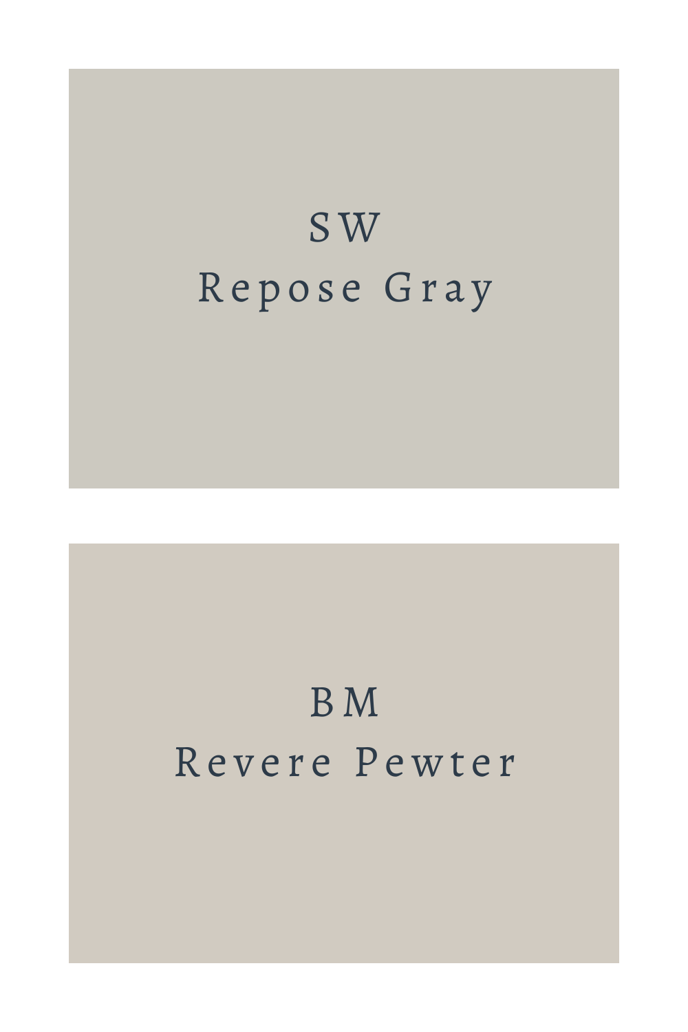
Revere Pewter has a similar depth as Repose Gray, but it leans slightly more warm and beige. If you like how dark Repose Gray is but found it a little too cool (like in a north-facing room) Revere Pewter is a good next step.
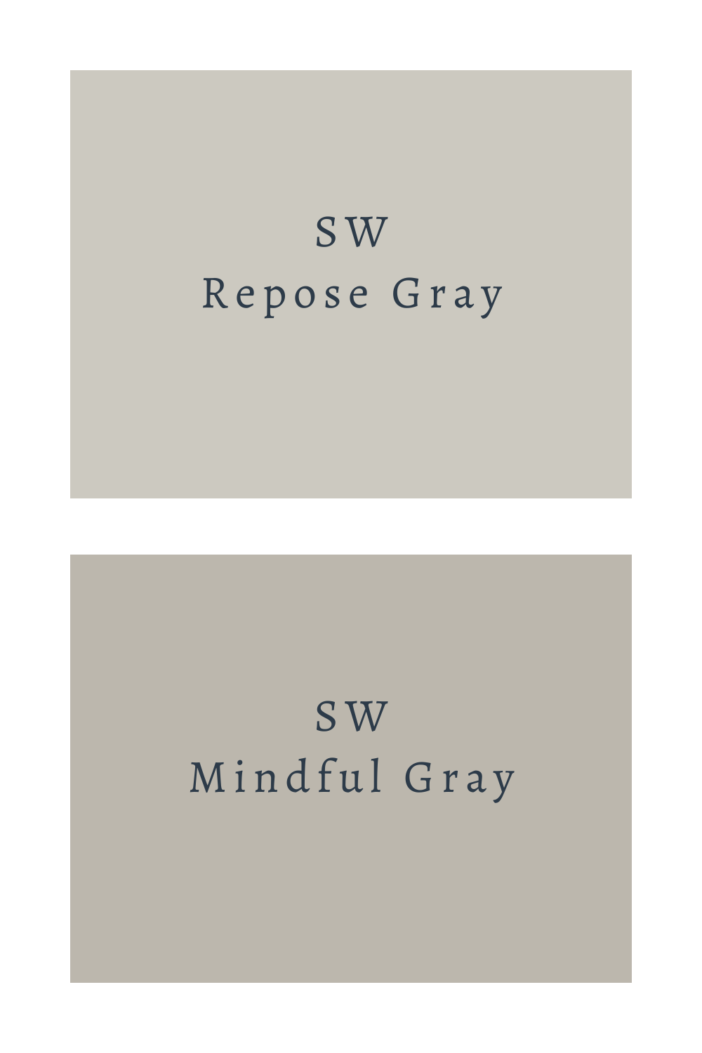
Mindful Gray is another popular SW gray, but it’s a little darker and has more of a green undertone than. a purple one. Mindful Gray is a better pick for honey oak.
Is Repose Gray Dated?
Repose Gray isn’t dated so long as you use it in a modern way. Using it to color-drench a room, as a trim color on wainscoting or beadboard, or paired with wallpaper are all very of-the-moment ways to use the shade. It’s also a timeless pick for home exteriors and exterior trim.
Is Repose Gray a Good Whole Home Paint Color?
Repose Gray was a popular “whole home” or “flow space” paint color for years – the color you’d paint your hallways and stairwells, or all connecting spaces in an open concept home. However, these days I don’t love it as a whole-home paint color. The all-gray color palette is dated, and I find gray tones to be limiting with today’s warmer decorating trends. Instead, opt for an off white or a warmer-toned beige.


One Comment