The Top Paint Colors for Dark Rooms, Plus How to Choose One
Would you like to save this?
If you’re currently on a quest to find the best paint colors for dark rooms in your home, and you’re feeling a little overwhelmed, I see you. I live in a northeast-facing 1930s home with lots of enclosed rooms and not a lot of natural light. I’ve spent the last 8 years experimenting with all sorts of paint colors, from bright whites meant to “reflect” what light we do get in our home, to dark, moody shades designed to work with our home’s inherent vibes.
I’ve found that the key to making a decision you don’t regret as soon as the paint dries, is to understand a few things about: 1. how color behaves in dark rooms, and 2. the vibe of room you’re painting.
After writing about paint colors for decorating magazines for more than 12 years, and choosing dozens of paint shades for my own homes and Airbnbs, I’ve got some hard-earned tips on picking paint colors for all sorts of spaces.
Here, I’ve put them into an extensive guide for choosing the best paint colors for dark rooms.
How to choose the best paint colors for dark rooms
From the colors to steer clear of, to how to solidify your decision, here’s and overview on how to choose the right paint shade for a dimly lit space, and tips for narrowing down your choices.
Tip 1: You don’t need to paint it bright white.
There’s a common misconception in decorating that dark rooms should be painted white in order to brighten them up and “make them feel bigger.” But this isn’t necessarily correct.
In fact, white and off-white paint colors can often fall flat in dark rooms.
To truly enjoy the beauty of white paint, it needs to be able to reflect light. If there’s not a lot of light to reflect, you can end up with a room that looks dingy or gray-toned.
About five years ago, I was certain that I wanted to paint my dining room Sherwin Williams Aesthetic White. At the time it was painted Benjamin Moore Simply White, and it felt a little dingy and stark. I thought the issue was the paint color, so I was looking for a creamy, but still bright color, and Aesthetic White kept coming up in the most beautiful photos. Like the one seen here:
But when I tried the swatch on my walls (against the existing Simply White) it looked like this:
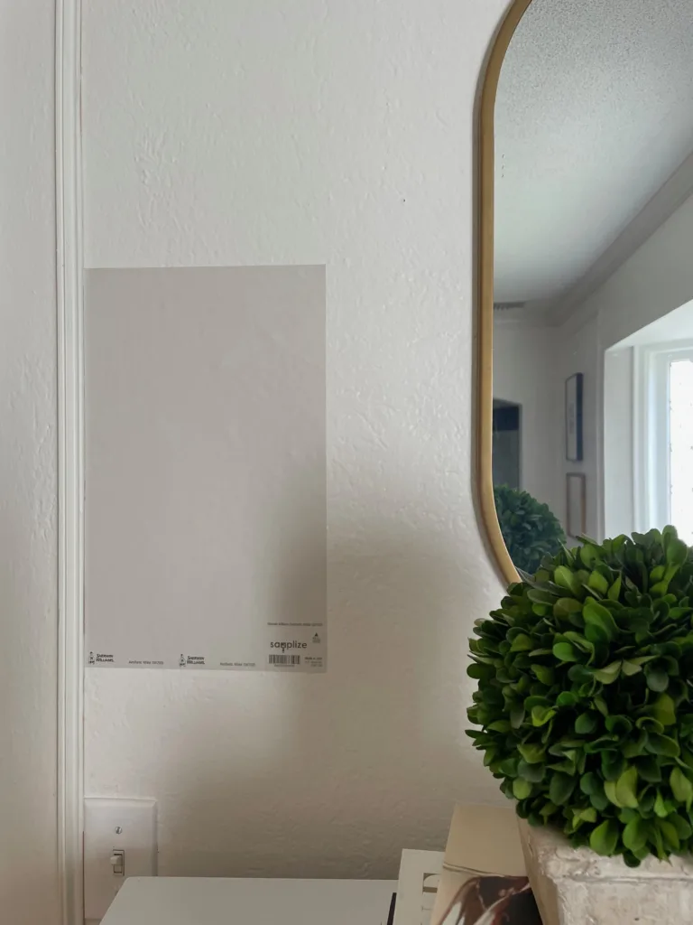
Not at all the warm, ethereal cream color I was going for. That’s when I first started looking into white paints and dark rooms, and eventually I decided to nix the white in this room altogether (which I’ll share more about in a minute).
All of this is to say that, if you want to create a room that feels airy and open, but it doesn’t get a lot of natural light, white can be tricky to get right.
(The one caveat to this, in my experience, is if you’re painting a dark, windowless bathroom, and you’re trying to create a more functional space so you can see what you’re doing. In this case, white can be a good choice for functional reasons!).
Which brings me to my second point.
Tip 2: Go for light colors over pure white.
White can be tricky in a low-light room—but that doesn’t mean you have to swing to a dark, moody color. The fix is usually not “another white.” It’s choosing a light neutral that reads white-ish, but has enough undertone and pigment to stay clean when the room is shadowy.
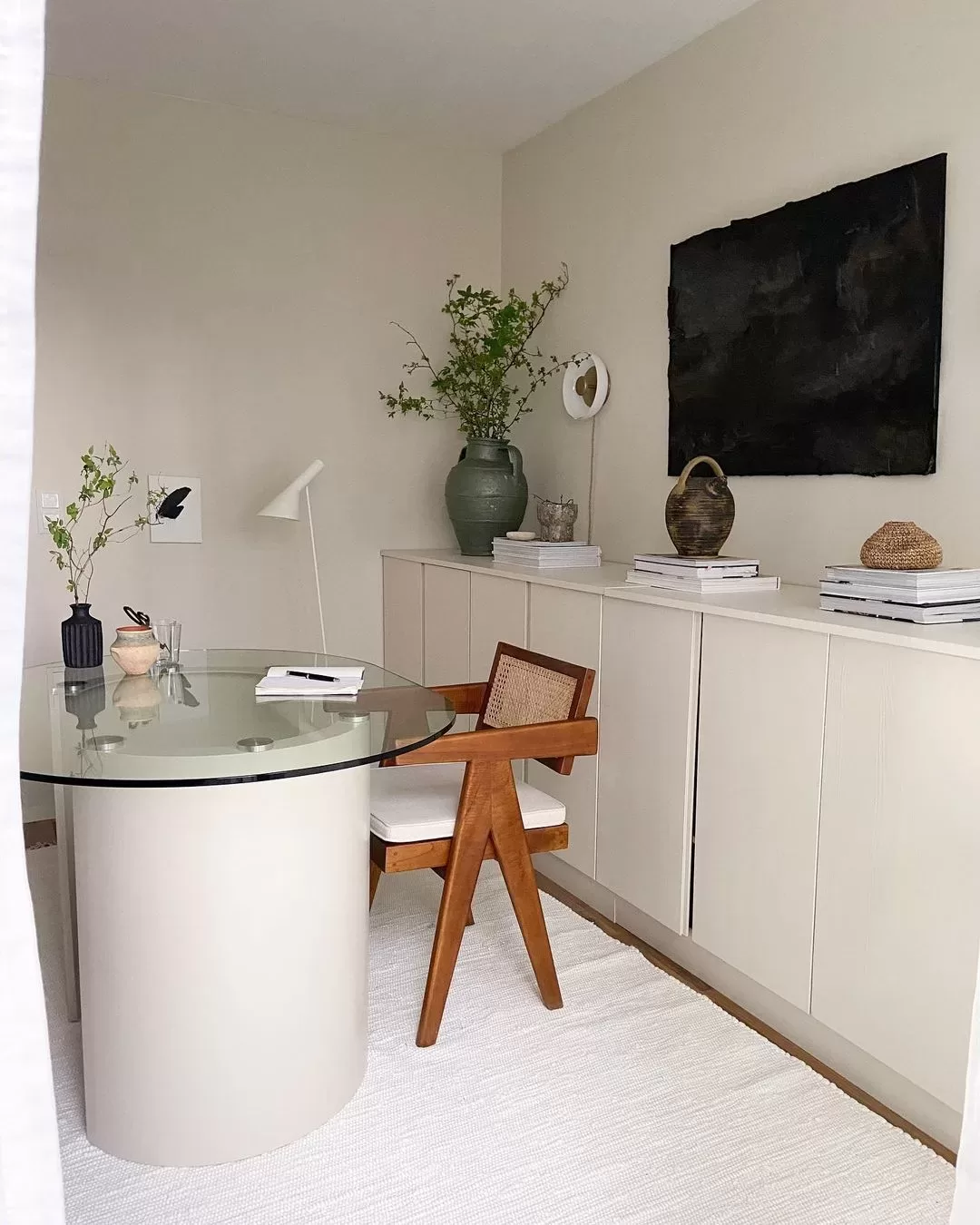
For a bright, white-adjacent look that behaves better in darker spaces, try soft creams or pale beiges—shades like Sherwin-Williams Creamy, Pacer White, or Navajo White, or Benjamin Moore Fossil. Even light shades of greige, like Benjamin Moore Pale Oak, above, can work if you are looking for a cooler tone with both brightness and depth.
Because these colors have a little more body than a true white, they’re less likely to turn flat, gray, or dingy when there isn’t much natural light. Instead, they read as the lightest neutral—the effect people usually want from white, without the “dirty white” surprise.
One more bonus: slightly deeper, warmer light neutrals are also more forgiving than crisp whites. If your room’s light skews cool and makes everything look gray, a paint with a touch of warmth can help counterbalance that cast and make the space feel cleaner and more inviting.
Tip 3: Try a mid-tone color
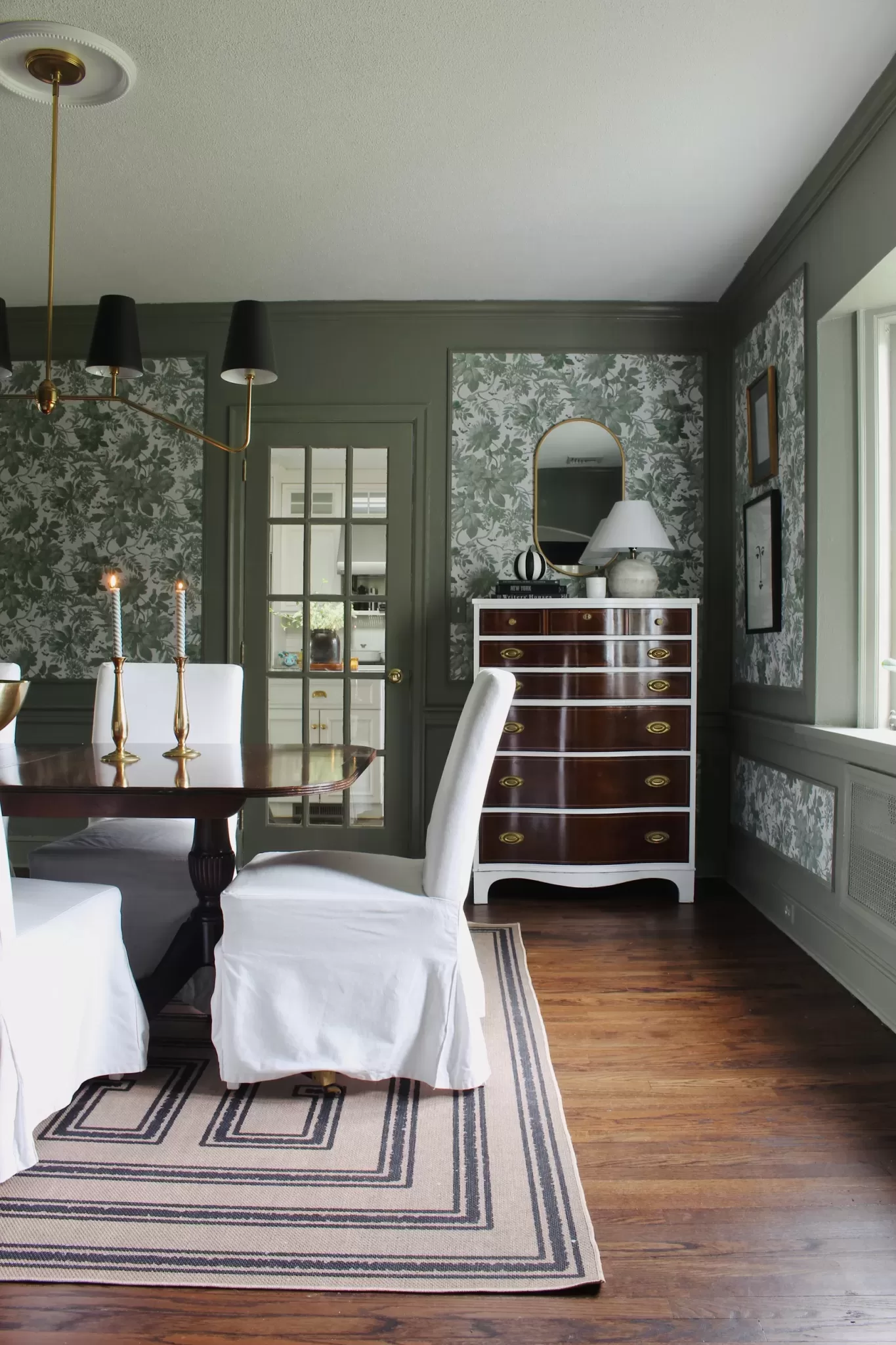
When I realized that white wasn’t the right color choice for my dining room, I did a complete 180 and decided to paint the room a mid-tone gray blue instead.
Mid-tone paints are ones that aren’t too dark and aren’t too light. They make a room feel moody, without making it feel imposing or just plain dark. If you’re looking for a mid-tone paint color, go for an LRV, or light reflectance value, of 20-60. You’ll find most paint brands have paint color LRVs listed on their websites.
Mid tone paint colors are my favorite choice for dark rooms. They’re a happy medium, because dark colors, with an LRV under 15 or so, can feel too dark, like you need to turn all the lights on to see what you’re doing kind of dark.
Tip 4: You might need a cleaner color than you think.
One of the ways to describe paint colors is “clean” and “dirty.” Clean, or clear, colors are colors without a lot of gray in them, and are often the “truer” version of that color. Think colors you’d find in a Crayola 16 pack, or shades like robin’s egg blue, mint green, bubblegum pink, etc.. Dirty colors, on the other hand, have more gray or brown tones to them. They tend to look more subdued and elegant. These are hues like olive, sage, or dusty rose.
Most people choose slightly dirty colors for their home, unless they have a very preppy style or are painting kids spaces.
Where this can cause problems in darker rooms is that sometimes, the neutral colors in a dirty paint tone can overpower the color pigment, so you end up seeing more gray than blue in a blue-gray paint color, or more brown than green in an olive one. I suggest that when you go choose sample colors at the paint store, bring home a couple of swatches that look brighter or more colorful that you think you want. They may end up looking perfect in a dark room.
Now, that doesn’t mean you need a perfectly clean paint color in a dark room. I personally always choose colors with at least a little gray or brown in them. They tend to be more live-able. But, you just might need a little less dirty of a color.
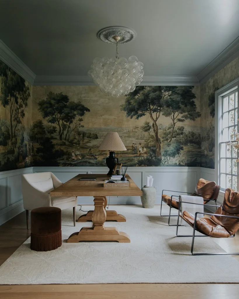
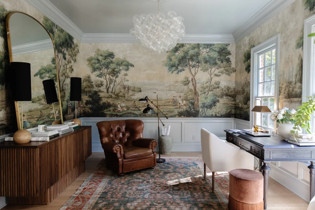
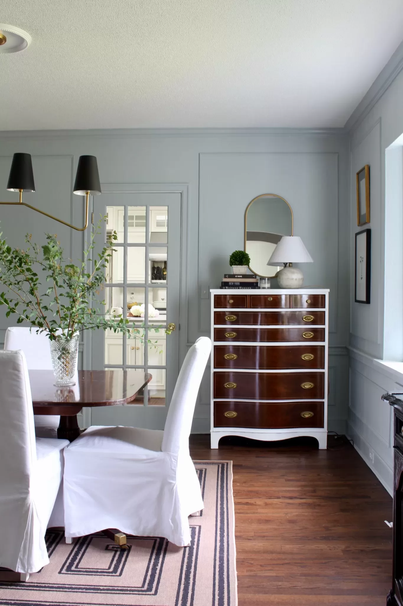
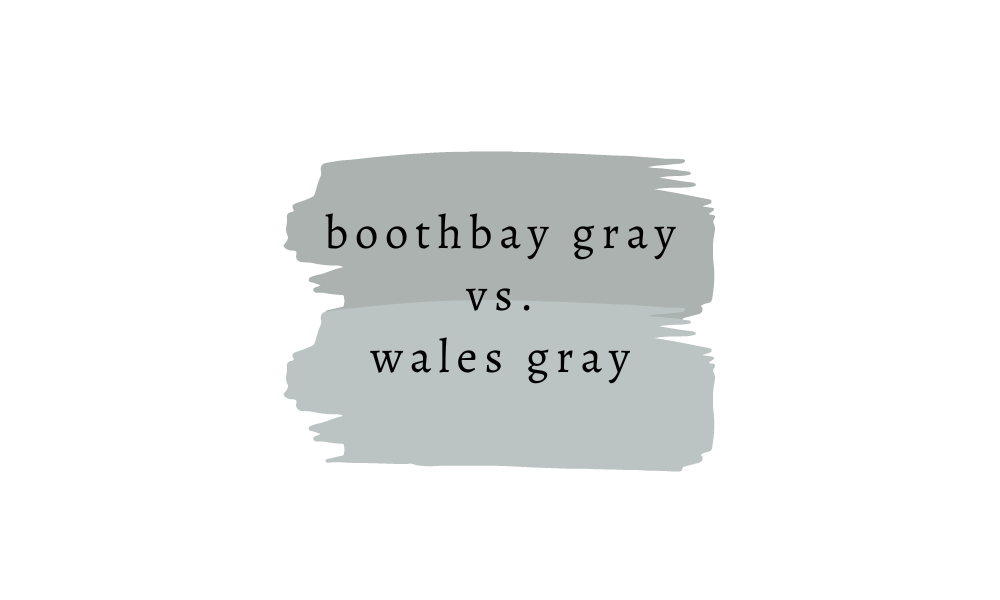
I faced this, again, in my dining room. I thought I wanted a gray-blue before I decided on green, and I was certain one of my top choices would be Benjamin Moore Boothbay Gray. This was based on the fact that Julia Marcum from Chris Loves Julia had just used this color in her home office, and it looked like the perfect shade of gray-blue.
But, when I tried it in my dark dining room, it looked like a cool gray. I got almost no blue from it. So, I ended up choosing Benjamin Moore Wales Gray, instead. You can see below the difference in these colors, and how they looked in each of our spaces.
Tip 5: Test the color first
The biggest tip I have for choosing the best paint colors for low light rooms is to sample, sample, sample.
You can read all the guidance you can find around how certain colors react in certain lighting conditions, but the color will still look different in your home. The way a paint color looks will change based on the furniture and decor you have in your room, what kind of overhead lights and lamps you have, how your home is positioned, and even what’s outside the windows.
Colors will also looks very different in online photos that they will in your space. Ditto for how paint swatches look in the paint store.
I always suggest painting 12″ blocks of a color on all of the walls in a room and then looking at the color throughout the day. If your wall color is drastically different from the new one, painting a band of white primer around each color swatch can help you get a better read on the true color.
As far as specific colors for a low-light room, there are a few that I love which can give you a place to work from.
Best Paint Colors for Dark Rooms
Honestly, there are hundreds, even thousands of paint colors that would work well for a dark room. The one that’s exactly perfect will depend on your decor, the style of your home, and your hard finishes (the colors of your flooring, countertops, tile, etc).
However, to get you started, I’m sharing a few of the paint colors that I personally love for darker rooms.
1. Benjamin Moore Pale Oak
Pale Oak is a lovely greige shade that’s just a few shades deeper than off white. While Pale Oak is on the warm side, it’s warmth is neutralized in shadowy spaces, making it feel like a just-right neutral hue that’s not too cool or too warm.
2. Sherwin Williams Creamy
If you have your heart set on a white space, but off whites are making the room feel cold and flat, try Sherwin Williams Creamy. It’s a cream color (of course) with plenty of warmth, which appears subtle and soft in a dark room.
3. Sherwin Williams Fossil
This lovely bone color borders on beige, and is perfect for creating a creamy look with some depth in a low-light room.
4. Benjamin Moore Swiss Coffee
For an off white with enough depth to hold its own in a dark space, try Swiss Coffee. Its beige and yellow undertones make it feel bright and dynamic even in lower-light situations.
5. Farrow & Ball Treron
I eventually swapped out my blue-gray dining room walls again for Farrow & Ball Treron, which is a beautiful gray-green that I think looks its most sophisticated in low-light rooms. It looks like an elegant and moody pewter color that’s not too dark.
6. Benjamin Moore Wales Gray
I think Benjamin Moore Wales Gray is the ideal blue-gray for a low-light room. Too much light make this color look like a brighter blue, but low-light make it look calming and oh-so-sophisticated.
7. Sherwin Williams Red End Point
This was the SW color of the year in 2022, and I’ve loved it ever since. This is a great color for a dim room because it has lots of warmth and isn’t too light or too dark. It’ll help you embrace the low-light in your dark room while also making it feel inviting and ethereal. Plus, it’s bang on trend.
Also: Painting the ceiling the same color as your walls is a great look in low-right rooms if you want to embrace a moody vibe.
8. HGTV Home by Sherwin Williams Bracing Blue
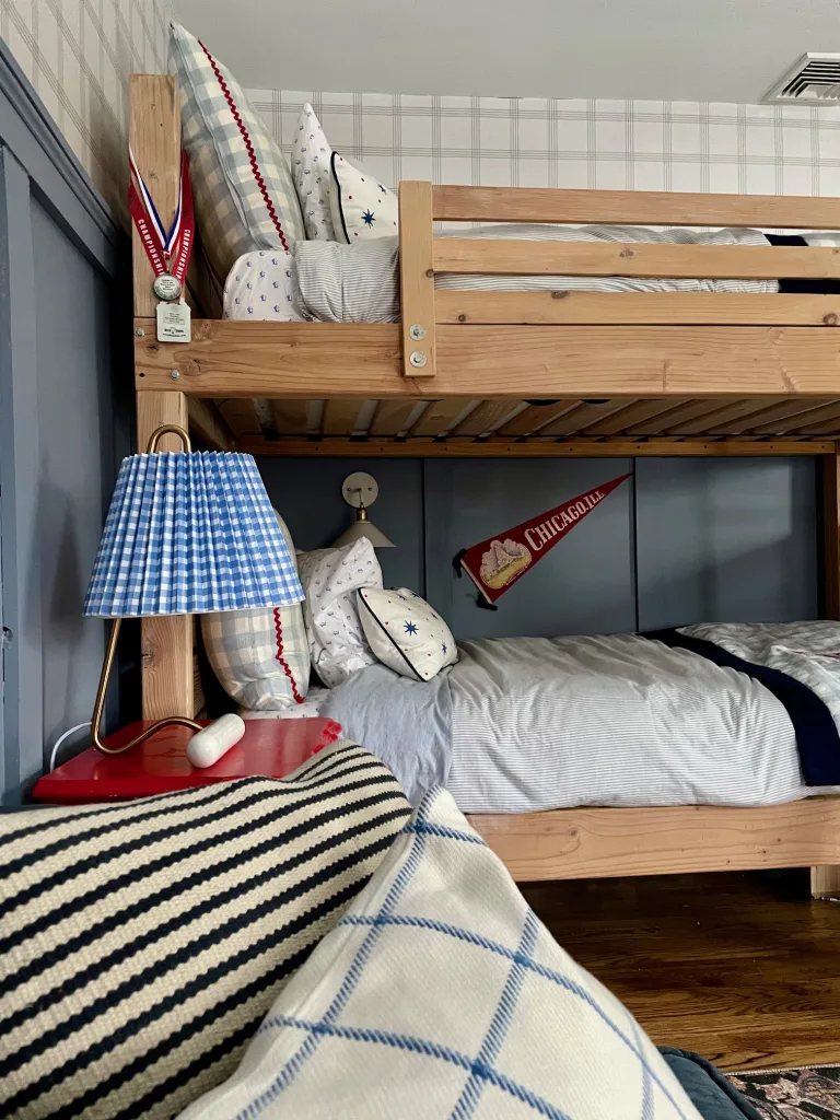
HGTV Home by Sherwin Williams Bracing Blue is a mid-tone blue with periwinkle and gray undertones that looks downright ethereal in a low-light room. I chose Bracing Blue for my sons’ low-light bedroom, and it’s one of my favorite paint colors I’ve ever used.
Their room used to be painted Benjamin Moore Hale Navy, which is a very dark paint color, but it was just too dark for their space. The room has two small windows, one that faces north and one that faces west, and it doesn’t get much natural light during the day. It was literally hard to see in there sometimes. Bracing Blue gives their room life and sets a mood, but doesn’t feel overly dark.
9. Benjamin Moore Little Falls
Benjamin Moore Little Falls is a pretty mid-tone shade of blue with a soft gray undertone that’s emphasized in dim rooms, giving it an added air of sophistication.
10. Sherwin Williams Mountain Road
Sherwin Williams Mountain Road is a rich green with a slightly yellow undertones that balance out cooler shadows.
Looking for more color help? Drop me a line at kaitlin@kaitlinmadden.com for a chance to be featured in my Reader Qs series.