The Best Benjamin Moore Navy Blue Paint Colors for Every Room
Navy blue is one of the most popular paint colors because it’s versatile enough to complement various interior styles and can be used in any room in the house. Like the best white paint colors, though, there are seemingly hundreds of blue shades to choose from. With so many paint colors in their lineup, Benjamin Moore features a fine collection of navy blues, from rich, purply-blues, to black-toned navies that feel moody and intense.
The variety of colors and undertones mean that you’re sure to find the right match for your space, but you might just need a bit of guidance to land on the perfect hue. Here, I’ve rounded up the best Benjamin Moore navy blue paint colors, based on my experience with them, plus designer favorites and the brand’s most popular shades according to an interview I did with the Benjamin Moore public relations team. Once you go through it, you will understand the differences between each and can pick the proper fit.
The Best Benjamin Moore Navy Blue Paint Colors
With dozens of blue hues to choose from, I’ve whittled down my top pick for Benjamin Moore Navy Blues.
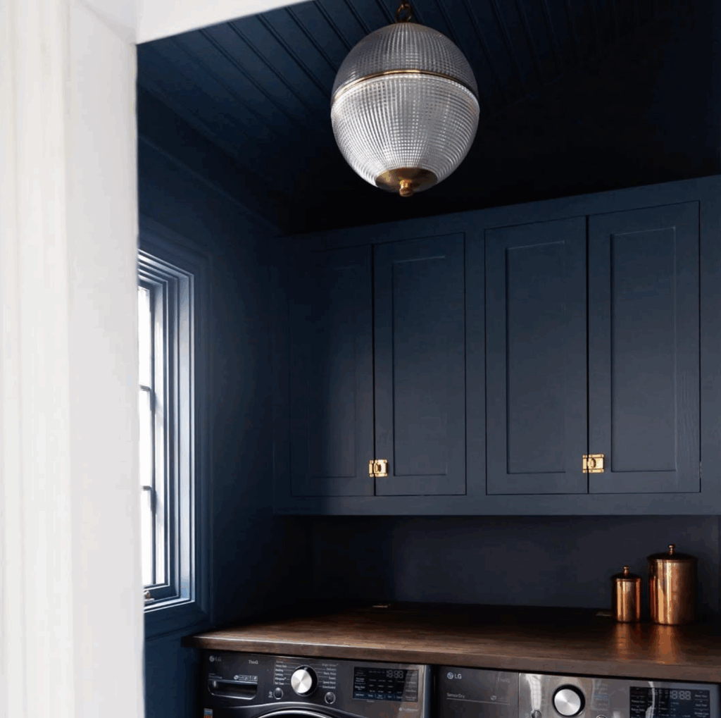
1. Hale Navy
LRV: 8.36 | Undertones: Gray
Would you like to save this?
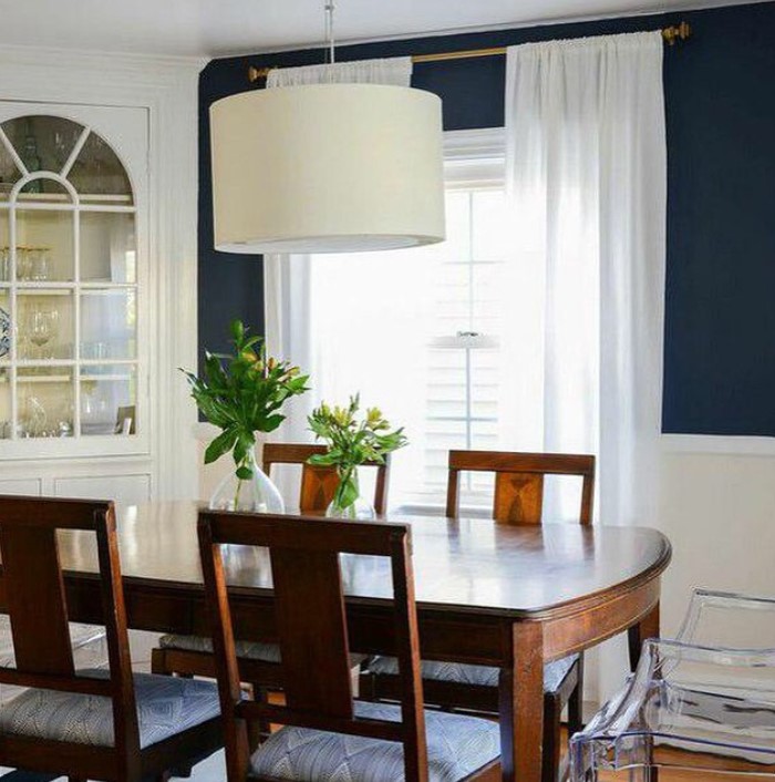
Hale Navy is like the navy blue benchmark … the shade most people picture when they imagine a classic, sophisticated navy. Its gray undertones keep it from reading too blue or too cold, which is exactly what makes it so easy to work with. I’ve used it many times in my own homes, as far back as in 2014, when we painted the dining room of our second home, above.
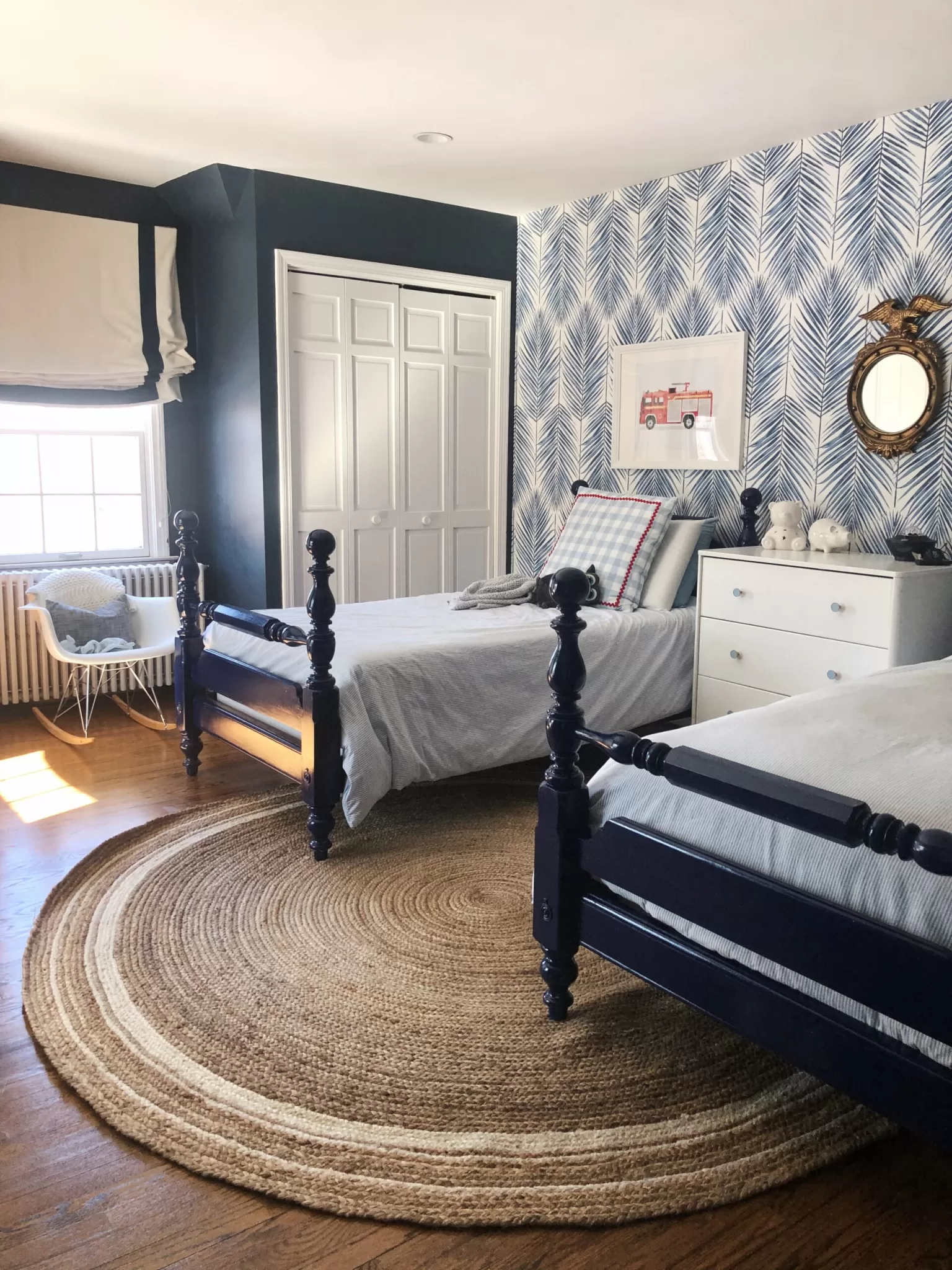
For a current look, try Hale Navy on an interior door, cabinetry or for contrast trim rather than an accent wall. I’d also caution against using it as a whole-room color in rooms that don’t get a ton of natural light. I did that in my sons’ room a few years back and ended up adding walpaper to one wall to brighten the space up because it felt a little too dark.
Overall, it’s a beautiful, muted navy that works beautifully with warm whites like White Dove or Swiss Coffee, and looks perfect alongside natural wood tones and unlacquered brass hardware.
2. Three Piece Suit (formerly Polo Blue)
LRV: 5.67 | Undertones: Gray-blue, can read near-charcoal in low light
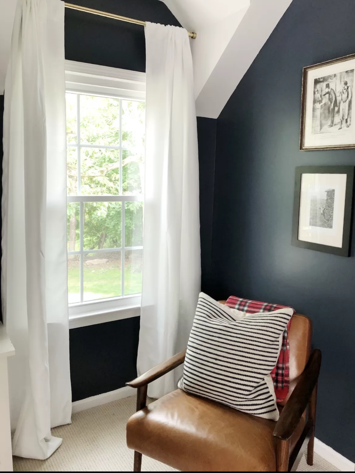
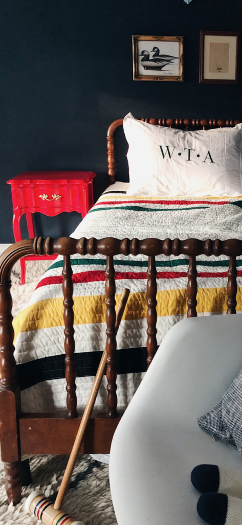
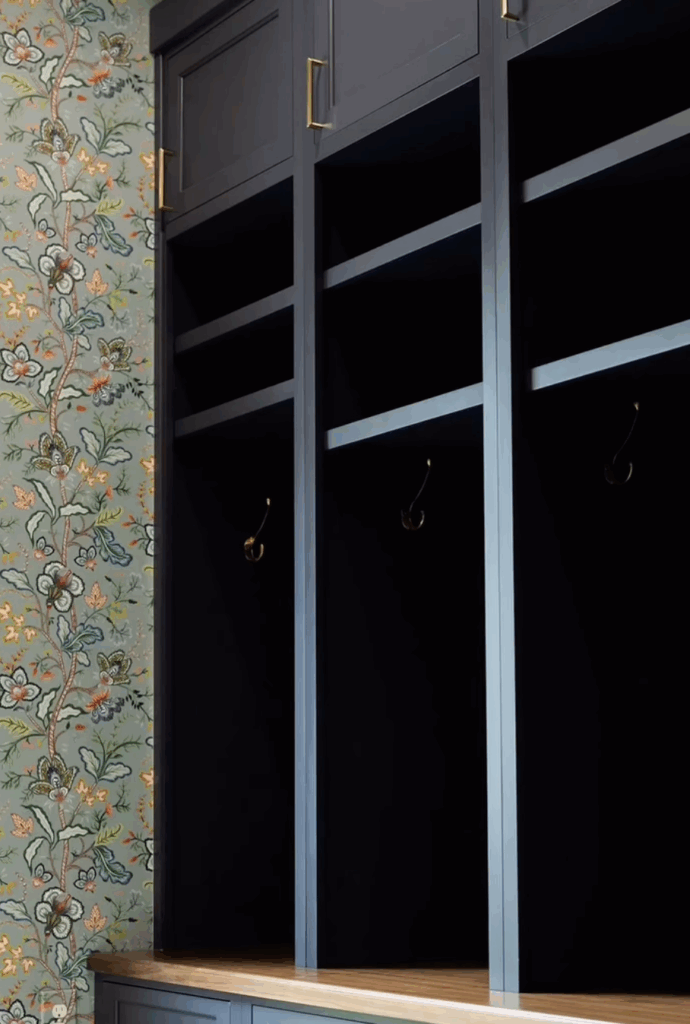
Three Piece Suit, recently renamed from Polo Blue, is one of the darkest shades in Benjamin Moore’s navy lineup. With an LRV of just 5.67, it sits close to black on the light reflectance scale, and in rooms with limited natural light, it can absolutely read that way. That’s not a drawback, though. It’s what gives it that tailored, almost lacquered quality that works beautifully in spaces where you want serious impact.
This is the color I’d reach for in a moody home office, a powder room, or in a really bright room where other shades read too “blue.”. Pair it with warm whites and aged brass for a look that feels current without being trendy.
3. Evening Sky
LRV: 7.35 | Undertones: Purple-blue
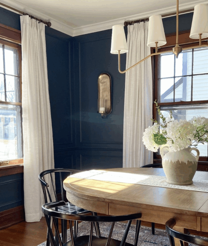
Evening Sky sits in similar territory to Hale Navy but carries a soft purple undertone that gives it a slightly richer, more complex feel. It’s a subtle shift, but it’s enough to read differently on the wall. It’s a bit more jewel-toned and “colorful.”
It works especially well in bedrooms and dining rooms where you want depth with a hint of warmth. On exteriors and front doors, it makes a confident statement without veering into trendy territory. Pair it with dusty rose or terracotta accents if you want to lean into its warm undertones, or keep it clean with warm whites and natural wood for a more grounded palette.
4. Blue Note
LRV: 9.02 | Undertones: Rich navy with inkiness
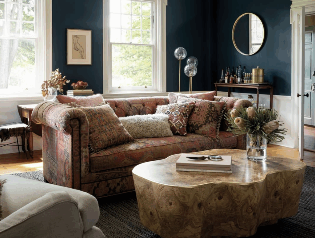
Blue Note has one of the higher LRVs on this list, but don’t let that fool you. It still reads as a deep, inky navy with serious depth. It’s the kind of color that gives a room a sense of luxury without much effort.
It pairs well with warm neutrals like Moonlight White and November Rain, both of which balance its depth without washing it out.
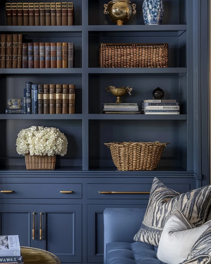
5. Gentleman’s Gray
LRV: 7.26 | Undertones: Teal-blue
Gentleman’s Gray is the outlier on this list, since it reads less like a classic navy and more like a deep teal-blue, which makes it one of the most distinctive shades in Benjamin Moore’s blue lineup. That teal quality gives it an energy the other navies don’t have; it feels simultaneously bold and fresh.
It’s an ideal pick for a home office or library where you want character without the room feeling cave-like.
6. Van Deusen Blue
LRV: 11.97 | Undertones: Cool blue
Van Deusen Blue is the lightest shade on this list, and it’s one of Benjamin Moore’s bestselling blues for a reason. With an LRV of nearly 12, it reads as a true, clear navy rather than something dark and moody, which makes it a strong choice for spaces where you want color without committing to something intense, or for dimly lit rooms where darker shades feel oppressive.
Its cool undertones mean you’ll want to pair it with whites on the cooler or crisper end of the spectrum. Chantilly Lace is a classic match, especially as an exterior color combo, with white on the siding and blue on the front door.
7. Newburyport Blue
LRV: 10.31 | Undertones: Blue, nautical quality
Along with Hale Navy and Van Deusen Blue, Newburyport Blue rounds out Benjamin Moore’s top three bestselling blues. It’s a clean, saturated navy with an honest blue tone, no strong gray or purple pull. Its place in Benjamin Moore’s Historical Collection reflects its enduring, classic appeal.
It’s particularly well-suited for coastal and traditional interiors, but it also works in contemporary spaces where you want genuine color rather than something muted.
8. Hudson Bay
LRV: 9.77 | Undertones: Blue, slightly warmer than Hale Navy
Hudson Bay is a bold, richly saturated navy with a more prominent blue tone than Hale Navy—it’s less gray, more genuinely blue. Despite that depth, it’s part of Benjamin Moore’s Designer Classics collection, which says something about its staying power.
In a bedroom, it creates a calm, enveloping feel that pairs well with natural linens and warm wood nightstands.