What Color Walls go With Cream Or Ivory Kitchen Cabinets?
Here’s a rundown on choosing the right paint color for cream cabinets, plus the color families that look best with cream.
Would you like to save this?
I would say that 90 percent of the reader emails or Instagram DMs I get are about paint color dilemmas. A recent one, from a woman working on a kitchen renovation, inspired me to write a post about what color walls go with cream kitchen cabinets.
In this case, the reader recently had her cabinets painted a warm off white that, in certain lighting, appeared more creamy and yellow than she was hoping for. She wanted to be sure that the wall color she chose toned down the cream hues instead of amplifying them.
My suggestions consisted of: 1. Use the same color on the walls as on the cabinets, 2. go for a neutral a few shades darker than the cabinets, with undertones similar to the cabinet color, or 3. Pick a warm off white with a creamy yellow undertone.
Before I jump into explaining the reasons for that and how to choose a wall color, I also want to address that you might be here reading about wall colors for cream kitchens not because you are jazzed about the new greigey-cream cabinet trend, but because you have inherited cream kitchen cabinets from the Tuscan-style kitchen trend of the last ’90s/early 2000s.
If you’re looking for a way to update dated-looking cream kitchen cabinets, this post will also be helpful, because I’ll explain how different paint shades will highlight or neutralize certain elements of your cream cabinets, and what to choose so they look their best.
I’ve also put together a list of colors that work well with cream, as well as ones that don’t towards the bottom of the post.
So, whether you’re looking for paint colors that go with your freshly painted cream or ivory cabinets, or you want to update your dated cream cabinets, you’re in the right spot.
What Color Walls go With Cream Or Ivory Kitchen Cabinets? (And What Colors Don’t)
While everyone’s home, style, and lighting situation is different, there are a few universal things you should know that will help you decide what colors go with the cream cabinets in your home.
The first is that cream and ivory shades have warm undertones. Undertones are hints of other colors that come through in paint. Cool undertones are blue, green, and violet, while warm ones are yellow, orange, pink/red. There are also more neutral undertones, which are either a balance of warm and cool tones, or a neutral like brown or gray.
Cream and ivory are made by adding a touch of yellow, orange, pink, or a combination, to a stark white paint to create a softer appearance. There are also a palette of cream tones that are popular right now that border on beige or greige, and these tend to have gray and/or brown undertones mixed in, too.
This is important to know because the color you put alongside your cream-colored cabinets will either magnify these undertones (and creaminess they add to your paint) or neutralize them.
Cool-toned colors will make the warmth in your cabinets stand out. (Which is why I told the reader who asked about her wall color to choose something warm.)
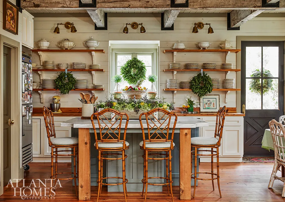
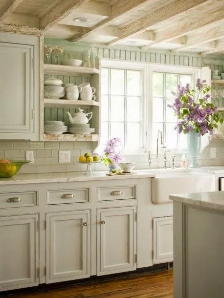
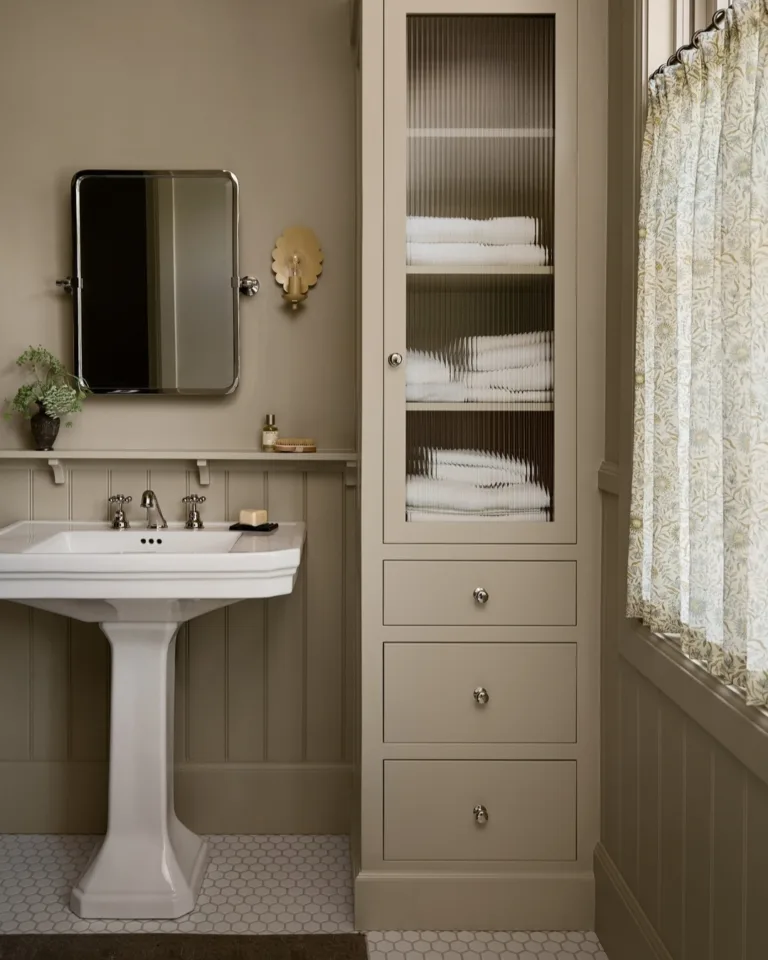
If you choose a cool-toned wall color, like a bright white or a silvery-gray, for example, your cream cabinets will instantly look warmer, or even yellow or pink-ish, by comparison. (See how in the photos below, the pale gray and bright white make the cream look out of place? If you picture these kitchens with a soft cream or pale beige wall, the whole room feels more harmonious) For this reason, I don’t suggest using cool-toned colors or bright whites with cream cabinets.

Instead, you need a paint color with some warmth. If you choose a warm white that’s lighter than your cabinets, you’ll subtly highlight the warmth of the cream color, and make the cabinets feel like an intentional part of the space. It is important to note that a lighter paint color like an off white will also make your cabinets look more cream, but overall, a warm off white can help create a fresher look for a dated cream kitchen.
Now, if you don’t love the cream color of your cabinets and you want to downplay or neutralize the warmth or you want to make them look more white to the eye, go for a warm neutral a few shades deeper than your cabinet color, like a soft beige or taupe, or a warm-toned color like a pale olive green. The darker color will make the cream color look lighter by comparison. It still won’t make them look white, since they aren’t white, but they will look whiter.
You can also choose a colored paint shade for your kitchen, but I find these are more difficult to get right since the wrong color can make a cream kitchen (especially an older one) look even more dated. There are a couple of exceptions, and I’ve noted them, below, alongside the neutral color suggestions,
Paint Colors for Cream and Ivory Kitchen Cabinets
Let’s get into the paint colors that look best with cream colored cabinets. Because the color you choose is so dependent on your specific situation, I’ve given general colors, plus a few suggested paint shades for each. Finding the right shade for your space will come down to sampling specific paint colors in your own home.
1. Cream
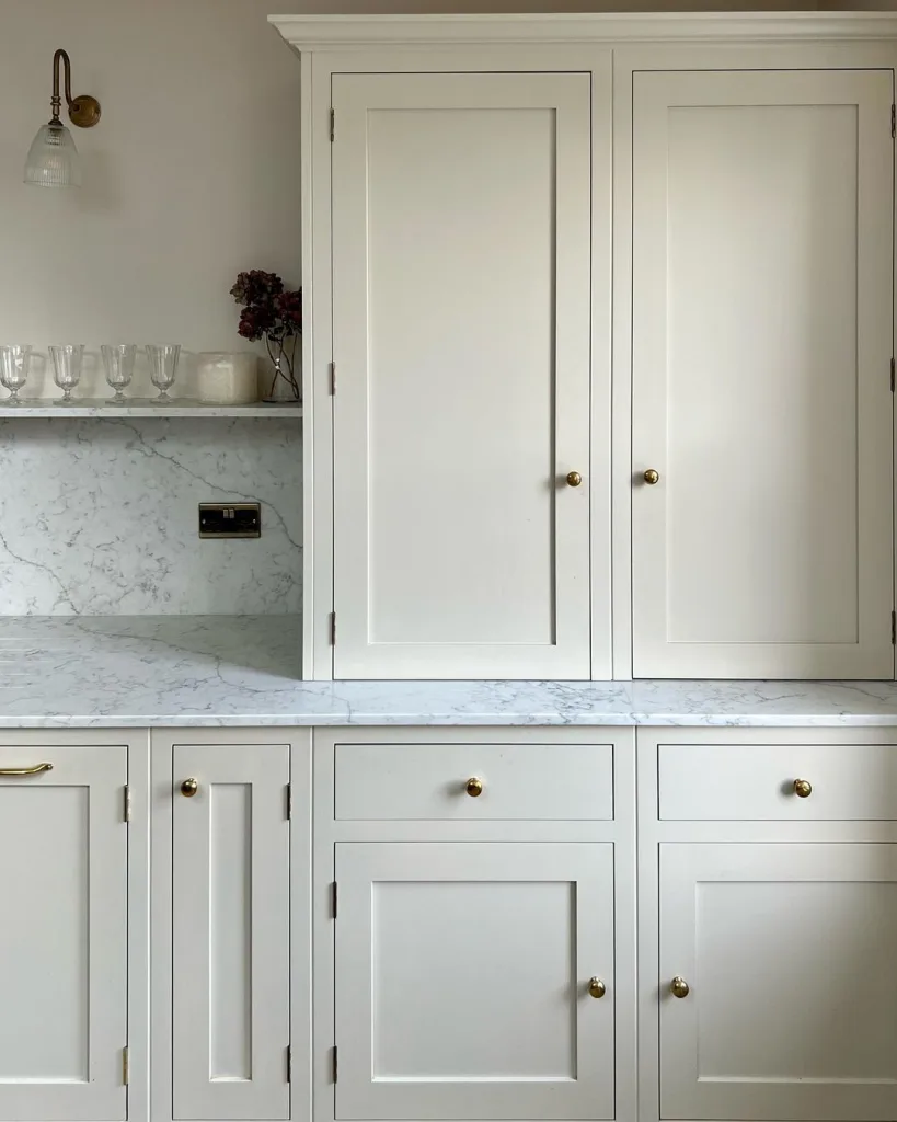
Sometimes, simplicity is the best strategy! Using the same cream color on your cabinets and walls eliminates any guesswork when it comes to paint color, plus it’s beautiful and timeless.
Your best bet, if you don’t know the color that was used on your cabinets, is to have a door or drawer front color matched at Home Depot or your local paint store. You can also pick up a fan deck (those books with all the paint swatches in them) at your local hardware store and try to find the cream paint color that most closely matches your cabinets.
This is a good route only if you like the color of your cream cabinets. If you don’t, more of the same won’t make you enjoy your kitchen any more.
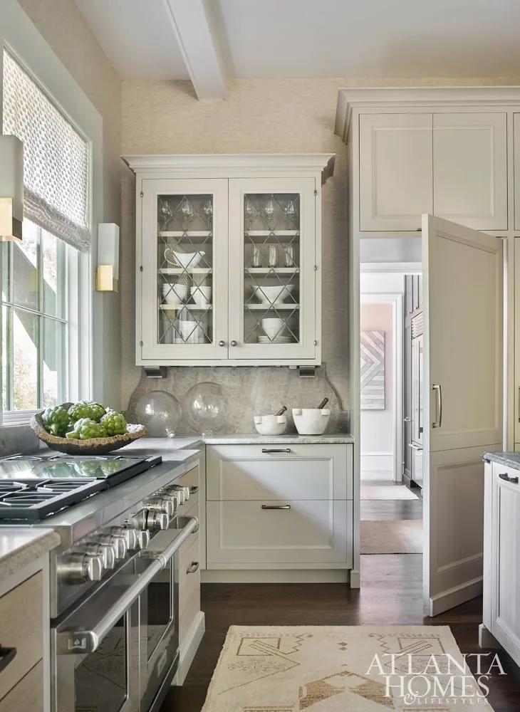
2. Off White

Painting your walls a warm off white will make your cabinets look more cream-colored by comparison, but the warmth in an off white (as opposed to a true white or blue-white) will create a unified look with a little more contrast than simply going with cream on your walls, too.
In the photo above, blogger Emma Courtney paired Benjamin Moore Natural Cream cabinets with Benjamin Moore White Dove Walls. You can see the subtle different between the cabinets and the shiplap. Unlike the example I shared earlier, with cream cabinets against a cool white tile, which didn’t work, this space still feels unified because the paint colors share similar warm undertones.
Colors to try:
- Benjamin Moore Simply White – Try this for creams with a yellow undertone, since Simply White has a yellow undertone, too.
- Benjamin Moore White Dove – Give White Dove a chance if your cream cabinets are more of neutral cream, not a yellow cream. White Dove has a more neutral undertone.
- Sherwin Williams Alabaster – This shade is a happy medium between White Dove and Simply White, if neither of those feel quite right.
3. Beige
Beige works if you’re looking for a neutral color that will tone down the warmth in your cream tones.
Again, you’ll want to choose something with undertones similar to the ones in your cabinets. If you currently have a 2000s or Tuscan-style kitchen with cream cabinets, avoid any shade of beige with orange or gold undertones, or colors that border on tan, since those will reinforce the dated vibe, instead of counteracting it.
Basically, avoid colors that look like this:

Instead, go for more toned-down shades in a color that suits the undertones of your cabinets. Or, if you aren’t sure what undertones your cream cabinets have, try a green-beige, which tend to be the most versatile shades.
I’ve listed a couple favorites, below, but a quick Google will give you lots more options.
Colors to try:
Benjamin Moore Finnie Gray – I have this color in the family room and breakfast nook off of my white kitchen. It’s a lovely green beige that’s not too dark or too light.
Farrow & Ball Old White – This is a lovely green-beige shade that’s on the softer side and won’t create as much contrast as Finnie Gray.
4. Taupe


If you’ve fallen in love with greiges and have thought about painting your cream kitchen a shade of greige, just know that greige can be tricky with cream if it’s too cool. That’s why I’ve included taupe instead, which is generally a bit deeper and warmer.
There is a caveat with taupe, though, in that it won’t work with every shade of cream. Taupe tends to have pink or purple undertones, so it’s a better choice if the shade of cream in your home has pink or orange undertones. If your cream is on the yellow side, don’t pick taupe for your walls. It’ll make the cabinets look dingy.
That said, if you love the look of taupe, you can also try a green-toned gray. These colors tend to look similar to taupe on the walls, giving a mushroom-colored look, but without the pink/purple undertones. Farrow & Ball Mouse’s Back and Farrow & Ball Light Gray are two lovely examples of gray-greens that work with cream.
Colors to try:
- Farrow & Ball Mouse’s Back – Mouse’s back is a beautiful, rich soft brown color with heavy doses of gray and green.
- Farrow & Ball Light Gray – Light Gray, which isn’t really gray, is a lovely, lighter alternative to Mouse’s Back.
- Behr Perfect Taupe– I love this shade of taupe against soft creams without too much yellow.
5. Olive Green
A muted olive green is a beautiful option if you’re looking some color or contrast in your kitchen. Given how on-trend this shade is, it’s a good pick for either updating an older Tuscan-style cream kitchen, or complementing a new one.
Colors to try:
- Benjamin Moore Rolling Hills – Rolling Hills is mid-tone green that’s rich but subdued thanks to a neutral gray undertone.
- Benjamin Moore Dry Sage – Dry Sage is a chameleon color than can look tan or green depending on the light. It’s a rich, warm color that complements cream well.
What colors do not go with cream or ivory cabinets?
Overall, the colors you should avoid are a mix of cool tones that will exaggerate the warmth of cream hues, or colors that risk making cream cabinets look dated.
Colors to avoid:
- Cool tone whites
- Cool tone grays and greiges
- Clear colors (AKA ones without any gray or brown added to them) like bright blue, Robin’s egg, Kelly Green, etc. These shades work better with true whites and will look out of place against cream.
- Brick reds and gold, which are reminiscent of the bad “Tuscan” trend of the early 2000s when paired with cream.
How to Update a Cream Kitchen?
If you’ve got a dated cream kitchen, there are lots of ways you can update it outside of painting your walls.
Swap out hardware.
Get rid of that old spiral-y looking hardware from 2001 and replace it with something in a warm metal like brass or bronze. Ditto for your sink faucet.
Get a runner
If your flooring is outdated too (or even if it’s not!) a new runner can give your kitchen a more of-the-moment look.
Swap out lighting.
Lighting is one of the best ways to update any old kitchen. Swapping island pendants for something new and classic, removing track lighting, or adding new sconces can all make an old kitchen feel fresher.


Hi! I have cream cabinets and I am looking update the brown color on my walls – this is an open concept and I will have to paint a large portion of the house this new color. I have two questions
1. Is it weird to paint an entire house one color? There is a color in our frontroom that I love that I want to do everywhere else, but I am not sure if thats a bad decision. The color is Haven of Coziness
2. Do you know if this color is appropriate next to cream cabinets?
Hi! No, it’s not weird to paint an entire house one color, but I’m not sure I would use that color only because you might find it hard to decorate around in every room. However, it does look like it would be nice with cream cabinets, since they both share warm tones!
Hello…great information. I have that “Tuscan” style/color kitchen with cream cabinets and gold colored walls. The hood above cook top is painted the same color as the walls with a walnut color trim. Should that be the same color as the walls as well but keep the walnut trim (it matches the kitchen table)? Also, what color should the windows and door trim be? White or cream? Thanks so much!!!
If you are painting the walls a cream color, I would paint the range hood the same. I would also stick to a warm off white for the trim, if you do a true white the cabinets will look dingy!
What color is the taupe on the first kitchen island?
Hi Kaitlyn, I’m trying not to be offended over your repetitive use of the word “dated” in this blog post because Hubby and I intentionally chose cream shaker cabinets when we renovated recently. We’re in Canada and wanted to add warmth to our small, dim, east facing kitchen. I appreciate your ideas for paint and will use your tips to replace the orangey-tan paint that’s a bit dark and likely adds to the out-of-style look. Our countertops are quartz that is light warm grey white veins, our flooring is a mix of cream and warm grey, and the tiles are stark white (perhaps a mistake, but they add brightness). I’ll experiment with a color that matches the cabinets. Thanks for this article.