Sherwin Williams Alabaster Review & Photos
Would you like to save this?
Sherwin Williams Alabaster is one of the brand’s most popular paint colors, and for good reason. This soft, slightly warm white is sophisticated and simple, without feeling stark … which is my personal favorite type of white paint.
I tested this paint color firsthand in my bedroom recently when I gave it a mini-makeover, and even though I didn’t use it (I wanted something a little deeper), it’s definitely going to be one of my go-to whites in the future (and may even replace Benjamin Moore Simply White as my favorite white paint.)
Here’s a closer look at Alabaster, with photos from the paint samples I did in my own home, plus images I’ve found of finished rooms in Alabaster.
What Color is Sherwin Williams Alabaster?

Alabaster is a lovely shade of off white. While it has some warmth, I’d consider it to be more of a neutral off white paint than other popular whites, like Simply White or Swiss Coffee because the undertones read more beige and less cream/yellow.
It’s a great color if you want an off white that has depth, but isn’t on the yellow side.
All that said, the paint color is still very light and the undertones are subtle.
When I tried it in my space, based off of the swatches I had seen online (like the one above), I expected the color to be deeper, almost like a pale greige, but it’s definitely a fairly bright
white paint, so don’t be fooled by how the color swatch looks on a screen.
Which brings me to…
What is the LRV of Sherwin Williams Alabaster?

One look at the LRV, or light reflectance value, of Sherwin Williams Alabaster would have tipped me off that this is a brighter paint color. The LRV of Sherwin Williams Alabaster is 82, which is very similar to Benjamin Moore White Dove, which is 83.16.
If you’re not familiar with LRV, it’s a measure of how bright a paint color is, with 0 being absolute black, and 100 being pure white. Most white paint colors are in the 80-93 range.
What are the undertones of Sherwin Williams Alabaster?
Alabaster has beige undertones, which are ideal if you’re looking for a warm off white that doesn’t rely on yellow for that warmth.
Sherwin Williams Alabaster In Real Life
It’s always helpful to see photos of a paint color used in real homes, so I’ve compiled a bunch of images I’ve found. This help you see how different the color can look on a wall vs. on the paint swatches you see online.
Still, looking at inspo images is no match for trying out the color in real life on your walls. This is a must for any paint color, including whites, since colors look so different depending on the lighting and furniture in a room, and the direction the room faces.
Even in my own bedroom when I tested the paint color, it looked different on each wall. My bedroom windows face north and east, so it gets cool-toned light which made the color look, overall, more like a true white. However, on the south-facing walls, it felt brightest, while on the west facing wall, where my bed is, the color felt dull.

This photo looks like a pretty true representation of the color – bright white with a touch of neutral warmth.

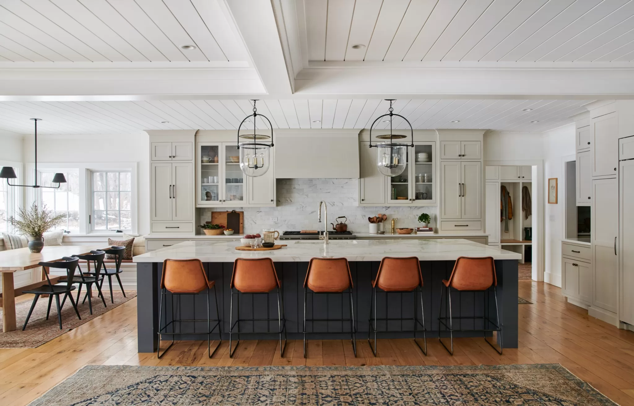
Here’s the shade paired with an off-black paint for a modern look that’s not harsh.

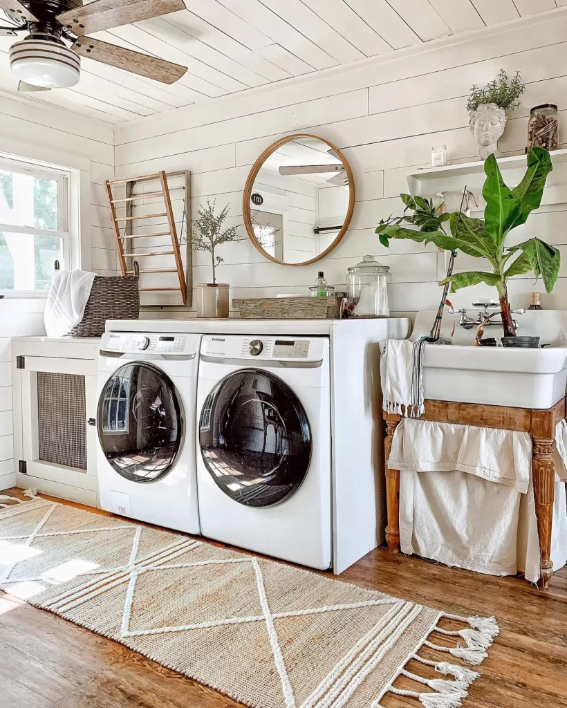
I think Alabaster shines in spaces with a rustic touch, like the home of blogger Liz Marie.

Here’s another example of how fab the hue looks in a rustic space.

Here’s a look at Alabaster on an exterior. It looks like this photo probably has a filter on it, which can warp the true look of the color, but it also brings up a good point, which is that colors tend to look lighter/brighter on exteriors than they do in interiors.
Colors like Sherwin Williams Alabaster

If you’re considering Alabaster, but want to check out a few other similar shades, here are three that I find to be very similar, plus how they compare to SW Alabaster.
Sherwin Williams Alabaster vs. Benjamin Moore White Dove

Alabaster and White Dove are often chosen because they are off white paint colors that are soft, but not yellow-toned. Overall, Sherwin-Williams Alabaster is a bit creamier because it’s undertones lean more beige, whereas Benjamin Moore White Dove has a hint of gray, giving it a slightly cooler appearance
With an LRV of 83, White Dove is also a tiny bit lighter than Alabaster, which has an LRV of 82. .
Sherwin Williams Alabaster vs. Snowbound
Snowbound is another of Sherwin Williams most popular whites. You can see in the photo, above, however, that Snowbound is a touch lighter than Alabaster (It has an LRV of 83 vs. Alabaster’s 82).. Snowbound also has warmer undertones, while Alabaster’s are more greige.
Sherwin Williams Alabaster vs. Pure White

And finally, if you’re looking for an off white with just the slightest hint of warmth, there’s Sherwin Williams Pure White. Unlike the name suggests, it’s not a pure white, but instead has an LRV of 84. While it’s the brightest color I’ve mentioned here, it’s definitely not a pure white. Instead, it’s got a touch of creamy yellow, which makes it also similar to Benjamin Moore’s Simply White.

Don’t Forget the Samples!
I LOVE Samplize peel-and-stick paint samples for trying paint colors at home. They’re easy to use, and they offer overnight delivery.


2 Comments