Benjamin Moore Wales Gray Review
Would you like to save this?
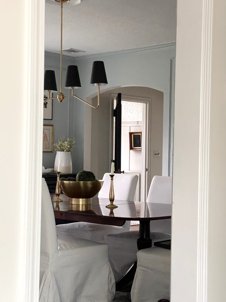
A few months ago, I decided to change the paint color in my dining room from Benjamin Moore Simply White to Benjamin Moore Wales Gray.
This might not seem like a huge deal, but it was a pretty big one to me. You see, for about a decade, I have strictly painted the big, main living areas in my home shades of white. But suddenly, I just had an urge to do something a little richer and more inviting.
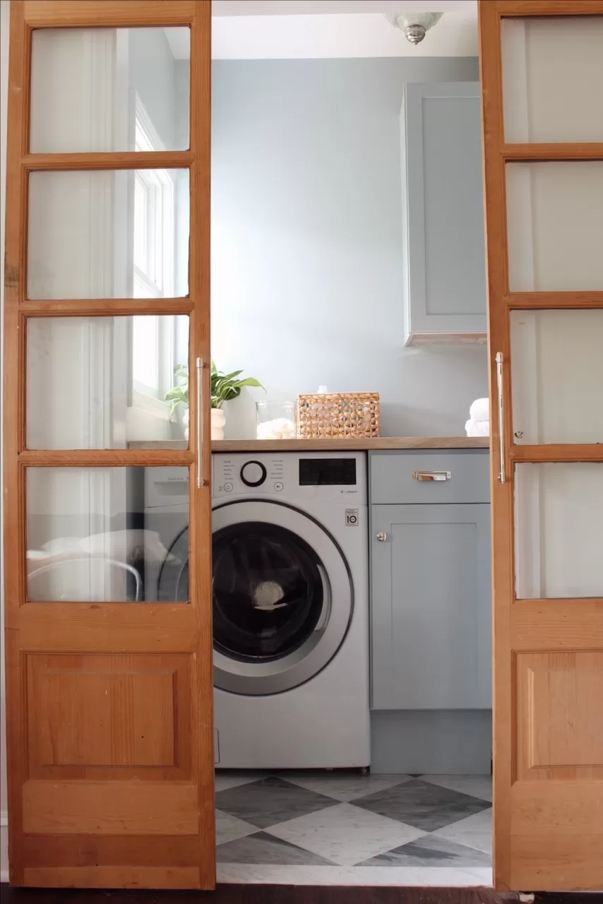
When it comes to adding color in my home, I always go for greens and blues, so I knew I wanted to do one of those two hues. I’d just painted our powder room Sherwin Williams Palm Leaf, and the laundry room Benjamin Moore Smoke, so I started the process by using some leftover paint and paint samples from those projects to see if anything worked in the space.
After doing that, I realized I wanted to go in the blue direction. I actually tried some of the Smoke paint I had left over, but it felt more blue in the dining room than it did in the laundry room, and I tend to like my paint colors to look a little muddy and muted.
But! I was able to use Smoke as a jumping off point. I did some research online, looking for colors similar to Benjamin Moore Smoke but a bit more gray or neutral toned. My two finalists were Benjamin Moore Boothbay Gray and Benjamin Moore Wales Gray. After getting paint samples, Boothbay Gray felt much more like a cool gray paint color, which Wales Gray was the exact sophisticated blue-gray paint color I was looking for.
Wondering if Wales Gray is the one? The easiest way to know for sure — grab a peel-and-stick sample and see it in your actual space.

What color is Benjamin Moore Wales Gray?

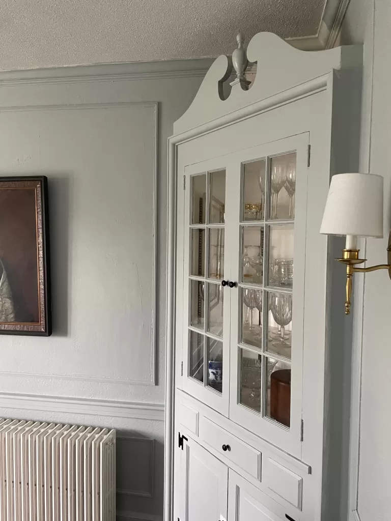
Benjamin Moore’s Wales Gray is a mid-toned gray paint color with a blue-green undertone. It has an RGB value of 139, 140, 132, and a hex code of #BBC4C2. The color is named after the country of Wales, and feels sophisticated, tranquil, and timeless.
Depending on the lighting and surrounding colors, the color of the paint can read either more blue-toned, or more gray-toned (which is why I always, always get paint samples)
Wales Gray can work well with both traditional and modern spaces, and pairs well with both warm and cool accent colors.
Benjamin Moore Wales Gray LRV
Wales Gray has an LRV, or Light Reflective Value, of 53.54, which means it’s a medium-toned color.
If you aren’t familiar with LRV, or Light Reflective Value, it’s a measurement of how dark or bright a paint color is on a scale of 0 (black) to 100 (pure white). The higher the LRV, the more white a color has it it, so the more light it reflects, and the lighter the color looks.
There are no paint colors that are 0 or 100, and most tend to fall on a scale of 3 to 96. Shades like Benjamin Moore Simply White, a very bright white with a touch of warmth, has an LRV of 93.
By comparison, Benjamin Moore Hale Navy, a dark blue, has an LRV of 6.
Shop top-selling gray-blue paint color samples, here:
Is Benjamin Moore Wales Gray Gray or Blue?
For this question, I have an age-old answer. It depends. As I mentioned, the color can look both blue and gray depending on the lighting. To me, it’s more of a blue color. When I walk into my dining room, I consider the walls to be blue. So, if you’re looking for more of a neutral gray paint color, I’d skip this one. But if you want something light blue, but not baby blue, Wales Gray should be a contender.
Benjamin Moore Wales Gray vs. Smoke
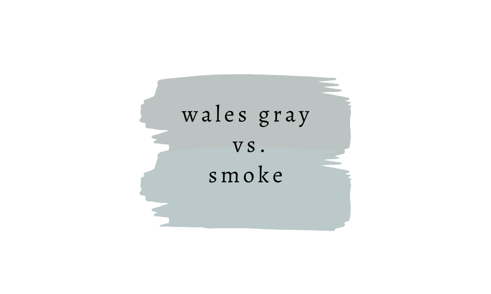
As you can see above, Benjamin Moore Wales Gray and Benjamin Moore Smoke are pretty similar. I have both in my home so I can attest to this. The main difference is that Smoke is a touch lighter than Wales Gray and also noticeably more blue.
Benjamin Moore Wales Gray vs. Boothbay Gray
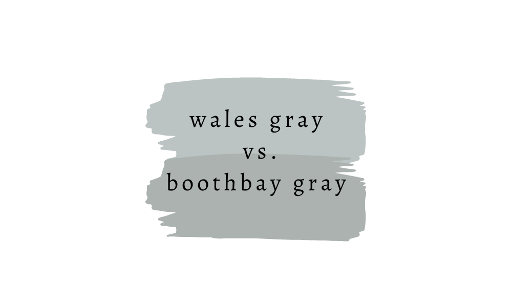
I mentioned earlier in the post that my two top color choices for my dining room were Wales Gray and Boothbay Gray. You can see above that Boothbay Gray is noticeably more gray, and also darker. However, it didn’t look quite this gray in my room. Definitely more of a true gray, though, with a touch of blue-green, if that’s what you’re looking for.
Another interesting note here – notice how, when compared to Boothbay Gray, Wales Gray looks more like gray color? But when placed next to Smoke, it looks more blue? The colors in your room and the lighting of your home truly do affect the way a paint color looks, which is why, again, I say you always need a paint sample!


Thank you so much. I’m so glad I found this article because these two colors (wales and boothbay) are our exact two contenders for our house exterior after agonizing for a while between charcoal and lighter shades! I am torn and appreciate both colors. My husband wants that splash of color, which I do think we would get with both. I’m a little afraid of wales looking to cape-cody when we don’t live near the water (horses on my block…my yard is full of fruit trees and tons of flowers, plants). I adore these shades and have beachglass in our bedroom. We did just do a sunroom with open windows overlooking the yard.
Which white or off white trim would you go with? We will be doing the flower window box black and a black front door. Thank you!
*too cape-cody. I love the color though. What would you choose for an exterior? We are in a ranch and have cedar shake siding.
Hi Jennifer! Can you do a sample of each? I have a feeling that the blues in Wales Gray may look much brighter on an exterior given all that natural light, but it also depends on your lot. BM Decorator’s White is always a great choice for outdoor trim work, since it has almost no undertones, and it’ll work with cool colors like Wales Gray and Boothbay Gray!