Sherwin Williams Palm Leaf Review + Photos in my home
Would you like to save this?
After much (too much?) deliberation, I chose Sherwin Williams Palm Leaf as the paint color for our powder room renovation. Let me tell you, I’m not kidding when I say I tested and considered over a dozen olive and sage green paint colors, and Palm Leaf came out on top.
I was going for a very specific look and effect. I wanted the color to play well with the other finishes in our room, which are gray and white marble, and brass, which is why I tested both sage and olive hues, to see what worked better. (Olive won, can you tell?) Our powder room also has no windows, which affected how the colors read in the room.
In case you’re curious, some of the other colors I tested included Benjamin Moore Mediterranean Olive, Benjamin Moore Southern Vine, and Farrow & Ball French Gray (a sage tone). Going into it, I thought Mediterranean Olive would be my winner, but it looked a bit dull in the room, for lack of a better word. Palm Leaf felt more crisp, and like a true green. Southern Vine was too dark, almost brown-black. And I ruled out French Gray because I decided against sage.
Palm Leaf is an absolutely beautiful color, but I was actually a bit surprised by it, because in some of the photos I’d seen of it online, it looked more yellow-toned, almost like a deep chartreuse (see example photos below). The dark tone it takes on in my powder room is because there are no windows, so it may look different in your space if it’s light and bright.
If you’re considering this hue for your paint project, here’s a breakdown of its color properties, why I chose it, complimentary hues, and more.
What color is Sherwin Williams Palm Leaf?

Sherwin Williams Palm Leaf is a deep yellow-green. As you can see from my photos, this color is pretty dark. It has an LRV, or light reflective value, of 10, which means it’s almost as dark as colors like BM Hale Navy, but not quite. If you’re not familiar with LRV, it is a measurement of how dark or bright a paint color is on a scale of 0 (black) to 100 (pure white).
What I like about it, though, is that it’s not so dark that it starts to read brown or neutral, which can happen with some greens. This was why I didn’t choose Benjamin Moore Southern Vine. It’s technically a green, but looked almost brown-black on my walls.
Is Sherwin Williams Palm Leaf Too Dark?
Whether or not Sherwin Williams Palm Leaf if too dark for your room depends on a few things, including:
- How much natural light your space gets
- The style you’re going for
- What else is in your room
Despite the fact that my powder room gets zero natural light, I did not think Palm Leaf was too dark. The lack of light conceals some of the color’s yellow undertones, making it appear more like a true olive. I liked that look, so it was perfect for me.
As far as style goes, I wanted a dark, moody room. I don’t have many of those in my house, and this little space was my chance. If you are into moody and aren’t afraid of color, you’ll love this shade.
Finally, the items in the rest of the room will also affect how dark or light the color looks. My bathroom has gray and white marble tiles and a marble sink, which help reflect what light is in the space. I love that the dark wall color also adds contrast to the marble elements, helping them to stand out.
Photos of Sherwin Williams Palm Leaf
Because color reads differently in every home, I wanted to share a few other photos I found of Palm Leaf online, to show some of the variations and undertones that show up depending on your lighting and style.
Palm Leaf in a bight kitchen
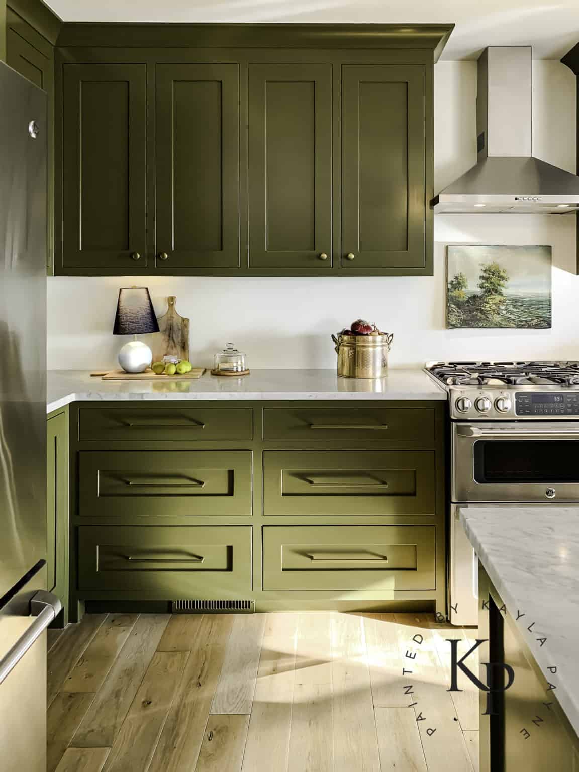
Oh my goodness how gorgeous is this kitchen? Blogger Kayla Payne painted her cabinets Sherwin Williams Palm Leaf, and I think the result it stunning. As you can see, the brightness of the room and the pale-toned floors bring out the yellow undertones in the color.
Palm Leaf on Interior Doors

Here’s an example of Palm Leaf used as an interior door color in the kitchen of Haneen’s Haven. Since it’s paired next to darker cabinets and flooring, the color reads less yellow and vibrant, similar to how it shows up in my bathroom.
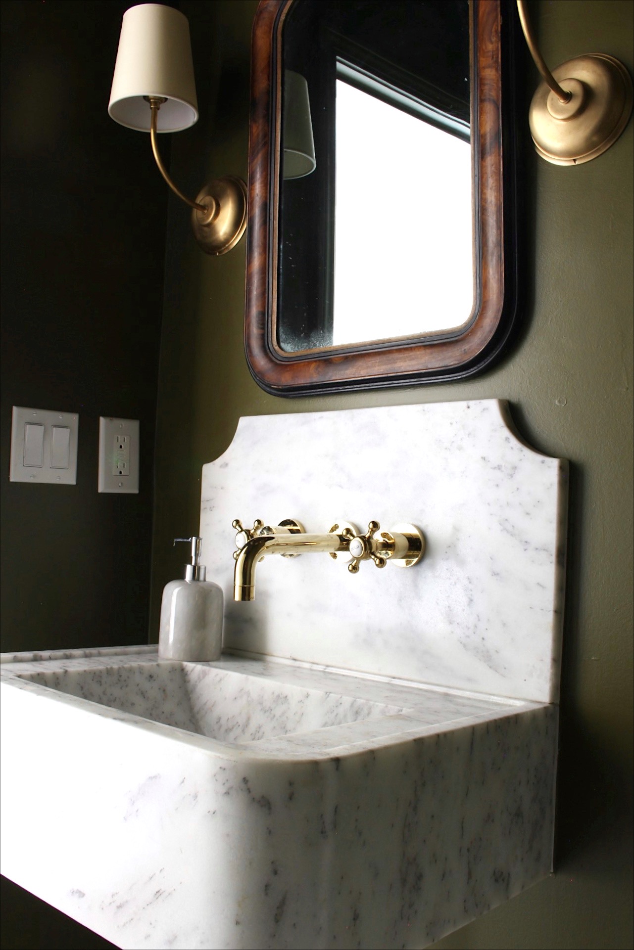
Palm Leaf in the bathroom

This is another photo from Haneen’s Haven, and it was actually the photo that inspired me to try Palm Leaf. I just love how to color comes across here! I think this photo is a good example of how the color looks in person, at least to me.
Colors that go with Palm Leaf
Personally, I think Palm Leaf makes a good ‘star of the show,’ meaning that it works against colors that are more neutral and muted. It’s a bold color.
As you can see in almost all of the example images above, it was used with mostly whites, blacks, wood tones, and marble, which I think make gorgeous complements.
If you’re looking for a white color to pair with Palm Leaf, try Benjamin Moore Simply White. It’s the color in the hallway outside of our powder room, and it looks great against the green when the door is open. I attribute this to the fact that Simply White has green-yellow undertones, so it’s a natural complement!