Benjamin Moore Hale Navy: Is it the Right Color For Your Room?
If you’re considering using Benjamin Moore Hale Navy in your home, you’re in the right place! I’ve used this beautiful navy blue paint color four times in my own homes over the last ten years. Once in my dining room, once in my husband’s office, once in my sons’ room, and once as an accent color in a kitchen.
Would you like to save this?
Clearly, I love the color, but I’ve also learned some things about when and where Hale Navy shines, and when it’s just not the right choice (I’ve had both experiences!).
So, to help you decide if it’s a potential hue for you, I’m going to cover everything you wanted to know (probably more than you’ve wanted to know) about Benjamin Moore Hale Navy. Let’s get into it!
Wondering if Hale Navy is the one? The easiest way to know for sure — grab a peel-and-stick sample and see it in your actual space.

What Color Is Hale Navy?
Hale Navy is a dark navy blue paint color with gray undertones, which, in my opinion, makes it a touch more sophisticated than a classic navy blue. Don’t get me wrong, navy blue on its own is a very sophisticated color. But, perhaps it’s because I’m mom of two boys, but it reminds me a lot of kids clothing and boy nurseries. Hale Navy, with it’s gray tones, feels more like an adult version of that classic, true navy.
According to Benjamin Moore, the color is “A timeless classic,” and a “deeply saturated shade of navy blue that evokes rich maritime traditions and storied exploits at sea.” It’s part of the company’s Historical Collection, which is inspired by American landmarks, traditions and history.
Shop peel-and-stick paint samples of top-selling Navy blues:
Hale Navy LRV and Undertones
Hale Navy has an LRV, or Light Reflectance Value, of 6.3. Light Reflectance Value is a measurement of how dark or bright a paint color is on a scale of 0 (black) to 100 (pure white). An LRV of 6.3 means that Hale Navy is pretty dark as far as paint colors go.
How this impacts the look of your room will largely depend on the level of light your room gets, and how you plan to use the color. I will tell you from experience that if you use the color in a room with little natural light, Hale Navy can be overwhelming, and make the room feel dark. In a space with a ton of natural light, though, the color looks more like a rich navy.
I’ve included photos of how it looks in both darker and lighter rooms, below.
As far as undertones go, I mentioned that Hale Navy has a grayish tint that makes it feel more muted than a true navy. This means that, even though it’s a bold choice given how dark it is, it’s not in-your-face or loud. It can be a moody backdrop for an entire room, or it can create a focal point as a color for a kitchen island, accent wall, or piece of furniture.
Its RGB color values are 67 red, 75 green, 86 blue, or in other words, it’s 26.67% red, 29.8% green and 34.12% blue.
Is Benjamin Moore Hale Navy too dark?
One of the biggest questions around Hale Navy is, is it too dark? The answer is: That depends, and it depends primarily on where you use it.
I’ve used Hale Navy in a room with a ton of light (see above!) and it looks almost like a bright blue. I was actually quite shocked by this when I painted the hood above our stovetop in Vermont, and I even checked the paint color multiple times to make sure I hadn’t accidentally ordered the wrong color.
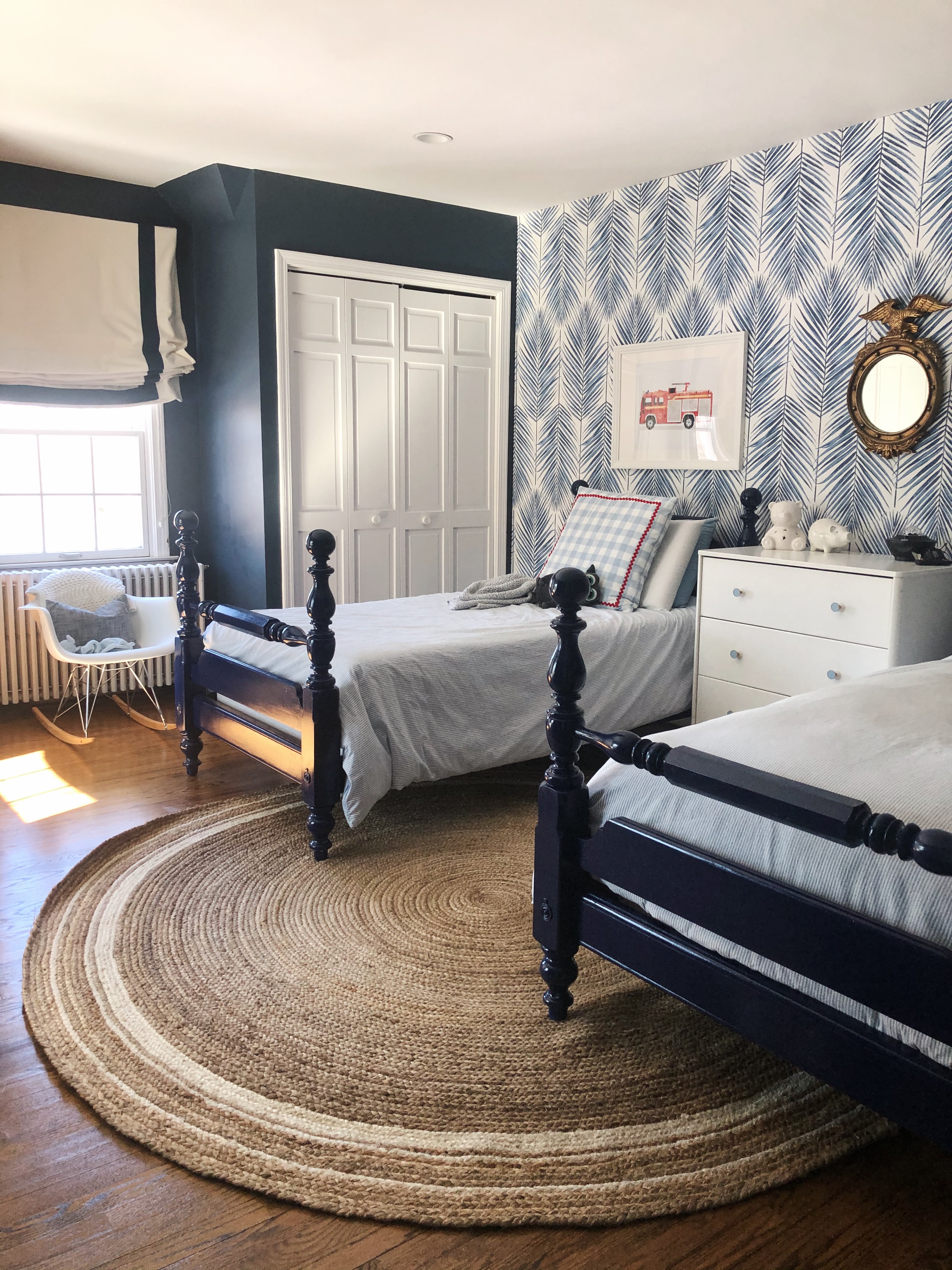
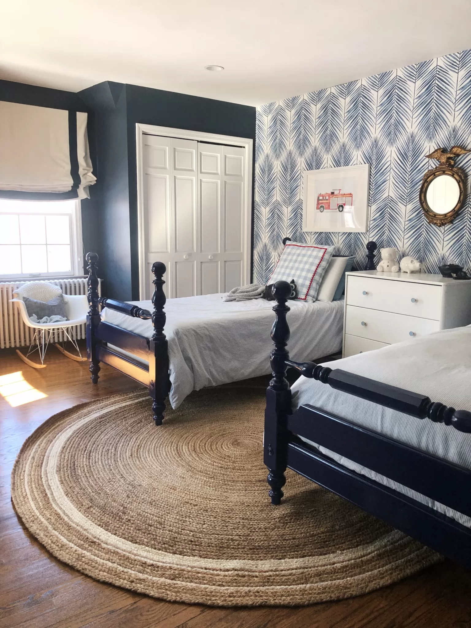
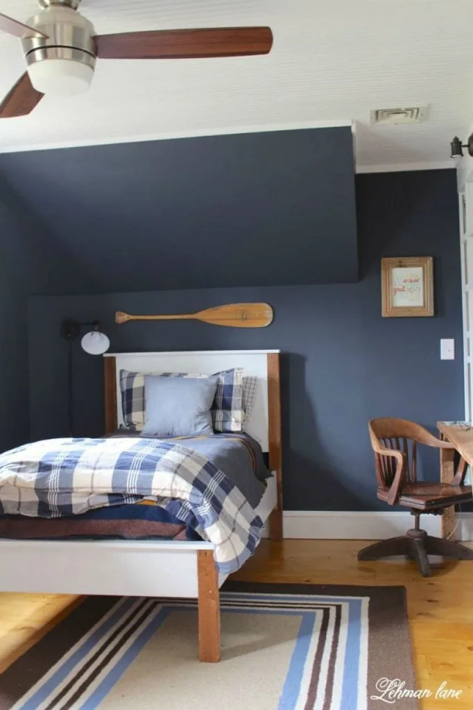
At the same time, I also used Hale Navy on all four walls of my sons’ bedroom, which gets little natural light, and the color was too dark. Like, to the point where I felt like it was hard to see. Eventually I added a wallpaper accent wall to bring some light back into the space, and repainted the whole room in a lighter shade a few years later.
The way the color will look in your home totally depends on the lighting in the space, the furnishing you use, and the other colors you pair it with. I always, always suggest getting a sample of a color before painting it on a wall.
Photos of Benjamin Moore Hale Navy
As I mentioned, I’ve used this color a bunch of times, starting back in 2014, and as recently as this year.
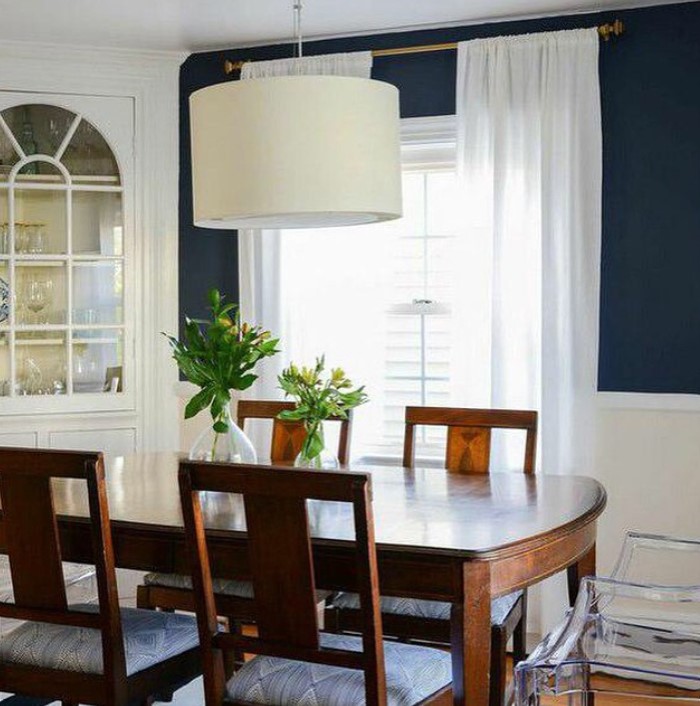
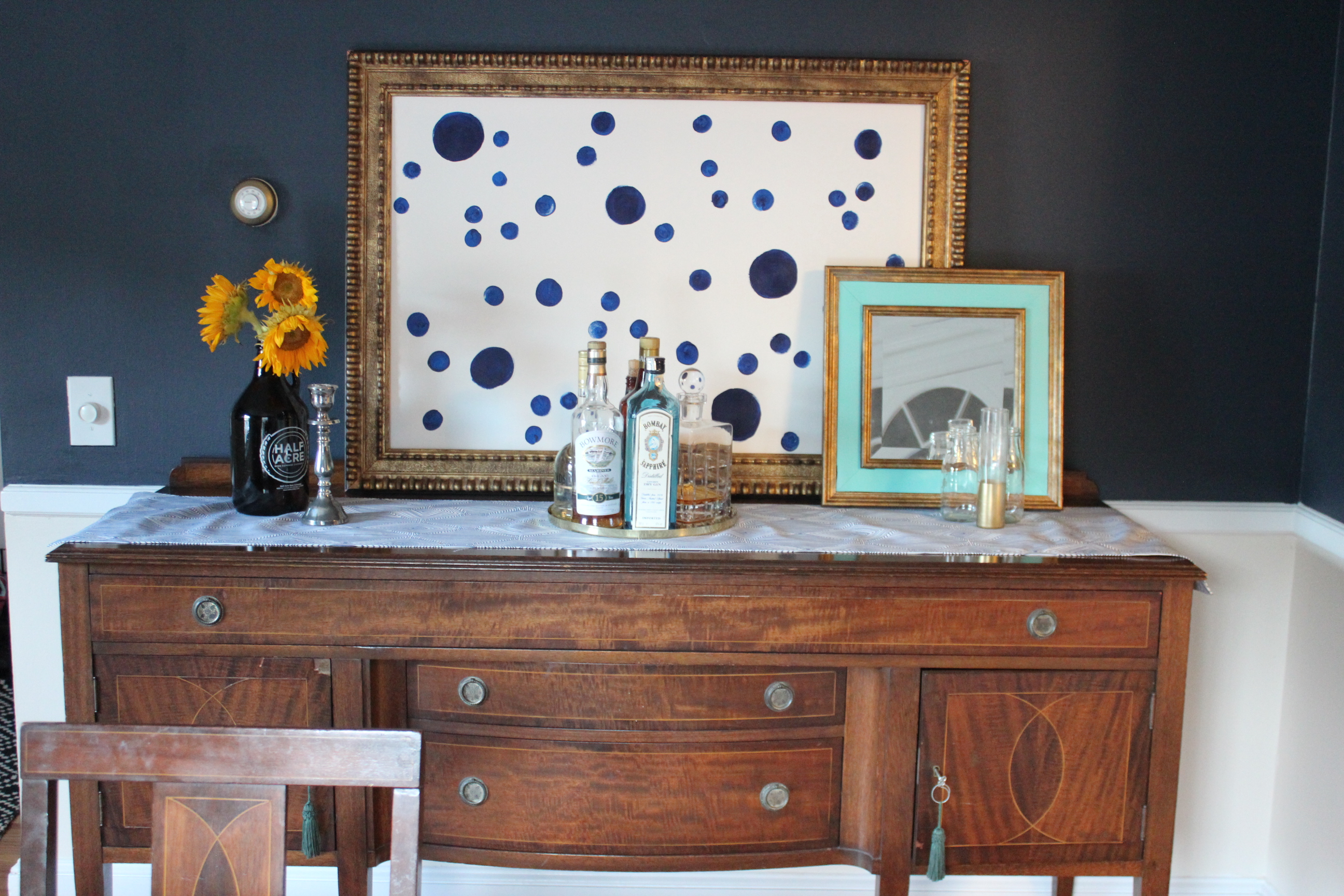
The first time I used it was as a wall color in the dining room of our small Cape Cod-style home in. (Please excuse my awkward bar styling, this was my first house). The room had windows facing East and North, and got an average amount of light. In my opinion, it was a just-right shade in this instance.
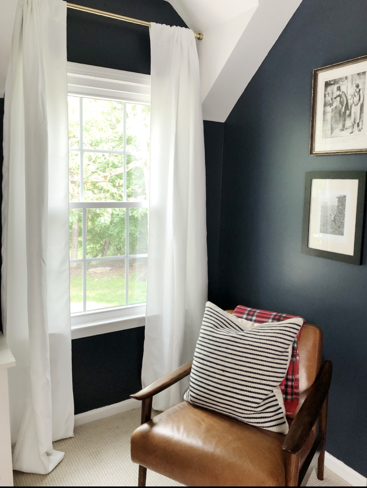
The next time I used it was in our current home, in the bedroom my husband uses as his office. This room has windows that face north and south, and it gets an average amount of light. It’s not flooded with light, but it’s not dark and shadowy, either. The color reads very similar to how it read in the dining room in our old house, a deep navy blue.
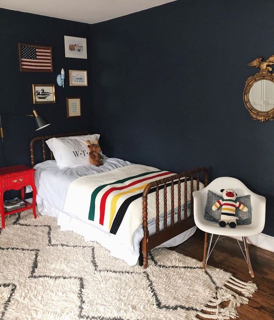
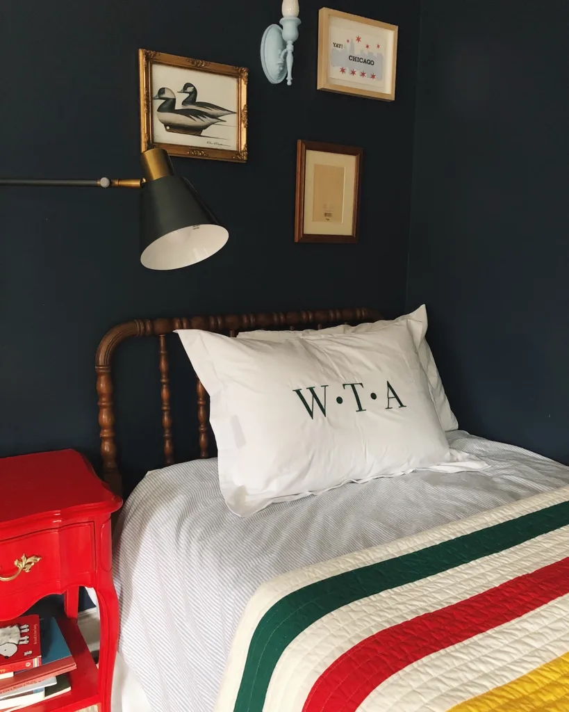
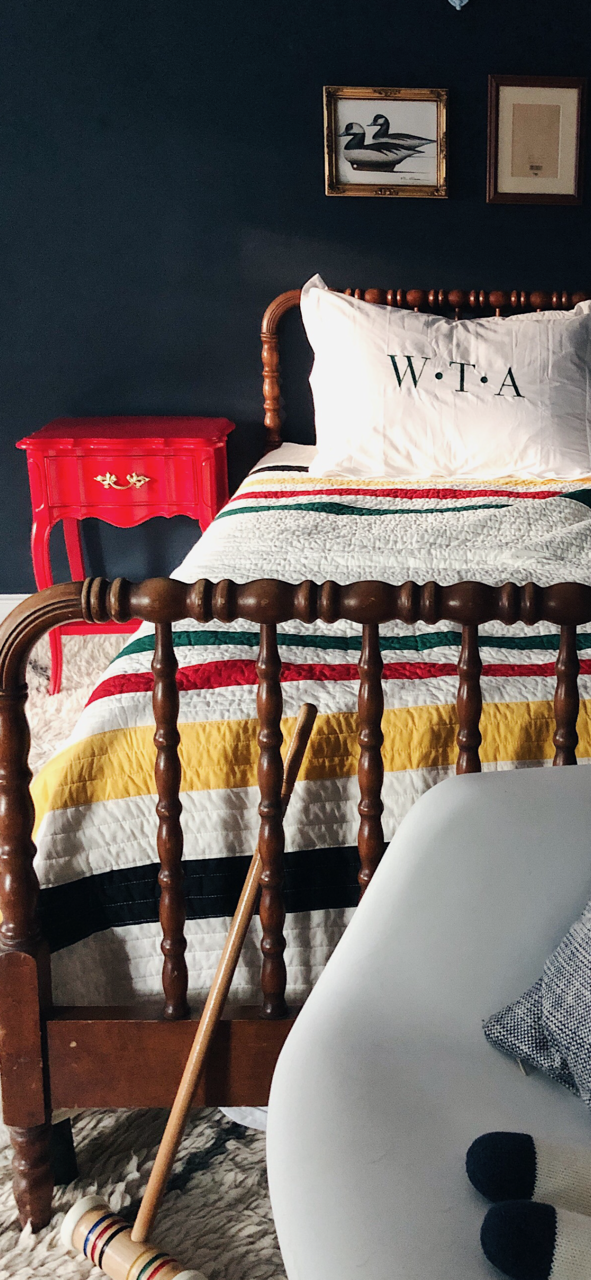
After I painted my husband’s office Hale Navy, I started working on my son’s ‘big boy’ room. He was three at the time, and when I was choosing a paint color, he was adamant that we use the same color I used in daddy’s office. I listened. to him, and painted his room Hale Navy. Which, it turns out, was not really the best idea.
His bedroom has two windows, one that faces North, and one that faces West, and it doesn’t get great light during the day. Because of this, Hale Navy is a tad too dark in this room. After I painted it, I had to add a couple of extra lamps even though the room has recessed lighting. The good news is that, with the blackout shades we have in there, the room looks like it’s the middle of the night even at noon, which is great for naps. Eventually, though, I wallpapered one wall of the room to brighten it up, which worked wonders.
Here’s the room when I first painted it.
And here it is after I redecorated a bit and added the bright wallpaper.
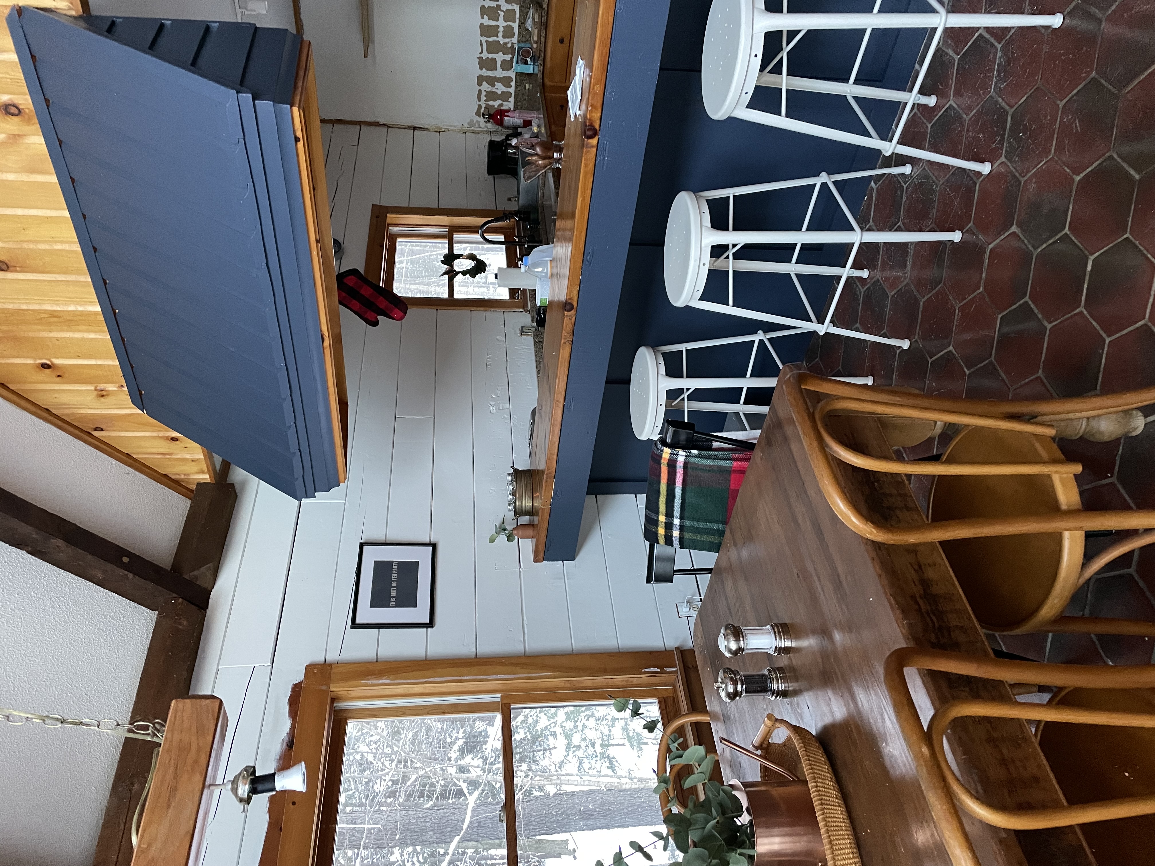
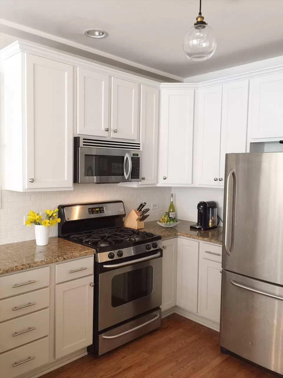
Finally, I used Hale Navy in the kitchen of our Vermont log cabin. I wanted a dark, moody blue to the base of the bar and range hood, and I went with my go-to, Hale Navy. But, the kitchen is part of a large, open great room that has a huge wall of south-facing windows in it. I painted the kitchen at night, and when I woke up the next morning I realized the shade was actually too bright in this case! I literally checked the paint can a few times to make sure I actually had the right color because it looked so saturated and bright.
What I learned here is that, if you’re planning to use Hale Navy in a room that gets very little light, or a whole lot of it, paint a big sample area and look at it in the morning, in the afternoon, and at night. This will give you a good idea of how it will look in the room, and is well worth the $7 you’ll pay for a sample pint at the store. Or, try ordering peel-and-stick paint samples, which are inexpensive and make it super easy to test all sorts of paint colors in a few minutes.
What color goes with Hale Navy?
Hale Navy is an excellent complement to warm neutral tones. According to Benjamin Moore, colors that go with Hale Navy include White Dove, Coventry Gray, Lenox Tan, and Glacier White.
Alternatives to Hale Navy
If you’re looking for colors that are similar to Hale Navy to compare it to, here are a few popular shades that are close to consider:
- Farrow & Ball Hague Blue – Hague Blue is a few shades lighter, slightly brighter, and more green
- Benjamin Moore Polo Blue – A greener, deeper blue than Hale Navy
- Portola Paints Newton’s Indigo – This color is just as dark as Hale Navy, but reads more blue-gray
- Benjamin Moore Old Navy – If you’re looking for more of a true navy without they gray that Hale Navy has, try Old Navy
- Benjamin Moore Mysterious, Evening Sky, Blue Note, and Baby Seal Black are the closest colors to Hale Navy, according to the brand.
Hale Navy Vs. Three Piece Suit (Formerly Known as Polo Blue)

Hale Navy and Three-Piece-Suit / Polo Blue are two of Benjamin Moore’s most popular dark navy paint colors. They’re similar, deep navy colors, but with subtle differences that make it important to pick the right shade for your project.
First, while both of these colors are dark, Polo Blue is slightly darker than Hale Navy. Polo Blue has an LRV of 5.67, while Hale Navy has an LRV of 6.3. So, if you’re looking for a paint color for a room that gets limited natural light, or that’s north-facing, the slightly lighter Hale Navy might be your best bet.
Polo Blue is also a bit more of a gray-blue than Hale Navy, and can read almost charcoal or black in certain lights. While Hale Navy also has gray undertones, they’re slightly more pronounced with Polo Blue, and Hale Navy tends to read more like a true navy.
Hale Navy Vs. Sherwin Williams Naval

Naval is one of Sherwin Williams most popular navy blues, and a common alternative to Hale Navy. The main difference between the two, for me, is that Naval is more of a berry-colored blue, and it has more blue undertones. Hale Navy, on the other hand has gray undertones that Naval doesn’t have. So, if you want something more blue or with blue-purple undertones instead of blue-gray ones, Naval is a good bet.
Hale Navy Vs. Farrow & Ball Hague Blue

Hale Navy is one of Benjamin Moore’s most popular colors, while Hague Blue is one of Farrow & Ball’s most popular blue hues. Hale Navy is a slightly darker shade of blue than Hague Blue.
The Hale Navy RGB color values are 67 red, 75 green, 86 blue, or in other words, while Hague blue is 62 red; 78 green, 86 blue, which means Hague Blue is also a bit more green than Hale Navy.
To the naked eye, Hale Navy appears to be more of a gray-toned blue, also.
Hale Navy Vs. Evening Sky

If you love Hale Navy but want something a touch lighter, try Benjamin Moore Evening Sky. According to Benjamin Moore, it’s one of the closest colors to Hale Navy, but it’s a slightly lighter color.
Overall, regardless of how this chameleon color changes based on lighting, it’s still one of my favorite paint colors, and I’m not alone.


So what did you end up using for the Vermont kitchen? Inquiring minds want to know! 🙂
I did all sorts of things and eventually painted it Benjamin Moore River Rock!
What are your thoughts on Hale Navy for an east-facing bedroom?
I love this article on Hale Navy! I live in Northern California, and am considering painting the exterior of my house Hale Navy. (Note, I still plan on keeping my western facing side lighter – only the neighbor behind me would notice the difference). What do you think of Hale Navy as an exterior?
I like it! But a few things to note: I find it looks a lot blue-er in full sun, and it’s a very dark color so it can make your siding get really hot – something to consider! I would definitely get a sample to see how it looks first.
We had it in an East-facing bedroom and it looked very dark. We only have 2 windows in that room, though, which contributed to the darkness. But, it depends on what you’re going for. Benjamin Moore Blue Note and Evening Dove are slightly lighter alternatives!