How to Create a Whole Home Color Palette (And A Free Neutral Color Palette Sample)

Would you like to save this?
Choosing paint colors can get mind-numbing pretty quickly, especially when you’re trying to create a color palette for your whole home that makes your space feel coordinated. That’s a lot of decisions. But, it’s definitely worth the effort to choose your paint colors with intention, since the right ones can enhance the atmosphere and flow of your home, and set the stage for your personal decorating style.
Whether you’re having your new house painted before you move in, or you’re simply painting a couple of rooms and want to make sure every area of your home feels like it belongs under the same roof, you’re in the right place. After more than 15 years as an interior design editor, I’ve learned lots of tips for choosing paint colors — including how to create a whole home color palette that works, and I’m going to share them step-by-step in a way that will hopefully make the color-picking process far, far simpler.
At the end of this post, I’ve also included a link to a free download of a neutral whole-home color palette that’s timeless and versatile, in case you’re looking for a shortcut (or a roadmap for planning out your own whole-home color palette).
But first, here are the steps to creating your perfect whole-home-color palette.
Don’t Forget the Samples!
I LOVE Samplize peel-and-stick paint samples for trying paint colors at home. They’re easy to use, and they offer overnight delivery.
1. Look for inspiration

This may seem like a basic first step, but it’s important! The real key to getting your paint color scheme right is to have a plan. To have a plan, you need to know what you want to space to look and feel like. The best way to do that? Look for design inspiration, and SAVE what you like.
I like to search all of the usual suspects like Instagram, Pinterest, design websites, the portfolios of interior designers I like, print magazines, etc.
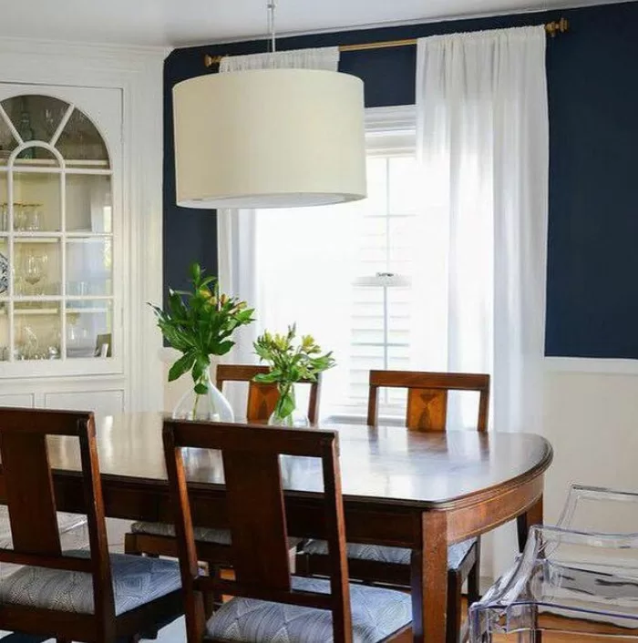
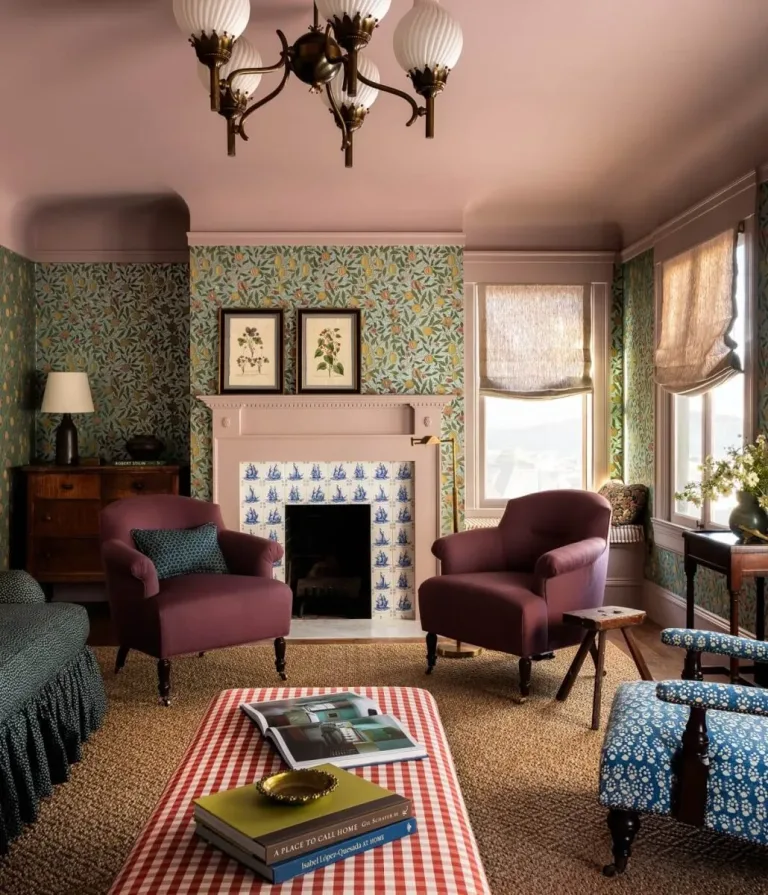
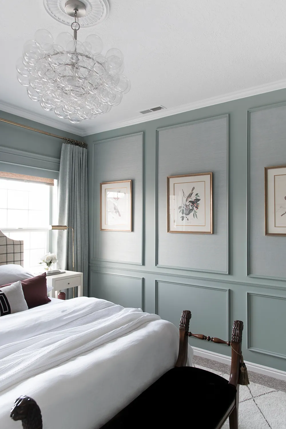
At the same time, inspiration can also come in the form of materials, rugs, a piece of art, bedding, or patterns you want to use in your space. If you’re planning to do wallpaper in one or a few rooms, now can be a good time to look for that, also. Wallpaper will not only dictate the paint colors you use in the room it’s in, but it’ll also guide the overall tones for the rest of your home. For example, if you have a muted, dusty green wallpaper in your dining room, you don’t want a brightly colored paint in the next room. You’re going to want to go for colors that share a similar tone.
Overall, saving inspiration and gathering material samples will give you clues about the colors you gravitate towards, whether you prefer neutral walls, pops of moody color here and there, or you really want more saturated, color-drenched spaces, and learning this will help you start to form a plan.
2. Choose a flow-space color.
Once you have a general idea of the vibe you’re going for in your home, it’s time to start investigating and choosing paint colors. I always like to start with the flow-space color. Your flow-space color is the one that leads you though your home’s connecting spaces, like foyers, hallways, and great rooms … any space that flows into another one without a natural end point, like a doorway or arch.
I like to start with the flow space color because it’s usually the most prominent paint color in a home, and it’s usually a neutral, so it can be an easier decision to make. It’s just a good way to get the decision momentum flowing, and your flow space color can also give you one more element to guide the rest of your paint color choices.
Like I said, flow spaces generally work best when painted a neutral. Years ago, I interviewed Chicago-based interior designer Ilene Chase for a paint color story, and I dug up our interview because I remembered she’d explained the reasoning for this really well.
She said: “Choosing a single color gives the house a common thread, and picking a neutral allows more flexibility with decorating. It also diminishes the risk that you’ll tire of the shade and have to repaint such a large area.” And there you have it.
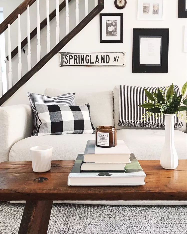
If you’re not sure about what neutral to pick, I suggest looking at the hard finishes of your home. These are things like flooring, countertops, backsplashes, things that can’t be changed. If they’re warm-toned, you’ll want a warm-toned neutral, and vice versa for cool tones. (I’m also always a fan of a soft off white, if you want to make the choice easy. My flow space color is Benjamin Moore Simply White.)
3. Learn a little color theory

Understanding how to classify color will help you ensure that your color palette flows, and also help you identify how to fix anything that feels “off” with your color scheme.
There are a few key ways to evaluate, or describe, color.
They are:
- Light/dark
- Dirty/clean
- Warm/cool
In general, you can mix light and dark colors, or warm and cool colors, in the same home and still maintain a cohesive color palette. In fact, it’s often a good idea to mix light/dark and warm/cool to create interest and set different moods for different spaces.
Where it gets tricky is in mixing clean and dirty colors. It can be done, but it’s difficult to do it right.
So to back up, let’s talk a little about clean and dirty colors, which is a concept known as “color purity.”
Clean colors are colors in their pure form, without any gray, brown or beige mixed in. These colors look brighter and well, more colorful. Like Kelly green, or royal blue. Pastels can also be clean colors.
Dirty colors have gray or beige mixed in. These colors tend to be more muted, like olive green or steel blue, but they can also be just touch more subdued than a pure, clean color, since dirty and clean are not absolute terms. You can see, below, how Benjamin Moore Green With Envy is just a smidge dirtier than Benjamin Moore Kelly Green, below.

In general, you want to choose colors in your house with a similar color purity.
This is because clean and dirty colors create completely different vibes and are suited to different decorating styles. Clean colors are preppy, happy, and energetic and work well with shades of crisp white and true black. Dirty colors are understated and sophisticated and tend to go best with earth tones, creams, and off-blacks. Because of this, walking from a room decorated in clean colors, to one decorated in dirty colors can be jarring and make it feel like you’re in two different houses.
Combining clean and dirty paint colors in the same room (i.e. one for walls, another for trim) can make the dirtier color look, well, dirty, so avoid this, too.
I do have two exceptions to this rule, though. They are:
- Kids rooms
- Powder rooms
Kids rooms are often outliers because they’re generally full of color and toys anyway, so you might as well make them fun. While I try to make my kids’ rooms reflect the overall vibe of our home, the paint colors in their spaces are definitely the most colorful in our home.
Because powder rooms are often teeny and windowless, I always like to make them a bit more fun, too. This means going for a bolder color or a bright wallpaper that might not be totally reflective of the rest of your home. My own powder room is painted Sherwin Williams Palm Leaf, which is almost like a mix between olive and chartreuse. It’s bold, but it’s perfect for the small space it’s in.
For an in-depth explanation of how to choose a paint color with an objective eye, give my blog post on the topic a read.
4. Plan it out

OK. So now that you’ve narrowed down your flow-space colors, you’ve gathered inspiration and you understand a little bit of color theory, it’s time to plan out your color scheme. This is the key step, because a plan will keep you on track and ensure your colors work together.
I always use a moodboard tool to do plan color schemes. I have a post about my favorite moodboard tools, both free and paid options.
Creating a paint color moodboard gives you a visual sense of how the colors will work together, and it’s a lot easier to try out different color combos on a screen than it is on your walls (which is the next step).
Here’s an example of a simple paint color palette. This one has more colors than you might need, but sometimes I like to do that to start and whittle down to my final selections.

A couple of tips on actually creating a paint color moodboard:
Once you know the names of the paint colors you like, then you just I look up the hex codes for these colors. Hex codes are 6-digit alpha-numeric color codes that you can find by simply Googling “Your brand / paint color hex code,” i.e. “Benjamin Moore White Dove hex code.” Once you have the hex code you just put it into the background or fill color field of whatever moodboard tool you’re using. In Canva, this looks like the below:

I just edit the colors as needed until I find a palette that looks good.
5. Test them IRL
The next step it to gather swatches of your colors. I either go to the paint store or order them online (Sherwin Williams allows you to order up to 10 of their small color cards for free), and I look at them in my home. This usually helps me weed out any definite nos. For anything I like, I’ll buy a full-size sample from Samplize.
If something doesn’t look quite right, I’ll often choose a similar shade that’s a bit lighter or darker. Don’t worry, if you change the color of one room a few shades, you don’t have to got back and edit your entire paint palette. The goal is to create a palette that feels cohesive overall, so as long as you aren’t making drastic changes, you’re good.
Want a short cut? Download my free 13-page neutral paint color palette and guide, below!


Information very helpful.
Yay!