How to Choose a Paint Color for Dummies – Your Complete Guide to Picking the Perfect Shade
Would you like to save this?
If you’ve ever found yourself staring at a wall covered in 12″ paint swatches about to pull your hair out in indecision, this post is for you.
As someone who does not count decision making as a strong suit, but is constantly redecorating and painting walls, I’ve had to come up with an objective process for choosing paint color – a set of guidelines that I follow in order to help me select the right shade for various rooms without, you know, pulling my hair out.
This process is what I’m going to share with you, below. By the end of this post, you’ll have a system for picking the right paint color for your space, instead of just guessing and hoping for the best.

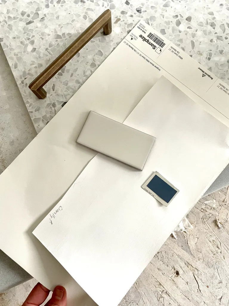
My Favorite Way to Sample Paint
I LOVE Samplize peel-and-stick paint samples for trying paint colors at home. They’re easy to use, and they offer overnight delivery.
Step 1: Look at Your Home
The first step in choosing the right paint color for your home is to evaluate what colors are currently in your space. Your home already has a color palette thanks to things like hard finishes and furniture, and your goal is to choose a paint color that complements these elements. (If you’re renovating or building new, pick out hard finishes before choosing a paint color!)
Hard finishes are the most important piece to consider here. They include things like flooring, tile, countertops, and cabinets – anything that’s attached to your home that you can’t change (or don’t plan to change). All of these elements have undertones that will naturally be complemented by certain paint colors.
If you’re not familiar with undertones, they are the underlying colors in a finish. They’re not necessarily the color you see right off the bat, like green or brown – those are called masstones. Undertones are the subtle secondary colors that create different shades of a masstone – for example, the difference between Kelly Green and Olive Green.
Undertones are described as warm, cool, or neutral, and they are literally the most important part of picking a paint color.
Warm undertones are reds, yellows, and oranges, cool undertones are blues, purples, and greens, and neutral undertones are things like beige, or an equal combination of warm and cool tones.
Your goal is to identify your home’s existing undertones, and choose a paint colors with those same undertones. This creates harmony in a space.
If you just moved into a home built in the early 2000s, for example, that has golden oak flooring, brown granite countertops, and a tan, Tuscan-inspired backsplash tile, your house has warm undertones. So you’ll want to choose a paint color that has warm undertones. That doesn’t mean you have to paint the walls tan or terracotta. But if you want to paint them white, you should choose a white with warm undertones (like Benjamin Moore Simply White or Swiss Coffee). If you want to paint the walls gray, go for a greige instead of a silvery blue-gray.

On the other hand, if you’re living in a contemporary space with lots of black and chrome and steely gray, then your space is cool-toned, and you’ll want to use cool-toned paint colors.
Your paint color should also complement the colors in your furniture, especially in rooms without a lot of hard finishes, like bedrooms or living rooms. Just like when you evaluate hard finishes, you should be looking at the undertones of your furniture and choose complementary paint colors..

If you find you have a mix of warm and cool undertones, or you’re having a hard time identifying the undertones in your home, you can choose paint colors with a neutral undertone. There are many, many colors with neutral undertones, that fit with either warm or cool spaces. (Benjamin Moore White Dove and Sherwin Williams Alabaster are two great examples of off white paint with neutral undertones).
To give you a cheat sheet (especially useful if you’re painting a new house that hasn’t been decorated yet) – warm toned paint colors tend to work best with traditional, transitional, farmhouse, country, French Country, Mediterranean, organic modern, and rustic-style spaces.
Cool tones are generally best for modern, contemporary, coastal, and industrial styles.
Step 2: Decide on the feel you want for your room
Once you’ve decided whether warm, cool, or neutral tones will be best for your space, you’ll want to think about the feel you’re going for in your room, since different paint colors will create different energies in your room.
In general:
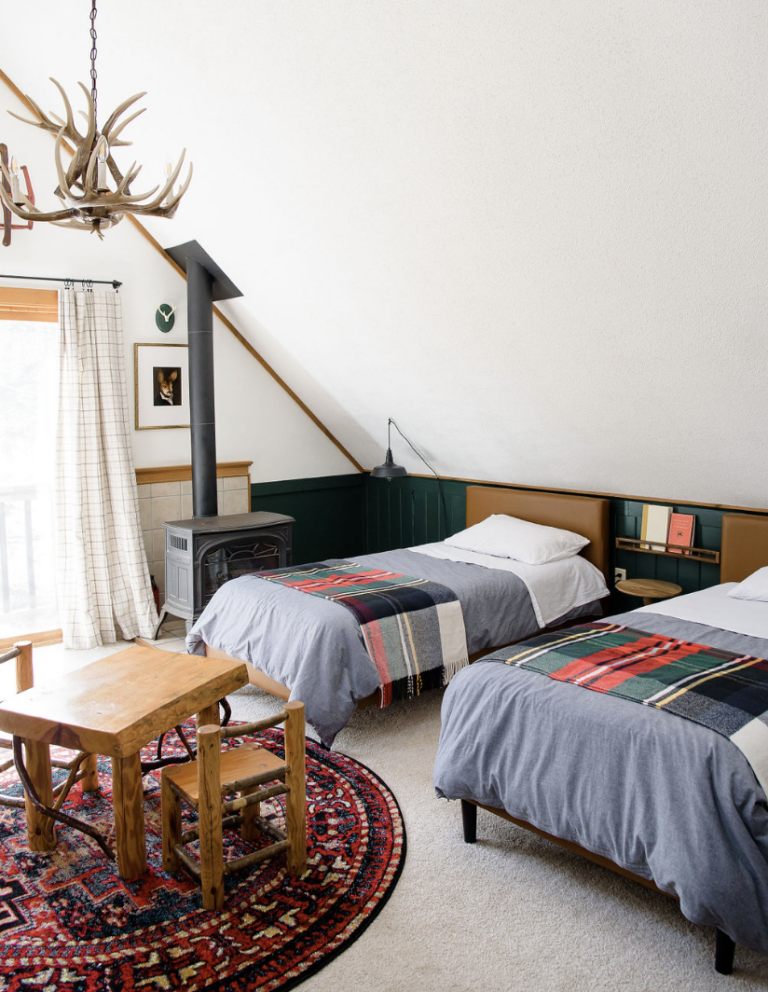
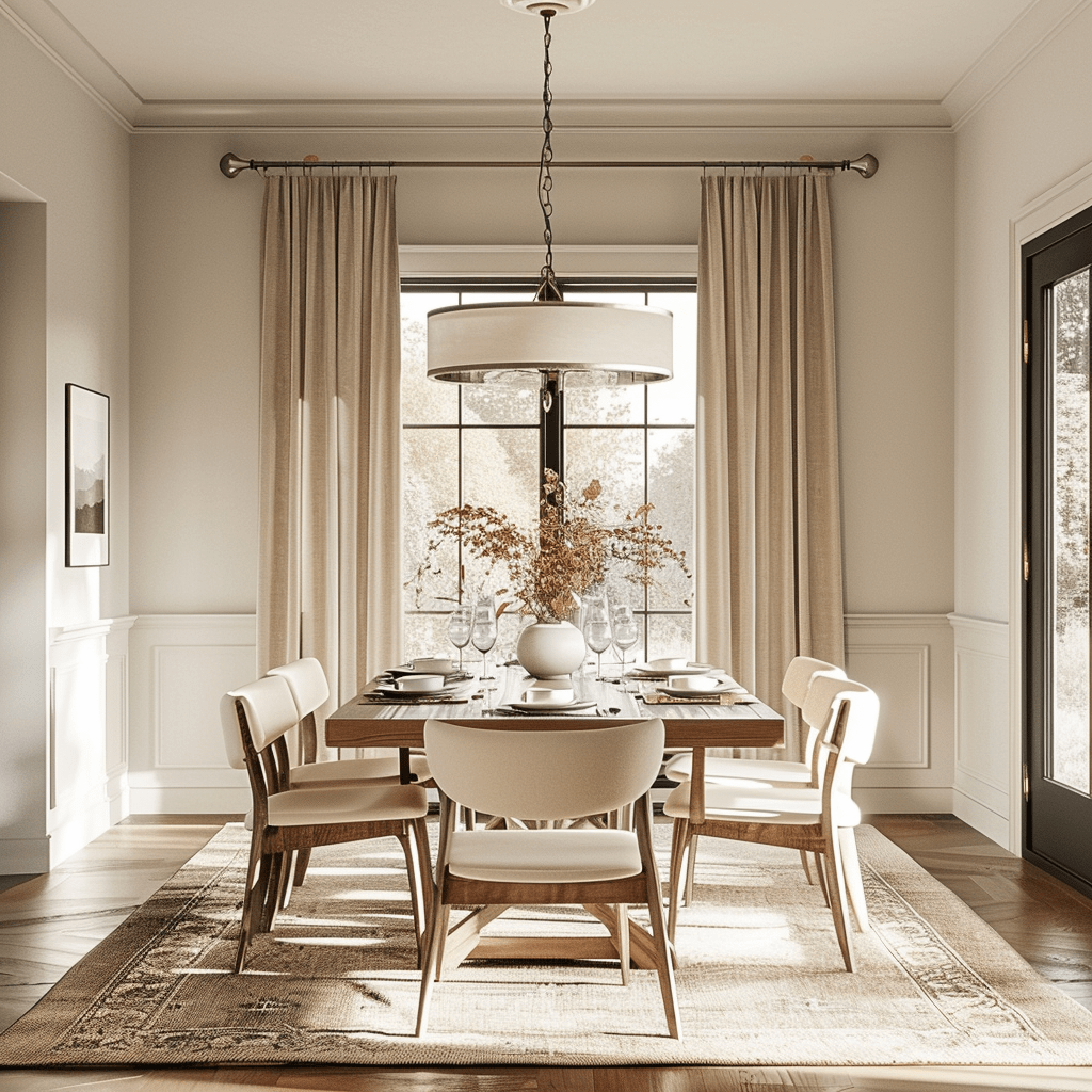
-Low contrast choices, i.e. paint colors that are a similar shade to your furnishings and hard surfaces, create a soothing, serene space. i.e. the room in the photo above.
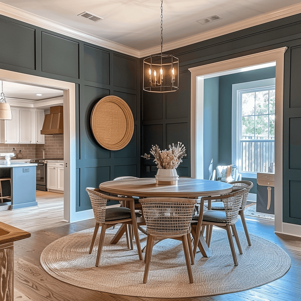
-High contrast choices, like pairing chocolate brown walls with cream-colored furniture, or charcoal walls with natural wood-toned furniture, will create a space that feels more high-energy and impactful.
Step 3: Gather inspo
Once you have an idea for the colors that’ll work in your space and the vibe you’re after, it’s time to look for inspiration. While it’s fine to write down particular colors you see online that you like and think will work in your space, you should also just get an idea of the broader color families you like, i.e. soft greige, or navy, or steely, mid-tone blue. Paint color looks very different in person than it does online.
I always save my inspiration images in a folder on my phone so I can take them with me to the paint store. Which brings me to my next point:
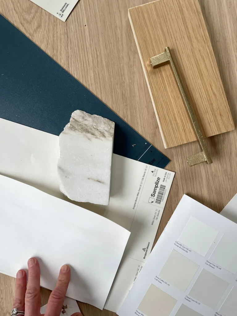
Step 4: Go get all the swatches
The next tip for choosing a paint color is to get paint color swatches in person – and to get more shades than you think. Be greedy with those paint swatches.

The reason? Paint color is deceptive.
Like I mentioned, it’s going to look different in your home than it does online, or in the paint store. It’ll even look different from room to room in your home.
So, with each color you like, I always recommend not just grabbing a swatch of that color, but all the swatches around it, too. I like to leave with 5-10 swatches per color. (You can also buy a paint brand’s fan deck, which is a little booklet-style tool with all of its paint colors).
I can’t tell you how many times I went into a paint store certain I found the color, and then as soon as I got that paint swatch out of the store and into the daylight, before I even got in my car, I knew it wasn’t right.
I always start with the small swatches from the store, because they’re free and you can grab a bunch of them and walk them around your house to see how the color looks.
Once you narrow it down to your 4-5 favorite swatches, then it’s time to get actual paint samples to test on your walls.
My Favorite Way to Sample Paint
I LOVE Samplize peel-and-stick paint samples for trying paint colors at home. They’re easy to use, and they offer overnight delivery.
FYI: Colors tend to look brighter on the wall than they do on a swatch or a screen! Something to keep in mind while you’re narrowing down your swatches.
Step 5: Learn Objective Ways to Evaluate Color
Once you get to the sampling stage of the paint color selection process, it becomes important to know how to evaluate color.
This is because, if you test a handful of paint colors on your walls but don’t 100 percent love any of them, or you find one you like but that’s not quite right for your space, you’ll know why the colors aren’t working and what to do next. It can also help you decide between a few two different shades that you like.
There are a few ways to evaluate, or describe, color.
They are:
- Light/dark
- Dirty/clean
- Warm/cool
Light vs. Dark
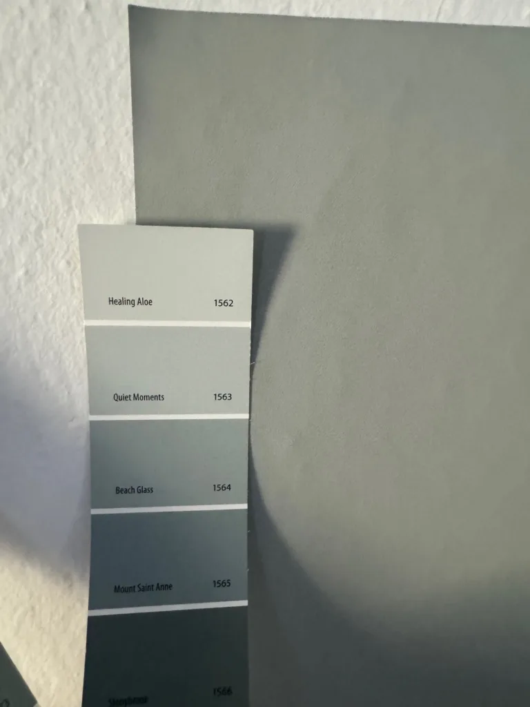
If you find a color you like, but it’s too dark for your room, you’re going to want to look for a similar shade with a higher LRV, or light reflectance value. LRV is a measure of how much light a paint color reflects. It’s measured on a scale of 0-100, with 0 being pitch black, and 100 being pure white. Thus, colors with a lower LRV are darker, and colors with a higher LRV are lighter.
Most paint brands list a color’s LRV on their website. If they don’t, you can ask the store or do an internet search. So, if the color you like has an LRV of 8.5, look for something at least 10 points higher, or something with at least 18.5, to give you a noticeable difference. Ditto for the opposite.
Clean vs. Dirty
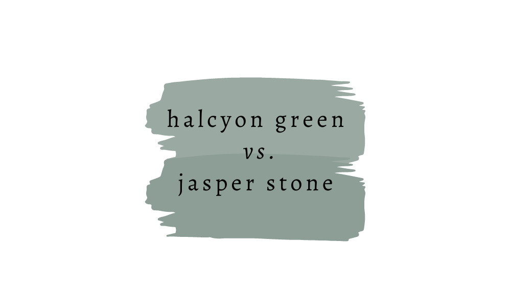
Paint colors can also be described as “clean” or “dirty.” This is known as paint color purity. Clean colors are colors with less gray or beige mixed in. These colors tend to look brighter and well, more colorful. Like Kelly green, or royal blue.
Dirty colors have gray or beige mixed in. These colors tend to be more muted, like olive green or steel blue, but they can also be just touch more subdued than a pure, clean color, like how Benjamin Moore Green With Envy is just a smidge dirtier than Benjamin Moore Kelly Green, below.

Dirty and clean are not absolute terms. They’re used to compare two colors, so one color is “dirtier” and one is “cleaner.”
If you find a color you like that just looks to bright, you need something dirtier, or with more gray/beige mixed in. The best way to do this is to take take the swatch to the paint store and compare it to other shades, looking for something that’s more muted and toned-down.

For example, when I was choosing a paint color for my sons’ room, I loved Sherwin Williams Sporty Blue, based on what I’d seen online and the paint swatches I got in the store. But, when I got home, it was too … blue. So, I ended up going with one of the other swatches I grabbed instead, Sherwin Williams Bracing Blue, which felt like a toned-down version of Sporty Blue.
It’s also important to keep color purity in mind when choosing trim colors or creating a whole house color palette, since colors with similar purity work best together!
Warm vs. Cool
The third and final way to evaluate color is warm vs. cool, which we talked about when we discussed undertones, but is worth addressing again.
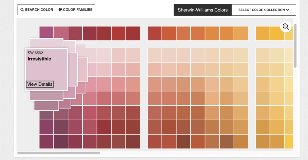
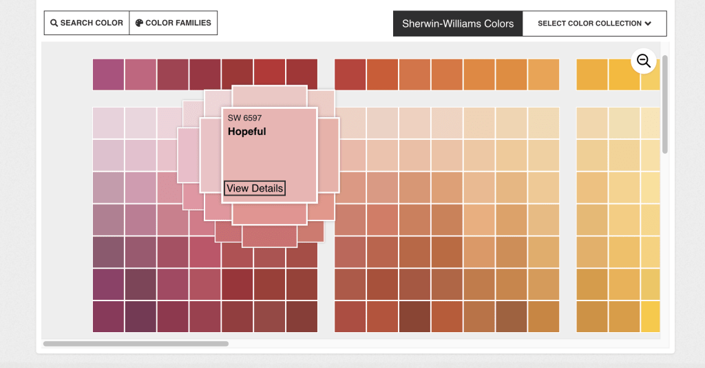
Warm tones have shades like orange, yellow, red, or gold mixed in, while cool ones have blue, green, and purple. One of the most helpful tools I’ve found is actually paint brand websites. Nearly all of them have their colors sorted by warmth.
Here’s a look at the Sherwin Williams site:
Step 6: Sample Paint Correctly
Now that you know how to evaluate your paint swatches and edit your selection, let’s talk about sampling paint.
You should always paint (or stick) a large sample on your walls, for a few reasons:
- Paint colors look lighter and brighter on walls. For some reason, when you paint a color on the walls, it’ll look lighter and brighter than it did on your little paint swatch. I always test a large swatch of color, at least 12″ x 12″ on each wall I plan to paint.
- Paint color changes in the light. I paint a sample on each wall to see how it looks at different angles in the room, since light will reflect off of each wall differently. This also lets me see how the light changes throughout the day will affect that paint shade on each wall.
- Paint sheen affects the way color looks. If you’re sampling actual paint and not using peel-and-stick samples, make sure you get the finish you plan to use (if you can get a sample in the finish, not all paint brands offer samples in all sheens).
You will find lots of opinions about whether or not you should test paint on your walls, or use peel-and-stick paint samples, or paint a swath of paint on a poster board and hold it up around your room.
I find them all to be effective, honestly. The most important part is getting a large area of each color into your actual space.
And finally, one tip about painting swatched right on the walls…. Either be super near about it, or sand your sample areas before you paint, otherwise you might see brush strokes or roller marks where you painted your samples underneath your newly painted walls.
Step 7: Just pick one!
Once you’ve narrowed it down to a few paint colors you love, it’s time to bite the bullet and just pick one. This can sometimes be the hardest part, but remember … it’s just paint. You can always re-paint in a few years if your tastes change or you want to try something new.