10 of the Best Whole House Paint Colors
Would you like to save this?
It can be daunting to try and choose a whole home paint color. Whether you’re moving into a new home and having it painted first, or you’re renovating and need to give the painters a color, like, yesterday, it can feel like major decision to try and pick one hue for the whole space.
In fact, one of the most common emails I get is from people choosing whole-home color schemes. They’re often asking for second opinions on colors they’re choosing, or for trim colors that coordinate with their chosen flooring, or what sheen to use where.
As someone whose written about interior design for the last 12 years, I’ve seen a lot of paint color trends come and go, but there are certain hues that stand the test of time. These are the ones you want to pick if you’re going for a whole-home paint color.
So, now, let’s get to the actual colors I love for a whole home.

Best paint colors for a whole home
As I mentioned, I always prefer neutrals when it comes to a whole home paint color. And, there are a few categories of neutrals that I think work best. I’ve included each color, then a few of my favorite paint shades within each color family.
White & Off White
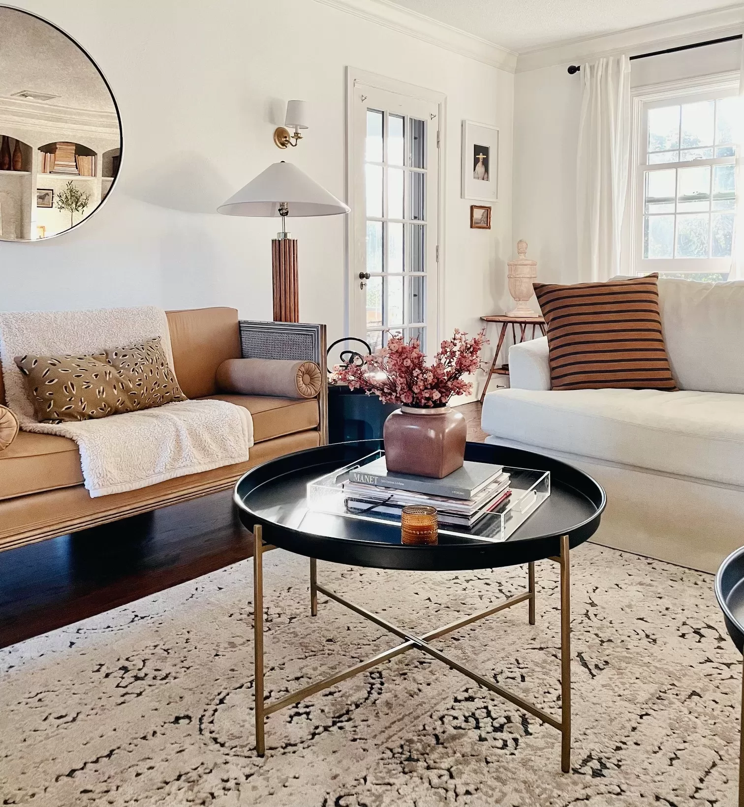
White (and shades of off white) is my single favorite paint color for a whole home It’s clean, crisp, and timeless, and it doesn’t tie you in any way to a certain style or look, so you have the ultimate in flexibility and versatility.
Personally, I prefer an off white to a true, stark white, which can feel a little stark. The good news is, unless you’re buying the paint straight from the can with zero tinting, most white paint is actually an off white. Some off whites are more cool-toned, and others are warmer.
Here are my most favorite white paint colors for the whole home:
Benjamin Moore Simply White

Simply White is a slightly warm-toned shade of off white, and one of my all-time favorite paint colors. It’s nearly as bright as a true white, but with a subtle warmth that makes a space feel more inviting. I’ve used it in a wide range of spaces and it always feels right.
Benjamin Moore White Dove
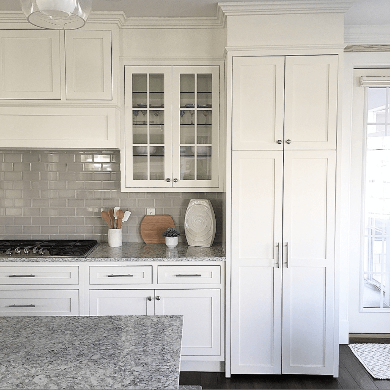
Aside from Simply White, Benjamin Moore White Dove is probably my second favorite whole home paint color. It’s a little bit deeper than Simply White, and the undertones are more neutral, while Simply White can look on the creamier side. It’s another can’t go wrong color.
Here’s a quick visual comparison of Simply White Vs. White Dove, so you can see the difference.

Sherwin Williams Alabaster
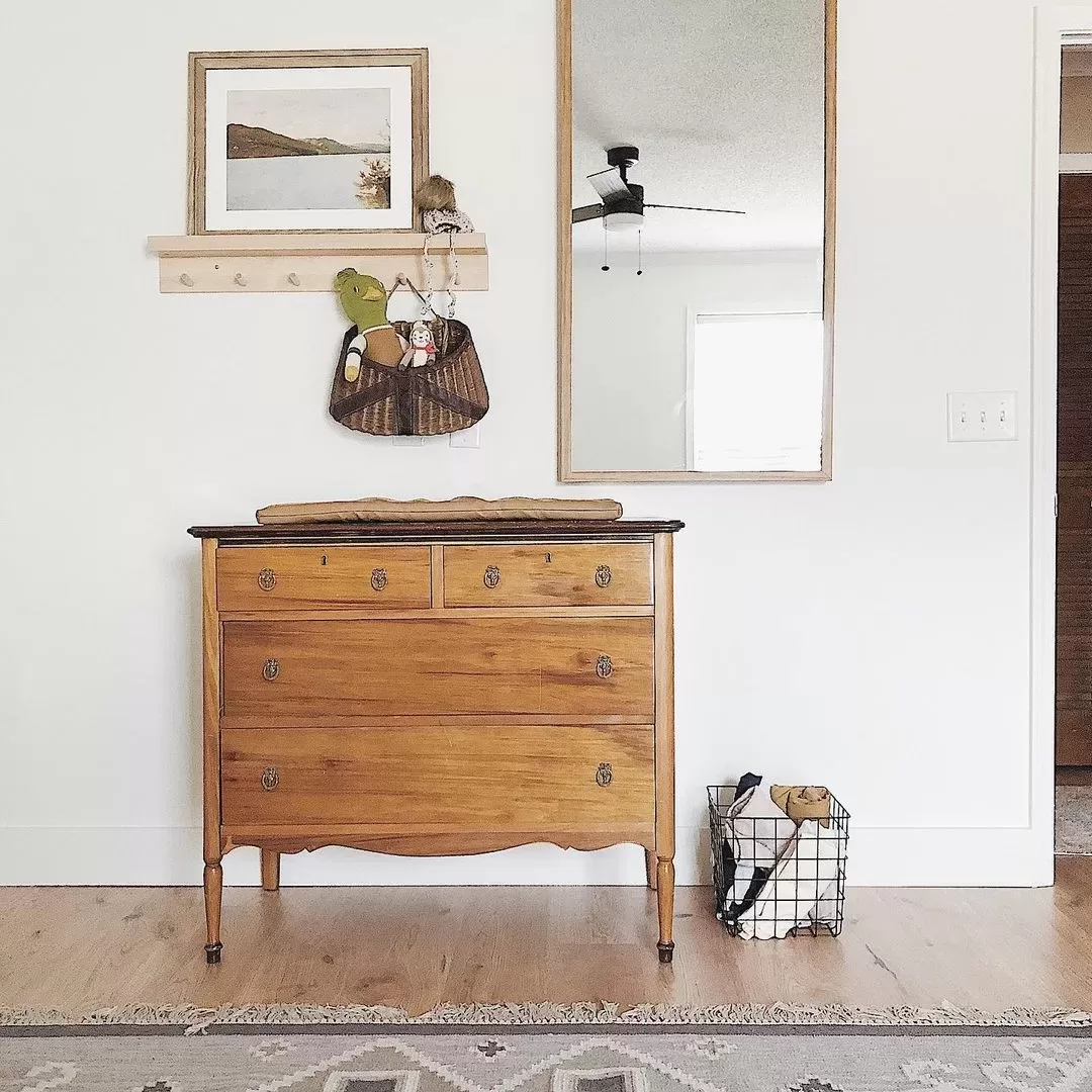
Sherwin Williams Alabaster is a very similar color to White Dove. It’s a neutral-leaning off-white that’s got very similar depth, but Alabaster is a tiny bit more beige-toned, while White Dove is more green-gray, which you can see, below.

Cream
Cream paint colors are another gorgeous whole-home paint choice. They offer more depth and impact than off whites, and create a home that feels a little more elegant and traditional, in my opinion. Contrary to what many think, creamy tones don’t always have to feel yellow, either. I’ve listed a few with various undertones, below.
Sherwin Williams Aesthetic White
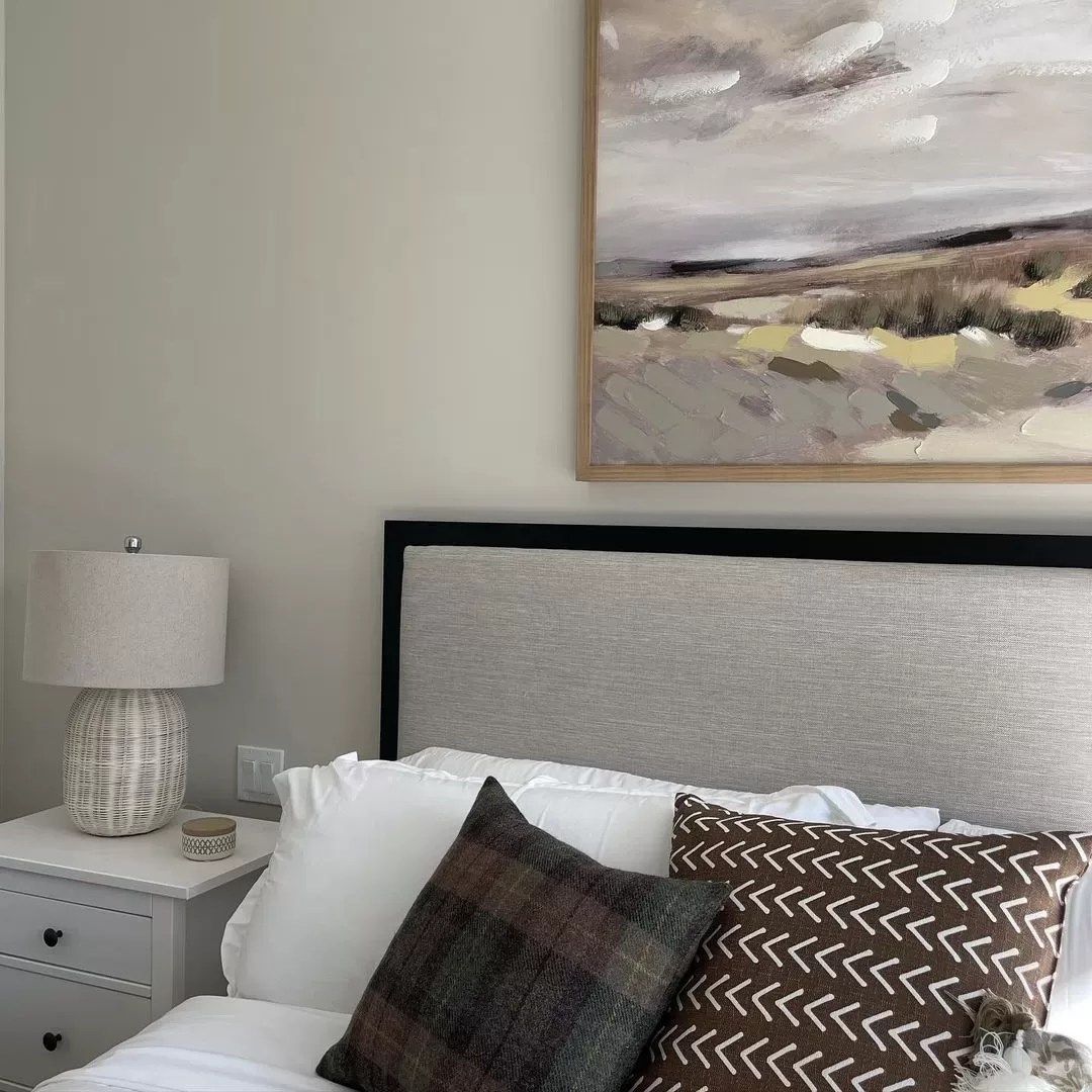
Aesthetic White is a cream paint color with neutral undertones. In a bright, south-facing room, the color will look more like a bone shade of cream, while in a north- or east-facing room, it can look even like a very pale gray. It’s a great shade if you love the look of white, but are after something a little richer.
Benjamin Moore Navajo White
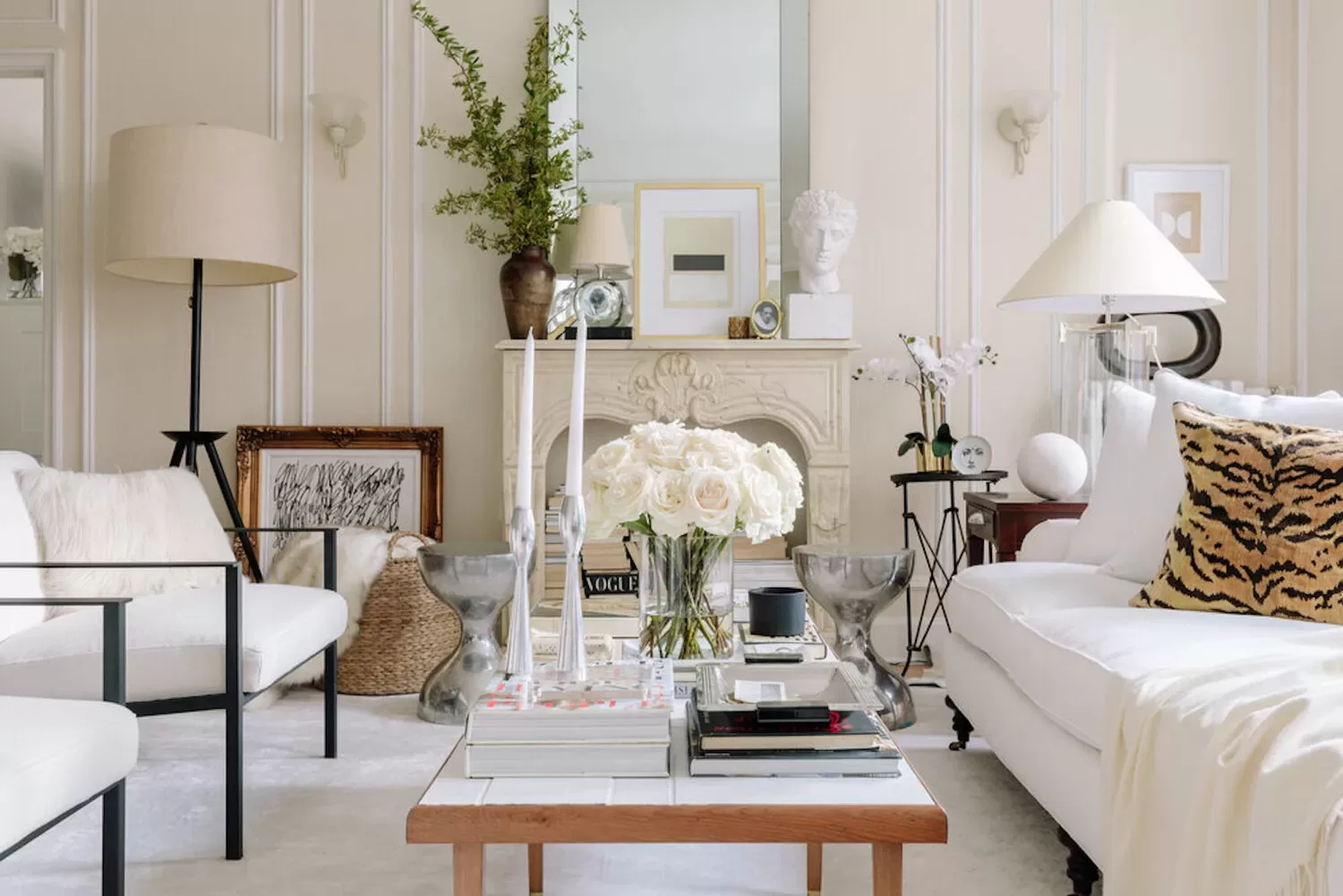
Benjamin Moore Navajo White is a classic shade of cream. It has beautiful beige-yellow undertones that shine through even in spaces that get cool light, so it’s a great choice for rooms that could use a little warmth on the walls.
Beige & Tan
Beige and tan shades were the default whole home paint color of the late 90s and early 2000s, but beige shades have made a big comeback in the last few years, too. For a more modern look, chose a pale beige with neutral undertones.
Benjamin Moore Pale Oak

Pale Oak is the perfect paint color if you want to dip your toe in the beige paint waters. It’s so soft it can almost look like a cream in some lighting, but is deep enough that you definitely won’t mistake it for white. Pale Oak has warm gray undertones, so it can be considered a greige, too.
Sherwin Williams Natural Tan
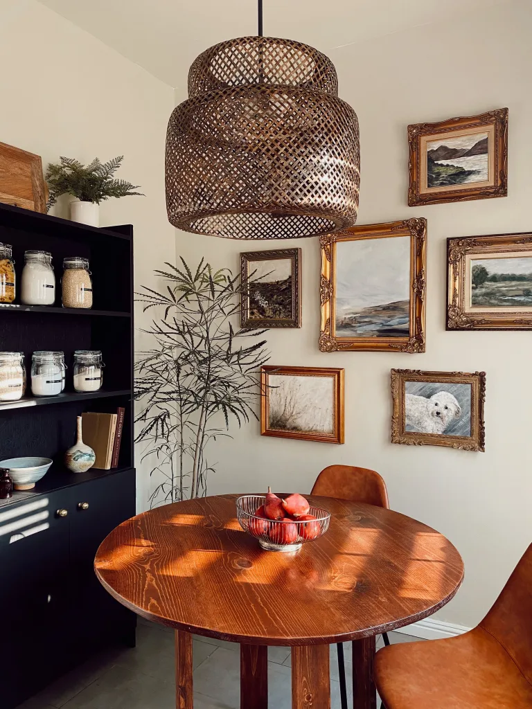
For a beige tone that leans more tan than gray, try Sherwin Williams Natural Tan. It’s another soft paint color that’s incredibly versatile, just with more tan undertones than Pale Oak has.
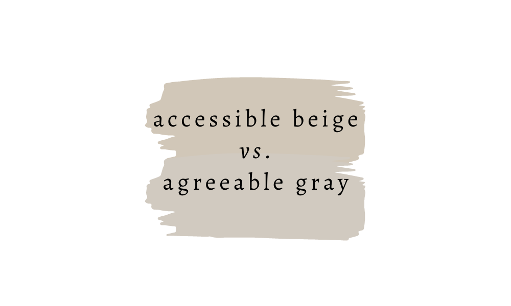
Sherwin Williams Accessible Beige

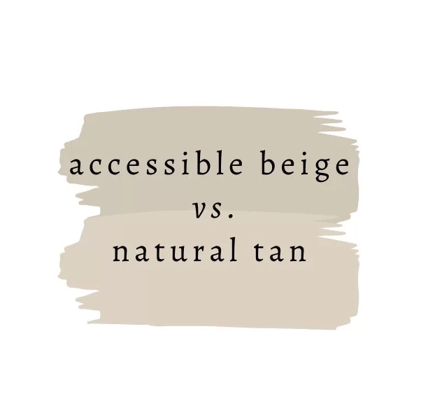
Accessible Beige has been a super popular paint color over the last few years. It’s more of a true beige than Pale Oak, which is lighter and can read greige or cream. If you’re looking for a more mushroom-toned beige that’s a little deeper than Pale Oak or Natural Tan, this is a great choice. Accessible Beige is also a neutral paint shade, since it doesn’t have obvious blue or yellow undertones, which makes it extra versatile.
Gray
A few years ago, gray was the go-to whole home paint color. It seemed like any new construction MLS listing was coated in cool gray paint. While cool-toned grays can still be lovely in some settings, the overall interior design trend is toward warmer hues, which means warm- or neutral-toned grays will feel fresher and more modern than cool tones. A few of my favorite gray paint colors are:
Sherwin Williams Agreeable Gray
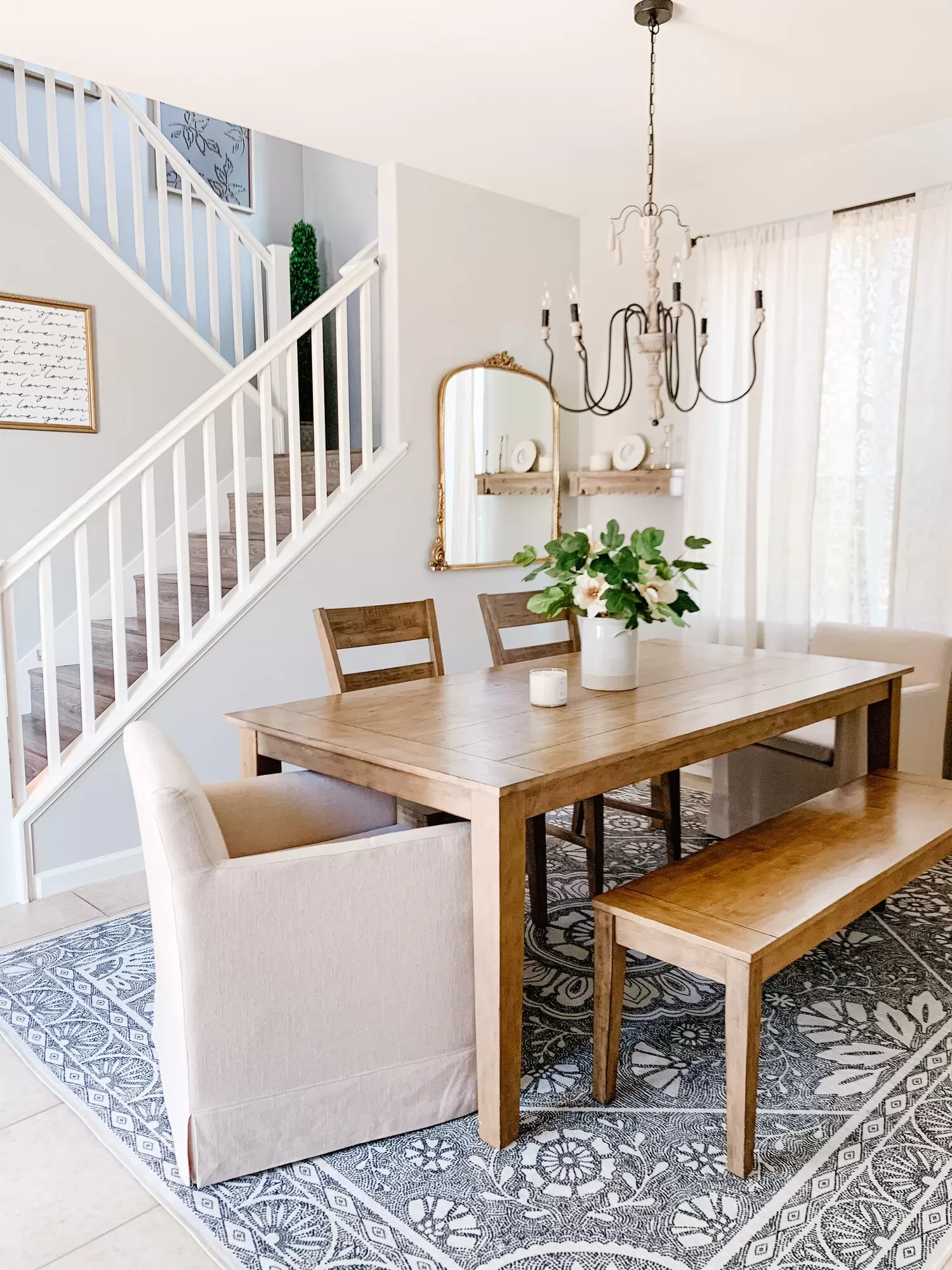
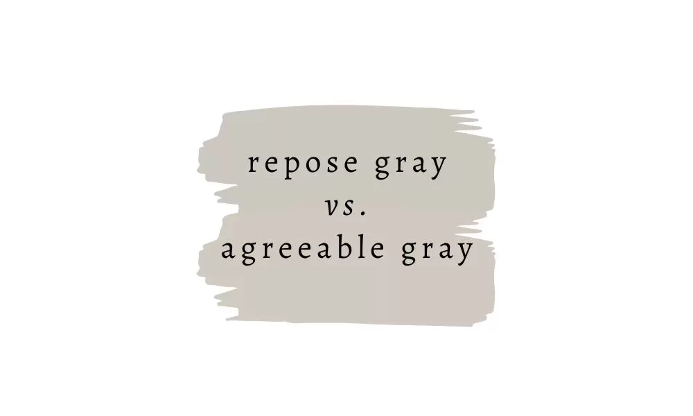
Sherwin Williams Agreeable Gray is a mid-tone gray with a beige undertone. Like a few of the beige shades I mentioned above, this one can straddle the “Greige” line, but the difference is that Agreeable Gray reads more gray, while the others read beige first. Think of Agreeable Gray and a gray with beige tones, and Accessible Beige/Pale Oak as beige shades with a touch of gray.
Any greige color can look cooler or warmer in your home, depending on the light in a room, so be sure to test these color chameleons first!
Sherwin Williams Repose Gray

For more of a neutral gray that doesn’t read like a greige, try Repose Gray. It’s a neutral, soft gray color that looks like a true gray on most walls, though will read cooler-toned in north and east-facing rooms.
Tips for choosing a whole home paint color
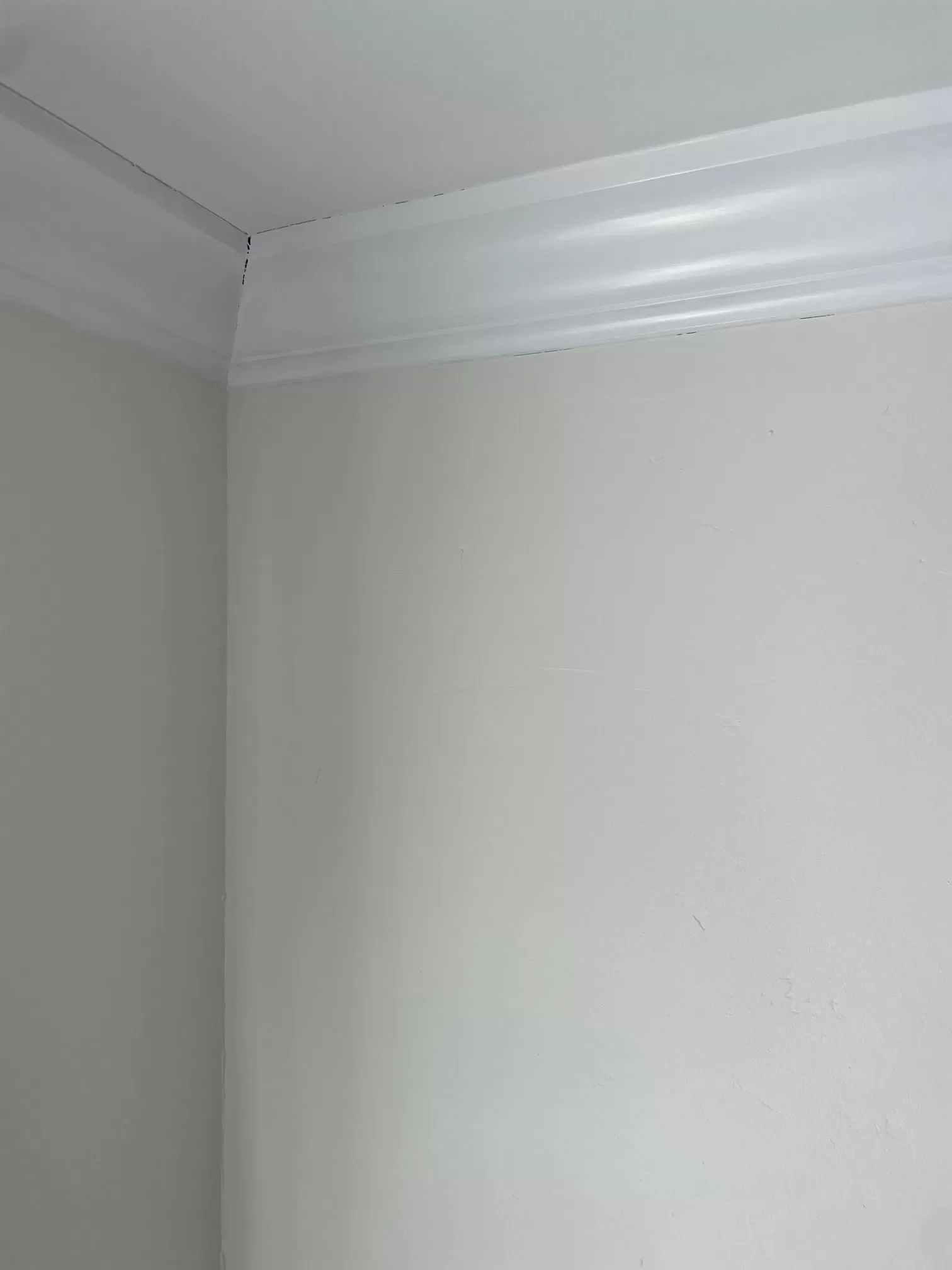
If you’re choosing a paint color for your whole house, there are a few tips that’ll help you narrow it down.
Choose a neutral
In 90% of the cases, you’ll want to pick a neutral color for your whole home paint color. That’s because a neutral gives you more flexibility with your decorating choices. If you pick a moody green, for example, you’re tied not only to colors that coordinate with that shade, but the overall vibe that the color sets for your home.
Light-toned neutrals like white, cream, greige, soft beige, pale taupes, etc. give you a clean, versatile backdrop, and you can save the bold color for the separate rooms off of the main corridor of your home.
Consider your decorating style
Certain paint colors, hues, and tones are best suited to certain decorating styles. Warm-toned whites, for example, beautifully complement traditional, farmhouse, and transitional decor, which tends to have richer, warmer color palettes like wood tones, creams, brass, etc. On the other hand, contemporary design, industrial and coastal schemes can be better suited to cooler neutral that pair well with polished nickel, various blues, chrome, and modern finishes like polished concrete.
If you Google things like “Warm white paint colors” or “cool neutral paint colors” you’ll find plenty of colors you can use as a starting point.
Consider your home
Once you have a few colors, or color categories, narrowed down, considering your actual home can help you settle on the right color. Homes with lots of natural light can wash out paint colors with just a little bit of warmth, and make them feel cooler than they’d look otherwise.
For example: I chose Benjamin Moore Simply White, one of my go-to whole home paint colors, for the living room in our cabin in Vermont, a space that’s drenched in light from floor-to-ceiling windows. Simply White is a creamy, warm white. But in this light-filled space, you would have thought I used a straight from the can bright white paint. I ended up choosing Benjamin Moore Swiss Coffee instead, which is a deeper shade with more pigment.
Rooms with lots of west or south-facing light, on the other hand, will make paint colors feel warmer, especially in the afternoon and evening. North-and east-facing rooms will, again, make warmer tones read cooler, so it’s a good idea to consider where your light is coming from. I have a whole post on how light affects paint color undertones.
The very best way to make sure your paint color is something you love is to sample! This is always the most important tip when it comes to choosing a paint color for a whole home, or any individual room.
Is it best to paint your whole home the same color?
It’s best to paint the connecting portions of your home the same color. So, if your great room, kitchen, hallways and stairs all connect, then paint them all the same color. The rooms that are separated by doors or arches can be painted different colors. This helps create flow throughout the home and prevent any unnatural spots where one color abruptply ends and another begins.
If you want to break up a big swath of a single hue, try an accent wall.


I can’t come back to this site, the ads are relentless
Yes, I wish I didn’t have to use ads but they’re what keeps most of the internet free!