The Top Home Color Trends of 2026, According to Paint Brands, Designers and Experts
Would you like to save this?
As someone who writes about decorating for a living, I’ve seen the top home color trends change a handful of times. In the 2010s, cool toned gray was the go-to neutral, but now beige and brown are back. At the same time, muted colors like blush and icy blue have given way to more saturated shades of burgundy, mushroom and olive.
If you’re not totally attuned to decorating styles, or you’re finding yourself redecorating your home for the first time in a decade and your head is swimming in a sea of muted-toned paint swatches, I’m here to help.
Here’s an overview of what this year’s big home color trends will be, including the top picks from all the big paint brands, plus designer advice and more.
What are the top home color trends of 2026?
The overarching theme for home color trends is that color is back, and cool tones are being replaced by warmer ones. This has been the general shift for paint color for a few years now.
These color trends are not only limited to the walls, and will be pervasive throughout the house, informing everything from kitchen cabinet colors, to upholstery, to floor color trends like tile.
Here’s a look at the colors we’ll all love this year.
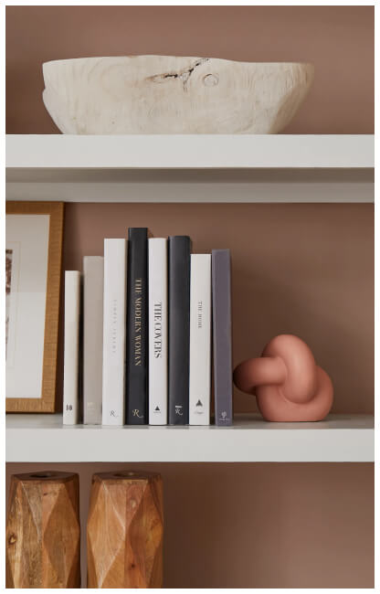
Beige and cream
Bright white and silver gray were the go-to neutrals of the 2010s, but you’ve probably noticed that the default neutrals are now decidedly warmer. That’s right, beige is back! White and gray have been replaced by beige colors and creams, from cream-colored kitchen cabinets, to pale beige-colored walls. (Check out my favorite cream paint colors here).
If you’re scarred by the orangey-tan walls of the late 90s and early 2000s (I am, I’ll admit), choosing greige paint colors like Benjamin Moore Pale Oak or neutral beiges like Sherwin Williams Accessible Beige will ensure the look feels like a modern home instead of your mom’s home.
If you’re don’t want to commit to cream but like the idea of a warmer look, you can also try a warm-toned white like Sherwin Williams Aesthetic White or Benjamin Moore Swiss Coffee.
Beige & Cream Shades to try:

Warm Neutrals Like Brown and Mushroom

As I mentioned, neutral shades overall are becoming warmer, whether it’s on walls or floors. After years of being out of style, shades like brown, terracotta, and burnt orange are becoming go-to hues, as are wood tones in general.
In fact, Benjamin Moore named Silhouette, a rich, cool brown, as its 2026 Color of the Year. The brand’s color marketing & development director, Andrea Magno, explained that the pick represented “a growing appreciation for the brown color family—rich with depth and a luxurious blend of burnt umber and delicate charcoal undertones,” which is definitely something I’ve been seeing in all areas of decor.
Warm Neutrals to Try:
Muted Pink
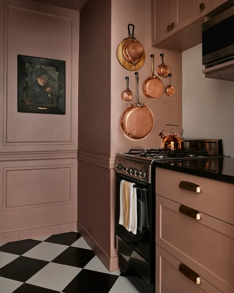
Sherwin Williams’ color of the year in 2024 was a shade called Redend Point, which is a color akin to red rocks, or clay. It’s a warm, pinkish, mid-tone neutral that feels very of the moment. Similar shades include Farrow & Ball’s Sulking Room Pink (above) and Dead Salmon.
I recently got an trend roundup from the publicist representing national homebuilder Taylor Morrison, and one of the key points noted the shift to warmer tones overall. “Adding soft, warm tones and light wood accents can immediately add warmth and bring cool tones into the new trends we are seeing today. Redend Point is an example of nature highlighting how some colors work well together,” the note said.
Check out my post on the rise of the pink bathroom for more muted pink inspo!
Dusty Pinks to try:
Rich Red Tones


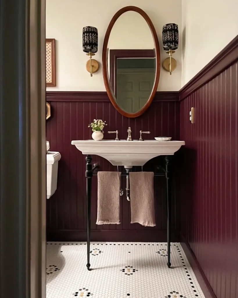
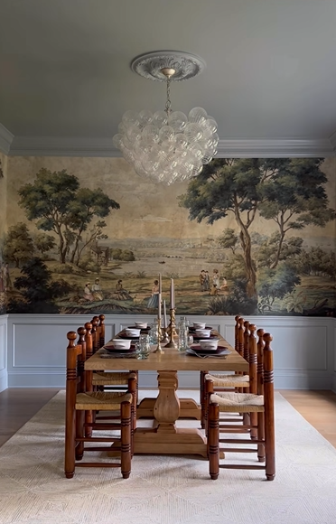
It’s been a minute (a lot of minutes) since a rich red was a home color trend, especially dark, purply reds like Burgundy and maroon. In fact, I can’t think of a year in my nearly 15 years as a home editor where a shade of red was truly the ‘it’ color. But, dark, deep reds are back. I’d actually go as far as to call burgundy the new green. The color is showing up on everything from walls, to rugs, to throw pillows.
Behr’s 2025 Color of The Year was a burgundy shade called Rumors, and Ace Hardware’s line Clark + Kensington chose a rich orange-red, Hazelnut Crunch, as its 2026 pick. I think this color trend will be around for years to come.

Richs reds to try:
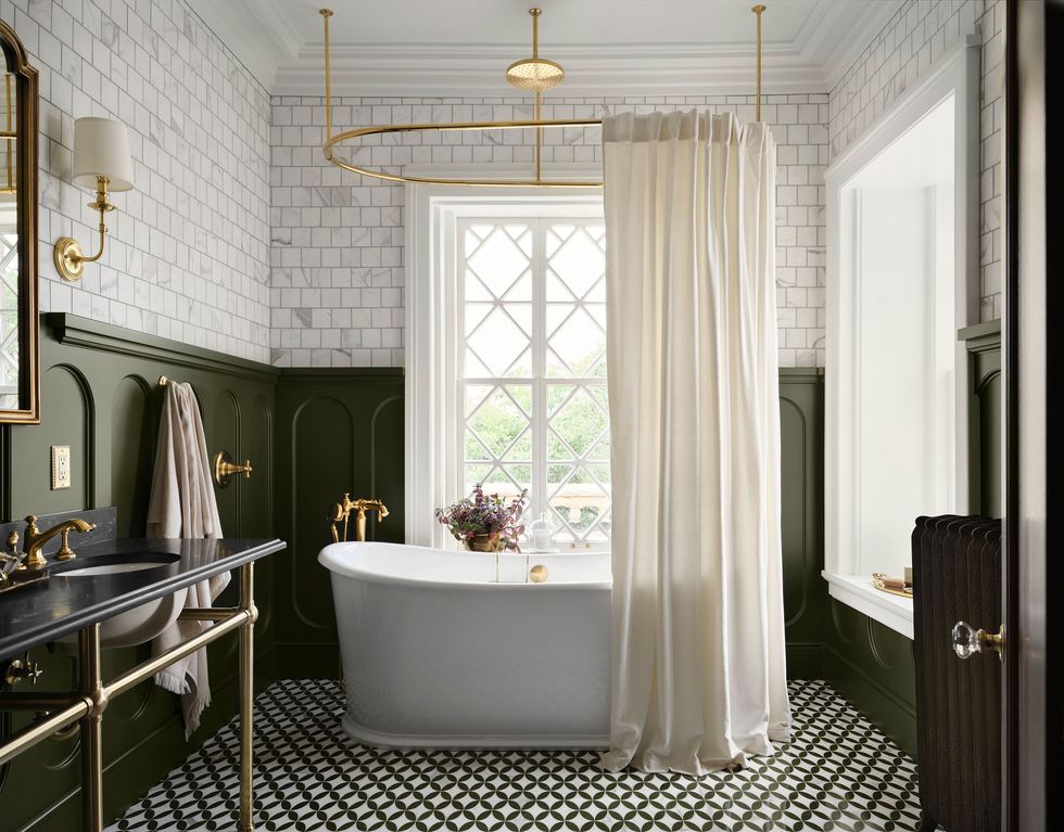
Moss green
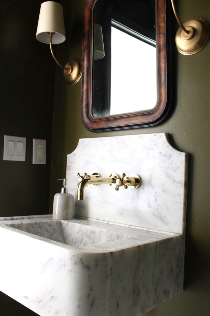
Olive and moss green has been a big hue in interiors for the last few seasons, and it will remain an on-trend color in 2024 and beyond. While it can be a bold choice for paint, which is why I kept it to a small powder room space in my own home, olive green is a beautiful accent color for throw pillows and decor.
Moss Greens to Try:
Plum

Like burgundy, it’s been a while since shades of purple have been in style (outside of kids spaces), but more mute tones of plum are back in a big way. Benjamin Moore named a soft purple shade, Cinnamon Slate, its 2025 Color of the Year, while PPG Paints chose Purple Basil, a slightly deeper shade of plum.

the Year
Plums to try:
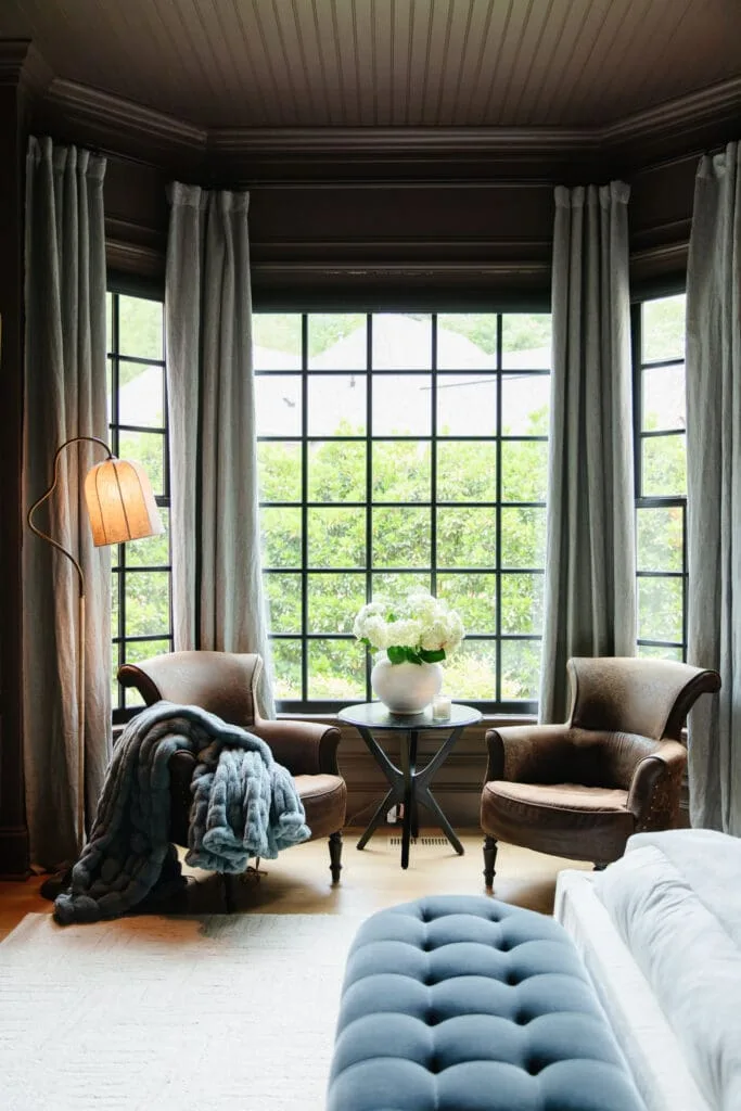
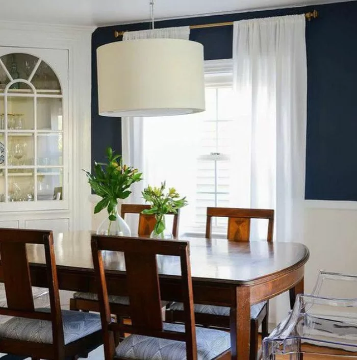
Steely blue
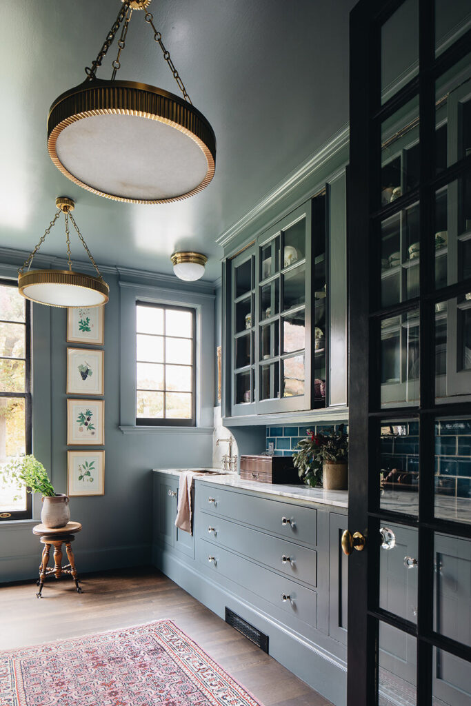
Steely blue hues, and blue-gray paint colors (especially or mid-tones blues with a gray undertone), have replaced more traditional navy blue as the go-to blue hues, a la the space above by designer Jean Stoffer.
Steely Blues to Try:

Need help choosing a paint color?
Join my FREE Facebook community, The Color Clinic, for real help choosing the right paint colors for your home
Other, More General Home Colors Trends
There are also some overarching home color trends that aren’t paint colors, but more like general shifts in decorating preferences, specifically around color. They are:
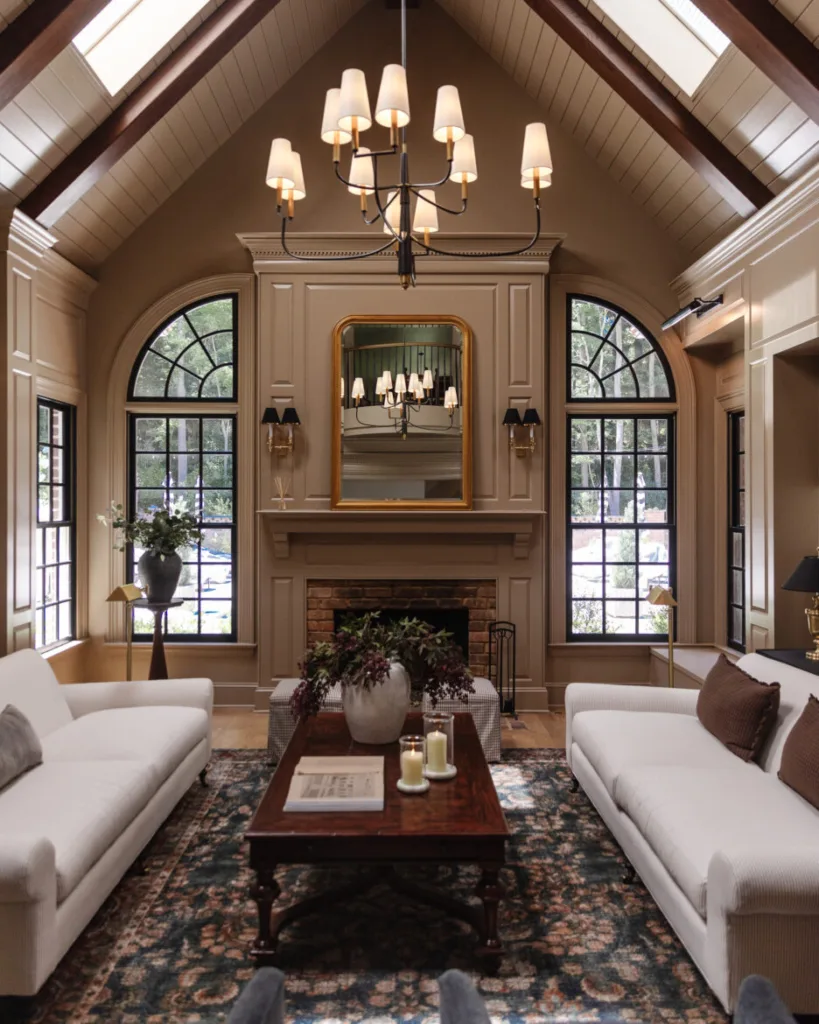
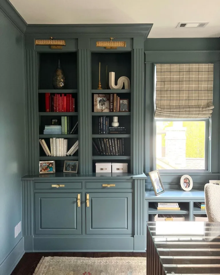
Mid-tone paint colors
A few years ago, paint was either super light (i.e. bright whites) or super dark ( a la black interior doors and dark colored accent walls).
Among Behr’s recent colors of the years are Perfect Taupe (one of my personal favorites and the color in my bedroom!), Smokey Pink, and Vermllion, all of which sit in that happy medium of being not too dark and not too light.
Blogger Julia Marcum, of Chris Loves Julia, has also declared mid-tone paint colors to be the ‘it’ tone for the next few years, and chose one (Benjamin Moore Boothbay Gray) for her study, in the photo above.
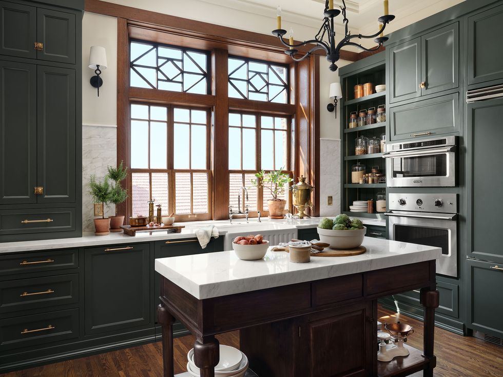
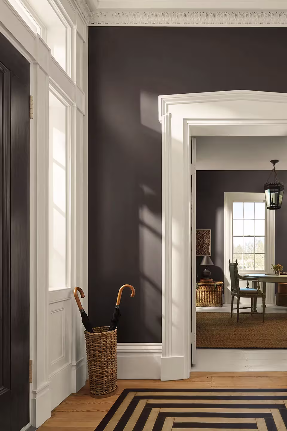
Dark Wood Tones

White oak and bleached woods have been the top furniture and floor color trend in the last five years, but wood-tones are getting darker. Rich, antique inspired tones like mahogany and chestnut are a top choice for both flooring and furniture.
Color Drenching

One of the biggest home color trends is actually not a specific color at all, it’s just a way to use it. Color drenching, which refers to painting the walls, trim and doors (and even the ceiling, in some cases) all the same color. The look is reminiscent of the English Cottage aesthetic that’s taking over design right now.
How to track the top home color trends
There are a few ways I track home color trends to see what’s in-style and what’s coming up. It’s actually pretty easy to see these big trends emerge, and they tend of happen all at once.
The first thing I always look to is the paint brands’ colors of the year (along with Pantone’s). Most of the major paint brands choose a color of the year, or a palette of the year, which signals the way that color trends are heading. While I don’t always think the colors are the most usable hues, they do tend to say something about the actual colors that are trending. I.e. a couple of years ago, almost every major brand chose a shade of sage green, and green has been everywhere ever since. This year, red and purple are the most popular colors, and it’s certainly experiencing a major comeback.
This sounds a bit strange, but I also look at the throw pillow colors the major home decor stores are offering. If you pay attention, you’ll notice that suddenly, Crate & Barrel and West Elm and H&M Home all start to sell throw pillows in similar hues. In the late 2010s it was blush pink and pale silvery blue, pale sage greens, and grays. Then it was rust, and amber. And if you look now, you’ll see a lot of the colors mentioned above, like burgundy and olive.
Lastly, top interior designers are always ahead of the mainstream decor trends. In fact, they’re the ones often setting the trends. If you follow the major “mass-market” interior designers, like Joanna Gaines, and Studio McGee, and Jean Stoffer, you’ll notice specific colors or design styles start to pop up more on your Instagram feed, and you’ll notice trends pretty quickly.
Even Joanna Gaines, who used to be known for her all-white farmhouse looks, and gone moody and saturated over the last few years. Which is proof that farmhouse has really run its course and we’re all ready for warmer, more colorful, more personal looks.
Want to learn more about the specific paint colors that will be big this year? Check out my post on my favorite moody paint colors of 2026.


One Comment