Benjamin Moore Providence Blue

Would you like to save this?
I was recently cleaning out the paint sample cabinet in my garage (anyone else have one of those? No, just me?), and I came across a little can of the prettiest blue color: Benjamin Moore Providence Blue.
I had considered this hue for our laundry room renovation a few years ago, and opted for the lighter Benjamin Moore Smoke, instead, but I feel like I might come back to Providence Blue for something in the future. So, I made a paint color card with the sample paint to file away for later use, and decided to share this pretty hue here on the blog in case you’re looking for a gorgeous, mid-tone slate blue paint color.

What color is Providence Blue?
Let’s start with the basics. Benjamin Moore’s Providence Blue- 1636 is a moody slate blue with a heavy dose of gray and a slightly smaller dose of green. Its deep, muted look makes it a versatile choice for modern and traditional styles alike.
Providence Blue Undertones

Providence Blue is characterized by its dark gray undertones, which give it a sophisticated quality. But, it also has a touch of green that makes it border on a deep teal hue (though it’s not quite as green-tinged as one of my other gray-blue favorites, Behr Midnight in New York).

My Favorite Way to Sample Paint
I LOVE Samplize peel-and-stick paint samples for trying paint colors at home. They’re easy to use, and they offer overnight delivery.
LRV of Providence Blue
The Light Reflectance Value (LRV) of Providence Blue is approximately 19.23. This places it in the medium-dark range, indicating that it absorbs more light than it reflects. This characteristic makes it a bold choice, ideal for statement walls or accent areas where a deep, immersive color is desired
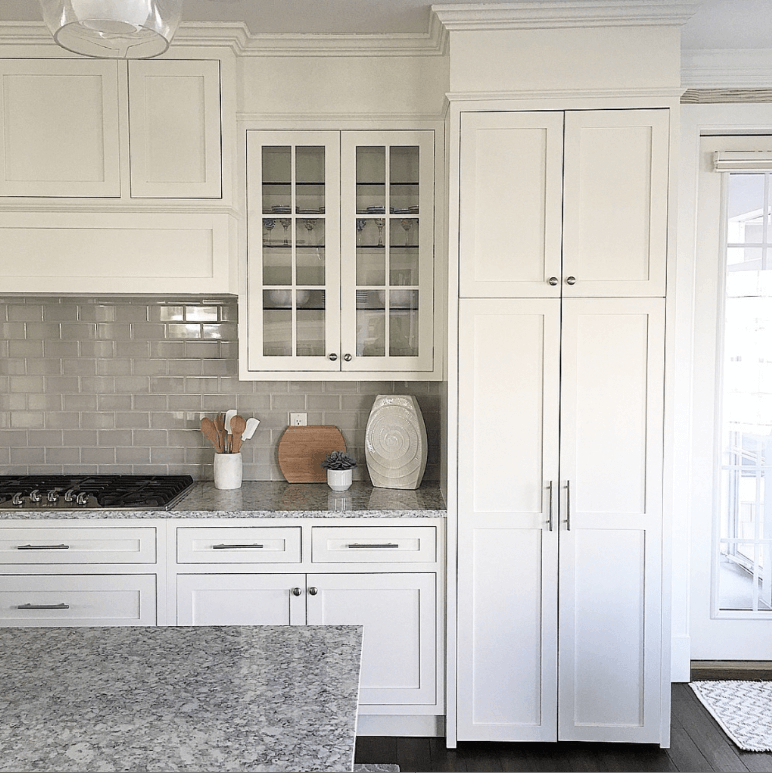
Where to Use Providence Blue

Providence Blue would work beautifully on kitchen cabinets and bathroom vanities as a bold pop of color, but I also love it as a whole-room shade. Particularly in a moody office, like the one above, but also in bedrooms, laundry rooms, and small powder rooms. This shade is a lovely choice for home exteriors, doors, and shutters.
Coordinating Paint Colors
Personally, I love Providence Blue paired with other colors that shade its rich vibe. I love it with saturated shades like Herb Bouquet, Hint of Mauve or Pine Cone Brown.
I don’t love this color paired with bright whites, though. If you are looking for a lighter shade to pair with Providence Blue for a ceiling or trim color, try a complex cream like Ballet White instead of a more true-white paint color.
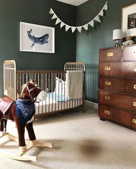
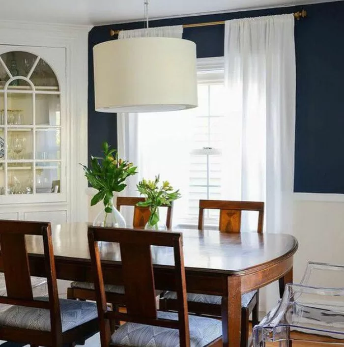
Providence Blue in Real Homes
Laundry Room
Accent Wall

Kitchen Island

Providence Blue vs. Blue Spruce

When comparing Providence Blue to Blue Spruce, both shades offer cool undertones but Blue Spruce leans slightly greener, providing a fresh woodland feel. Providence Blue, with its slate blue characteristics, is more subdued and traditionally ‘blue’ in appearance, making it suitable for those seeking a more classic blue tone.
Providence Blue vs. Water’s Edge

Providence Blue is darker and more intense compared to Water’s Edge, which offers a lighter, airier blue with a tranquil effect. Water’s Edge could be a better choice for spaces that benefit from a brighter, more open feel, while Providence Blue is ideal for creating a bolder vibe.
Want more options? Check out my post on my favorite gray-blue paint colors.