Behr Midnight In New York
Would you like to save this?
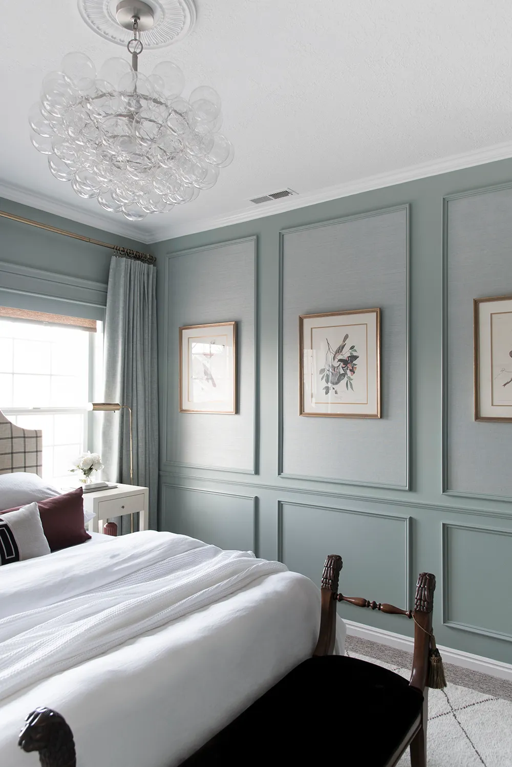
If you’re looking for a deep blue-green paint color, then Behr Midnight in New York might just be the hue for you. I chose this paint color for the guest room in our Vermont cabin (see above!) when I was looking for something moody and earthy, but also modern, and I love the way it turned out.
Here’s a closer look at this dark blue-gray paint color, plus more photos of it in my space and elsewhere.
What Color is Behr Midnight in New York?

Behr classifies Midnight in New York as a gray tone, but it has some blue and even green undertones that make it read almost like a very deep teal color. The undertones are much more prominent in a well lit room, and I noticed them more in our cabin in the middle of the day when the room was flooded with light.
Behr Midnight in New York LRV

Even though I tend to be more intuitive than data-driven when I’m decorating my own homes, I do find it helpful to know the technical details of a paint color, since, if the paint color I’m considering isn’t the right one, it helps me to know where to go next.
This is where LRV comes in.
LRV stands for light reflectance value, and is a measure of how bright a paint color is on a scale of 0 (pitch black) to 100 (pure white.)
Midnight in New York has an LRV of 10, which makes it a very dark paint color. For comparison purposes, it’s about as dark as Benjamin Moore Wrought Iron, which has an LRV of 8.9 and is a near-black hue.
I wanted a moody, modern vibe to my room, so the darkness of the color worked out perfectly in the space.
Behr Midnight in New York Undertones
As I mentioned, Midnight in New York has blue and green undertones. I’ve found that the green and blue tones are balanced, giving the color a deep teal look. However, in the bright light, the color does look more green, while the blue tones tend to take over in darker spaces, or at darker times of day.
Photos in Real Spaces
Because color looks different depending on the space, it’s always helpful to look at it in a range of rooms. In addition to my guest room, I found photos of the color in a few other spaces, where it looks a few shades different.
Again, here it is in my guest room:

And here it is in the office of blogger The Simple Farmhouse. Notice how it looks more green here? My hunch is that this room gets more natural light than my guest room in Vermont.

And here it is in a dining space in a Maine home. This representation of the color looks more similar to the way it looks in real life in my house.

What colors go with Midnight in New York?
One of the things you’ll notice about all of the rooms, above, is that Midnight in New York is paired with wood tones. I love this combo, which makes this paint color perfect for a rustic or midcentury space with warm walnut tones.
Aside from wood tones, Midnight in New York works well with white, which provides a nice contrast, as well as brown and black.
At the same time, if you prefer brighter spaces, I can also see this color being using to add some gravitas to a room with pops of pink and mauve, or moss green, too.
Overall Review
Overall, Midnight in New York is a gorgeous dark gray with heavy blue-green undertones. It’s a beautiful shade for rooms where you want to make a statement.