The Only 77 Paint Colors You Need to Know in 2026
Choosing the best paint color can leave your head spinning. I’ve been writing about paint color for 15 years, and I’ve chosen dozens of them for my own homes, Airbnbs, and decorating clients, and it can still baffle me at times.
There’s a lot that can go into picking a paint color: the vibe you’re going for, the undertones in your floors and hard finishes, the lighting the room gets. Plus, there are thousands of colors out there, and probably dozens that would look great in your space, but you can only choose one (or maybe two if you’re using an accent or trim color).
Overwhelm-dot-com.
The thing I’ve learned that’s been helpful for me, though, is that not all paint colors are created equally. Some are just better than others. There may be thousands of shades out there, but only a fraction of those are best-sellers, designer favorites, or just good, reliable, go-to colors: the neutrals that work in almost any space, the shades of green that are just prettier than the others or the certain paint colors that are just spot-on trend for the current styles.
So, to make my life easier, I tend to stick to a list of the good paint colors. If you know what the best paint colors are, it gets a little easier to narrow down your top pick.
Until now, that list of paint colors has always been mostly a mental list. I know which ones I like, or the ones I would like to use one day, but I hadn’t written that list down. However, I recently realized that this might be super useful information for people who haven’t spent 15 years writing about design, and I decided to sit down and write out my ultimate list of all the very best paint colors for 2026 and beyond.
The list includes popular shades from the leading brands, and best-selling neutrals, plus the on-trend colors that designers and influencers are reaching for right now. Bookmark it, pin it, email it to yourself using the “Would you like to save this” box you’ll see in this post, or, click here to download a PDF of all the colors, so you can reference it whenever you need to choose a paint color.
To keep it extra simple, I broke the list down into “Timeless shades,” and “Trending shades” that’ll you’ll see everywhere for the next 10 years.
Timeless Paint Colors
These are the tried-and-trues—the shades I (and loads of others) reach for year after year because they work well with a range of styles, undertones, and lighting.
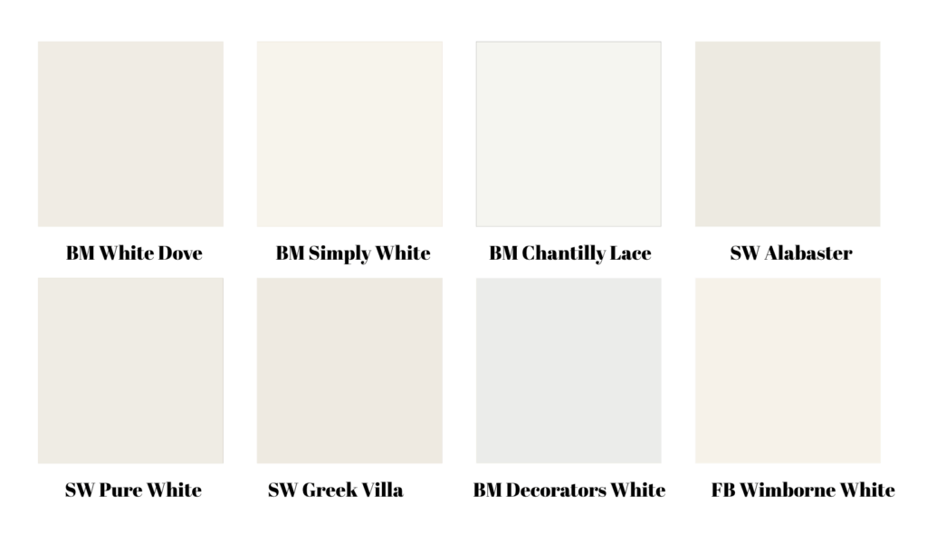
White
Would you like to save this?
1. Benjamin Moore White Dove – A soft, creamy off-white that reads warm without yellowing, White Dove has been the brand’s best-selling paint color for years.
2. Benjamin Moore Simply White – Another warm-but-bright off white, with a slightly creamier undertone than White Dove.
3. Benjamin Moore Chantilly Lace– A crisp, true white that feels modern and airy. Best for rooms with good natural light, since it can feel flat in low-light.
4. Sherwin-Williams Alabaster – Clean and calming with the tiniest kiss of warmth. Lovely for whole-home continuity, and similar to White Dove.
5. Sherwin Williams Pure White – Another good true white with just a touch of warmth.
6. Sherwin Williams Greek Villa – A slightly richer shade of white that’s not quite as bright as the others on this list, for when you need something with a little depth.
7. Benjamin Moore Decorators White – A bright white with a slightly cool undertone.
8. Farrow & Ball Wimborne White – One of the brand’s best-selling warm whites.
Download the complete list of The Only 77 Paint Colors Worth Knowing
Gray & Greige
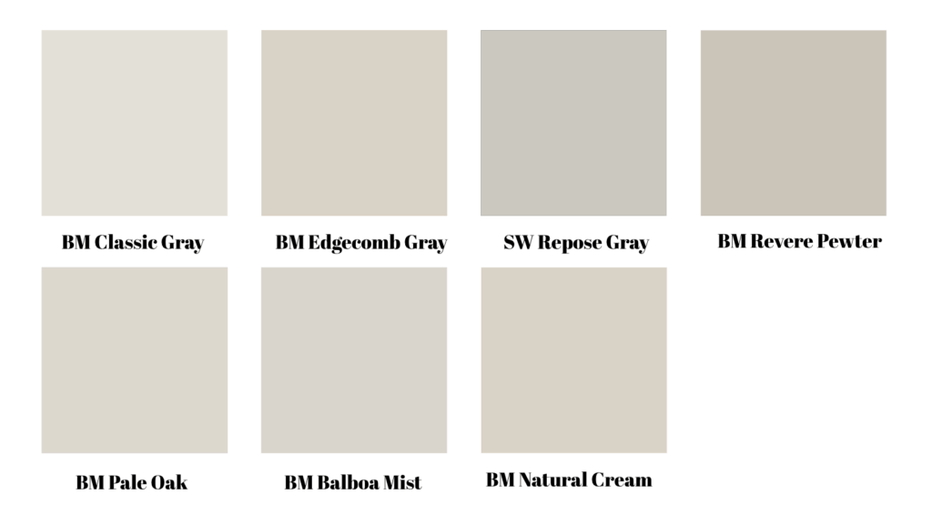
9. Benjamin Moore Classic Gray – Feather-light greige that’s perfect when you want a hint of color rather than a true gray.
10. Benjamin Moore Edgecomb Gray – A chameleon greige: warm enough for traditional spaces, clean enough for modern.
11. Sherwin-Williams Repose Gray – Balanced, versatile and designer-approved; holds up in both cool and warm light.
12. Benjamin Moore Revere Pewter – A perennial favorite for a reason—earthy warmth without going beige.
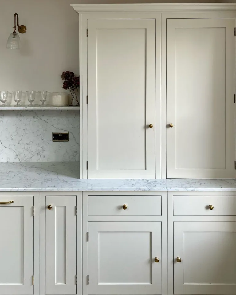
13. Benjamin Moore Pale Oak – Lighter and a little more beige than Revere Pewter, Pale Oak makes a beautiful neutral for cabinetry, trim and walls.
14. Benjamin Moore Balboa Mist – Another warm gray, just a touch cooler than Pale Oak
15. Benjamin Moore Natural Cream– This near-beige has a hint of gray that gives it a sophisticated edge.
Tan & Beige
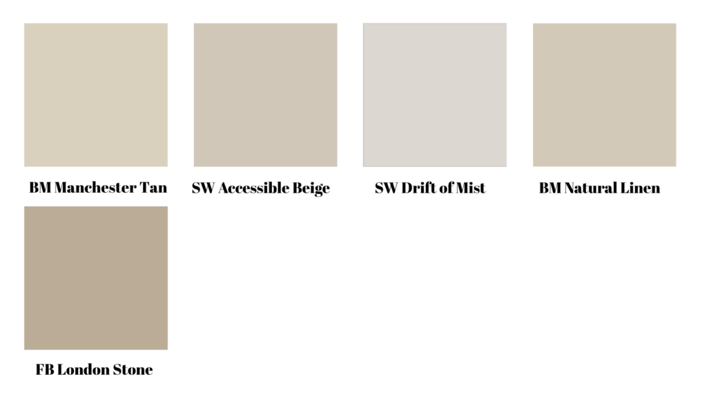
16. Benjamin Moore Manchester Tan – Classic, sophisticated tan with subtle green undertone (great for red/orange floors).
17. Sherwin-Williams Accessible Beige -Light beige with greige restraint—never goes yellow.
18. Sherwin Williams Drift of Mist – Soft, cool beige that borders on greige.
19. Benjamin Moore Natural Linen– Airy, sandy beige that loves linen, seagrass, and oak.
20. Farrow & Ball London Stone– A classic tan with a hint of pink
Download the complete list of The Only 77 Paint Colors Worth Knowing
Cream & Yellow
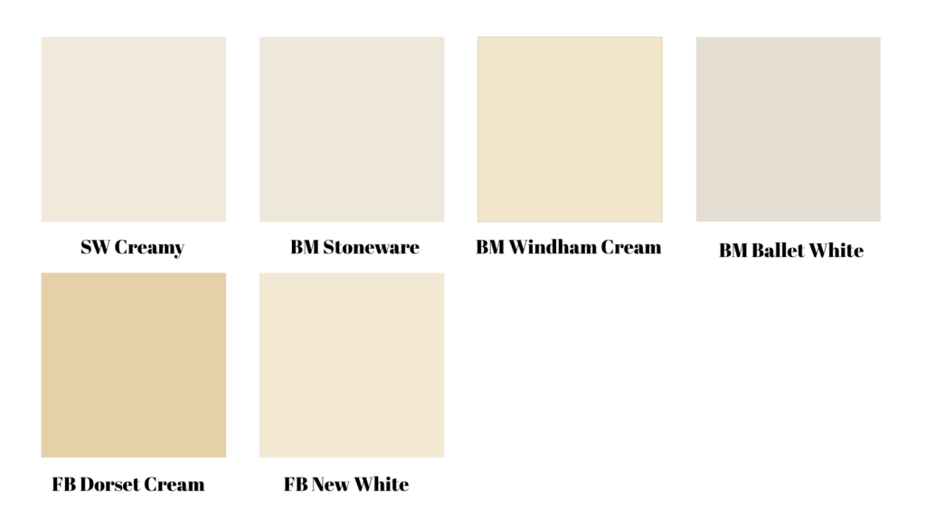
21. Sherwin Williams Creamy – This pale cream is slightly richer than off white.
22. Benjamin Moore Stoneware – A soft cream with more beige undertones.
23. Benjamin Moore Windham Cream – A pale yellow with neutral undertones
24. Benjamin Moore Ballet White – A rich off white with cream and beige undertones.
25. Farrow & Ball Dorset Cream – The perfect buttery yellow
26. Farrow & Ball New White – The midpoint between yellow and cream.
Black & Charcoal
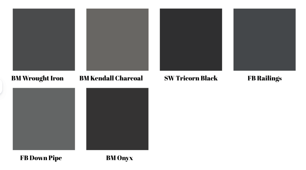
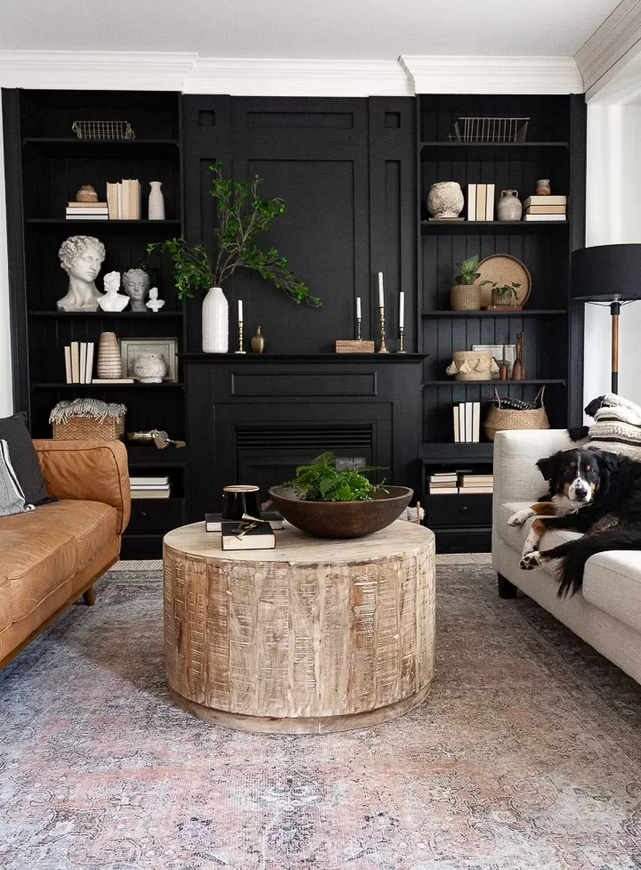
27. Benjamin Moore Wrought Iron – A soft, almost-charcoal black that’s fantastic on interior doors, window mullions, and cabinetry.
28. Benjamin Moore Kendall Charcoal – Classic charcoal without obvious blue tones.
29. Sherwin-Williams Tricorn Black – A true, inky black for high contrast moments.
30. Farrow & Ball Railings – Midnight with a hint of blue; moody and chic on banisters and built-ins.
31. Farrow & Ball Down Pipe – A soft charcoal that works well for exteriors, interior doors, and cabinetry.
32. Benjamin Moore Onyx – Neutral undertones make this a go-anywhere black.
Green
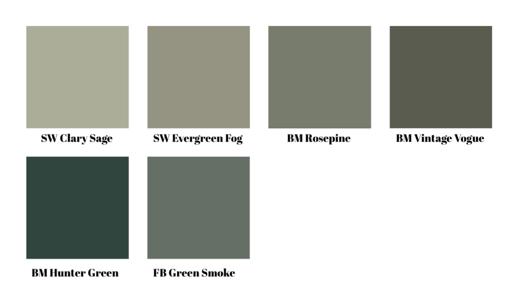
33. Sherwin Williams Clary Sage– A calm, classic sage green with a neutral undertone.
34. Sherwin-Williams Evergreen Fog -Misty, modern green that’s easy across styles.
35. Benjamin Moore Rosepine – A gorgeous mid-tone green with neutral undertones.
36. Benjamin Moore Vintage Vogue – A depp green with sophisticated gray tones
37. Benjamin Moore Hunter Green – A classic Hunter green.
38. Farrow & Ball Green Smoke – Gentle gray-green with historic warmth—stunning on cabinets and mudrooms.
Blue
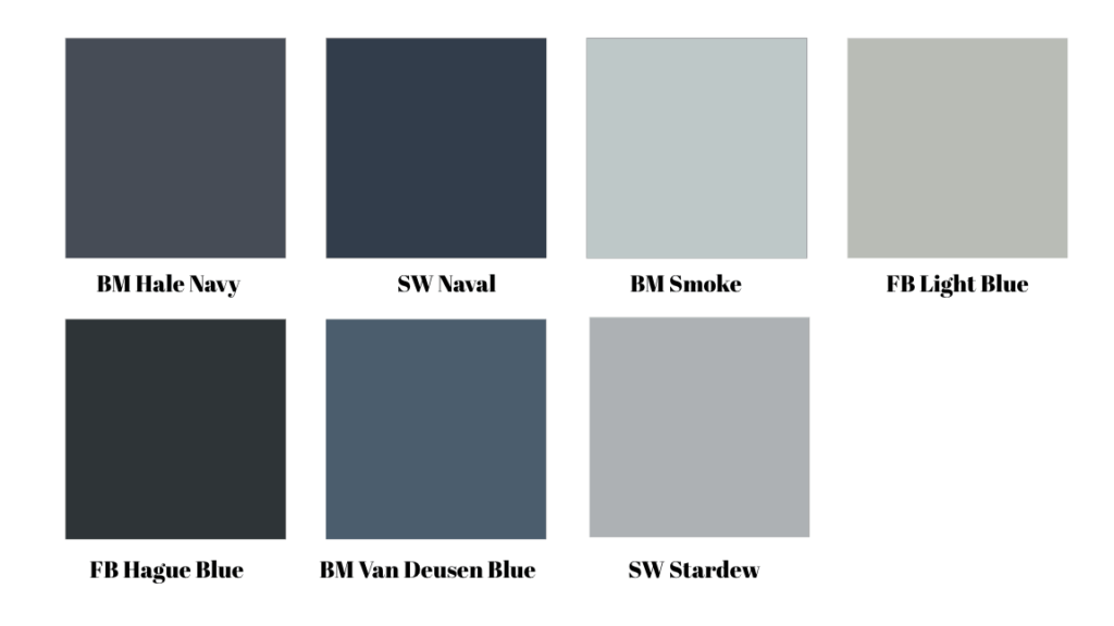
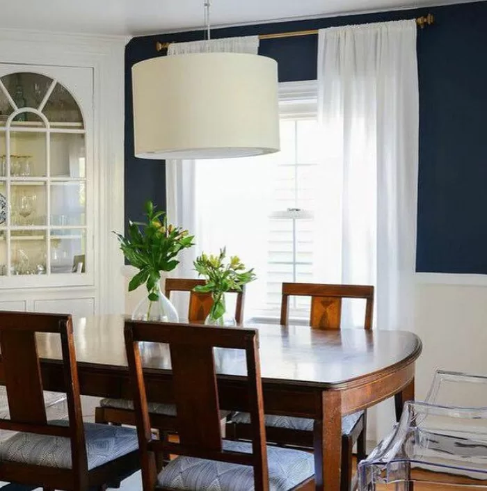
39. Benjamin Moore Hale Navy – The benchmark navy—rich, inky, and timeless (but dark!).
40. Sherwin-Williams Naval – Deep nautical blue that reads luxe with unlacquered brass.
41. Benjamin Moore Smoke -An airy blue-gray that’s great in laundry rooms, baths, and guest rooms.
42. Farrow & Ball Light Blue – Quiet, atmospheric pale blue with a gray undertone for serene spaces.
43. Farrow & Ball Hague Blue – This clean teal blue is a designer favorite
44. Benjamin Moore Van Deusen Blue – A beautiful blue for built-ins, cabinetry, and contrast trim with white walls.
45. Sherwin Williams Stardew – A pretty, soft blue with a big dose of gray.
Pink & Purple
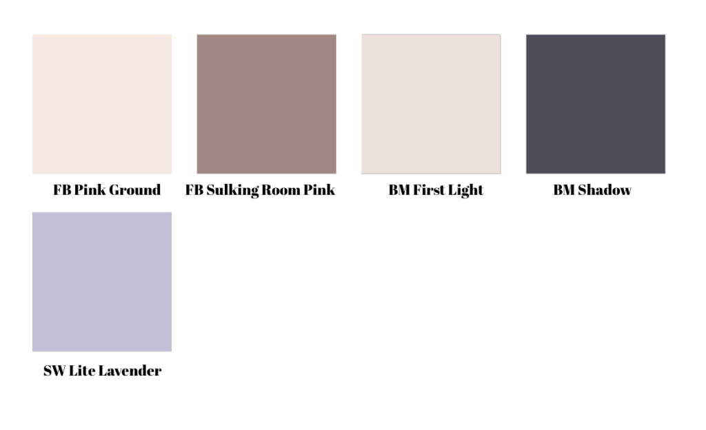
46. Farrow & Ball Pink Ground – A warm blush that reads sophisticated, not sweet.
47. Farrow & Ball Sulking Room Pink – Mauve-rose with depth; gorgeous in bedrooms and dining rooms.
48. Benjamin Moore First Light – Barely-there blush that works as a modern neutral.
49. Benjamin Moore Shadow – A rich deep eggplant with a hint of charcoal.
50. Sherwin Williams Lite Lavender – A sweet pale purple with a touch of gray.
Trend Driven Colors for 2026
Trends ebb and flow, but the current styles are warm, grounded and quietly colorful—think browns, plums, olives, buttery neutrals, and deep, gray-blues. Here are the themes I’m seeing.
Earthy Greens
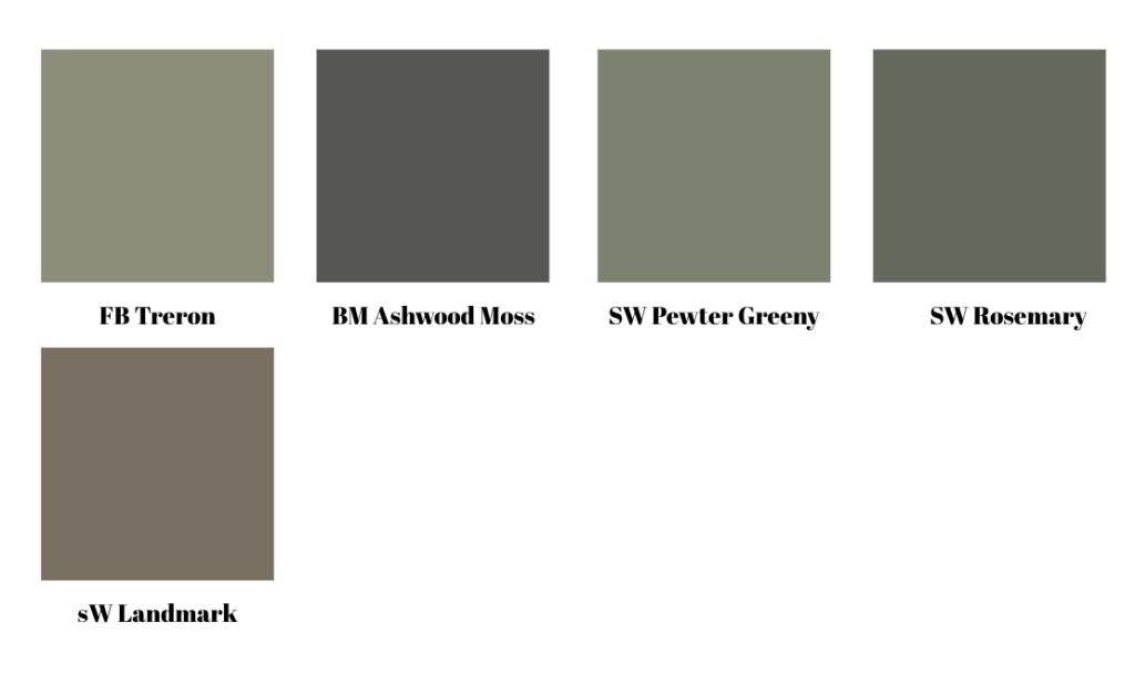
51. Farrow & Ball Treron – Muted green with neutral undertones.
52. Benjamin Moore Ashwood Moss – A classic, sophisticated green
53. Sherwin Williams Pewter Green – A popular pick for 10 years running, this smoky green packs depth.
54. Sherwin Williams Rosemary – Medium-toned earthy green
55. Sherwin Williams Landmark – Muted green brown that looks rich on cabinets.
Dusty Blues & Deep Teals
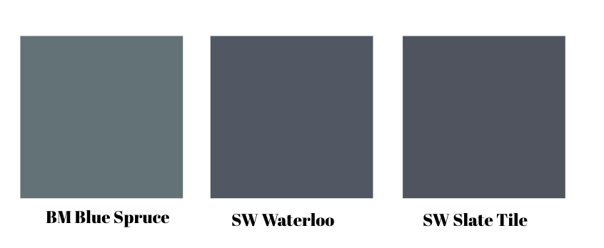
56. Benjamin Moore Blue Spruce – A rich blue with green and gray undertones
57. Sherwin Williams Waterloo – A beautiful true blue with just enough neutral undertones to make it sophisticated.
58. Sherwin Williams Slate Tile- Deep blue-gray with. a hint of green
Rich Brown

Rich brown is having a renaissance across fashion and interiors. Pantone’s Mocha Mousse underscores the shift toward warm, comforting browns that pair beautifully with brass and creamy whites.
59. Sherwin Williams Van Dyke Brown – True chocolate brown.
60. Benjamin Moore Silhouette – The brand’s 2026 Color of the Yeat, blends espresso and charcoal
61. Farrow & Ball London Clay – A toned-down brown.
Plum & Red
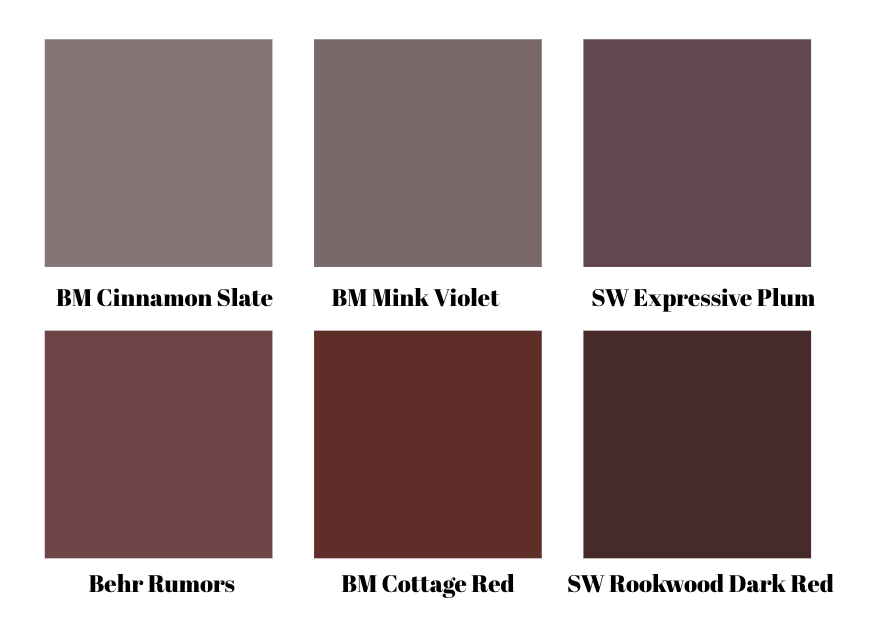
62. Benjamin Moore Cinnamon Slate – A nuanced heathered plum meets velvety brown; elegant on walls or a primary bath vanity.
63, Benjamin Moore Mink Violet – A violet with plenty of brown tones.
64. Sherwin Williams Expressive Plum – Pretty purple with magenta tones.
65. Behr Rumors -A dynamic ruby red for doors, dining rooms, or a dramatic powder room; surprisingly versatile with camel and stone.
66. Benjamin Moore Cottage Red – A beautiful, brick-y burgundy without lots of noticeable blues.
67.Sherwin Williams Rookwood Dark Red – Designer favorite deep red.
Buttercream & Gold
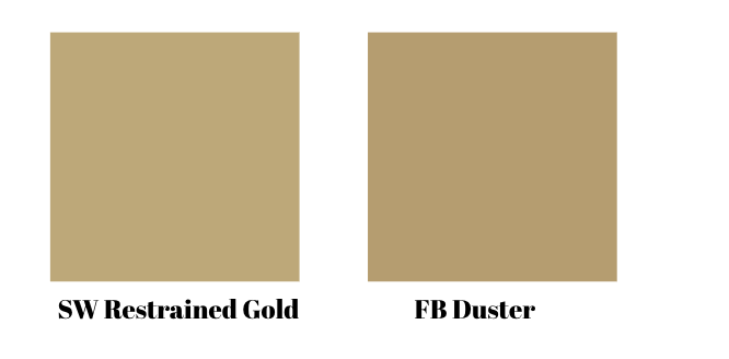
68. Sherwin Williams Restrained Gold – A buttery yellow-brown shade.

69. Farrow & Ball Duster – A pretty mustard hue that works like a neutral.
Tan & Taupe
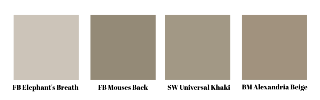
70. Farrow & Ball Elephant’s Breath – A gorgeous, elegant taupe.
71. Farrow & Ball Mouses Back – Warm taupe that’s unexpectedly chic.
72. Sherwin Williams Universal Khaki – The brand’s 2026 color of the year is a rich tan with olive undertones.
73. Benjamin Moore Alexandria Beige – A rich tan that borders on brown.
Dusty Pink
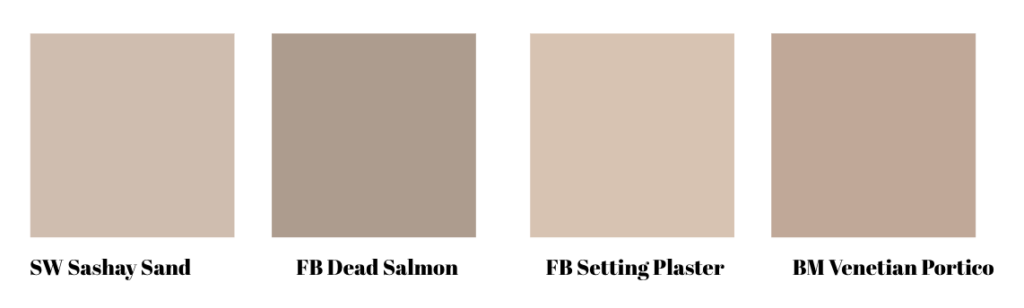
74. Sherwin Williams Sashay Sand – A soft pink with noticeable brown tones.
75. Farrow & Ball Dead Salmon – A sandy pink that feels sophisticated, not sweet.
76. Farrow & Ball Setting Plaster – A go-to for designers, this pink has rich neutral undertones.
77. Benjamin Moore Venetian Portico – Another sandy shade that borders on tan and one of BM’s 2022 Colors of the Year.
Quick Pairing Guide
- Warm whites & greiges: unlacquered brass, oak, travertine, creamy linens.
- Deep blues & blacks: polished nickel, marble, cognac leather.
- Olives & sages: antiqued brass, soapstone, terracotta, natural rattan.
- Pinks & plums: walnut, velvet, aged brass, woven textures.