What color is Indigo? And why I’m obsessed
Would you like to save this?
[What Color is Indio? Originally posted 10/2014, Updated 5/2023]
I’ve always loved navy (it’s pretty much the only color I regularly decorate with) so when all things indigo started trending late last year, I was pumped. Because navy and indigo are almost indistinguishable, but indigo just sounds so much more adventurous.
At the same time, there is still a difference between the two hues … so what is it? Let’s discuss.
What Color is Indigo?
You might know Indigo as the “i” in ROYGBIV. It’s the color on the rainbow that sits between blue and violet. Which gives us the simple explanation that Indigo is a mix of blue and purple. It’s a deep shade that’s similar to navy, but with a richness and depth brought on by the purple hues. You could almost describe is navy, but the purple version. Navy purple, instead of navy blue.
Indigo is also usually a dark color.
The term Indigo can also refer to deep blues, that are sort of like navy but without the gray tones. This color comparison is from Indigo dyes, a dark blue dye extracted from the leaves of plants in the Indigofera genus.
How to Decorate with Indigo
When we moved into our house in Hingham, MA back in 2013, I went pretty nuts with deep shades of blue. See: walls of the dining room, interior of the kitchen cabinet, contents of the china cabinet, arm chair in the living room, wall art in the dining room, wall art in the kitchen…
Though common design sense warns against decorating a home almost entirely around a fleeting color trend, the great thing about this one is, when indigo goes out of style, I’ll just call it navy.
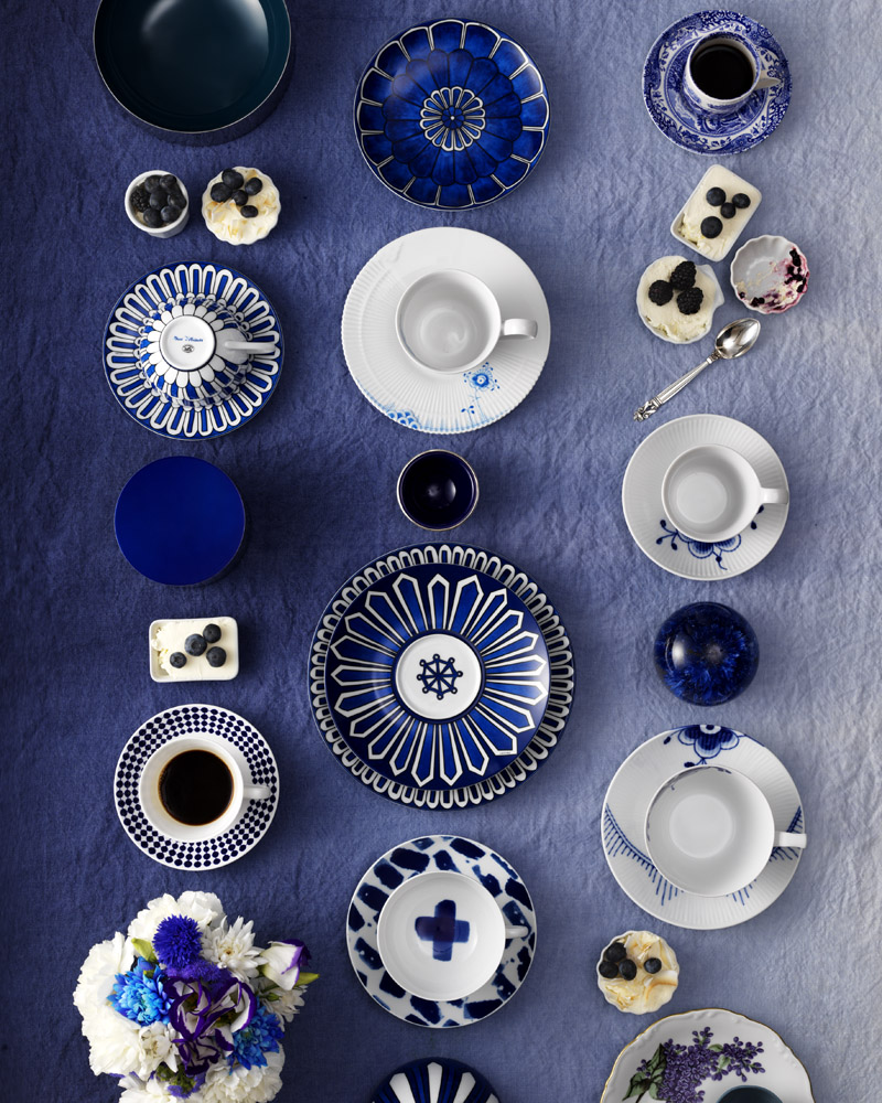
I’ve been collecting blue and white porcelain lately, but I love it mixed in with different prints in the same color palette.
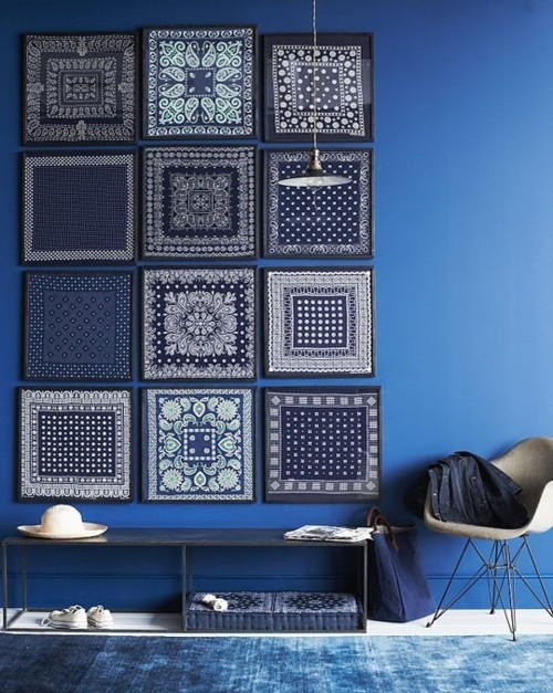
This is an awesome DIY from PopSugar. I have indigo-painted frames in my kitchen, and I’m not a huge fan of the art in them, so this could be a great solve.
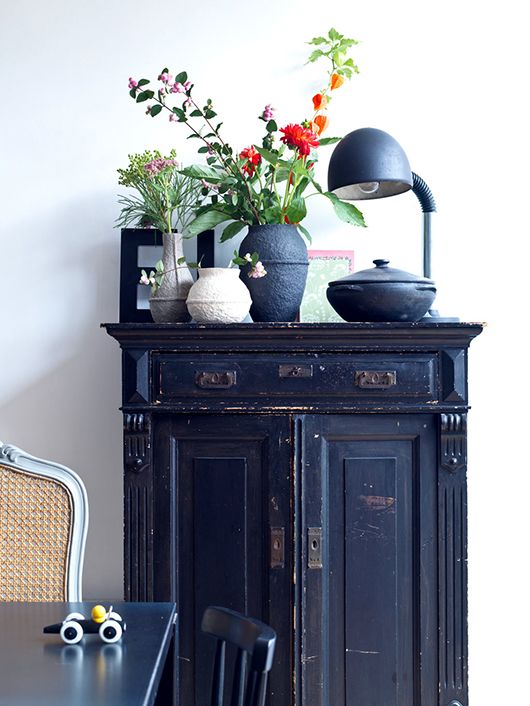
I’m not usually a huge fan of the weathered/shabby chic look, but in a deep color, the distressed trend looks super-fresh.
Out of all the blue things in this photo, I’m most drawn to the pendant light on the right-hand side. Gorg.
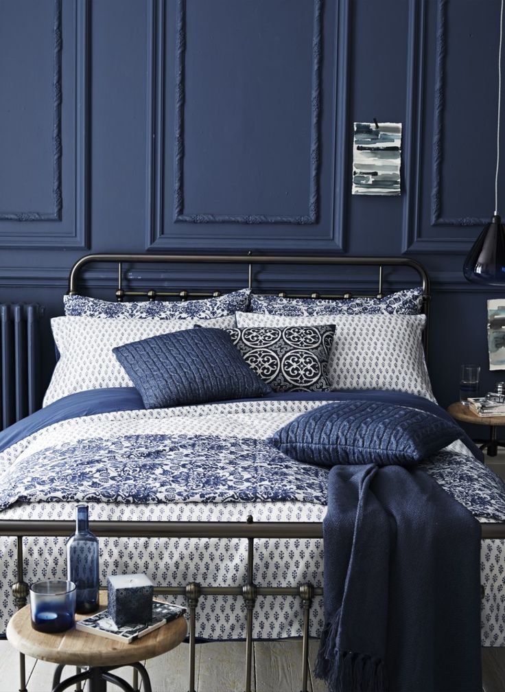
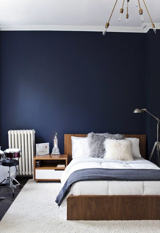
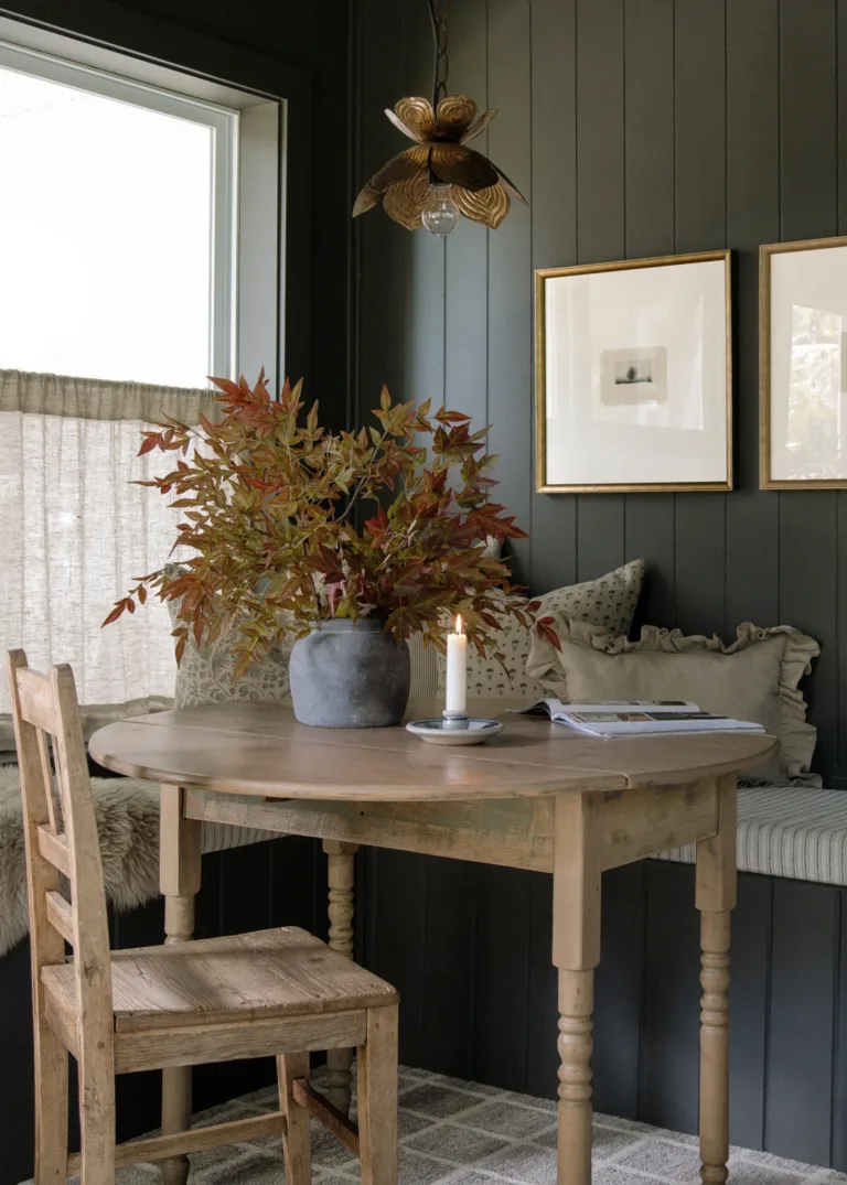
This is sort of the color scheme I’m going for in my dining room, with the navy walls, wooden furniture and brass accents.
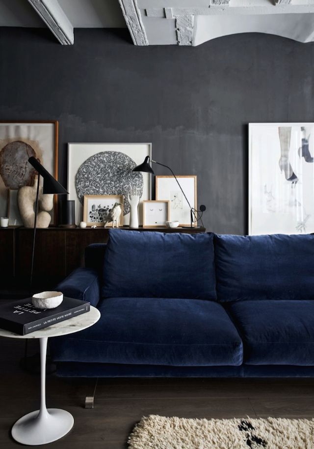
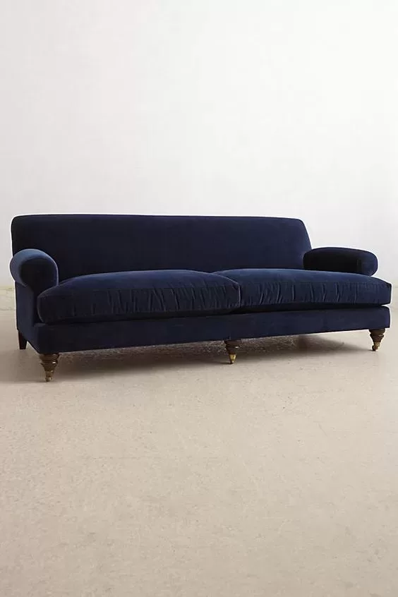
I think velvet was meant to be in a deep blue. No other color looks as good. Except olive green, perhaps.
Make my whole house this color, please and thank you.
