Sherwin Williams Repose Gray vs. Agreeable Gray

Would you like to save this?
If you’ve ever stood in the paint aisle trying to decide between these two shades, you’re not alone. Repose Gray and Agreeable Gray are consistently two of Sherwin Williams’ best-selling colors, and their similarities are exactly what makes choosing between them so tough. They’re both warm grays, both greige-adjacent, both super versatile. On a small. swatch, they can look especially similar.
But put them on your walls, and the differences become real—sometimes surprisingly so. Here’s what you actually need to know to pick the right one for your space.
Sherwin Williams Repose Gray Vs Agreeable Gray: What’s the Difference?
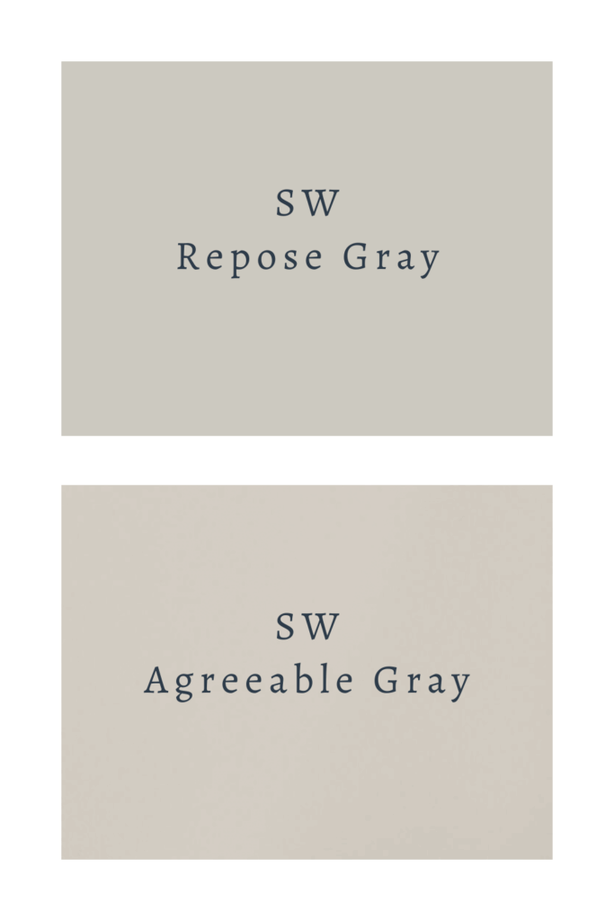
The core difference: Agreeable Gray is the warmer of the two, and Repose Gray is the cooler. Neither is a cold, silvery gray, but Repose Gray sits closer to true gray on the spectrum, while Agreeable Gray leans more definitively into greige territory.
Their LRVs are also nearly identical: Agreeable Gray comes in at 60, Repose Gray at 58. That two-point difference means Repose Gray is technically slightly darker, but in practice, it’s not something you’d really notice from across the room. Lighting will have a far bigger effect on how light or dark either color appears than those two LRV points.
Sherwin Williams Repose Gray Vs Agreeable Gray: The Undertone Difference

If you still can’t decide between these two colors, there is one more thing to consider. The undertones.
Both colors have green undertones, but they behave differently because of what else is going on in each hue.
Agreeable Gray’s green undertone is warmed up by beige, which is what gives it that earthy, greige quality.
Repose Gray’s green undertone is more prominent and less buffered by warmth, which is what gives it a slightly cooler, more neutral gray quality. In direct comparison, this is the color that reads as gray; Agreeable Gray is the one that reads as greige.
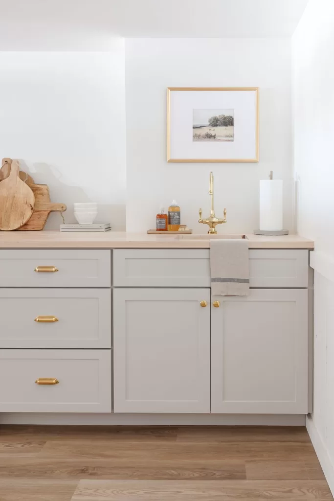
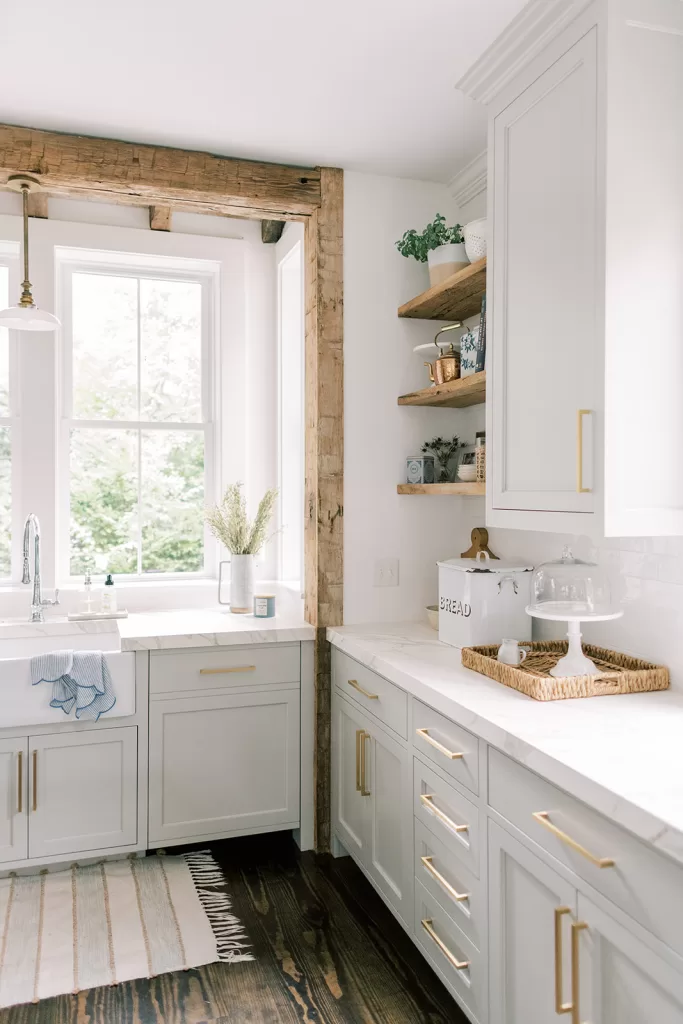
This matters most when you’re thinking about trim color. Repose Gray’s cooler undertones can clash with warm off-whites — if you pair it with a creamy or yellowish white trim, the purple in Repose Gray will make the yellow in the white look more pronounced. Stick to crisp, clean whites like SW Pure White or SW Extra White with Repose Gray. Agreeable Gray is more forgiving and will tolerate warmer whites — like BM White Dove — without as much tension.
Which One Should You Choose?
Go with Agreeable Gray if you want warmth. It’s the better choice if your home has cool-toned hard surfaces (think gray tile, cool-toned stone, stainless appliances) and you want the wall color to offset that, or if you have warm wood tones and want them to feel cozy and harmonious. It’s also the safer pick for north-facing rooms where you need all the warmth you can get.
Go with Repose Gray if you want a truer gray that still feels livable. It’s a better fit for rooms with warm, sun-drenched light where Agreeable Gray might feel too beige, and for homeowners who love the look of gray but don’t want to veer into full greige territory. It’s also a great choice if you’re pairing with cool-toned whites and want everything to feel cohesive and crisp.
The honest answer, though? The right color depends entirely on your room — its light, its finishes, and the whites you’re planning to use alongside it. Both colors have a long track record of looking beautiful in the right conditions and slightly off in the wrong ones. Do yourself a favor and sample both in your actual space, in your actual lighting, before you commit. Peel-and-stick swatches like Samplize make this genuinely easy — you can move them around the room throughout the day and see how each color shifts. It’s worth the extra step.


3 Comments