5 Kitchen Backsplashes That Will Look Dated in 5 Years (And the Better Alternatives)
There are certain “rules” of interior design that are really just common sense. Take kitchen design for example. A good interior designer would tell you that, unless you have an unlimited budget, unlimited patience for renovations, and unlimited interest in home projects, it’s best to design your kitchen for the long haul. That means simple, classic choices that will stand the test of time, so you don’t find yourself staring down the barrel of another remodel in 10 years.
Most homeowners seem to understand this inherently, though, especially when it comes to choosing cabinets and countertops. But, where a lasting kitchen design can sometimes go wrong is in the backsplash. Backsplashes seem like a good spot to try out trends because they’re not quite as large or expensive to replace as the more fixed elements like cabinets, counters, and flooring
At the same time, backsplash styles tend to go in an out of fashion quicker than larger elements, and choosing a design that’s too trendy can end up stamping your kitchen in time. Once a backsplash starts to feel dated, it can make an otherwise well-designed kitchen feel tired—even if everything else is still working.
That doesn’t mean you need to stick to a boring kitchens or avoid trends altogether. It’s just a good idea to be selective about where to use those trends, and where to go for something that’ll stand the test of time.
How to Tell If a Backsplash Will Date Fast

Would you like to save this?
Before getting into specific offenders, here’s a simple rule-of-thumb I use when evaluating backsplash choices:
If the backsplash is doing most of the talking in the kitchen, it’s more likely to age quickly.
More specifically, backsplash choices tend to date fast when they include:
- High-contrast patterns that dominate the room
- Novelty shapes or materials that suddenly spike in popularity
- Very busy grout lines
- Designs chosen mainly because they’re “everywhere right now”
- A style that’s brand new, as opposed to a resurgence of a classic material or design
A backsplash that ages well usually plays a supporting role to the overall design scheme. It adds texture, warmth, or subtle interest, but it’s not the design focal point.
With that in mind, here’s a lit of some of the warning signs for a quick-to-date backsplash.
Backsplashes With a Timestamp, And What to Pick Instead
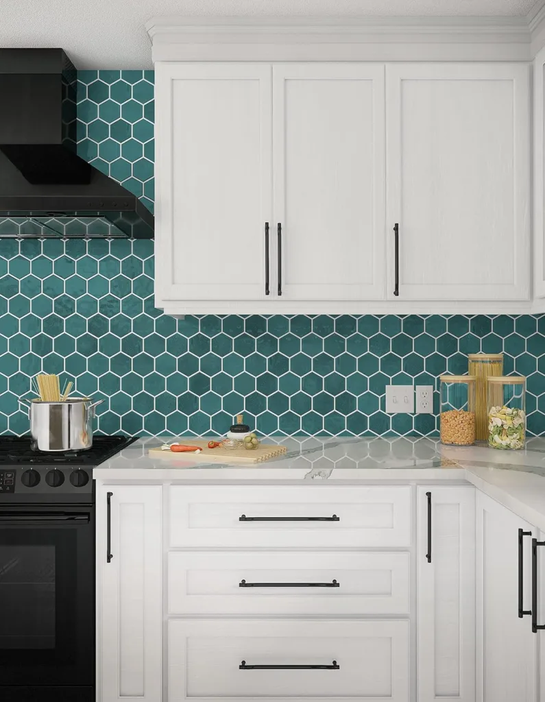
1. High-Contrast Patterned Tile (Cement or Encaustic-Look Tile)
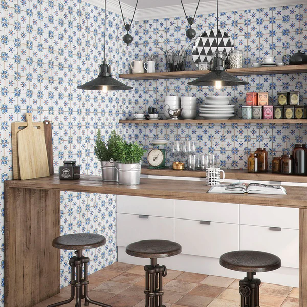
These tiles had a huge moment—and for good reason. They photograph beautifully. They add instant personality. And in the right context, they can be charming.
But as a primary kitchen backsplash, high-contrast patterned tile tends to age quickly.
The reason is visual dominance. When the backsplash becomes the main focal point, everything else has to work around it, which makes it difficult to update other aspects of the kitchen design as trends change.
There’s also a timing issue. Bold patterned backsplashes are closely tied to late-2010s design trends. Even well-done versions can start to read as “of that era” faster than more restrained choices.
Better alternatives:
If you love pattern, shift it to something more flexible—like a runner, bar stools, or even art. For the backsplash itself, look for:
- Tone-on-tone tile with subtle variation
- Handmade-look ceramic tile without a graphic pattern
- Texture over contrast
You still get interest, but without locking the kitchen into a specific moment.
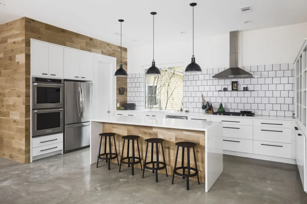
2. Skinny Glass or Shiny Mosaic Tile Sheets
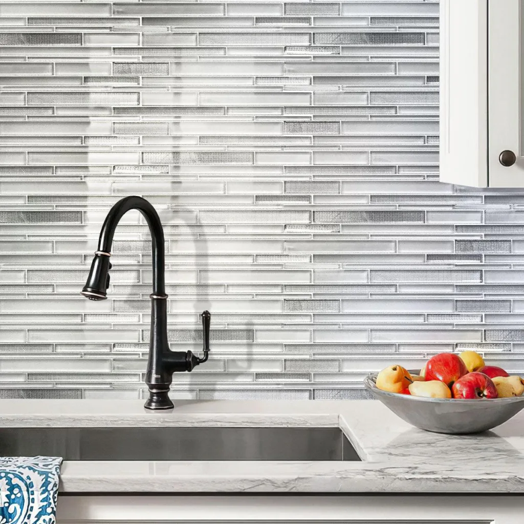
This is one of those backsplash choices that feels instantly dated the moment you see it—because it already is.
Skinny glass mosaics and shiny tile sheets were everywhere in builder-grade kitchens and early 2000s renovations. I actually had this tile in the kitchen of the first condo my husband and I ever bought in 2013, so I can say that, beyond aesthetics, they’re also sort of impractical. The many grout lines make them hard to clean.
Better alternatives:
If your goal is a clean, streamlined look:
- Choose solid ceramic or porcelain tile
- Go slightly larger in scale to reduce grout lines
- If you like a linear look, try a stacked subway tile design with matching grout
A simple material done well will always outlast something trying too hard to feel “updated.”
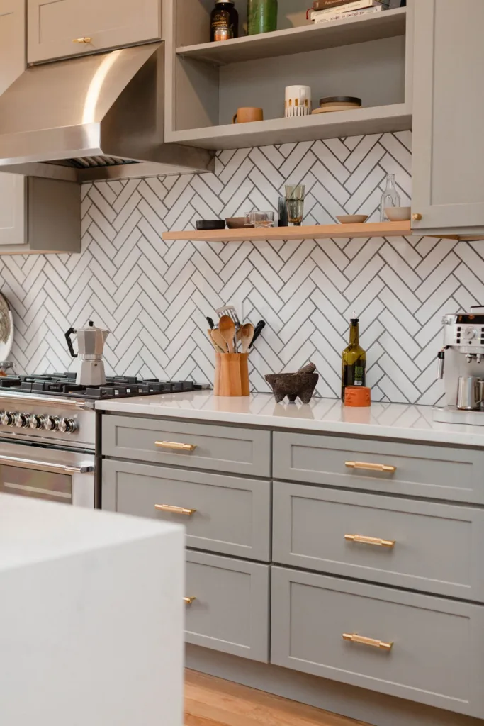
3. Trend-Driven Tile Shapes (Scallop, Chevron, Extreme Arch)
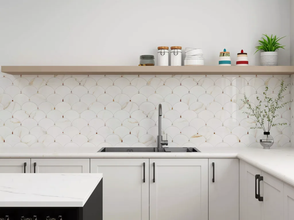
When the shape of the tile is the main design feature, that’s a red flag.
Scalloped tiles, dramatic arches, exaggerated chevrons—these shapes can look fun and fresh when they first appear. But because the novelty is the entire appeal, they tend to burn out quickly.
Once that shape stops feeling new, there’s nothing neutral left to fall back on.
Better alternatives:
Instead of relying on shape alone:
- Stick with simple rectangles or squares
- Create interest through layout (vertical stack, subtle offset)
- Let grout color or finish add softness, not contrast
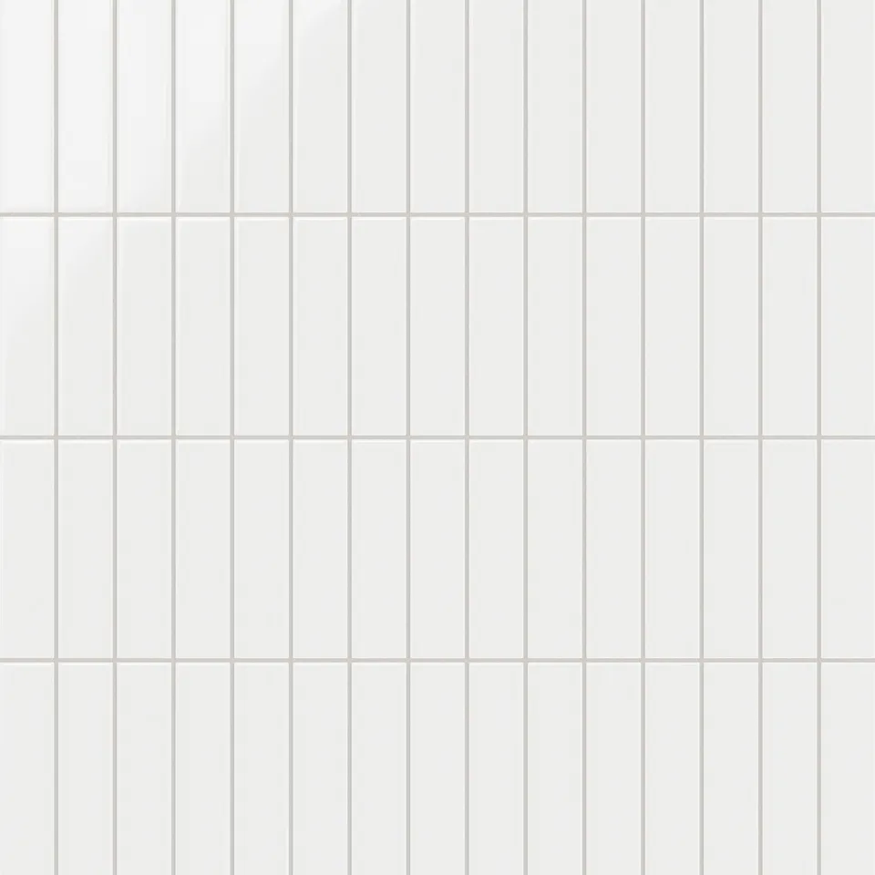
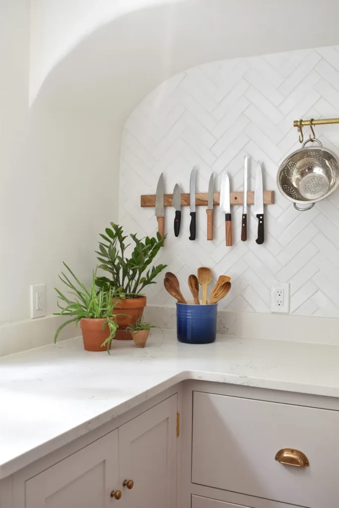
Once again, here’s a look at that same white Fireclay tile, again laid in a chevron pattern, except this example shows white grout so the pattern isn’t as emphasized. The simplicity makes the chevron pattern more subtle, and thus, more timeless.
4. Ultra-Glossy White Tile With Dark Grout
Speaking of white tile and dark grout! You may remember this look from the Joanna Gaines farmhouse era.
Ultra-glossy white subway tile paired with dark grout had a massive Pinterest moment in the mid-to-late 2010s. At the time, it felt graphic and modern. Now, it reads very clearly as a trend from that era.
The other issue is contrast. Instead of quietly supporting the kitchen, the backsplash becomes visually busy—and often harder to live with day to day.
Better alternatives:
- Use grout that closely matches the tile color
- Look for slightly irregular or handmade-style subway tile to soften the look
You still get the familiarity of subway tile, but without the harsh outlines that date it.
5. Color-Forward Tile Used as the Main Design Moment
I’m not anti-color. But I am cautious about where color goes in a kitchen.
When the backsplash is the primary source of color—especially if it’s a bold or trendy hue—it tends to age faster than people expect. Color trends move quickly, and once you tire of that specific shade, the only option is to live with it or replace the whole thing.
This is especially true when the tile color is doing all the heavy lifting in an otherwise neutral kitchen. Once that color falls out of favor, the entire space can feel stuck.
Better alternatives:
- Keep the backsplash neutral and let color come from paint, lighting, or hardware
- If you do want color, choose muted, historically grounded tones rather than saturated trend shades
- Limit color to smaller accents or secondary areas (like a coffee station)
Think of backsplash tile as a foundation—not a statement piece.
Backsplash Choices That Age Well
After all the warnings, here’s the good news: timeless doesn’t mean boring.
These are backsplash choices I see working again and again, across different homes, styles, and price points.
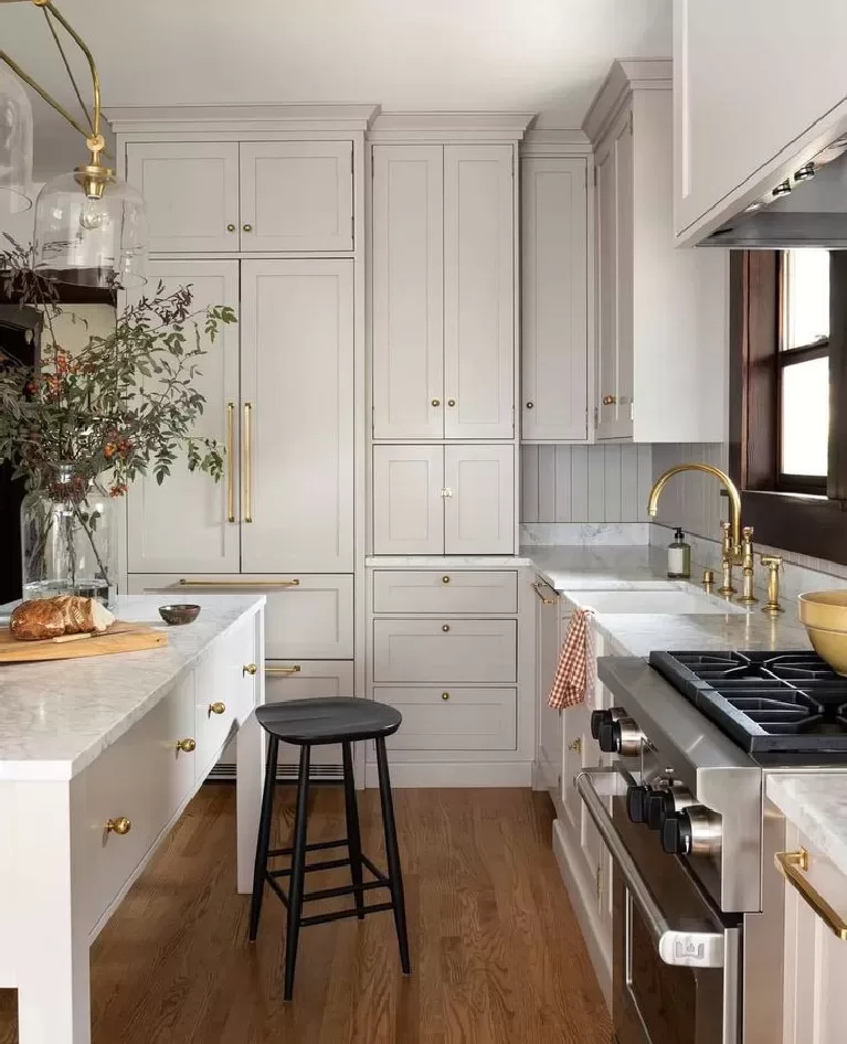
Warm White or Cream Ceramic Tile
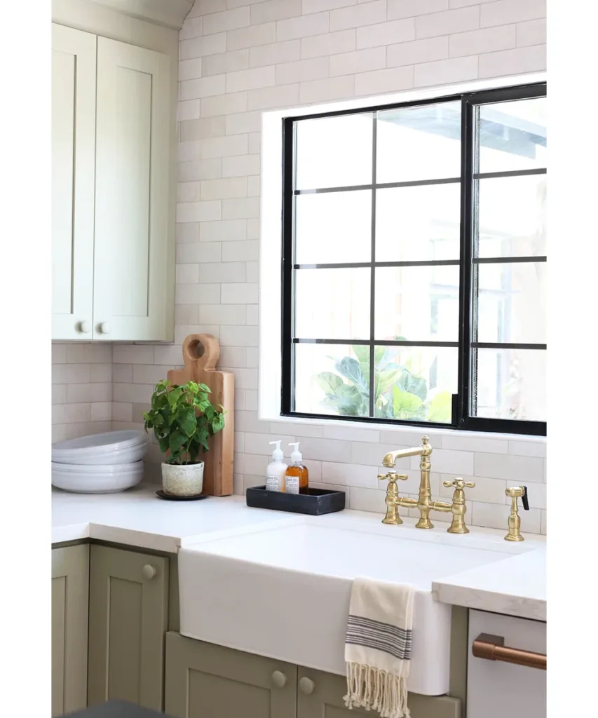
Warmth is key. Soft whites and creams feel more forgiving and less tied to a specific trend cycle than bright, icy whites.
Natural Stone (Used Thoughtfully)
Honed marble, limestone, or quartzite—with natural veining rather than graphic patterns—adds depth without shouting. Imperfections actually help these materials age better.
Counter-Matching or Slab Backsplashes
Using the same material as the countertop creates a seamless, quiet backdrop—especially helpful in kitchens with a lot going on visually.
Handmade-Look Tile in Neutral Tones
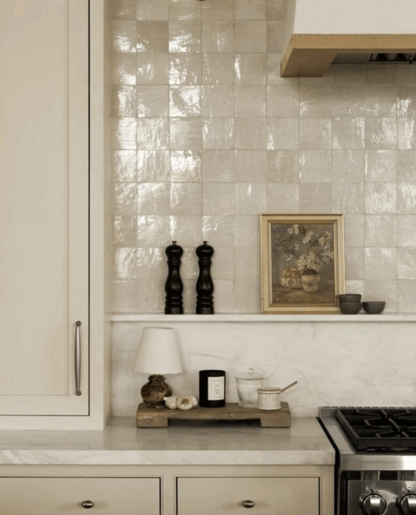
Subtle variation gives character without locking you into a moment. These tiles feel human, not trendy.
Where to UseTrends Instead
If you love trends—and I do—you don’t have to avoid them. Just put them where they’re easier to change.
Great places for trend-forward choices:
- Lighting (including kitchen lamps)
- Rugs and runngers
- Bar stools
- Cabinet hardware
- Paint color
- Styling (art, ceramics, textiles)
These elements let your kitchen evolve over time without requiring any demo work.