Benjamin Moore Silhouette AF‑655: A Sophisticated Neutral for 2026
Earlier this year, I had a feeling that at least a handful of the big paint brands would be choosing brown as their color of the year. It’s a color that’s just really been at the forefront of design conversations, so it seemed like the natural fit for the “it” shade of 2026. And, I fully meant to post some sort of Tiktok or IG post with this prediction, so that when the colors were announced I would have proof of my own trend-predicting superpowers. But, alas, I never filmed such a thing, so you’ll just have to take my word that I totally knew brown would be the big color of 2026! Needless to say, when Benjamin Moore announced its 2026 Color of the Year was Silhouette, a rich gray-brown, I wasn’t surprised.

Would you like to save this?
This pretty, dramatic shade is keeping right in line with the big home decor color trends we can expect to see for the next few years.
If you love this shade and are thinking about using it in your own home, keep reading for everything you need to know about Silhouette!
What Color Is Benjamin Moore Silhouette?
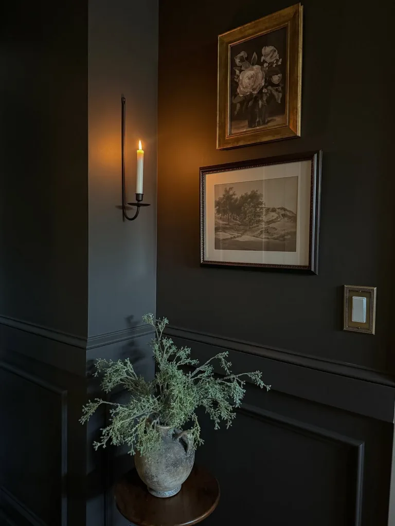
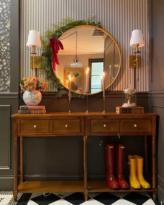
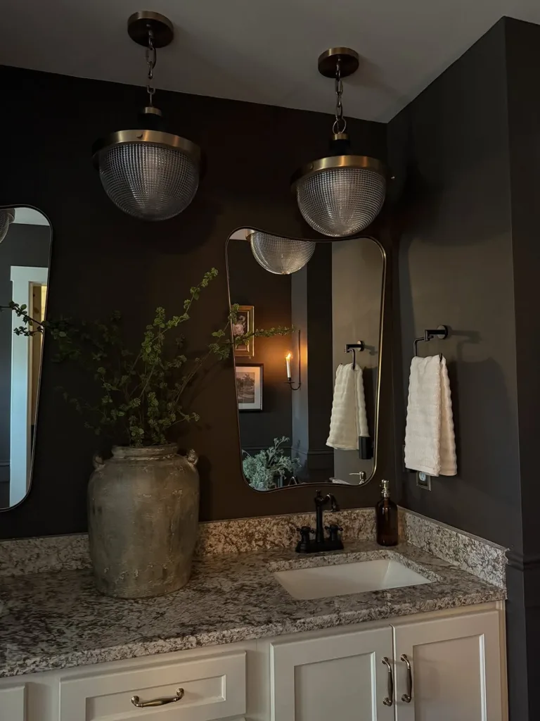
So what color is Silhouette, exactly? It isn’t just “brown.” It’s a deep charcoal‑brown with lots of layers. Benjamin Moore calls it an elegant blend of espresso and charcoal—which was inspired by classic menswear collections. It also appears to have a subtle purple cast, too. In my experience, a complex color like this one means it’ll read differently depending on lighting and what you pair it with—cream and beige make it feel neutral and sophisticated, but blushes, mauves or muted greens pull out its moody, bohemian vibe.
Light Reflectance Value (LRV) and Undertones

In paint‑speak, LRV measures how much light a color reflects (0 = black, 100 = white). Silhouette’s LRV is around 10.18 placing it firmly in the dark range. It absorbs most of the light in a space, which is why rooms painted entirely in Silhouette feel cocooning and intimate.
Undertone‑wise, Silhouette is not a flat brown. As I mentioned, it’s a blend of brown, gray and a touch of purple. In south‑facing rooms it picks up a warm brown warmth, while in cooler light it can lean purple‑gray.
Because it has both warm and cool notes, Silhouette pairs well with warm whites, creamy beiges, mauves, dusty pinks or deep greens.
How Silhouette Looks in Different Light
Given the different undertones, this color is definitely a chameleon. In a north‑ or east- facing room (where light tends to be gray-blue), the violet‑gray undertones will come through, and give the hue a cool, smoky vibe. But in a south‑ or west- facing room where the light is generally warmer, the brown and espresso notes will steal the show.
Lighting changes everything, so I recommend sampling Silhouette under both natural daylight and artificial bulbs before committing.
Best Places to Use Silhouette
Because it’s so rich and versatile, Silhouette isn’t the color you splash on every wall. Think of it as a statement neutral that deserves a little intention:
- Accent walls and millwork Its deep, layered tones add instant drama to built ins, small powder rooms or millwork.
- Cozy bedrooms or libraries. Painting an entire room in Silhouette creates an enveloping, intimate atmosphere. If you go this route, especially in a bedroom, be sure to add soft linens and lots of texture to keep the space from feeling heavy.
- Powder rooms. Moody undertones give these spaces a sophisticated, jewel‑box like quality. Try it with brass fixtures or warm wood tones for extra depth.
- Entry doors and exterior trim. Still nervous? Paint just your front door, shutters or a garage door. It’s a great way to dip your toe into the color.