Benjamin Moore Blue Spruce: The Deep Green-Blue I’ve Loved for Years (and Finally Used)
When I find a paint color I love, I tend to mentally file it away and until I can find an excuse to use it. Benjamin Moore Blue Spruce has been one of those colors for me for years.

Would you like to save this?
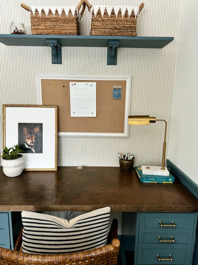
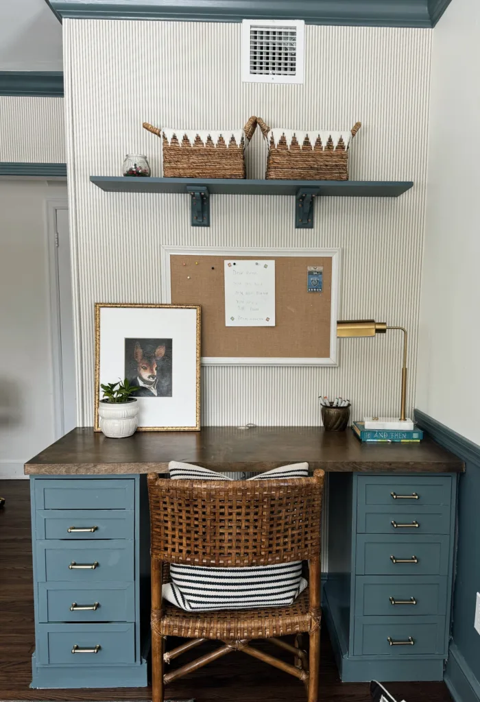
I’ve recommended it to other people a bunch of times, saved it to inspiration folders and bookmarked it as a “someday” shade—but until recently, I hadn’t actually used it in my own home. That finally changed last month when I decided to paint the trim in our kids’ playroom, and Blue Spruce ended up being the winning color.
If you’re looking for a rich, moody medium-blue that still feels classic and livable, let me walk you through everything you need to know about this pretty paint color.
What Color Is Benjamin Moore Blue Spruce?
Benjamin Moore Blue Sprue is a deep shade of blue with noticeable green and gray undertones.
Depending on the light, it can lean:
- More teal-blue in warm or natural light
- More blue-gray in lower light or north-facing rooms
We have it in a south facing room and, while its still obviously blue, the green tones are definitely very apparent.
Benjamin Moore Blue Spruce: LRV and Undertones
Blue Spruce has an LRV of about 16, which means it’s is a deeper, mid-to-dark tone paint color. It’s definitely a vibe, but it’s not as dark as other popular blue tones like BM Hale Navy or Polo Blue.
Like I mentioned, Blue Spruce is a blue with green and gray undertones. To my eye, the primary undertone is green, with gray being secondary.
That gray undertone is key, though. It softens the color and gives it that sophisticated, almost historic feel that makes colors feel more livable and timeless. It never looks jewel-toned or overly saturated, which is why it works so well in traditional homes and layered interiors.
Where to Use Benjamin Moore Blue Spruce

Blue Spruce is surprisingly flexible, especially if you’re open to using color beyond just walls.
I love it for:
Trim and millwork
This is where I finally used it—in our playroom trim—and I couldn’t love it more. It adds instant character and contrast while still feeling classic.
Built-ins and cabinetry
Perfect for bookshelves, media units, or lower cabinets. It pairs beautifully with warm whites and natural wood.

Styling: @anndesan
Bedrooms
Especially primary bedrooms or guest rooms where you want something calming but not boring.
Dining rooms or libraries
This color absolutely shines in rooms that benefit from a bit of drama.
Front doors or exteriors
Blue Spruce is stunning outside—especially against brick, stone, or white siding.
Because it has both blue and green undertones, it works well with brass, bronze, black hardware, and warm wood tones.
Benjamin Moore Blue Spruce vs. Other Blue-Gray and Green-Blue Paint Colors

If you’re debating Blue Spruce against a few other popular shades, here’s how it compares:
Blue Spruce vs. Benjamin Moore Providence Blue

Providence Blue it another of my favorite blue-grays. It’s very similar to Blue Spruce, but it’s a touch lighters and its undertones are more gray and less green.
Blue Spruce vs. Sherwin Williams Slate Tile

If you want something that leans a little more gray, Slate Tile is a beautiful choice that’s more on the charcoal side.
Behr Norwegian Blue

The Norwegian Blue paint swatch caught my eye at Home Depot because it reminded me of Blue Spruce. On the wall, it’s lighter and softer than Blue Spruce, without the green undertone.
Blue Spruce vs. Farrow & Ball Selvedge

For a lighter, softer option, Farrow & Ball Selvedge is a great pick. It also doesn’t have the obvious green undetones that Blue Spruce has.
Trim Colors and Pairings for Blue Spruce
If you’re pairing Blue Spruce with other colors, here are some combinations I love:
- Warm whites: Benjamin Moore White Dove, Sherwin Williams Alabaster
- Soft neutrals: Pale Oak, Classic Gray
- Earthy accents: Warm woods, leather, woven textures
- Metals: Warm picks like antique and unlacquered brass, copper, and aged bronze