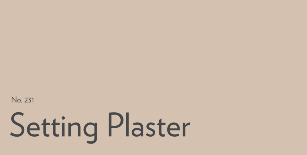
Farrow & Ball Setting Plaster (No. 231): All About This Pretty Pink (But Not Too Pink) Shade
When we first moved into our home in 2018, the lower level was painted almost entirely in a pale neutral pink. I hated it, and painted over every inch with Benjmain Moore Simply White. Well, everything that’s old comes around again, because now, dusty pink shades are popping up everywhere in interiors … and I no longer hate it.
One of the prettiest blush-pink shades I’ve seen cropping up more and more if Farrow & Ball Setting Plaster. Setting Plaster is one of those colors that looks “soft and neutral” in a styled photo, then you see it in a real room and realize it’s doing a lot more than that. It lands in that dusty blush category that’s trending again—but in a way that still works with classic finishes (wood, stone, brass) instead of screaming “pink!”
Farrow & Ball calls it a dusty plaster pink with yellow pigment mixed in, which is why it tends to feel warmer and more grown-up than a typical blush.
If you’re thinking about this pretty pink, here’s everything you need to know about it, and probably more.
What color is Farrow & Ball Setting Plaster?
Would you like to save this?
Setting Plaster No. 231 is a dusty, muted pink that often reads like a blush-beige on the wall—especially in warm light or alongside creamy whites. Farrow & Ball explicitly notes it’s “definitely a pink” historically, but softened by yellow pigment.
Farrow & Ball Setting Plaster LRV and undertones
LRV, or Light Reflectance Value, is basically a measure of how much light a color bounces back — on a scale of 0 to 100. Setting Plaster sits at around 57, which puts it right in the middle: not so light it reads as white, not so dark it feels heavy.
One thing to note: Farrow & Ball doesn’t publish official LRV numbers, so any figure you find online is a third-party estimate.
That said, 57 is a really nice range to land in. It’s light enough to feel airy, but there’s enough pigment there that it actually shows up as a color — not just a vaguely pink white.
Setting Plaster Undertones
As for undertones: F&B says the warmth comes from yellow pigment in the formula, which is what keeps it from feeling cold or too childish. In your space, you can expect a warm blush that shifts depending on the light in your space — more beige and powdery in warm south-facing light, more rosy and dusty in cooler northern exposure.
Where to use Farrow & Ball Setting Plaster
Setting Plaster is a surprisingly versatile shade that can really be used throughout the house, whether in small doses or as a whole-room shade. Here’s a look at it in various spaces.
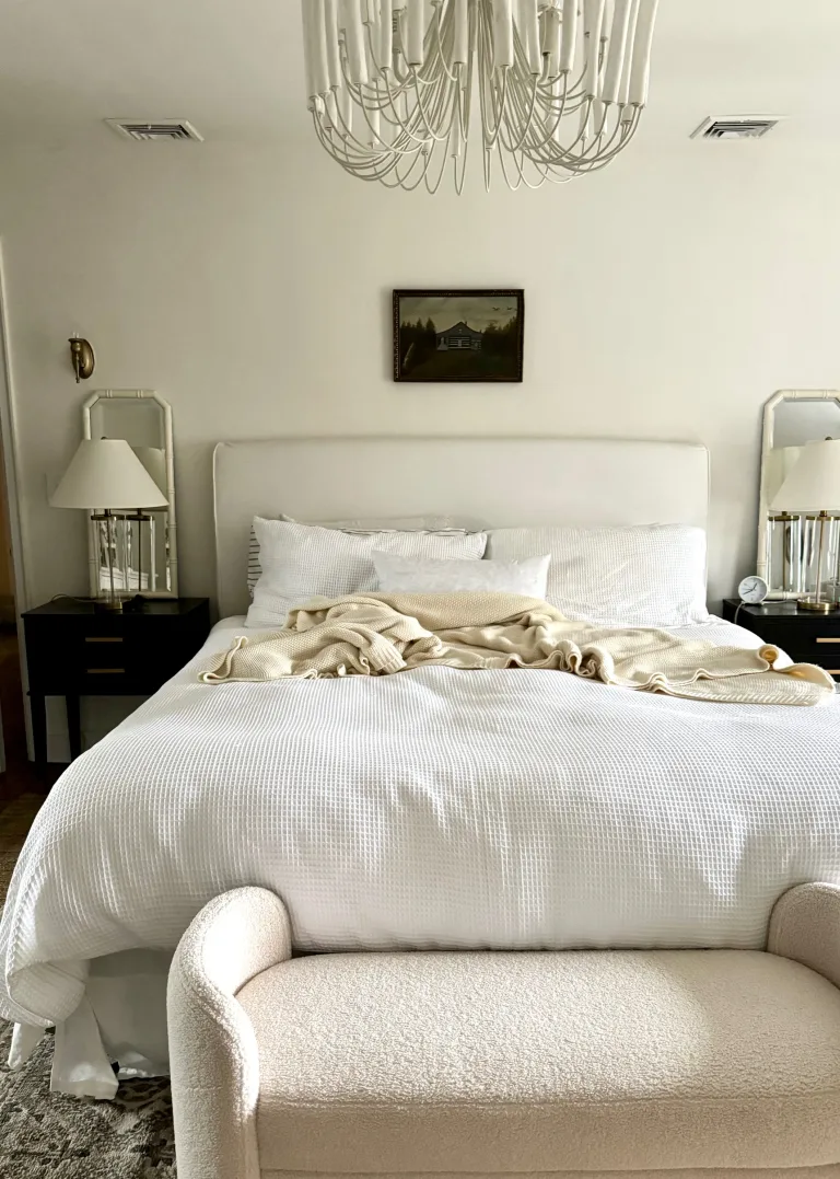
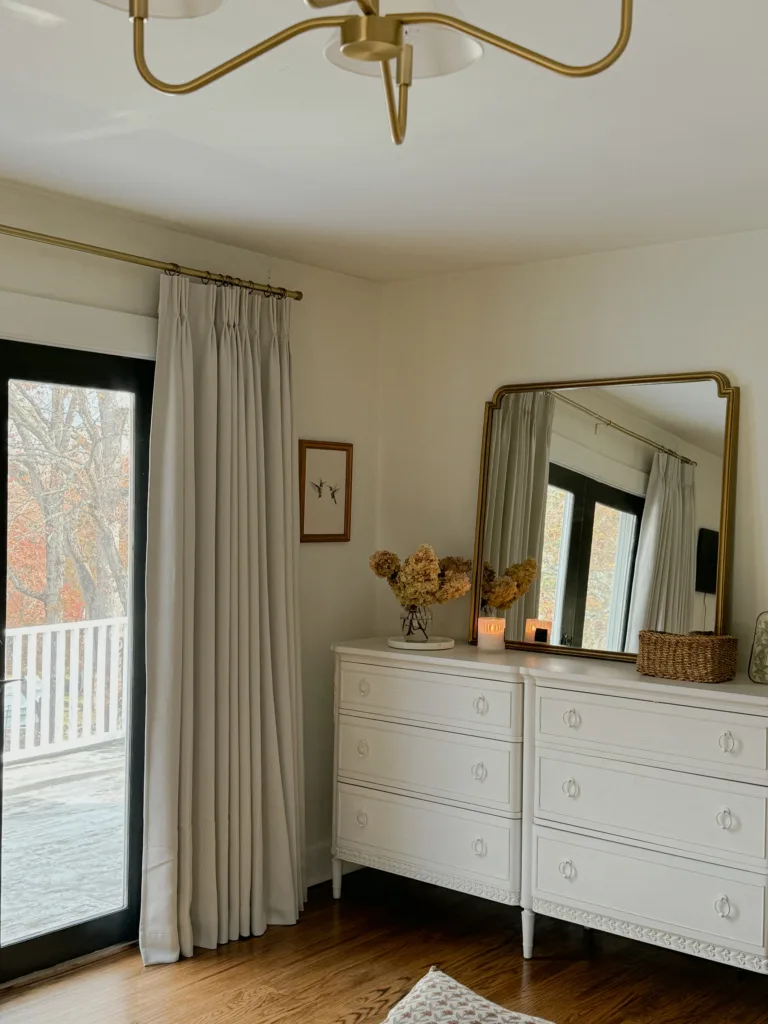
Bedrooms

This is where it makes the most sense: warm, flattering and calm, especially with paired with creamy neutrals and layered patterns.
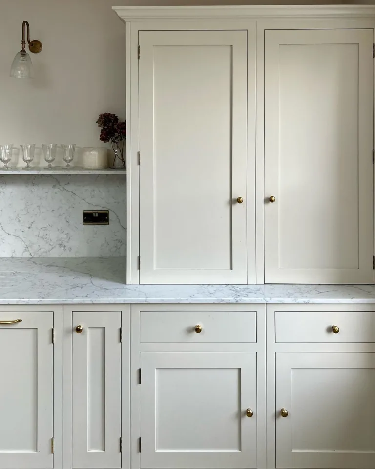
Kitchens
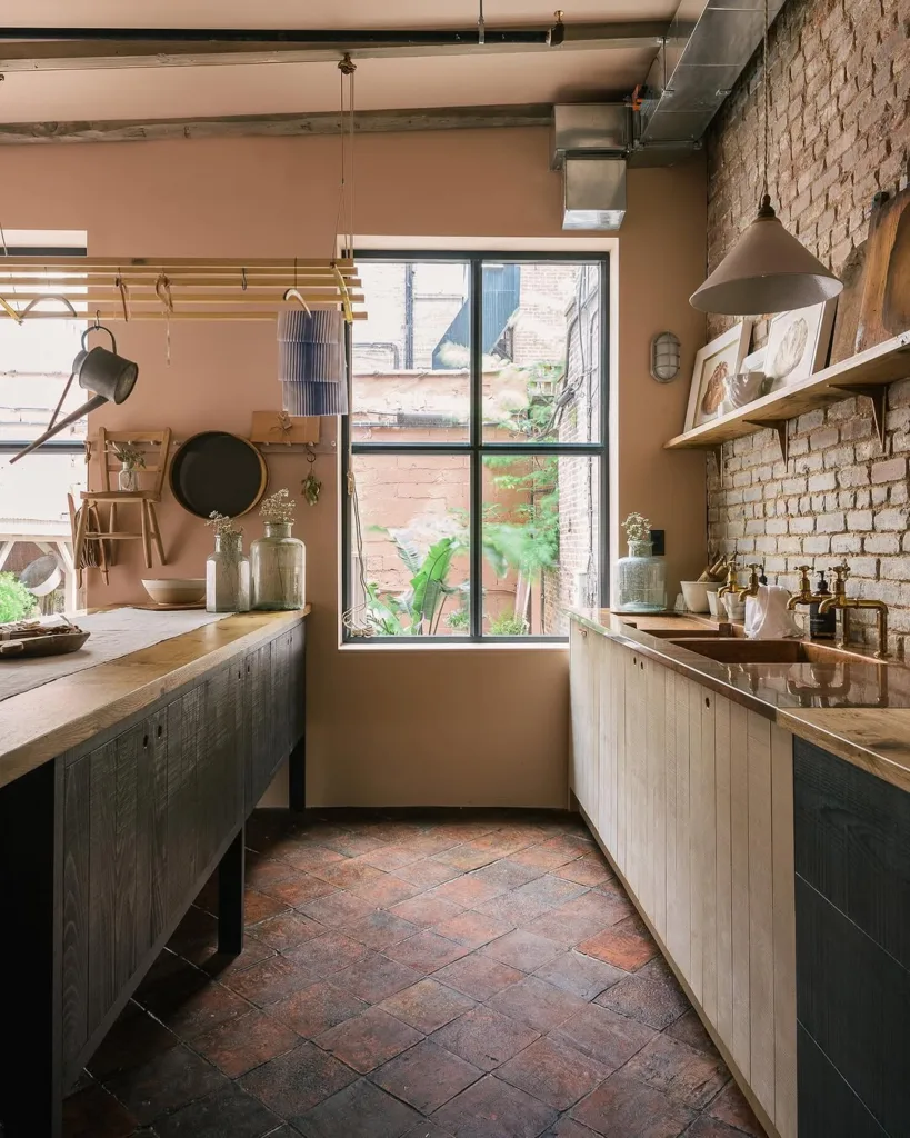

This is probably the most unexpected use-case for a pale pink, but as you can see in these shots from DeVol kitchens and Sean Simington, it creates a cozy and sophisticated English cottage vibe.
Powder rooms / Bathrooms

Setting Plaster shines in smaller spaces where a “quiet color” still reads intentional (and looks great with aged brass and black or deep blue accents, like in the space above).
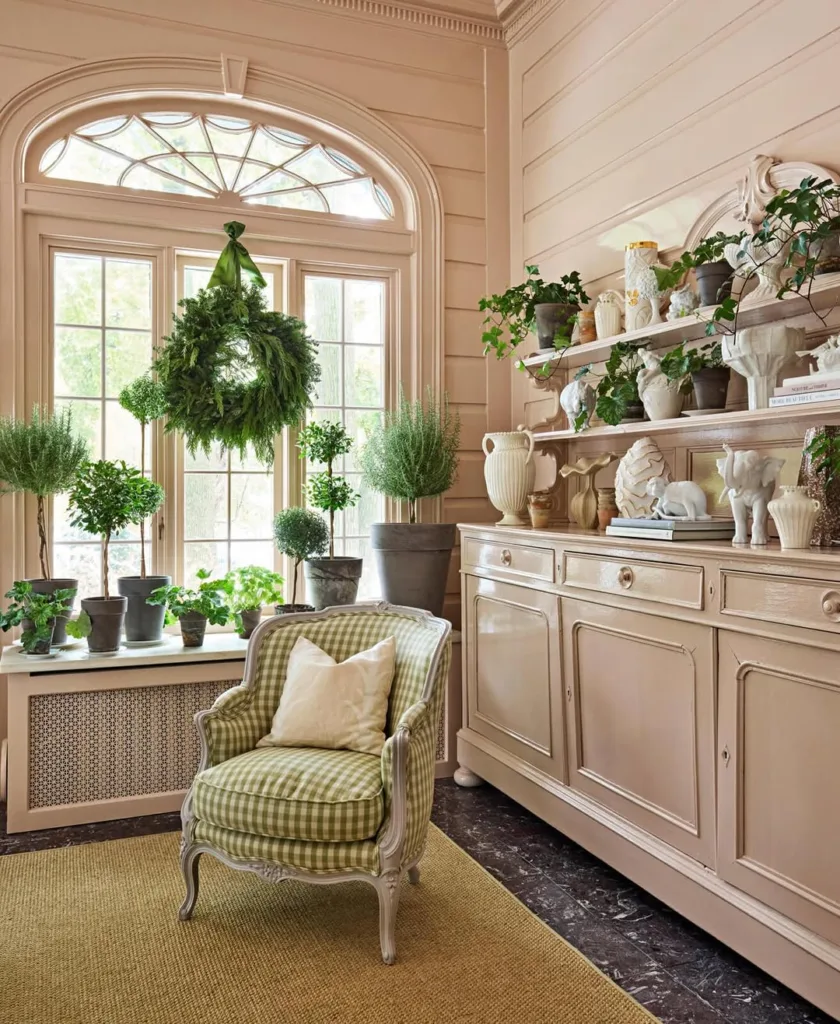
Living rooms (as a neutral alternative)

If you want warmth without beige, it can act like a tinted neutral—especially with oak, linen and soft whites, or in a cottage-inspired space with lots of layered patterns.
What colors go with Farrow & Ball Setting Plaster
Because Setting Plaster is a warm blush with yellow influence, it plays best with warm off-whites, inky blue-greens, and deep earthy browns/greens.
Here are strong pairings:
Farrow & Ball School House White

A warm, classic off-white for trim/adjacent rooms
Sherwin Williams Iron Ore

Iron Ore is an off-black that adds gravitas to Setting Plaster’s pink.
Benjamin Moore Providence Blue

A deep blue with green undertones offers great contrast.
Sherwin Williams Rosemary

A rose garden-inspired combo.
Farrow & Ball Treron

A muted green; makes Setting Plaster feel sophisticated, not sweet
Farrow & Ball Mahogany

F&B suggests this rich brown-red that leans historic and warm as a coordinating shade for Setting Plaster.