Farrow & Ball Light Blue: Why We Chose it For Our Living Room
I debated painting our living room a shade of blue FOR YEARS, before I committed and decided to go for it this summer.
When I first had the itch to paint a couple years back, I though I wanted to do a powdery blue. But then I decided to make this space feel a little more casual, and I started considering colors with some gray to them. I love a blue gray and have used it a few times in our home already so I immediately had some top contenders. They were:
- Benjamin Moore Wales Gray, a color I had previously used in my dining room
- Farrow & Ball De Nimes, a darker blue gray in case the room wanted to go a little moodier
- Benjamin Moore Mount Saint Anne: A deeper shade of blue gray that’s not quite as dark as De Nimes
- Benjamin Moore Providence Blue: A slightly grayer, greener take on Mount Saint Ann
- Farrow & Ball Skylight: A warmer, paler blue gray
- Farrow & Ball Light Blue: A lovely shade of light blue with a heavy dose of gray.
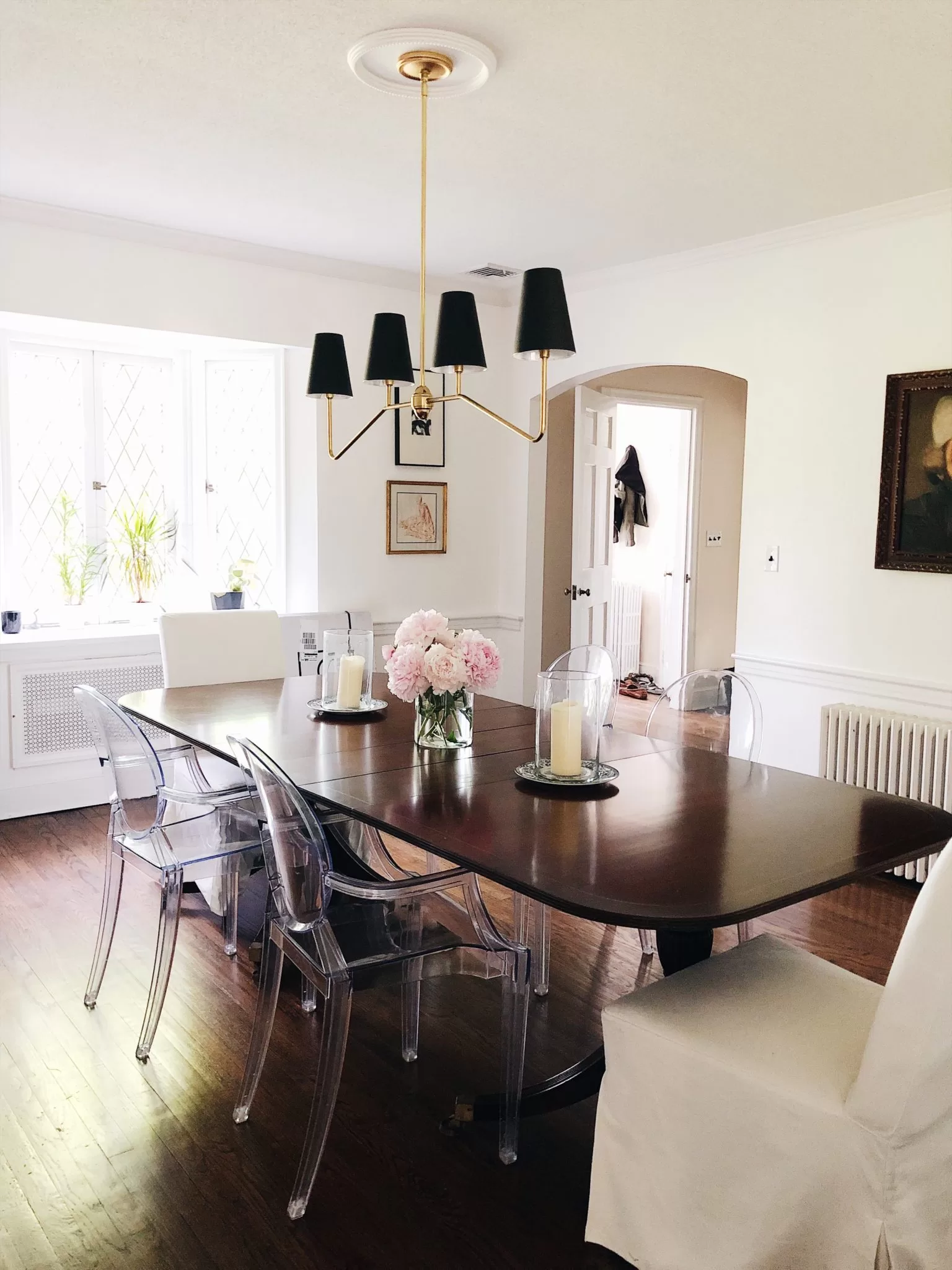
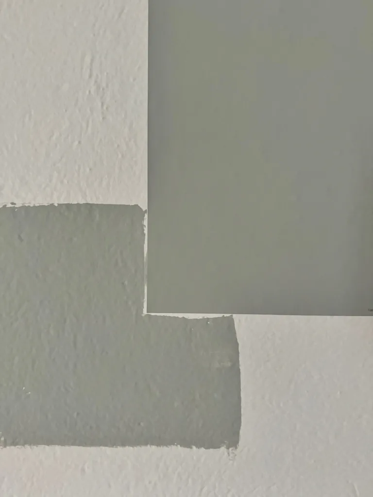
After being torn between Mount Saint Ann and Light Blue, I put the question out to Instagram, where the vote was nearly unanimous for Light Blue. After testing it out for a few more days, I ultimately decided to go with Light Blue, and I love it. Here’s a peek at the painted room:
Would you like to save this?
If you’re thinking about using this hue in your space, here’s everything you need to know about, inspo photos, and more.
Wondering if Light Blue is the one? The easiest way to know for sure — grab a peel-and-stick sample and see it in your actual space.

What color is Farrow & Ball Light Blue?
Despite the name, Light Blue isn’t really what most people would call a true “light blue,” at least not in the powdery, pastel sense. Light Blue instead reads more like a silvery, gray-infused blue with hints of green. On the wall, it feels muted and sophisticated rather than pastel or bright.
It’s one of those shades that reads almost as a neutral, yet still adds personality and character to a room.
Farrow & Ball Light Blue: Depth and Undertones
Light Blue has an LRV (or light reflectance value, a scale that measures paint lightness from 0 to 100, where 0 is pitch black and 100 is pure white), of 49, which makes it the perfect example of a mid-tone paint colors. It’s not too light, and not too dark. It looks saturated and ever-so-slightly moody, without feeling dark or overwhelming at all.
Like I mentioned previously, it’s a blue paint color with obvious gray undertones, and slightly green ones. I think the undertones are what make this color so interesting: it’s not a straightforward blue-gray, but rather a mix of blue, gray, and a whisper of green. That touch of green is what gives it depth and prevents it from feeling cold or flat.
Like all paint colors, Light Blue is nuanced and changes depending on the time of day and the direction of your room.
- North-facing rooms: The cooler light emphasizes its gray side, so it feels moodier and more slate-like. We have the color in a north-east facing room, which makes it feel a bit more gray that it would otherwise.
- South-facing rooms: The warmth brings out the green and blue notes, so it looks softer and more tranquil.
- Artificial light: Under warm bulbs, Light Blue can appear more green than blue, while under cooler LEDs it feels silvery.
Grab a Farrow & Ball Peel-and-Stick Paint Color Sample
Where to Use Farrow & Ball Light Blue
Light Blue is incredibly versatile. It’s not so bold that it overwhelms a space, but it has enough character to make a statement.
Bedrooms
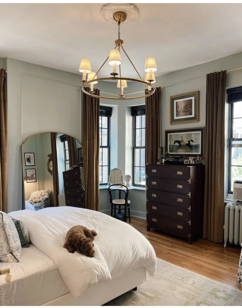
I love Light Blue for bedrooms because it has such a calming, serene vibe. Perfect if you want that “spa-like” atmosphere.
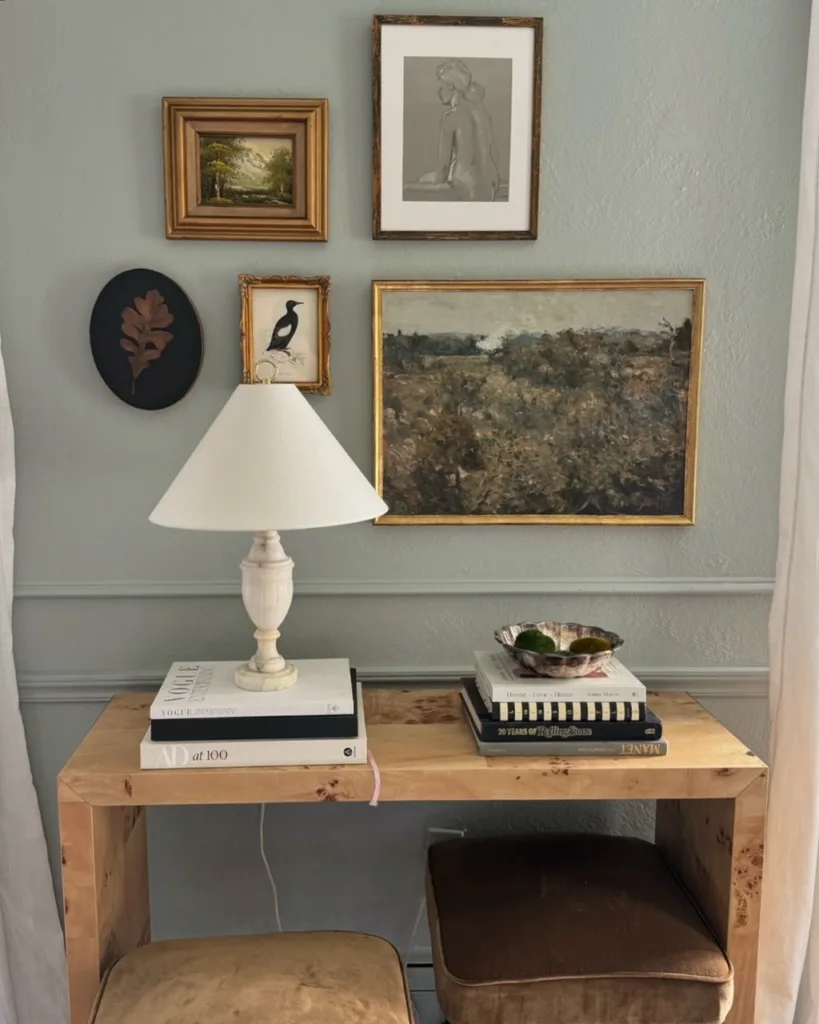
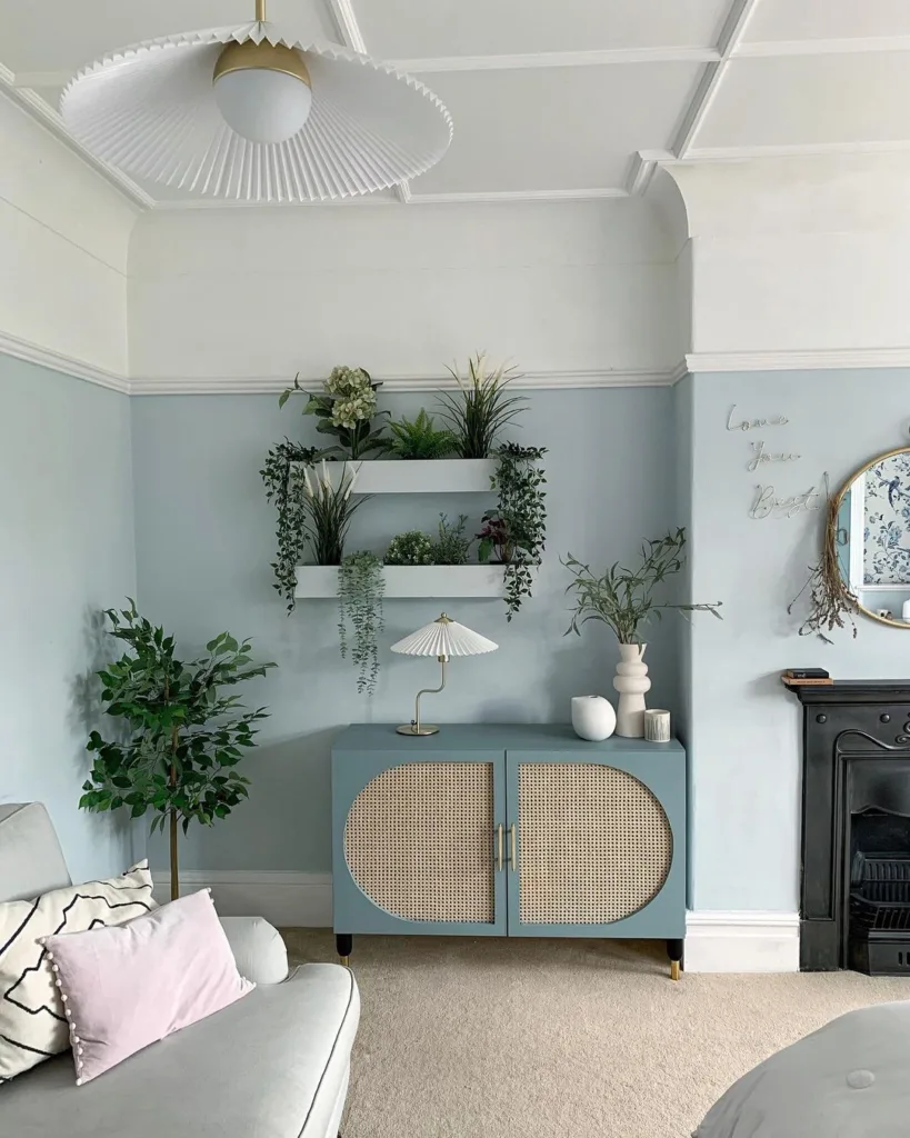
Living rooms
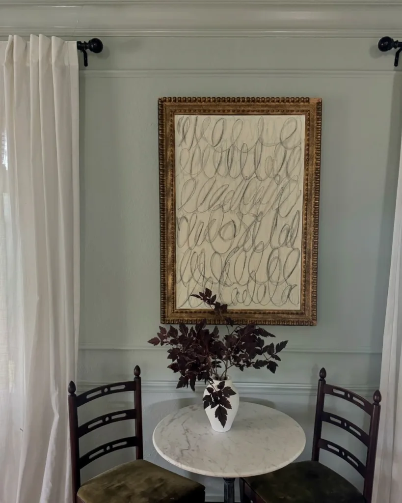
I’m partial to using the color in living rooms! The color sort of toes the line between white and a moodier, den-like space, which is one of the things that drew me to it.
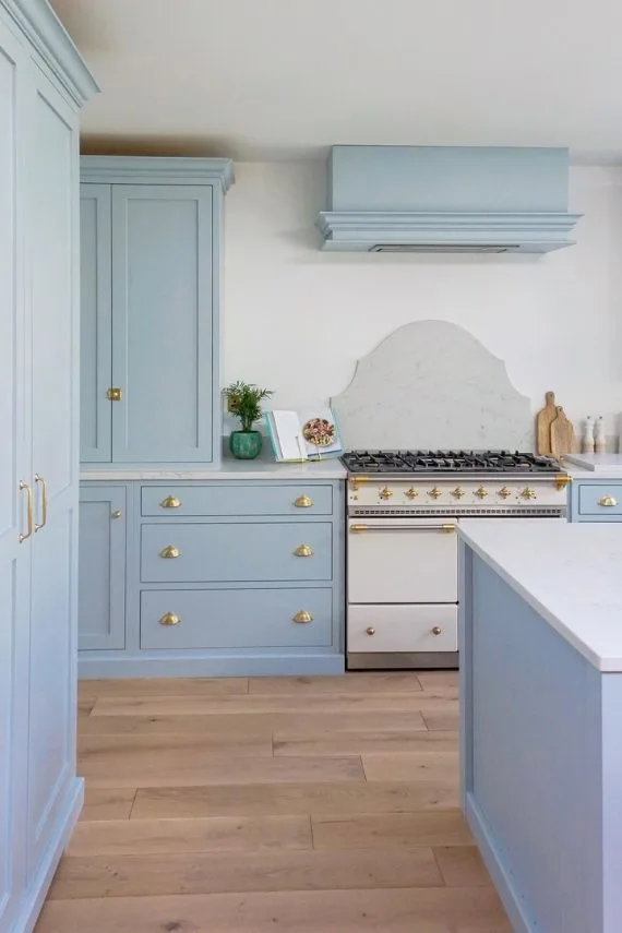
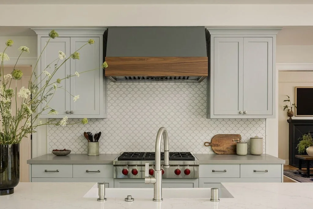
Kitchens
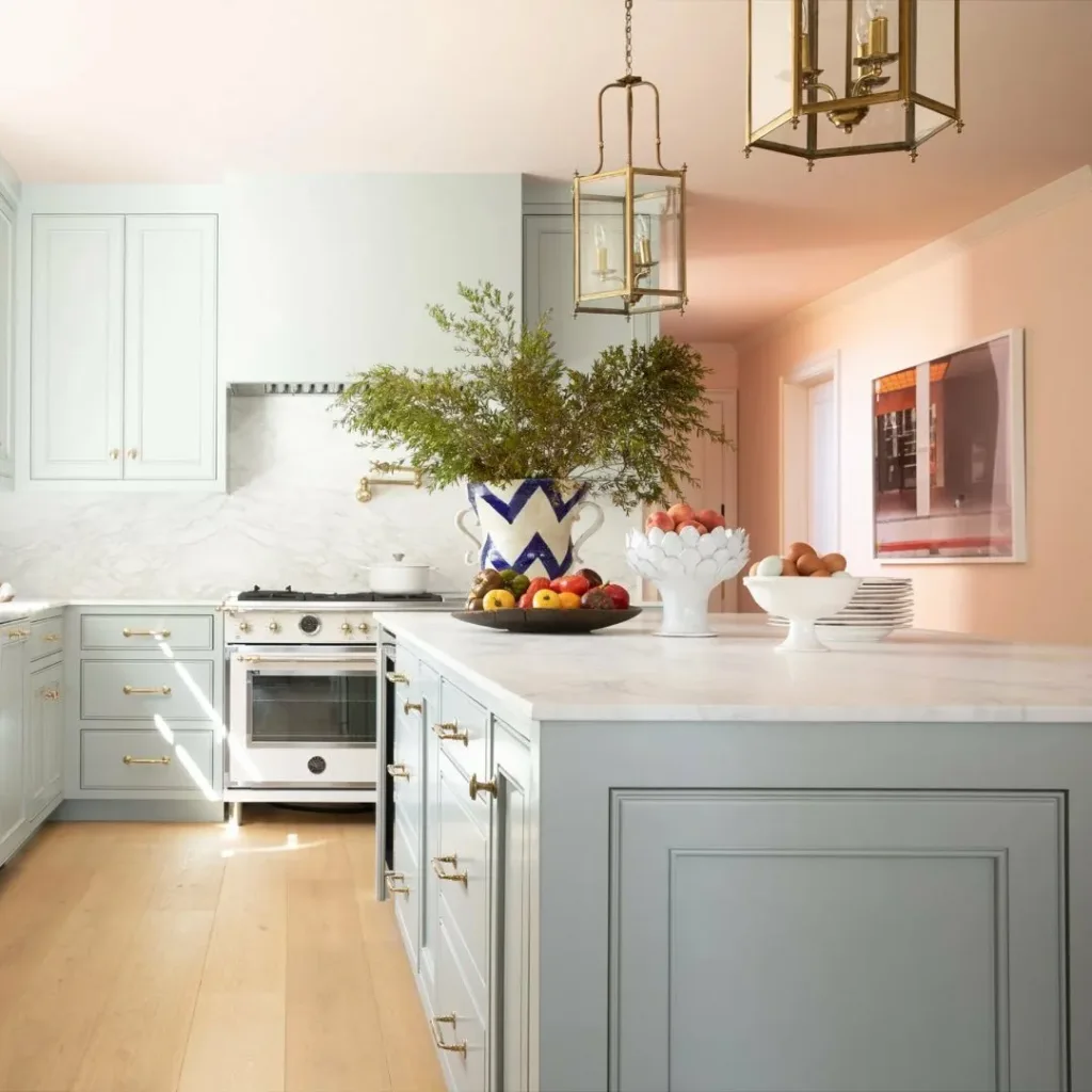
This shade is gorgeous on cabinetry, particularly in country, coastal, or cottage-style homes. It pairs well with marble, soapstone, or warm wood counters.
Bathrooms
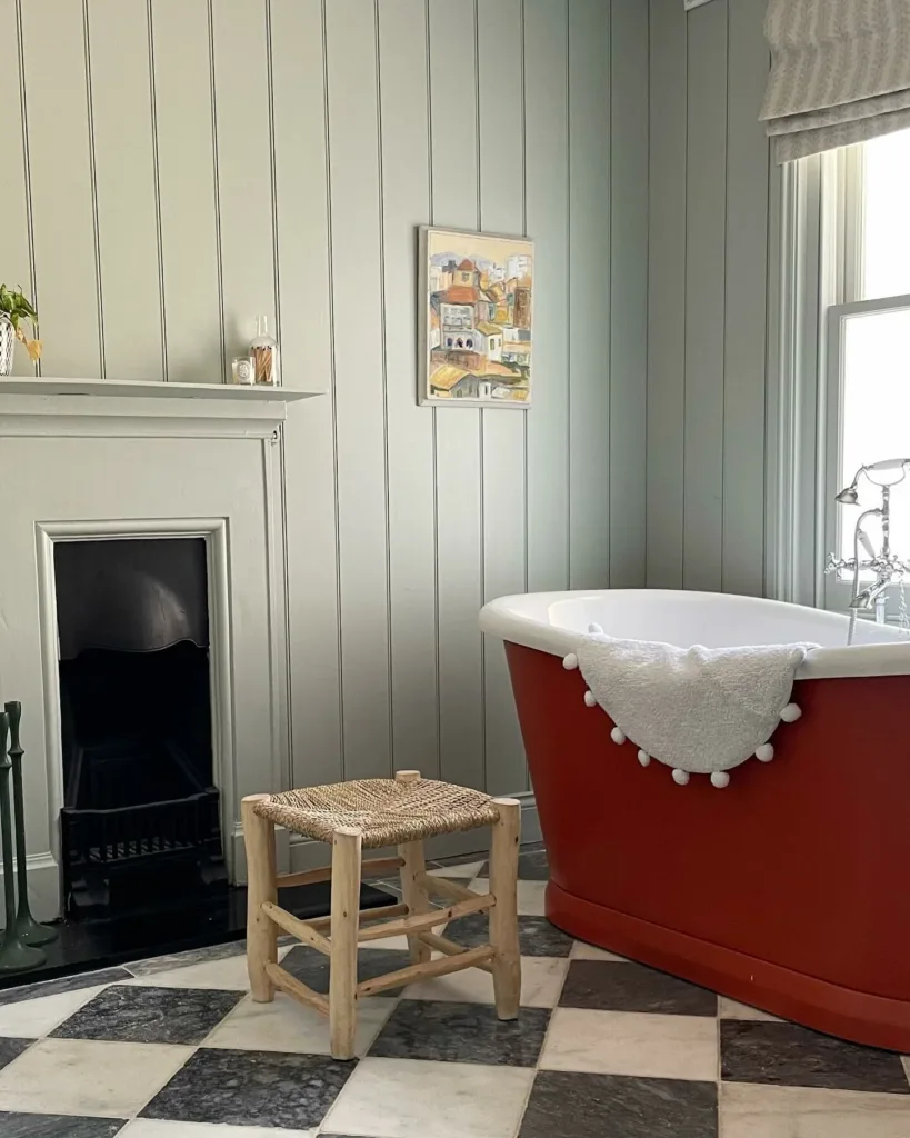
With its watery undertones, it’s an obvious choice for a serene, airy bathroom.
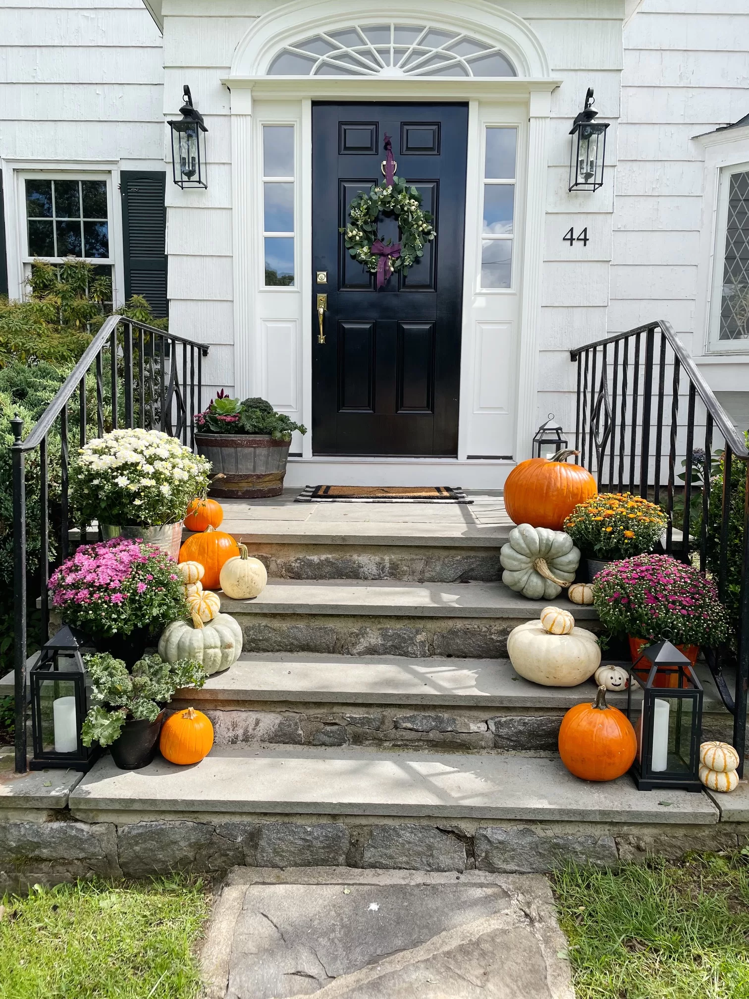
Exteriors
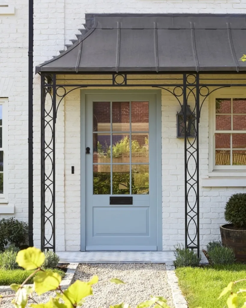
Used outside, Light Blue reads as a classic muted blue-gray that complements both brick and shingle siding. I also love this color for front doors and shutters.
Personally, I love it in rooms where you want a color that feels subtle but not boring. It has just enough pigment to keep things interesting without overwhelming the room.
Farrow & Ball Light Blue vs. Other Blue-Gray Paint Colors
There are a handful of classic blue-grays that always come up in conversation, and Light Blue is often compared to them. Here’s how it stacks up:
Light Blue vs. Farrow & Ball Borrowed Light
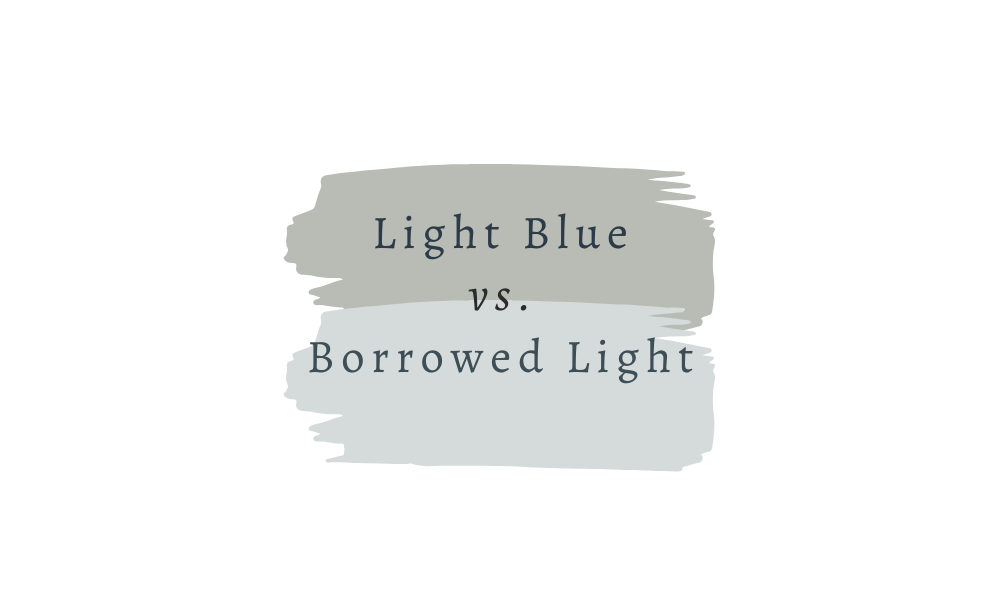
Borrowed Light is much brighter and more of a true pale blue. If you’re after something airy and cheerful, Borrowed Light is your pick. Light Blue, on the other hand, feels softer and more muted, with more gray in the mix.
Light Blue vs. Farrow & Ball Parma Gray
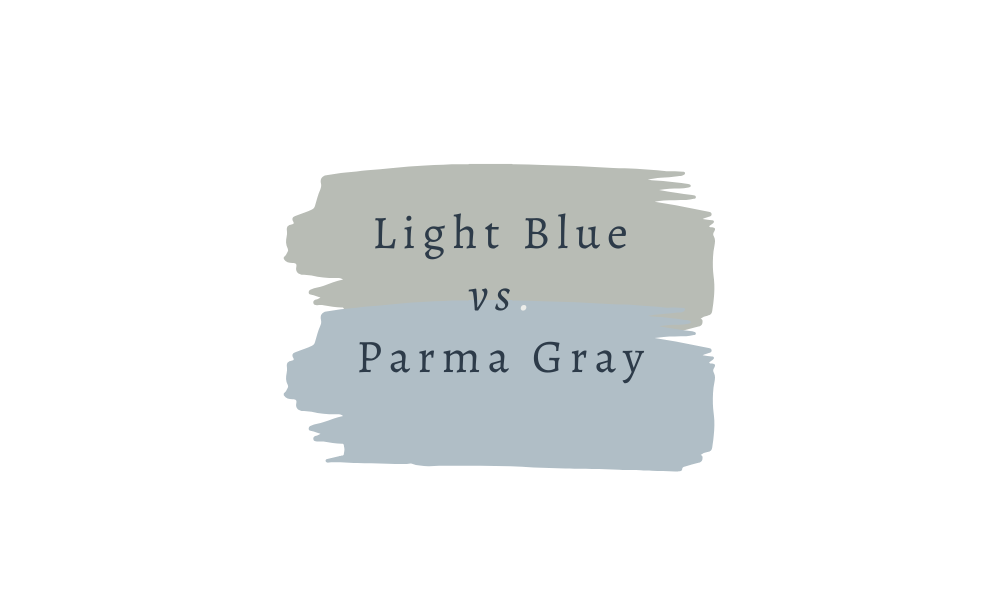
Parma Gray is a crisp, cooler gray-blue, with less green in the undertone. Light Blue feels more subtle and natural, while Parma Gray has a cleaner, almost nautical look.
Light Blue vs. Skylight

Skylight was also on my list to test for this space. It’s a paler blue, with less obvious gray and green undertones, which make it feel softer.
Light Blue vs. Benjamin Moore Imperial Gray
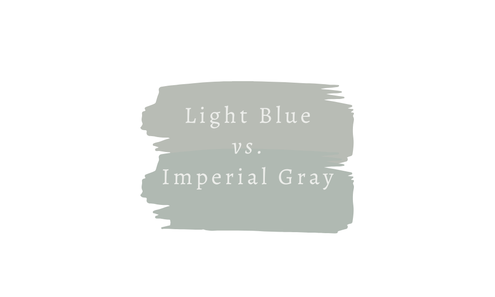
Imperial Gray and Light Blue share a similar gray-blue family feel, but Imperial Gray has a touch more green, making it feel a little brighter and less gray than Light Blue.