36 Moody Paint Colors I Love for 2025
If you love home decor as much as I do, you’ve probably noticed a big shift happening in the way that people are decorating in the last few years. Gone (or going, at least) and the bright white walls and “sad beige” aesthetic, and here to stay are moody, saturated spaces, Maybe I’m just sick of seeing neutrals, but I’m loving all these colorful rooms, and I’ve even started re-painting some of the white walls in my own home with rich colors.
Here, I’ve rounded up some of my favorite moody paint colors in every hue, all of which are perfect for 2025 and beyond.
Moody Greens
Would you like to save this?
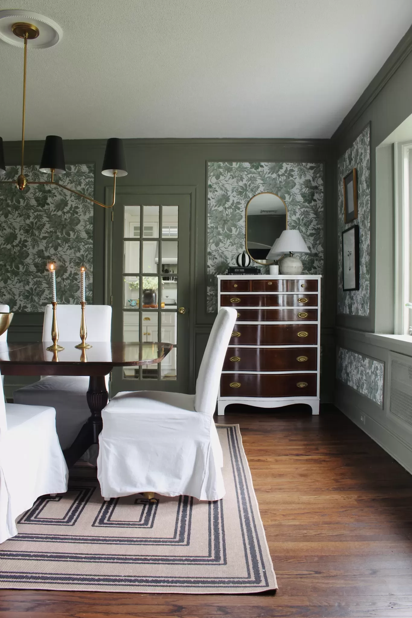
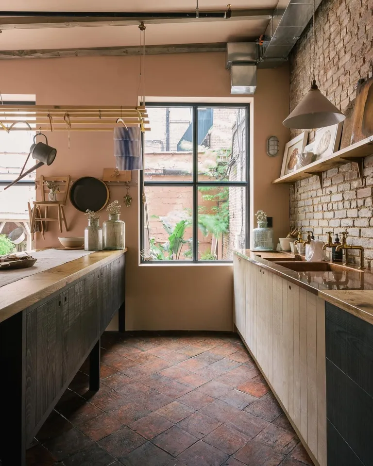
I started with moody shades of green for no other reason than green is my favorite color! I love gray and beige-toned greens. There’s just something so sophisticated about them. I used Farrow & Ball Treron (tinted to Behr paint, controversial, I know) for my dining room, above, and it’s one of my all-time favorite paint shades.
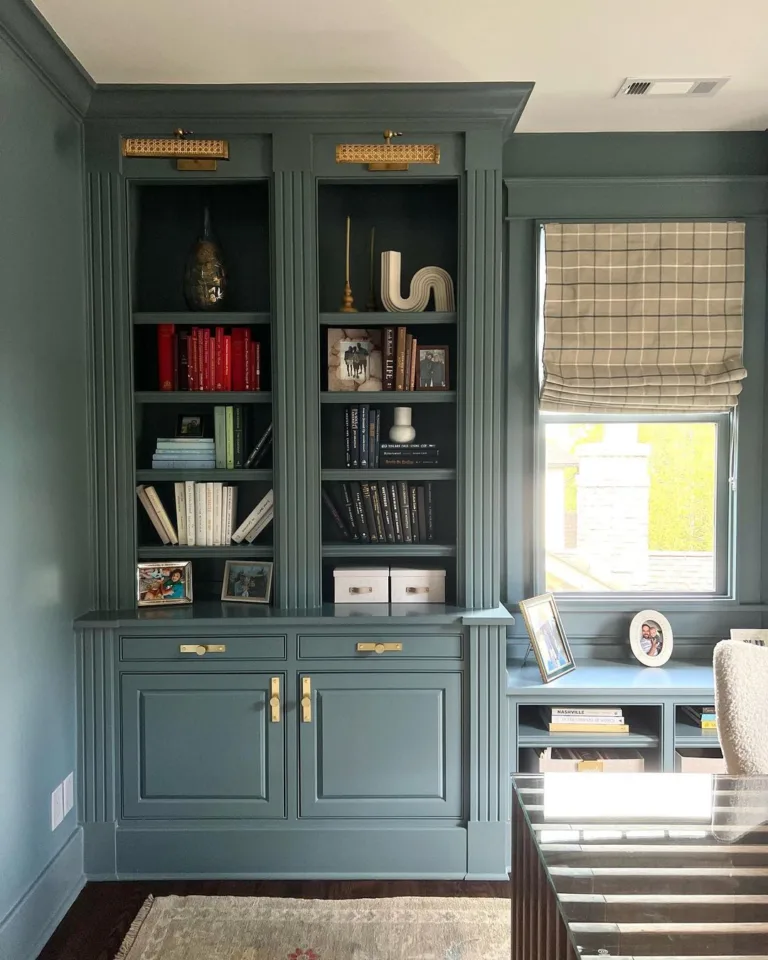
Some of my other favorite moody greens include Farrow & Ball French Gray (used in my husband’s office, which I still need to take pics of), Sherwin Williams Pewter Green (used in my son’s nursery) and Benjamin Moore River Rock (used on the cabinets in our Vermont cabin). Benjamin Moore Vintage Vogue is just such a classic rich green, and Sherwin Williams Roycroft Bronze-Green is a rich, neutral-toned green that I’ve been dying to use.

- Farrow & Ball Treron
- Farrow & Ball French Gray
- Benjamin Moore Vintage Vogue
- Benjamin Moore River Rock
- Sherwin Williams Pewter Green
- Sherinw Williams Roycroft Bronze Green
Moody Blues

Moody blue paint colors are incredibly versatile. Depending on the shade you use, they can work in literally any room in the house. I love paler shades, like Farrow & Ball Light Gray, in living rooms, bedrooms and sitting areas, while medium and darker-toned shades work for powder rooms, home offices, cabinetry, and pantries.
These are my current favorite moody blues! I’m currently considering Farrow & Ball French Gray for our living room, and De Nimes and Providence Blue were contenders for our laundry room (I ended up going with BM Smoke!)

- Farrow & Ball De Nimes
- Farrow & Ball Inchyra Blue
- Farrow & Ball Light Gray
- Benjamin Moore Philipsburg Blue
- Benjamin Moore Providence Blue
- Sherwin Williams Slate Tile
Moody Reds

Shades of Burgundy have exploded onto the design scene in the last few years, which, in my opinion, makes reds the trendiest way to use moody color this year. In my opinion, burgundy red is the new sage/olive green, which was everywhere a few years ago.
I’ve never personally tried a burgundry shade in my own home, since I’m partial to cool colors in my own spaces, but I think they’re gorg in other peoples’. Here are a few of the hues I’ve seen that I love most.

- Behr Rumors
- Benjamin Moore Caponata
- Benjamin Moore Classic Burgundy
- Clare Paints Vintage
- Farrow & Ball Preference Red
- Farrow & Ball Brinjal
Moody Browns

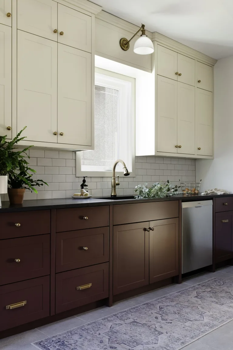
Aside from red, brown is also making a major comeback this year. Who would have ever thought we’d say that, because I didn’t, especially at the height of Millennial Gray a few years back. But! Here we are, are brown is, dare I say, chic AF. Julia Marcum, of Chris Loves Julia, is a brown-paint pioneer, painting both her pantry and her primary bedroom in moody shades of mocha in recent years!

- Sherwin Williams’ Van Dyke Brown
- Benjamin Moore Finnie Gray
- Sherwin Williams Urbane Bronze
- Farrow & Ball Elephant’s Breath
- Farrow & Ball London Clay
- Sherwin Williams Warm Stone
Moody Grays & Neutrals

Yes, gray is not the go-to neutral anymore, but that doesn’t mean it’s totally out of style. Gray paint is the perfect moody paint color, so long as you apply it in a 2025 way. First of all, choose. warm gray, not a cool one. Second, color-drench your room in it. This means paint your walls, interior doors, and trim all the same color.
I’ve included some classic grays I love, plus warm grays that border on taupe, and a few creamy neutrals with a moody vibe, too.

- Benjamin Moore Kendall Charcoal
- Farrow & Ball Charleston Gray
- Benjamin Moore Chelsea Gray
- Farrow & Ball Worsted
- Farrow & Ball Old White
- Sherwin Williams Mindful Gray
Moody Pinks & Purples
Pink and purple are also totally in this year, so long as they’re of the muted, moody variety. Look for toned-down shades with a heavy dose of beige or greige for the most up-to-date look. “Clearer” shades of pink and purple tend to look either childish or preppy, which is fine if that’s your vibe, but moody they are not. Here are some of the colors I love right now!

- Benjamin Moore Chambourd
- Benjamin Moore Black Raspberry
- Benjamin Moore Seaside Sand
- Sherwin Williams Redend Point
- Farrow & Ball Pelt
- Farrow & Ball Sulking Room Pink
What makes a paint color moody?
Moody paint colors get their vibe from their undertones, which are usually brown or gray. These neutral, darker undertones give paint colors a muted look, which makes them feel moodier. While paint colors don’t need to be super-dark to feel moody, they do need to be fairly saturated, moreso if it’s for a room that gets a good amount of natural light. Look for mid-tone or deep paint colors, like those with an LRV (or light reflectance value, a measure of paint lightness from 0-100, with 0 being black and 100 being pure white) from 7-65, for the moodiest results.

I am not happy about the time I waste “going down the rabbit hole’ on Pinterest BUT I am looking to purchasing a lake home and was looking for some paint 2025 colors. I like that you’re from CT. Me too and I also love VT! Janel
It can definitely be a rabbit hole, but you find the good stuff eventually!! Good luck choosing colors!