Farrow & Ball De Nimes: A Gorgeous Blue Gray Paint Color That’s Perfect for 2026
I first learned about Farrow & Ball De Nîmes (No. 299) a few years ago … either on Instagram or in a design magazine. I can’t exactly remember. But what I do remember, is that the source was calling the shade an “it color” and a go-to blue for that year. There were 5 or 6 photos included of how versatile and sophisticated the color was, and I’ve wanted to use it in my home ever since.
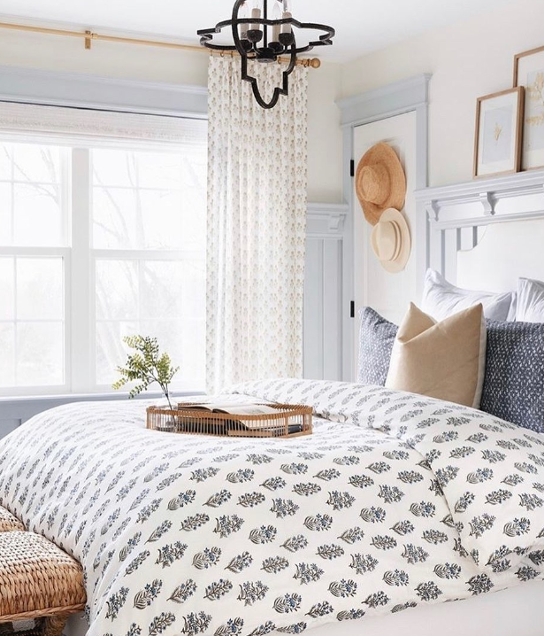
When we did our first floor renovation, I was considering the shade for our laundry room, and ended up going with something lighter (Benjamin Moore Smoke, though I kind of regret not picking De Nimes, especially as paint color trends turn more moody!)
And I recently re-considered it for our living room paint job. Once again, I went with a lighter shade (Farrow & Ball Light Blue this time), but I still think this is such a gorgeous color and will probably keep trying it in my house until I find the right spot for it.
Would you like to save this?
If you’re considering Farrow & Ball DeNimes for your house, here’s more about this lovely shade of dark blueI
What Color Is Farrow & Ball De Nîmes?
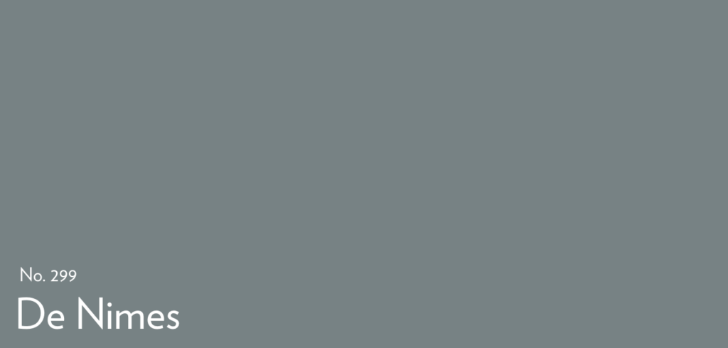
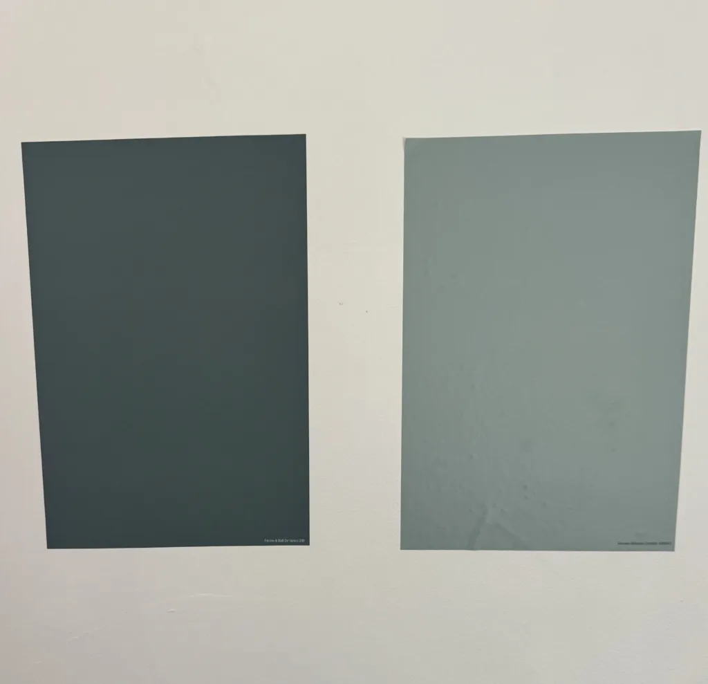
Farrow & Ball De Nimes is a dark blue with hints of gray and a touch of green. According to the brand’s website, De Nîmes is rooted in a Regency-era palette but takes its name—and its hue—from the indigo cloth historically woven in the French city of Nîmes (think of classic, slightly worn-in denim).
De Nimes LRV & Undertones
De Nimes has an LRV (light reflectance value, which is measured on a scale of 0-100, with 0 being pitch black and 100 being pure white) of about 21, which places it in the medium-dark range—enough depth for impact but not so dark as to swallow light.
RGB (Red, Green, Blue) Profile: 116, 130, 132—evidencing a balanced mix of blue and green in its undertones.
Undertones: A whisper of green mixed with blue-gray, giving it that “washed denim” appearance.
How De Nîmes Behaves in Different Light
Like literally every other paint color out there, De Nimes looks different depending on the lighting. In my own home, for example, when I tried it in a south-facing laundry room, it read like a much brighter shade of blue than I was expecting – the blue tones really pulled through. But, in the northeast-facing living room, it was a much more muted blue-gray.
Here’s a look at how the hue changes based on room direction.
North-Facing Rooms: Cool, indirect light draws out the grayer, almost steel-blue cast—ideal for creating a calm, contemplative vibe.
South-Facing Rooms: Warm, all-day sun softens the blue into a balanced slate that still feels fresh and airy.
East-Facing Rooms: Morning light makes the blue pop with crisp clarity; by afternoon, it settles into its soothing gray tones.
West-Facing Rooms: Subdued morning light leans gray, while evening sun brings a muted warmth back to the blue.
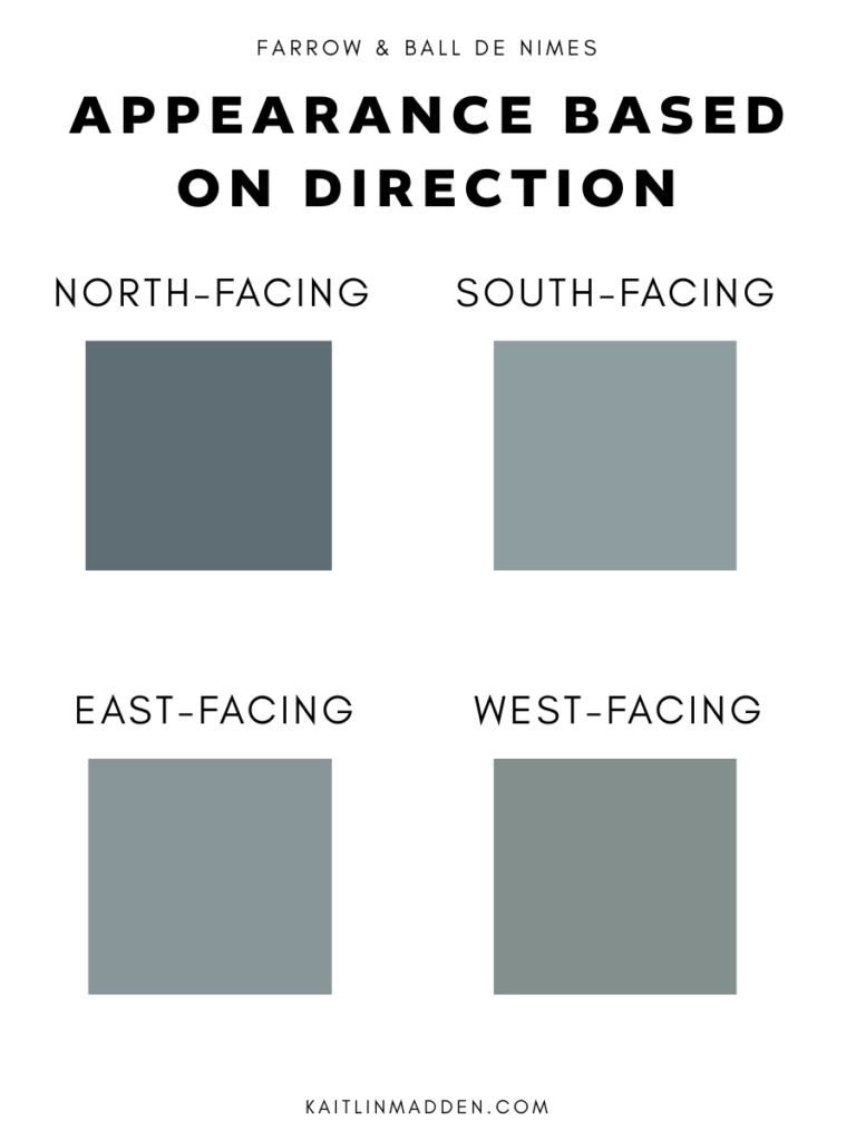
Understanding these shifts is key to predicting how De Nîmes will read in your space.
Where to Use De Nîmes
Kitchen Islands & Cabinetry
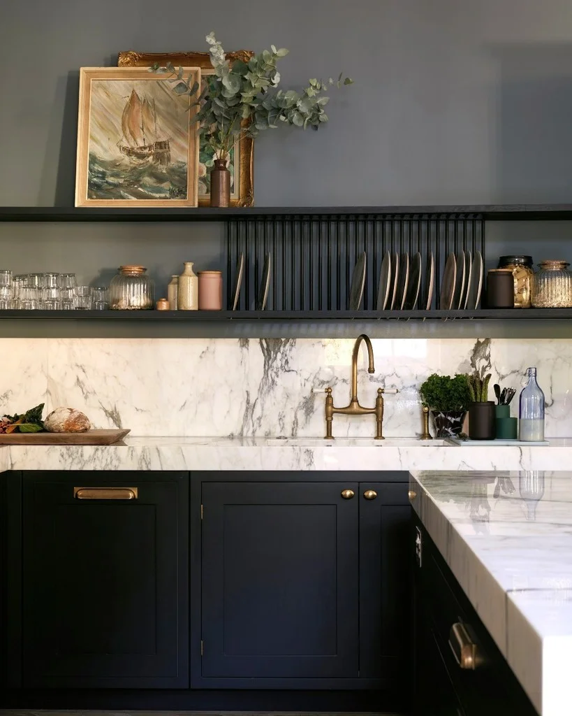
Pairs beautifully with white marble or Carrara counters, a la the above—its depth anchors the room without feeling heavy.
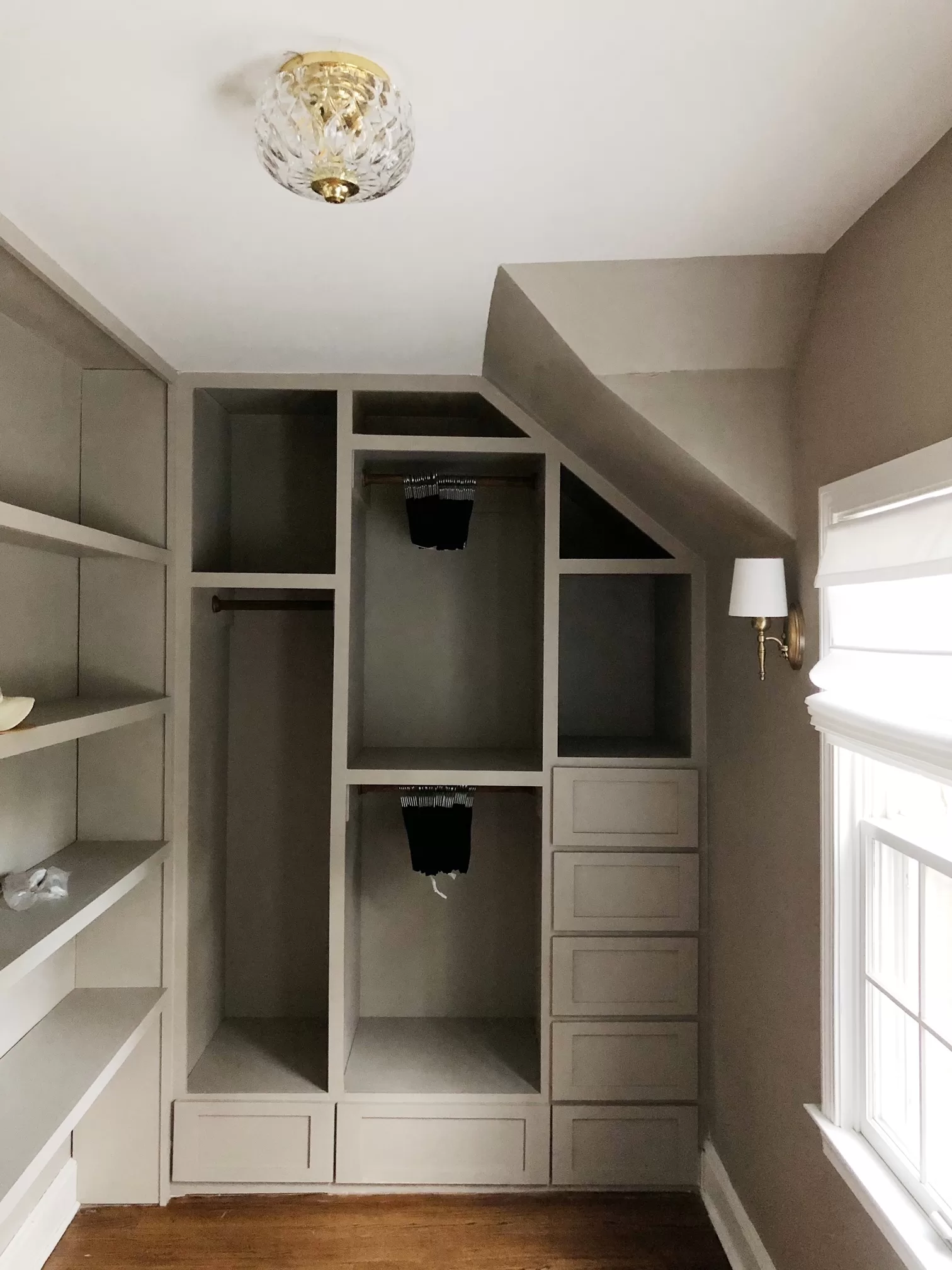
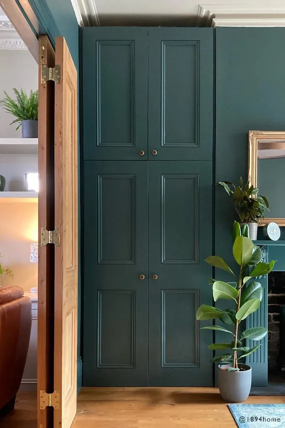
Built-Ins & Millwork
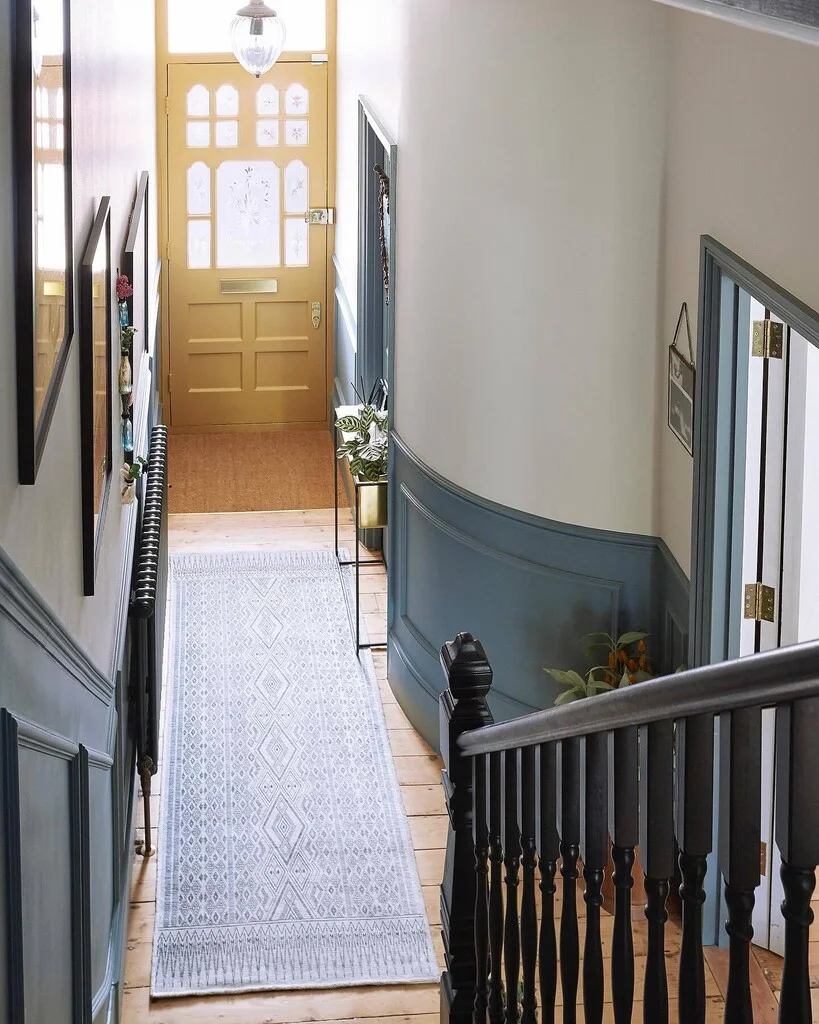
Creates drama on built ins in a library nook, home office, or living room, or as an accent color on trimwork with white walls. Notice how much lighter it looks here?
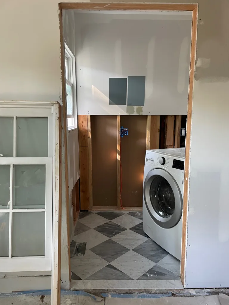
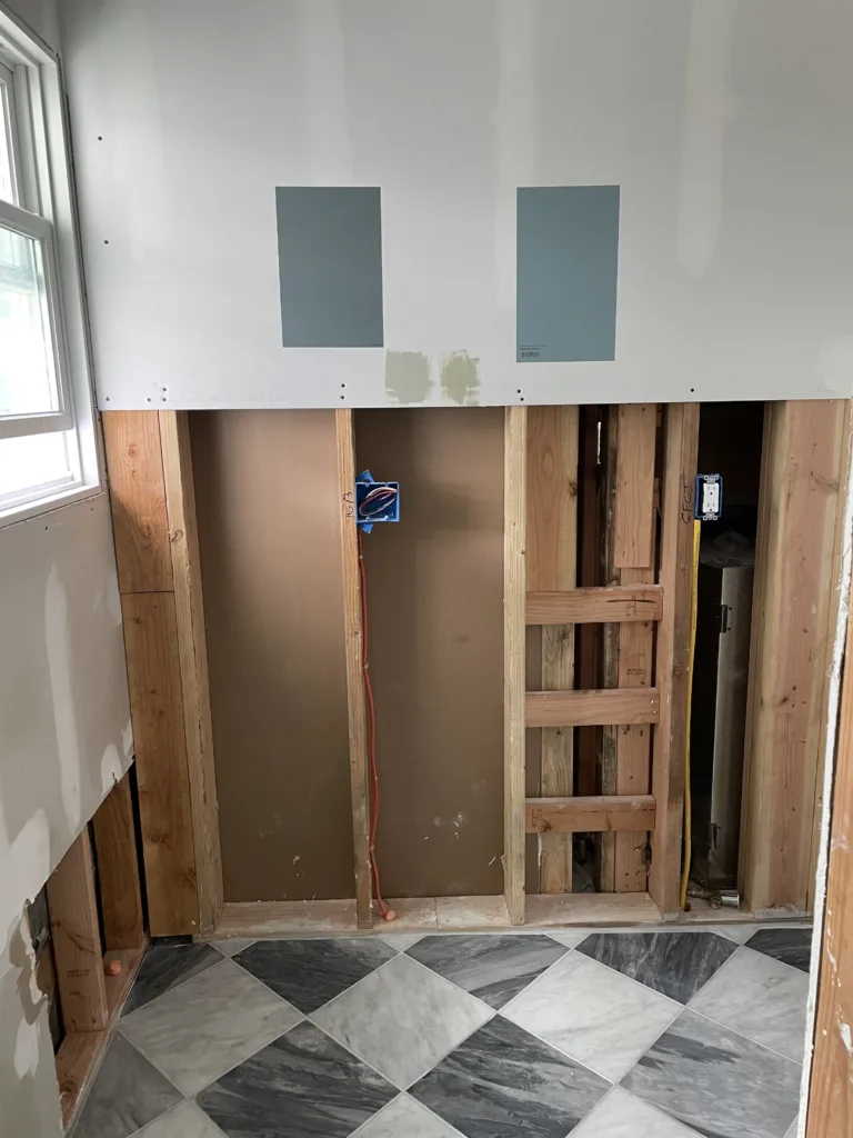
Powder Rooms & Laundry Rooms
The color’s soak-in-the-light quality makes small spaces feel moody yet inviting.
Exterior Doors & Trim

Offers a unique alternative to black or navy, lending traditional facades a subtly modern twist.
De Nîmes vs. Other Dark Blues
De Nîmes vs. Farrow & Ball Hague Blue:
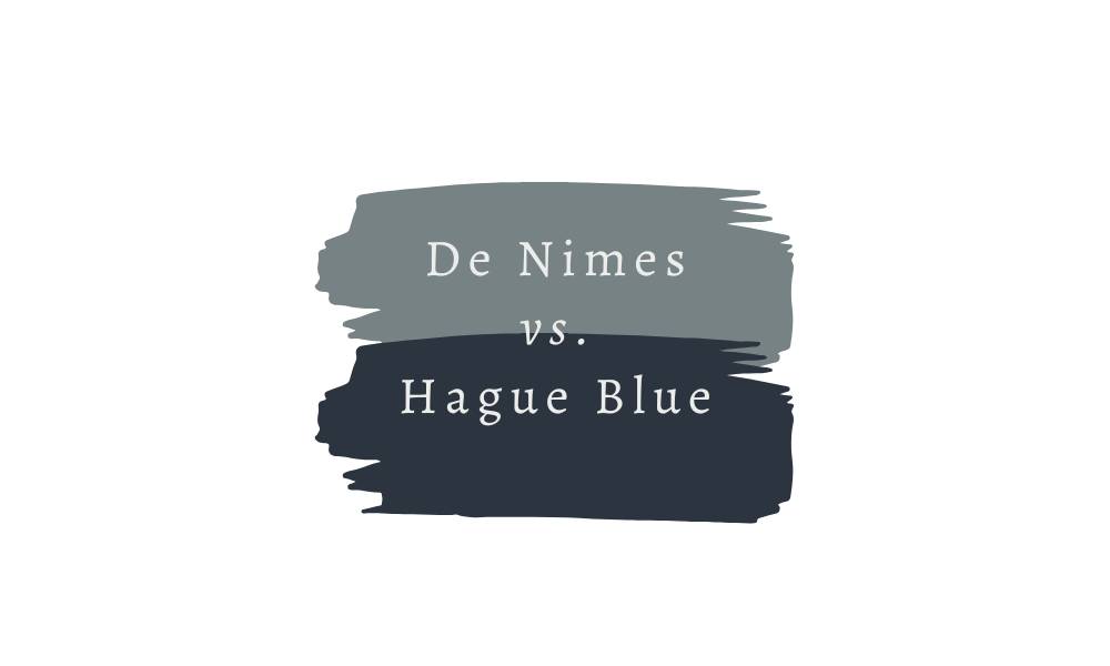
Hague Blue is a deep navy, and is both more saturated and darker than De Nimes, , making it ideal for maximum drama. De Nîmes is softer, more versatile, and less “formal.”
De Nîmes vs. Farrow & Ball Selvedge
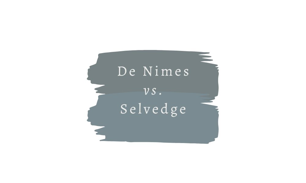
Selvedge has a similar color profile, but it’s a few shades lighter and a touch more green than De Nîmes, which feels bluer and moodier by comparison.
De Nîmes vs. Farrow & Ball Inchyra Blue
On the other hand, Inchyra Blue is a darker blue-gray option that leans almost teal in certain lights.
Pairing & Trim Suggestions
- Trim Color: I love Farrow & Ball Shaded White or All White for crisp contrast, or use De Nîmes in a high-gloss sheen against matte walls for a tone-on-tone effect.
- Metals & Accents: Aged brass, copper or bronze hardware play nicely with De Nimes while adding warmth.
- Complementary Hues: Camel leather, soft blush, or deep terracotta for textiles; natural oak or walnut wood tones for floors and furniture.
FAQs
Is De Nîmes too dark for a small room?
At LRV 21, it will cocoon small spaces—use it on a single accent wall or in a powder room, then balance with bright white trim and strategic lighting.
How do I test its undertones?
Apply a 2×2-foot sample on two opposite walls at eye level. Observe in morning and evening light before committing.
Will it clash with cool-toned marble or quartz?
On the contrary—its green-gray hints harmonize beautifully with both cool and warm stone varietals, making it surprisingly adaptable.