Sherwin Williams Agreeable Gray – Learn All About This Popular Shade
Would you like to save this?
If you spent any time on Pinterest in the 2010s, you already know Sherwin Williams Agreeable Gray. It was the neutral — the color that showed up in every “before and after,” every spec home, every new construction build from 2012 to 2020. At one point, more than 33,000 people a month were searching for it on Google, and I’d bet it was being rolled onto more walls than almost any other paint color in the country (except maybe Sherwin Williams Repose Gray or Benjamin Moore Revere Pewter).
These days, it’s not quite the default shade it once was. Warmer neutrals—your taupes, your creamy beiges, your earthy browns—have taken over the spotlight, and the all-gray-everything aesthetic that dominated the last decade has quietly (slash mercifully) faded. But here’s the thing: Agreeable Gray was never really a cool gray in the first place. It’s a greige. A warm, beige-leaning gray that bridges the two, which is exactly why it has outlasted many of the other grays from the 2010s era and remains one of Sherwin Williams’ top-50 most popular colors.
So the real question isn’t “Is Agreeable Gray still in style?”
It’s “When does it actually work—and what makes it fall flat or look dated”?
Let’s break it down.
Sherwin Williams Agreeable Gray LRV & Color Profile
Agreeable Gray (SW 7029) is a light, warm-toned gray (or more accurately, a greige, sitting right in the middle of gray and beige). It has an LRV (light reflectance value) of 60, which puts it comfortably in the mid-range: not so light that it reads as an off-white, and not so deep that it adds real drama. It’s a color with enough presence to feel intentional, but enough restraint to work as a whole-house neutral.
Shop greige peel-and-stick paint samples:

Agreeable Gray Undertones
This is where Agreeable Gray gets a little interesting, and where a lot of people get caught off guard. It’s not as straightforward as it looks on the chip.
Its primary undertone is a warm, slightly green-tinged one, which is what gives it that greige quality. But under certain lighting conditions, it can also flash a hint of violet, which is the cool undertone that surprises people. Warm tones dominate overall, so it still reads warm in most situations, but that violet shift is worth knowing about before you commit. (Always sample IRL!)
The bottom line is this: Agreeable Gray is more gray than beige, but it behaves warmer than most grays because of its green undertone. If you look at it next to a true beige, the gray base becomes pretty obvious.
How Agreeable Gray Looks in Different Lighting
This is the most important thing to understand about Agreeable Gray, and the reason you should always, always sample it in your actual room before painting.
In south-facing rooms, which get warm, bright natural light throughout the day, the beige and green undertones are amplified. The color looks softer, cozier, and more taupe.
In north-facing rooms, the cool, indirect light pulls out the violet undertone and suppresses the warmth. Agreeable Gray will look noticeably cooler, grayer, and sometimes even a little purple-tinged in these conditions.
East-facing rooms get warm morning light that transitions to cooler light in the afternoon. If the room is primarily used in the morning (like a breakfast nook), it’ll feel warm and inviting. By afternoon, it’ll shift cooler.
West-facing rooms are the reverse: cool in the morning, warmer in the late afternoon and evening. If it’s a room you mostly use at night, keep in mind that incandescent or warm artificial lighting will bring out the beige tones, while cool LED bulbs will emphasize the gray. (Side note: always go for warm lighting!)
Sherwin Williams Agreeable Gray in Real Spaces
These are my favorite areas of the home for Agreeable Gray:
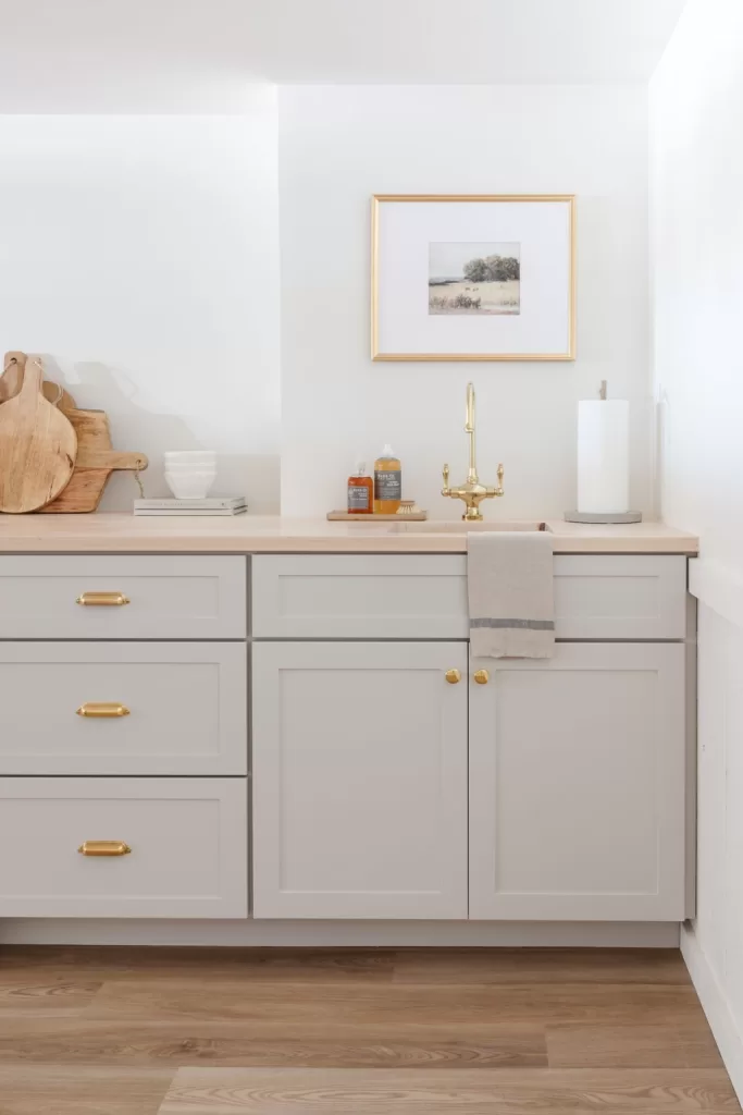
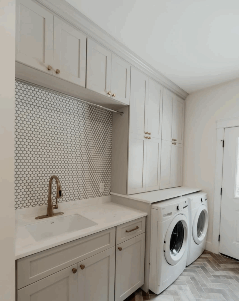
Kitchens & Cabinetry
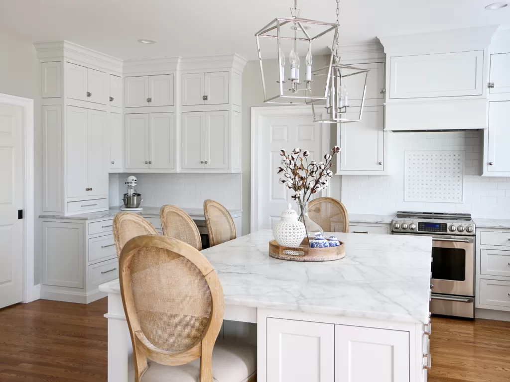
Agreeable Gray is a pretty choice for walls against white cabinets (like in the top photo), but I actually think it’s an underrated color for cabinets themselves, like the in the bottom image, especially against the soapstone counters and brass hardware.
Interior doors & trim
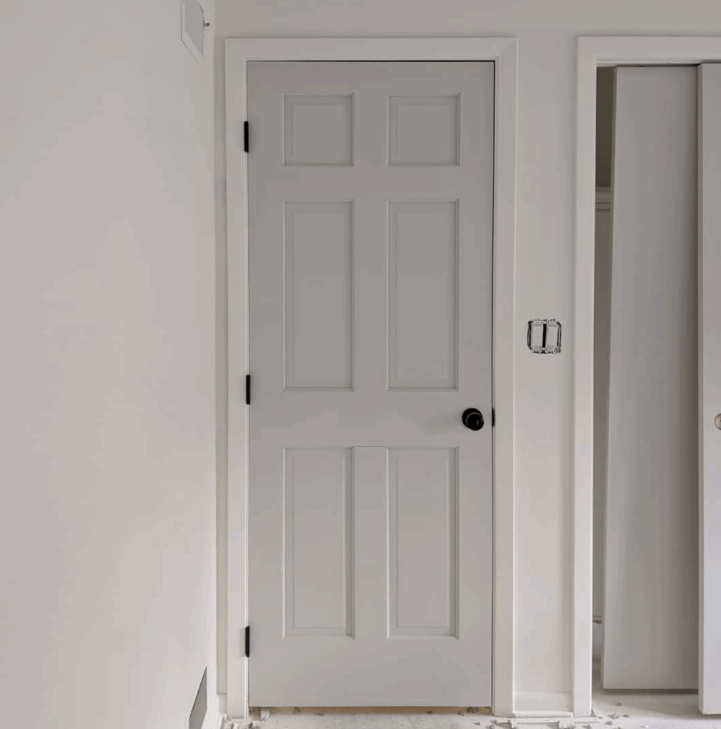

I personally love Agreeable Gray as a color for interior doors, on paenling, or for contrast trim with white walls. It adds design interest without being overwhelming.
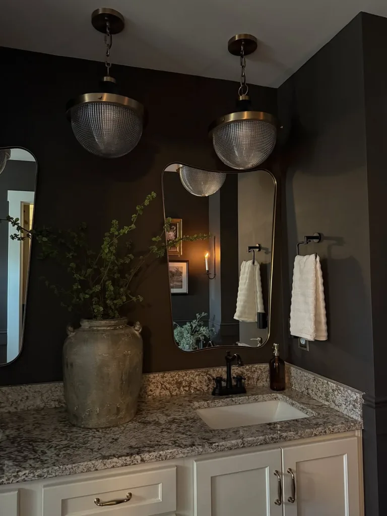
Bathrooms
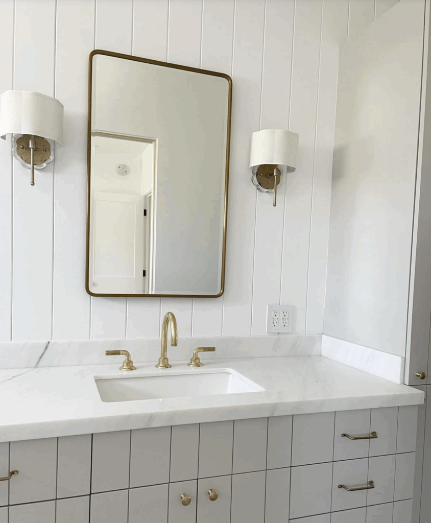
It’s especially good on vanities or beadboard paneling in the bathroom. Works well, with the caveat that bathroom lighting (often cooler and artificial) can shift it grayer. Test with your actual light bulbs, not just in daylight.
Exteriors
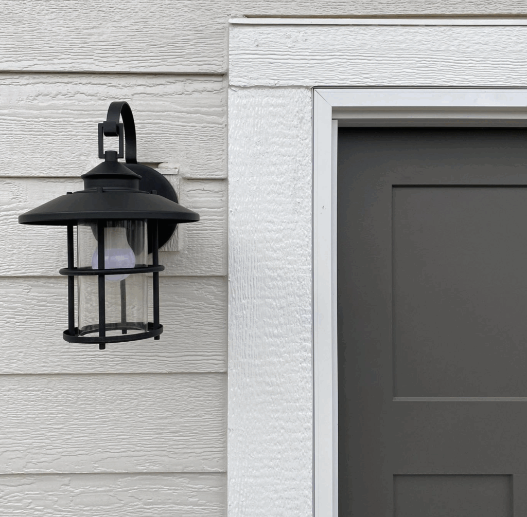
Agreeable Gray reads lighter in direct sunlight, so keep that in mind — it may look significantly lighter than it does inside. That said, it’s a solid, broadly appealing exterior color that works well with warm white and off-black accents.
Paint Colors Similar to Sherwin Williams Agreeable Gray
In case Agreeable Gray appears too warm or light, here are some similar shades that you may also love:
Repose Gray
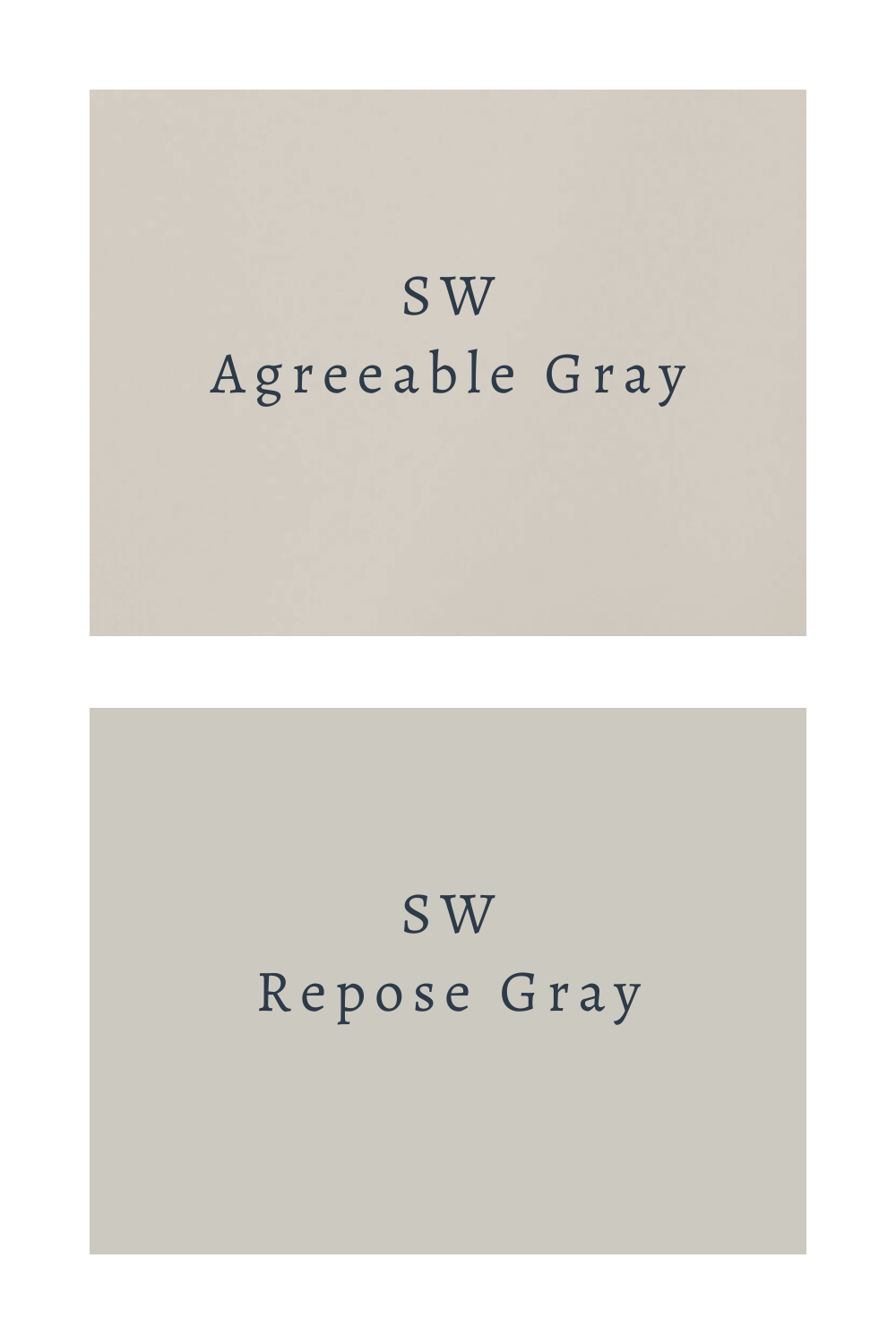
SW Repose Gray is bit cooler and more gray-toned that Agreeable Gray.
Worldly Gray
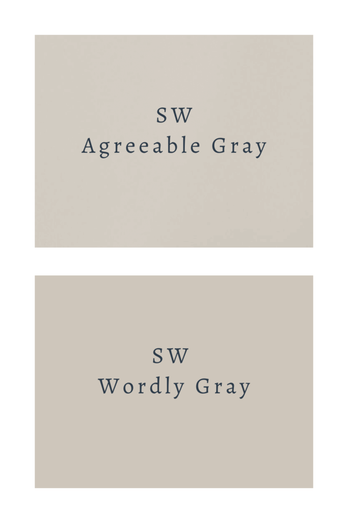
Slightly darker and warmer, with more red undertones. A good step up if Agreeable Gray feels too light.
Colonnade Gray
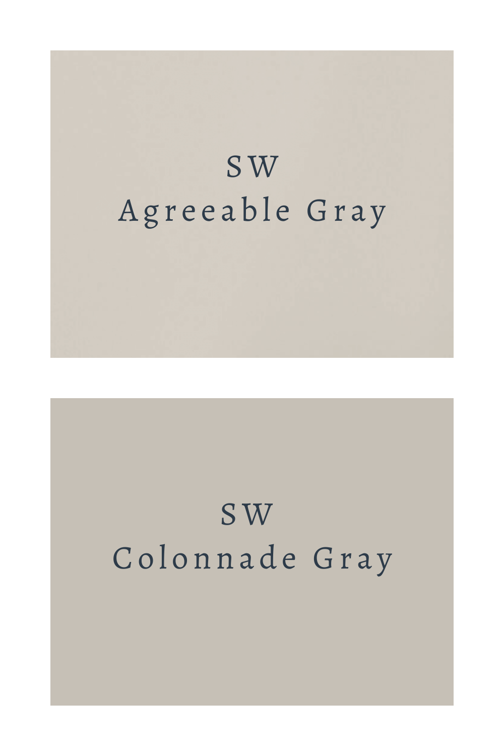
Similar greige family, but cooler. A better option if Agreeable Gray is reading too warm.
Gossamer Veil
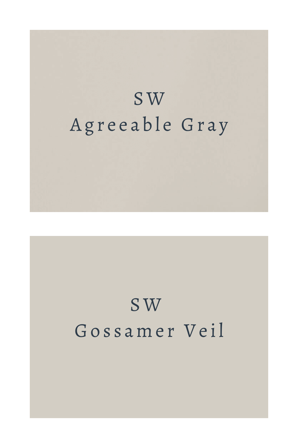
Similar warmth, but slightly lighter and crisper. If Agreeable Gray feels too purple or beige, this one has more neutral undertones.


6 Comments