8 of my Favorite White Paint Colors For Kitchen Cabinets

Would you like to save this?
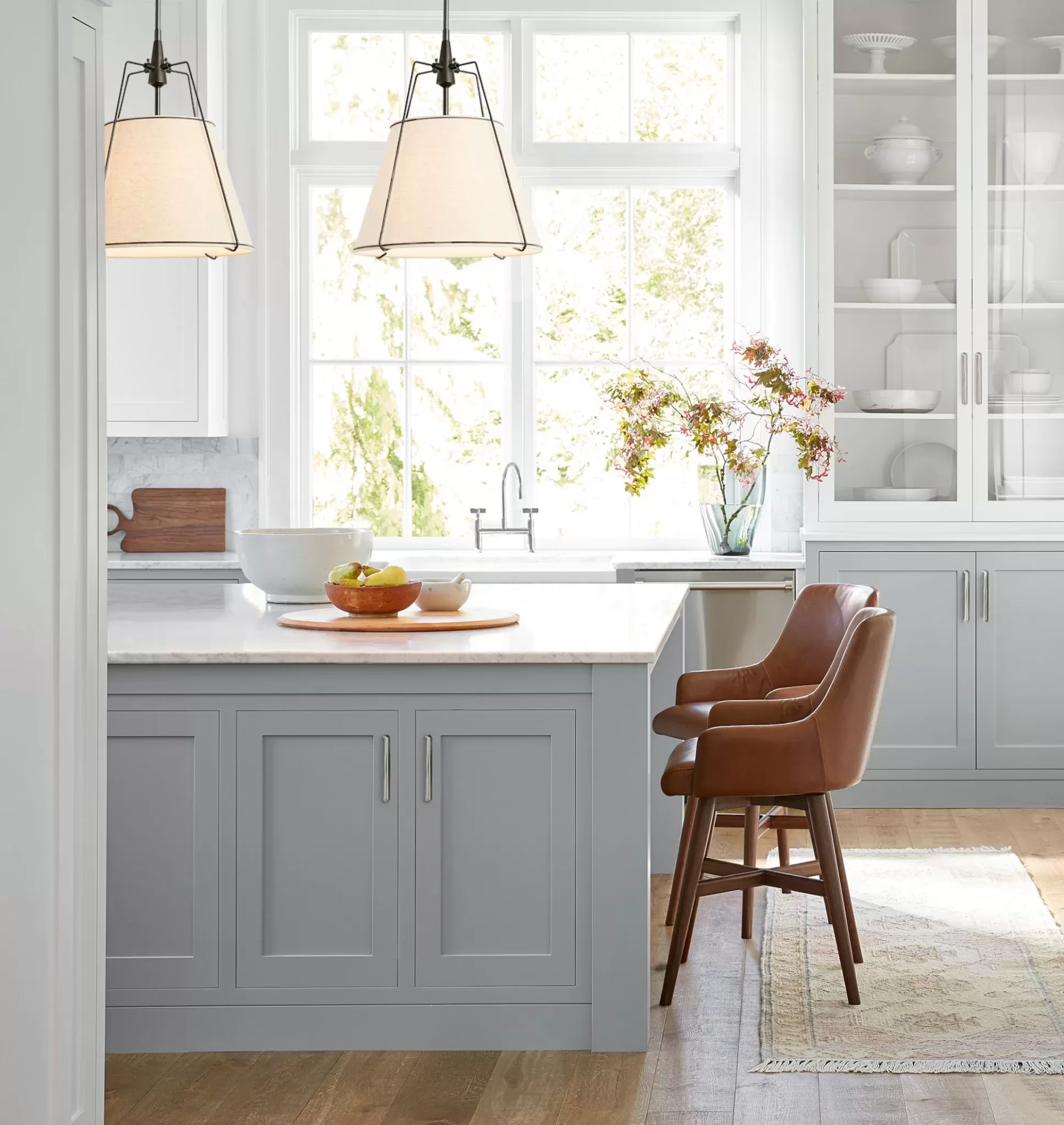
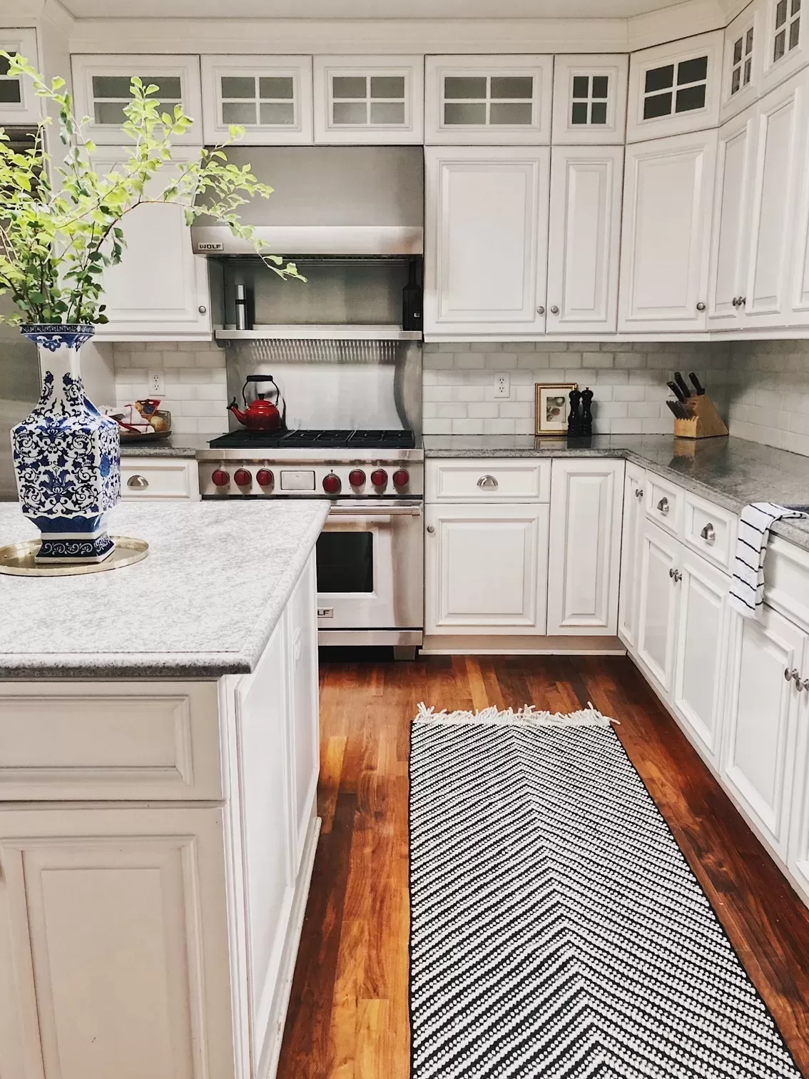
White kitchen cabinets are one of the most timeless choices you can make for your home—they’re classic in that Nancy Meyers aesthetic sort of way, but they can also suit nearly any home style, from contemporary, to farmhouse, to French Country. They may not be the most on-trend finish right now, but you know what? When it comes to big, expensive design decisions, I always think simple is best. Our kitchen was renovated in 2006, 12 years before we moved in and 19 years before writing this post and I feel like it still looks pretty darn good (unfortunately I never got the exact cabinet color from the previous owners!)
If you agree with me about timeless finishes, and you’ve decided to go with white cabinets, you might actually be more confused than ever, because now you need to choose a shade of white. This can be downright mind-numbing since there are exactly 42,000 shades of white paint. Or something like that.
The good news: There are a handful of gorgeous, versatile, go-to whites that are perfect for kitchen cabinets, and I’m about to tell you what they are.

My Favorite Way to Sample Paint
I LOVE Samplize peel-and-stick paint samples for trying paint colors at home. They’re easy to use, and they offer overnight delivery.
How to choose a white paint for kitchen cabinets
Before I list out all of my favorite white paint colors for kitchen cabinets, I wanted to first share some of the important factors you should consider when choosing one. It’s not quite as simple as picking out a shade of white you like. You also want to make sure the hue you pick works with your space.
Here are a few things to consider when determining if a white paint color will look good in your kitchen.
Your hard finishes
This is the most important factor to consider when choosing a white paint for your cabinets. Your goal is to choose a white paint that complements your hard finishes. The hard finishes in a room are things like countertops, flooring and backsplash tile. Basically, anything that is attached to the bones of your house. The tones in your hard finishes will dictate the white paint colors that will and won’t look good in your kitchen.
Cool-toned hard finishes are things like concrete, gray-toned or bright-white tile Blanco Carrara marble or charcoal-colored granite, and chrome or black hardware (hardware isn’t a technically a hard finish, but it can be something to consider if your faucets and fixtures are already in place). Cool-toned finishes are complemented best by true white paint colors or cool-white paint colors.
Warmer-toned hard finishes, like medium-brown flooring, off-white or beige tile (like travertine) and brass plumbing fixtures are best complemented by off whites and warm whites. One common design mistake I often see is people wanting to update warm-toned Tuscan kitchen (the kind with tan granite and a limestone tile backsplash) by painting the cabinets bright white. Instead of making the whole space look updated, it just makes the hard finishes look even more warm and dated by comparison.
Lighting
The lighting in your kitchen will impact:
- Whether or not white actually does look good in your kitchen
- The shades of white that look best on your kitchen cabinets.
White seems like a failproof color, and in a lot of cases it is. But, it’s not a winner in every room. In general, white looks best in a room with lots of natural light, since white literally reflects light. In dimmer spaces, white paints, especially those with gray or yellow undertones, can look dingey and dull. If you have a space without much natural light, start by sampling true white paint colors (I’ve listed some below). If that doesn’t work for you, it might be best to choose a pale neutral (like Benjamin Moore Pale Oak, or a mushroom tone) instead.
On the other hand, if you have a space that gets lots of natural light, it’s important to know that your white paint colors will look lighter and brighter that they do on a swatch. So, if you want your cabinets to read off-white, you may need to choose a color a shade or two deeper than what you might think.
The way that lighting in a room affects color is the number one reason it’s so important to test paint colors. Color can look so different from room-to-room and house-to-house, so never skip this step!
My Favorite Way to Sample Paint
I LOVE Samplize peel-and-stick paint samples for trying paint colors at home. They’re easy to use, and they offer overnight delivery.
Top White Paints for Kitchen Cabinets
So, now that you have some guidelines for picking a paint color, here are some of the ones I love for cabinets.

True White Cabinet Colors


If you want a true white, without a lot of undertones consider High Reflective White. This one is coming straight from the (white) horse’s mouth: High Reflective White is officially Sherwin Williams brightest, clearest white. With an LRV (or light reflectance value, a measure of paint brightness on a scale of 0-100) of roughly 93, it’s also about as bright as paint colors come. I love High-Reflective White paired with subway tile.
Benjamin Moore Chantilly Lace


According to Benjamin Moore, Chantilly Lace has “little to no visible undertone” and it one of its cleanest, brightest whites. Chantilly Lace is a crisp white that’s gorgeous on cabinets, especially in spaces that are contemporary, coastal, or preppy & bright. I consider it to be almost a failsafe white paint color if you want cabinets that look bright white without any hint of an undertone. Like I said, I don’t know the exact color of our kitchen cabinets because it was remodeled years before we moved it, but if I had to guess, I’d say they are BM Chantilly Lace.
Sherwin Williams Pure White


Pure White is another of Sherwin Williams’ true white paint colors (not to be confused with Extra White, which is a deeper, cooler shade). Pure White has an LRV of about 85, which makes it not quite as bright at High Reflective White. But its neutral undertones make it a true white shade.
Warm Whites
When it comes to warm whites, there are a few I go back to over and over again in my own homes. These colors also happen to be among the most popular shades of white from the leading paint brands, and there’s a reason for that.
Benjamin Moore Simply White


Designer: @churchill_design
Architecture: @brandonarchitects Photo: @chadmellon
Simply White has been one of my go-to paint colors for years, and I’ve literally used it in every home I’ve ever owned. It’s a gorgeous off white with warm undertones, that works beautifully in traditional spaces, against espresso wood tones, and with soapstone, Calacatta Gold or butcher block countertops. In spaces with lots of natural light, it almost reads like a bright white. At the same time, since it does get its warmth from a yellow shade, I don’t love Simple White against bright white and cool gray-toned finishes like Cararra marble or pristine white subway tile.
Benjamin Moore White Dove


If you’ve considered Benjamin Moore Simply White or Swiss Coffee and found either color too yellow, give Benjamin Moore White Dove a try. It’s another off-white with neutral undertones, so it feels warm without being yellow. With an LRV of 85.38, it’s got some depth, but can also read like a bright white in a sun-filled room. It’s also Benjamin Moore’s all-time best-selling white paint color, and it’s most-sampled.
Sherwin Williams Alabaster


Sherwin Williams Alabaster is a lovely off white that gets warmth primarily from beige undertones. It does have some yellow undertones, but in most instances they are subtle enough that the color won’t read yellow.
Sherwin Williams Greek Villa


Greek Villa is a gorgeous warm white with a subtle creamy undertone. I love it for cottage-y spaces or in homes with classic bones and warm colors. It works in a lot of the same instances as Simply White, i.e. with warmer marbles and rich wood tones.
Cool-toned whites
Benjamin Moore Decorator’s White


I love a cool-toned white with some depth, and Benjamin Moore Decorators White fits the bill. It’s a versatile off white with a hint of blue, which makes it a gorgeous fit for coastal spaces, kitchens with Cararra marble counters, stainless appliances and white tile backplashes, and modern, minimalist rooms.
Cream Paint Colors
Benjamin Moore Creamy


So, I decided to also throw in a shade of cream, since creamy white cabinets have become super popular in the last couple of years. Benjamin Moore’s Creamy is a gorgeous shade of cream that was popularized when Shea McGee used it on her kitchen cabinets, above. It creates a little more depth than a bright-white cabinet, and feels more on-trend without losing the classicism of white.
Choosing a wall color for a kitchen with white cabinets
One of the other decisions you need to make when choosing white cabinets is the wall color that’ll go with them. Personally, I always think that if you go with white cabinets, you should choose a white wall color. Colorful walls and white cabinets feel dated. Ditto for gray walls and white cabinets.
But, which white to choose? I either go with:
- The same color as the cabinets, especially if you do a bright white like Chantilly Lace
- The same color as the cabinets done at 50% or 75% strength
- A lighter shade of white in a similar tone. I.e. if you did Benjamin Moore Creamy on the cabinets, you could do Benjamin Moore White Dove paint.